Page MenuHomePhabricator

Homepage: traffic from email confirmation success page
Closed, ResolvedPublic

Description

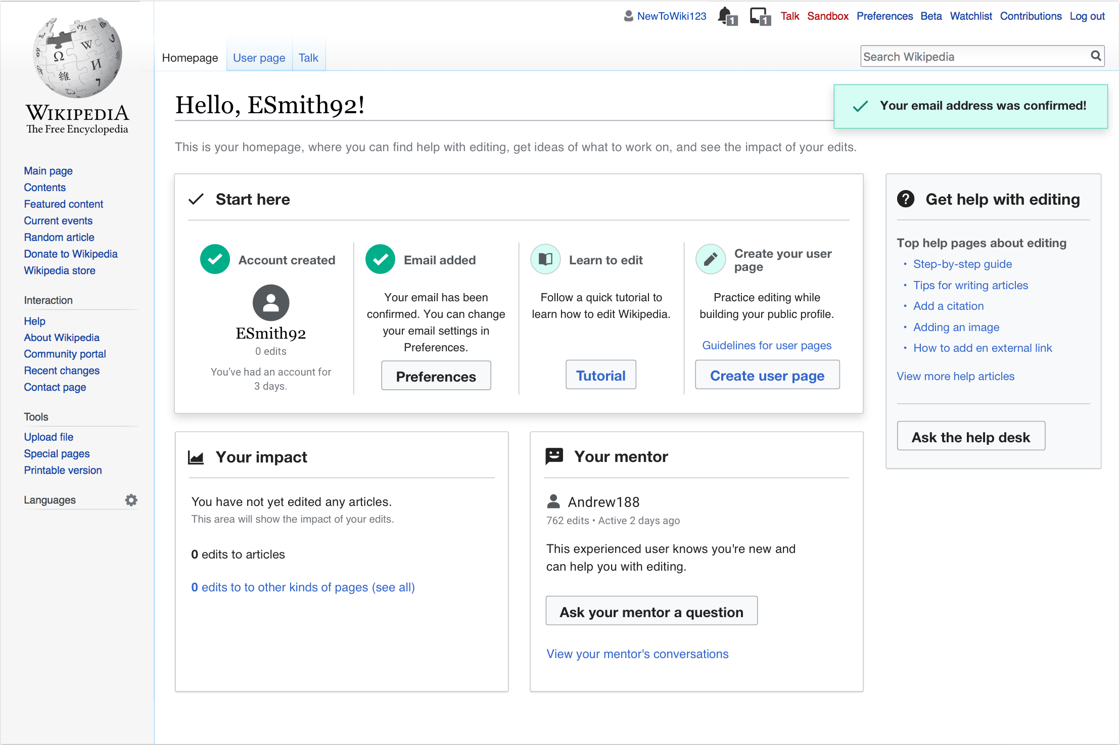
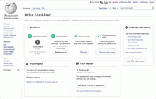
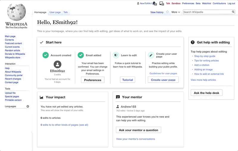
The objective of this task is to help more newcomers discover their homepage. When it is built, it should be part of the "homepage treatment", meaning that those newcomers that are in the treatment group of the homepage experiment should see this addition, and the newcomers in the control group should not.

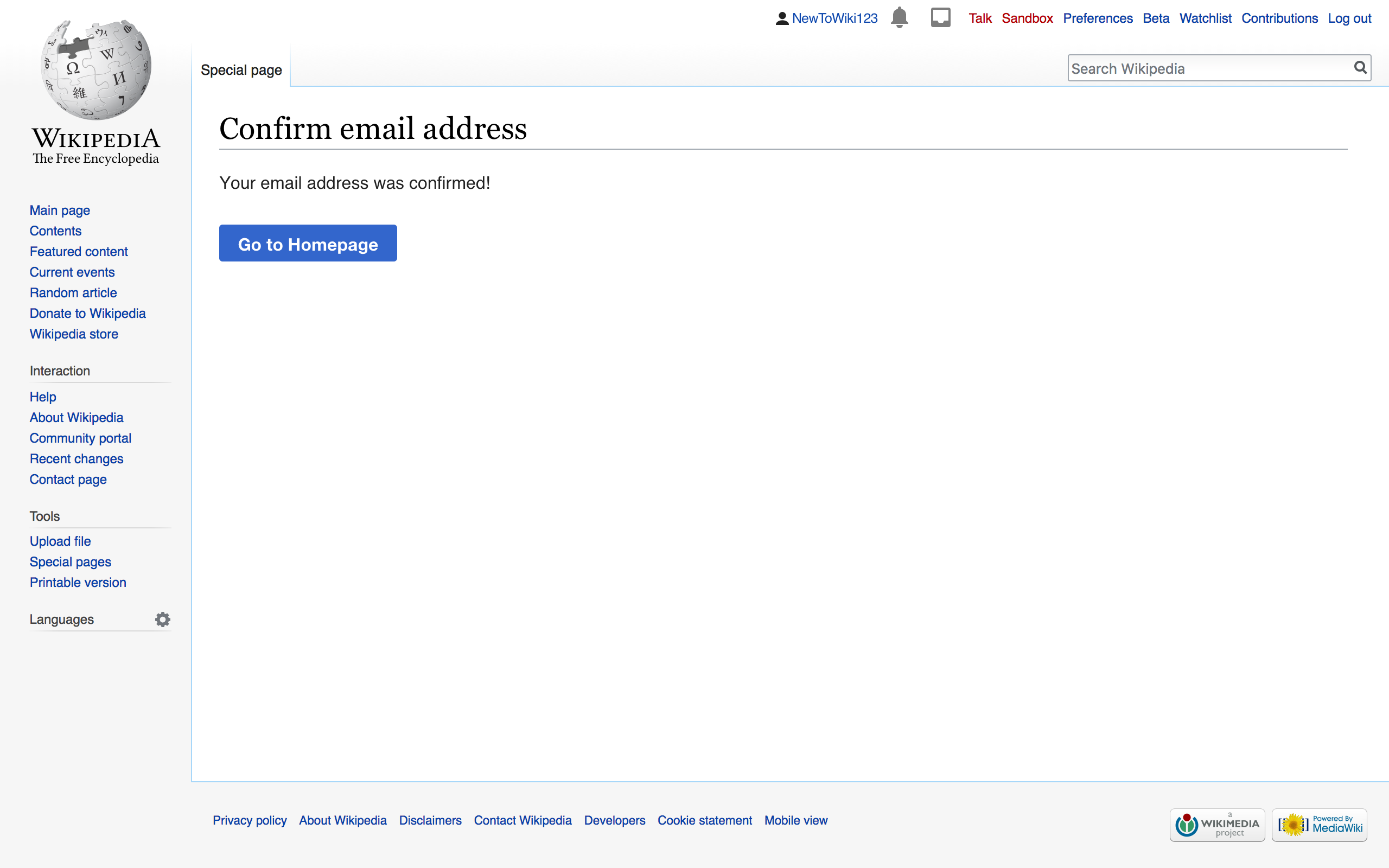
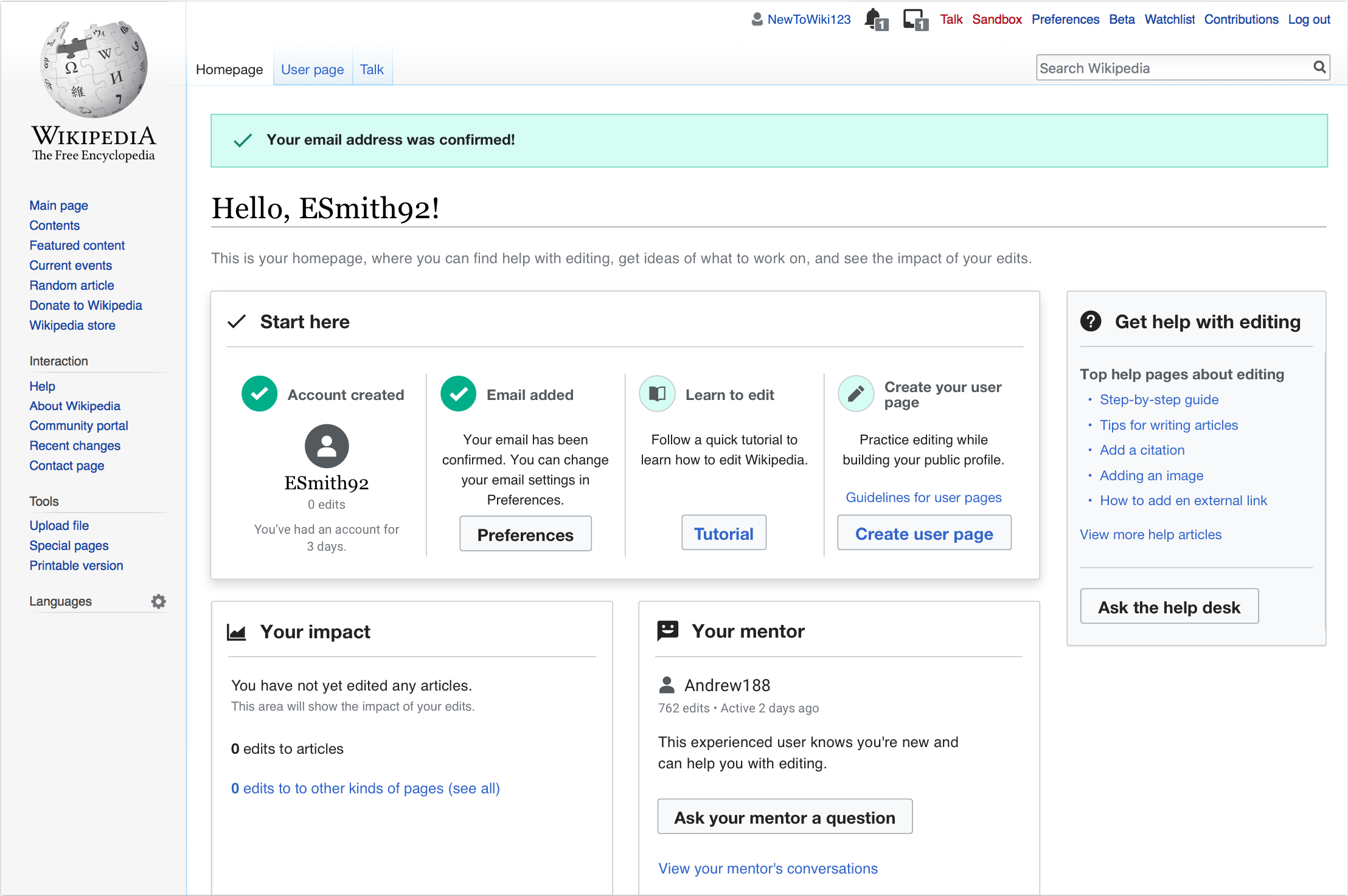
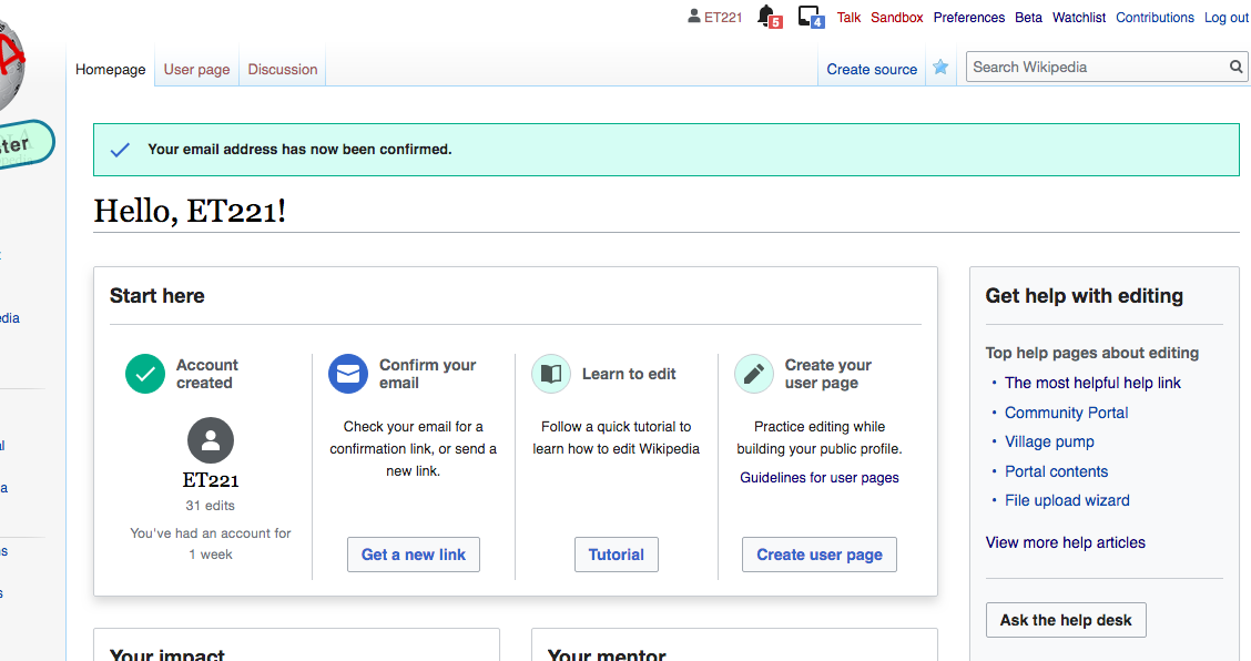
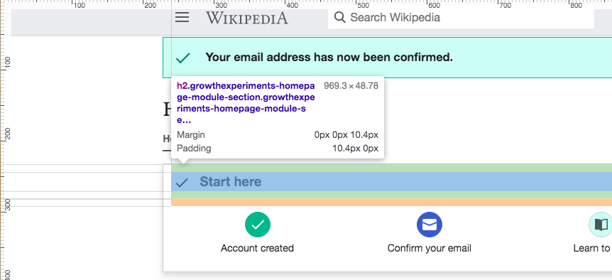
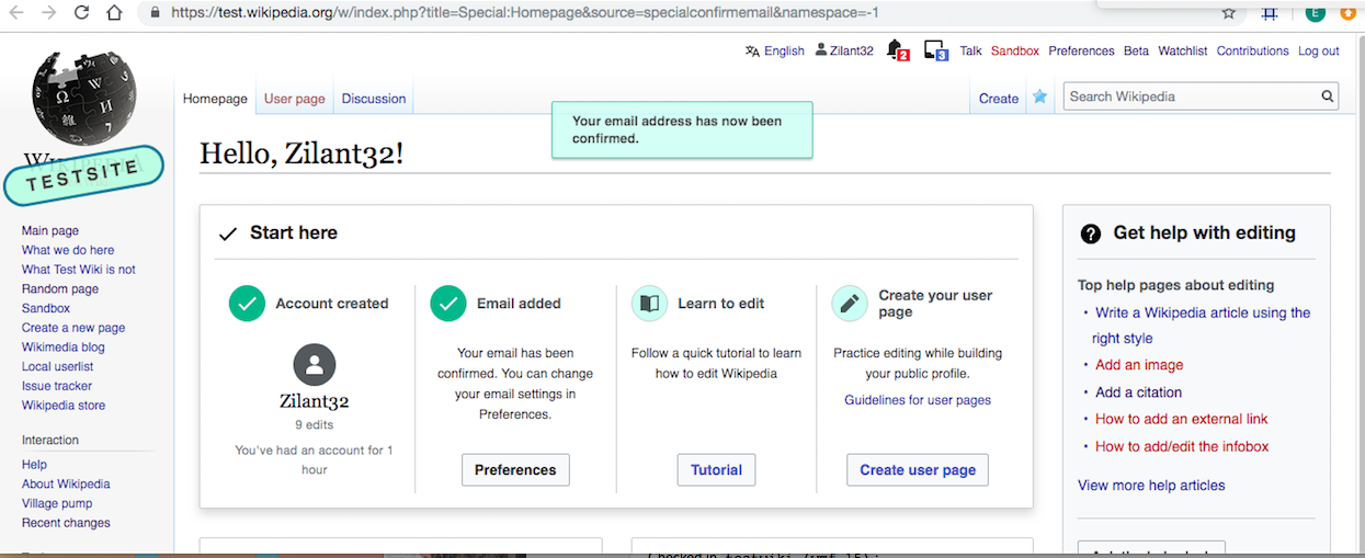
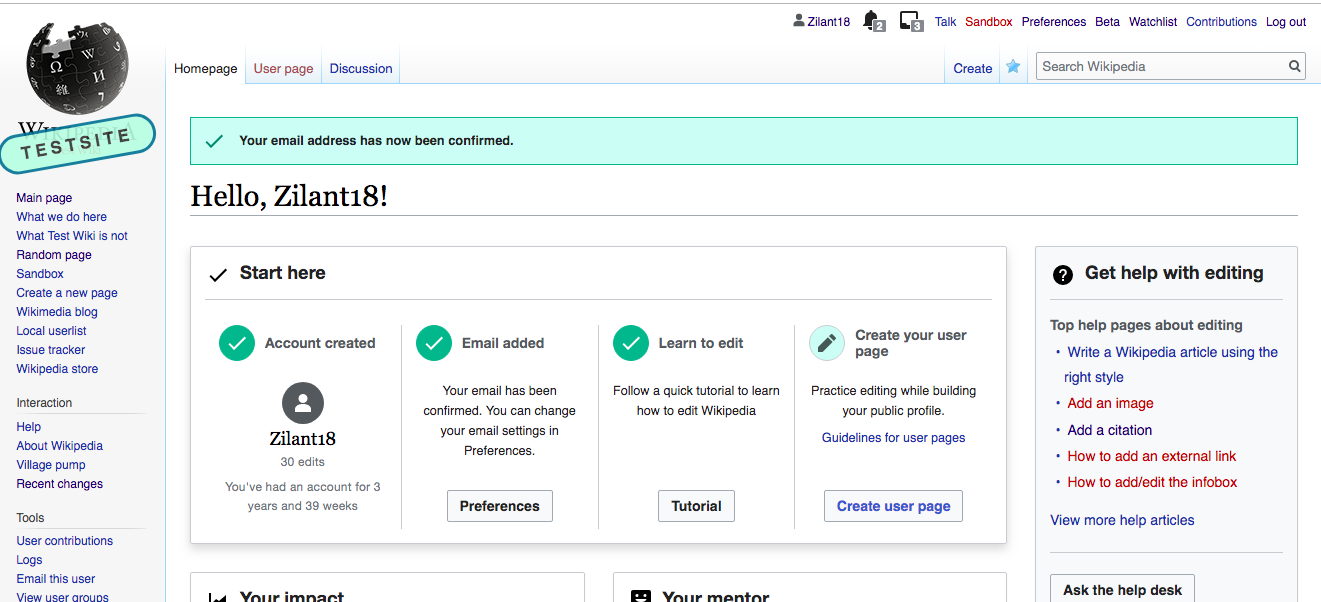
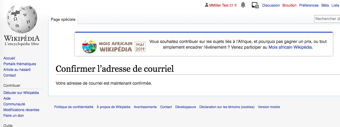
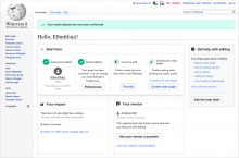
In Czech and Korean Wikipedias, 30-35% of users have confirmed email addresses. When users confirm their email address, they land on a page that gives them no further call to action at all. See image below from French Wikipedia.

image.png (423×1 px, 105 KB)

Specifications

  • all - redirect the user to Special:Homepage
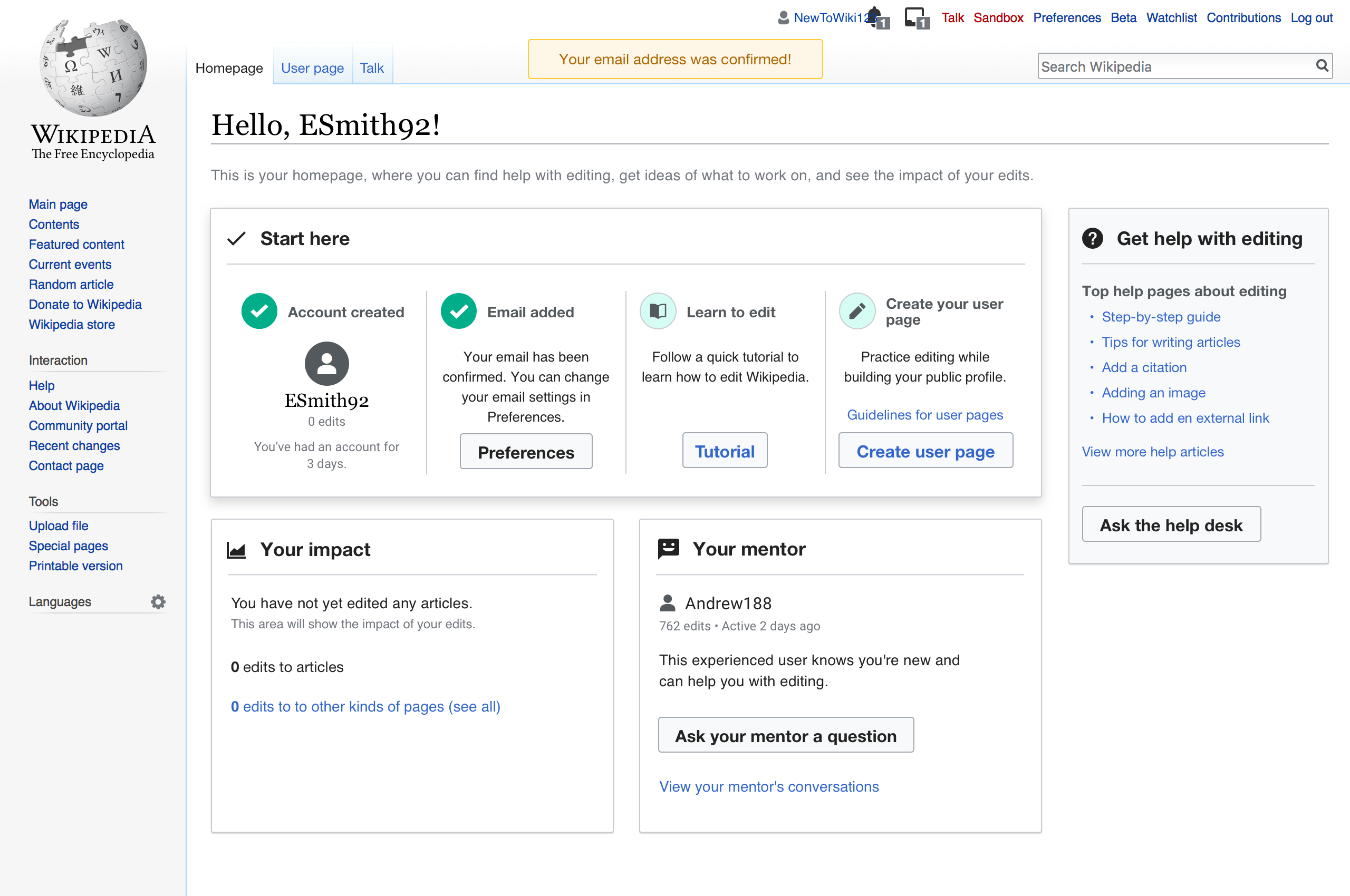
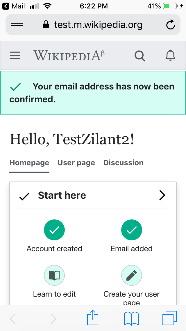
  • Desktop -- a toast message will appear (and auto-dismiss) with animation, staying on screen for 5 seconds. (See * for message detailed specs)
    Jun-12-2019 12-41-49.gif (508×800 px, 2 MB)
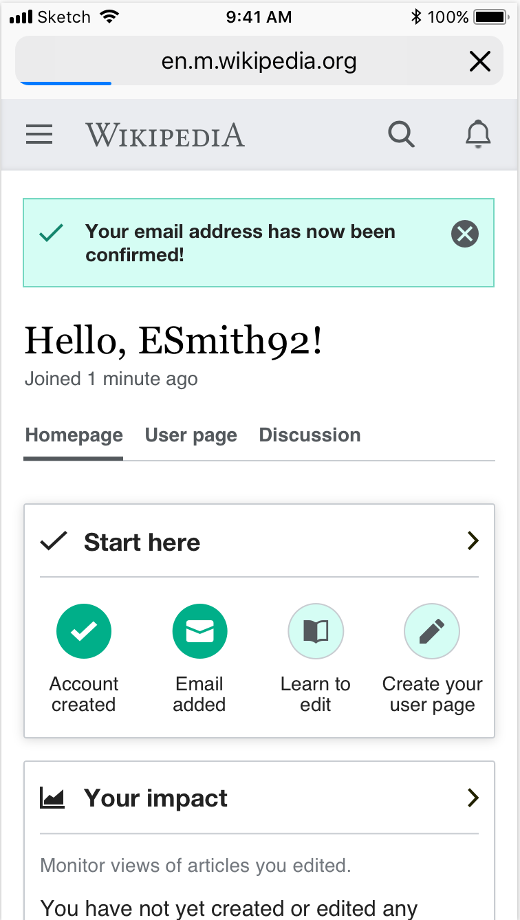
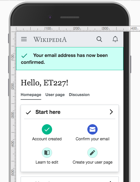
  • Mobile -- a toast message will appear (and auto-dismiss) with animation, staying on screen for 10 seconds. (styling for the toast is the classic styling for mobile toasts)
    Screenshot 2019-06-12 13.03.46.png (1×758 px, 139 KB)
  • no-Js
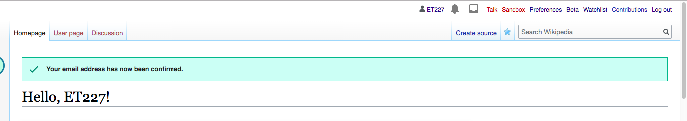
    • Desktop and Mobile -- a banner message will appear above the Homepage. It will not dismiss automatically or have a dismiss button. It will go away when either the user refresh the page or moves away from the homepage. (See * for message detailed specs)
      Screenshot 2019-06-13 19.58.02.png (1×1 px, 402 KB)
      Screenshot 2019-06-13 19.58.59.png (1×816 px, 157 KB)

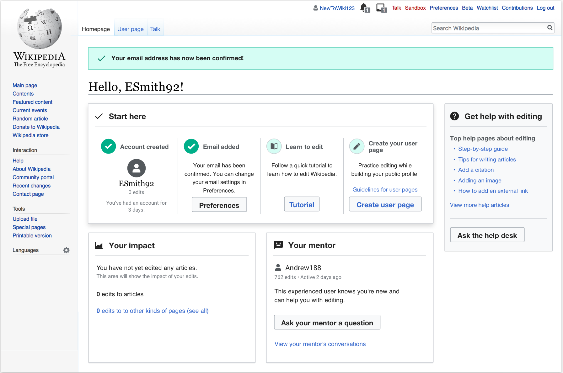
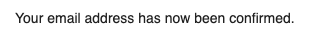
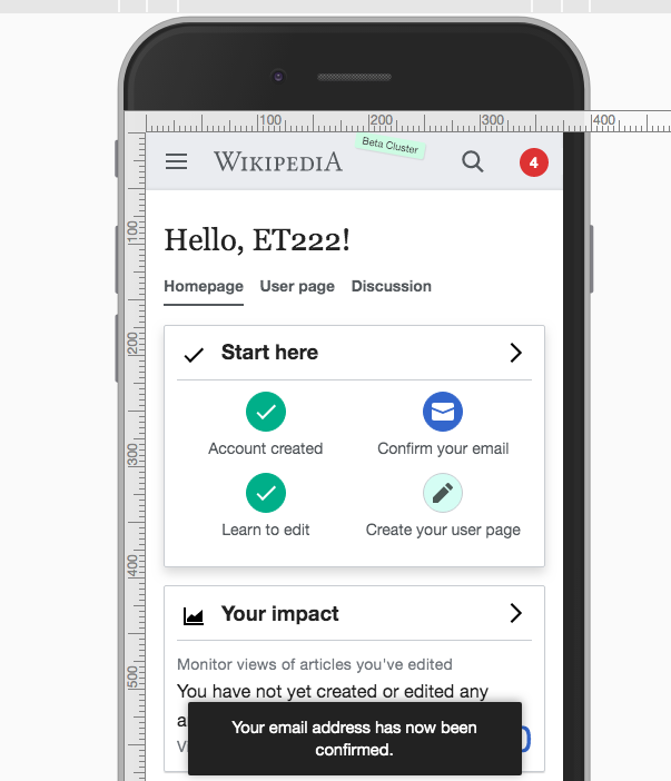
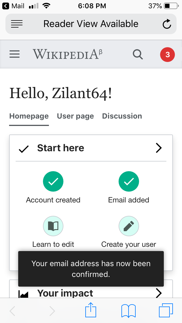
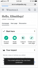
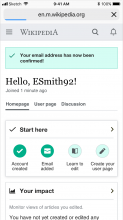
* Here are the detailed specs for the success message

  • message copy will read: "Your email address has now been confirmed."
  • bg color #d5fdf4
  • border 1px solid #00af89 - no rounded corners
  • checkmark icon color #00af89
  • font-size: 14px (equivalent in ems: 1em)
  • color: #222

Mockups are up-to-date on Zeplin.

Instrumentation

When users arrive on their homepage through confirming their email, we should record that visit in HomepageVisit as coming through that channel.

  • Desktop
  • Desktop no-Js
  • Mobile
  • Mobile no-Js

Event Timeline

There are a very large number of changes, so older changes are hidden. Show Older Changes
Catrope renamed this task from Homepage: traffic from confirming emails to Homepage: traffic from email confirmation success page.May 9 2019, 8:26 PM

@MMiller_WMF

Here are two design proposals based on considerations highlighted in the task description.

  1. Confirmation link in confirmation email will redirect user to the homepage. A toast will appear front and center, notifiying the user about email confirmation success "Your email address was confirmed!"

Discovery - From email - Homepage with toast.png (1×2 px, 686 KB)

Notes: I'm not sure about toast current alignment and behavior as I couldn't see one in action. My preferred choice would be:

  • Alignment: center aligned at the top of the page and below the personal tools
  • Behavior: the toast would appear with a transition on it's opacity (0 to 1), and a slight movement from center top to its position. It would disappear the other way around, opacity transition (1 to 0), and a slight movement from its position to center top.
  1. Email confirmation success page would simply show a clearer call-to-action to go to the homepage: a progressive button with copy "Go to Homepage"

Discovery - From email - Success page CTA.png (1×2 px, 404 KB)

I have a couple questions for @Catrope (or other engineers) about option #1 (redirect with toast)

  • Given that users have landed on the email confirmation page for years, would immediately redirecting them to their homepage instead cause any problems? Do you know of any reason they actually need to land on and see the email confirmation page?
  • What problems do you foresee with the toast? Will no-JS users not see it? What else can go wrong?

@Cntlsn -- how would you want to option #1 on mobile?

@Cntlsn you can experiment with the toast with running this in your console:

mw.notify( 'Your email has been confirmed', { title: 'Success!', autoHide: false, type: 'warn' } );

For the configuration options you can look at resources/src/mediawiki.notification/notification.js

Given that users have landed on the email confirmation page for years, would immediately redirecting them to their homepage instead cause any problems? Do you know of any reason they actually need to land on and see the email confirmation page?

I think the idea is just to tell the user it succeeded. They need to land on the page for the email to be properly verified but we can redirect them before they've seen the page load.

What problems do you foresee with the toast? Will no-JS users not see it? What else can go wrong?

Correct, no-JS users will not see it. One idea would be to have a "your email is verified" module that appears above the start module, and only show if the user has been redirected from Special:ConfirmEmail. That would provide more visibility and work for no-JS users.

I like Kosta's idea of showing a "your email is verified" message based on whether the user was redirected from Special:ConfirmEmail to the home page.

Overall I think redirecting from Special:ConfirmEmail to Special:Homepage (for users in the control group) is the best option. We can redirect to something like Special:Homepage?fromconfirmemail=1 so that we can then display the page slightly differently (e.g. adding the thing Kosta proposed, or the toast Alessandro proposed).

Thanks @kostajh and @Catrope for your feedback on this!

I also agree that redirecting the users to the Homepage would be the best option for the user experience.
Just want to make sure I understand correctly how this would work: after clicking on the link in the email, the Special:ConfirmEmail page will load and after some time it will redirect to Special:Homepage?
Or actually the redirect to Special:Homepage would be so quick that the user won't be able to see the Special:ConfirmEmail page?
The reason I'm asking is that if we're in the first scenario, then I think it would be good to offer some kind of feedback of what's happening to the user, like a message with indication that the user is being redirected and a countdown, or something similar.

Talking about the toast vs boxed message, I'd love the design treatment to also support no-JS. But, I was having a look T127405 and I'm afraid I'm not sure what's exactly the option that OOUI would like to see supported in the future.
I'm looping @Volker_E for guidance on this: considering this mockup, what do you think would be the best way to show the message in the toast?
Thx!

@Cntlsn The message should be either a success message (preferred) or a notice message. M241 shows the current iteration of the user system messages (block and inline).
So in contrast to the mockup I see following points to change:

  • Change from warning to success colored message
  • Add 'check' icon. It's then probably a good time to think about and revisit the icon accompanying “Start here” module
  • Messages unlike other interactive elements don't receive border-radius: 2px – should be set to 0
  • Save/publish success message in VE has a close icon as well
  • Box-shadow should be added to overlay messages

Thanks @Volker_E for all your notes!

I'm not sure I understand if the kind of boxed messages in M241 can be used as toast messages?
And in case that's possible, do all toast messages have to appear from the right of the screen? Because in that scenario I think the message won't be very visible:

Screenshot 2019-06-06 18.32.23.png (1×2 px, 561 KB)

I think in this case having the message dropping from the top/center of the page would actually make the message more visible:
Screenshot 2019-06-06 18.32.37.png (1×2 px, 555 KB)

In case those kind of messages are not supposed to be used as toasts, is this the kind of treatment the message would get?

Screenshot 2019-06-06 18.33.15.png (1×2 px, 562 KB)

In this last scenario, would it be possible to automatically dismiss the message, like for instance with an animation? Or this kind of messages should always need a user action to be dismissed?

Thanks again, and sorry for all the questions, trying to make some clarity on this :)

Top/center would be aligned with VisualEditor save message, that seems fine for now.

I think the toast approach is good. Let's also include a design for no-JS users.

@kostajh @SBisson @Catrope -- do you recommend that we use the exact same message that is currently used on Special:ConfirmEmail?

image.png (38×318 px, 4 KB)

Will this save us translation needs?

@Cntlsn -- please go ahead and change the description of this task to include the specifications and mockups.

Top/center would be aligned with VisualEditor save message, that seems fine for now.

That's how is the message whatever editor you successfully used. And the one for successful mentions IIRC.

do you recommend that we use the exact same message that is currently used on Special:ConfirmEmail?

That makes sense to me.

Will this save us translation needs?

Yes, I don't think we need to add a new translation string.

Thanks @kostajh and @Catrope for your feedback on this!

I also agree that redirecting the users to the Homepage would be the best option for the user experience.
Just want to make sure I understand correctly how this would work: after clicking on the link in the email, the Special:ConfirmEmail page will load and after some time it will redirect to Special:Homepage?
Or actually the redirect to Special:Homepage would be so quick that the user won't be able to see the Special:ConfirmEmail page?
The reason I'm asking is that if we're in the first scenario, then I think it would be good to offer some kind of feedback of what's happening to the user, like a message with indication that the user is being redirected and a countdown, or something similar.

What I'm proposing is the second scenario: when you go to Special:ConfirmEmail, it would immediately (without displaying a page) redirect to Special:Homepage?fromconfirmemail=1, and Special:Homepage would notice the ?fromconfirmemail=1 parameter and display a message thanking the user for confirming their email.

Thanks @Catrope @kostajh @MMiller_WMF for your input.

If you confirm the following mockups are feasible, I will update the task description with detailed specifications.

Desktop Js

Screenshot 2019-06-12 13.02.18.png (1×2 px, 552 KB)

Jun-12-2019 12-41-49.gif (508×800 px, 2 MB)

Desktop no-Js

Screenshot 2019-06-12 13.03.34.png (1×2 px, 557 KB)

Mobile Js

Screenshot 2019-06-12 13.03.46.png (1×758 px, 139 KB)

Mobile no-Js

Screenshot 2019-06-12 13.04.00.png (1×756 px, 140 KB)

Looping @SBisson in since we just discussed in chat that making a message dismissable for no-Js users would potentially be too much work for supporting a small percentage of no-Js browsers.

In the two no-Js scenarios above I would only consider displaying the message if browsing to another page and then back to the homepage would remove the message.
Would that be the case?

I think the mockups are feasible but in the no-js cases should we omit the dismiss button?

@Cntlsn -- please do update the task description and put this in ready for development. You can go ahead and specify the no-JS version as not having a dismiss button, and for the banner to go away when users refresh or revisit the homepage.

Cntlsn removed a project: Growth Design.

@SBisson @kostajh
I have updated the specifications in the task description, and uploaded up-to-date mockups to Zeplin.

This is ready for development.

In the two no-Js scenarios above I would only consider displaying the message if browsing to another page and then back to the homepage would remove the message.
Would that be the case?

Yes, except that if you go back using the browser back button, it might not be removed. The browser back button behaves strangely and in ways that we have little control over. If the user navigates to the homepage in any other way, the message would not appear a second time.

@Catrope Thanks for the details, that's what I expected.

@Volker_E Thanks for updating the specs.

Zeplin mockups are up-to -date

Change 520512 had a related patch set uploaded (by Kosta Harlan; owner: Kosta Harlan):
[mediawiki/extensions/GrowthExperiments@master] (wip) Reroute ConfirmEmailComplete hook to Special:Homepage

https://gerrit.wikimedia.org/r/520512

Change 520512 merged by jenkins-bot:
[mediawiki/extensions/GrowthExperiments@master] Reroute ConfirmEmailComplete hook to Special:Homepage

https://gerrit.wikimedia.org/r/520512

@Cntlsn I'm not sure it's possible to get the checkmark into the notification for desktop JS version, at least not the way the notifications library is structured now. I would propose we proceed without the checkmark and then possibly come back to it as a follow-up later.

@kostajh I'm ok with proceeding without the checkmark for now!

I'm also looping in @Volker_E for possible further clarification on this.

Change 521535 had a related patch set uploaded (by Kosta Harlan; owner: Kosta Harlan):
[mediawiki/extensions/GrowthExperiments@master] Fix accidentally working LESS for ConfirmEmail

https://gerrit.wikimedia.org/r/521535

Change 521535 merged by jenkins-bot:
[mediawiki/extensions/GrowthExperiments@master] Fix accidentally working LESS for ConfirmEmail

https://gerrit.wikimedia.org/r/521535

Unable to check for a real confirmation (filed T227714). Meanwhile, here are screenshots done with `Special:Homepage&source=specialconfirmemail. @Cntlsn, please take a look for possible adjustments and move back to QA column for verification on confirmation email.

Screen Shot 2019-07-09 at 3.06.07 PM.png (383×1 px, 83 KB)

Screen Shot 2019-07-12 at 5.30.37 PM.png (702×603 px, 79 KB)

  • no js ( 'x' button is missing)

Screen Shot 2019-07-12 at 5.34.26 PM.png (596×1 px, 127 KB)

Screen Shot 2019-07-12 at 5.34.03 PM.png (669×438 px, 66 KB)

The success icon should be Green50 (green), not Accent50 (blue).
In the message style guide design we've also been defining the text to run alongside the icon – the text shouldn't wrap below the icon like in the last mobile screenshot.

Thanks @Volker_E for your comments.
@kostajh raised a series of concerns about styling messages as per specifications on M241.
I agreed on moving forward anyway and then fixing later, but I will collect the observations below, so it would be nice if you could give a look and give your input:

  • issue about getting the checkmark into the notification, mw.notify not being particularly flexible around this
    Screen Shot 2019-07-09 at 3.06.07 PM.png (383×1 px, 83 KB)
  • for no JS, not possible we get to choose the color of the checkmark. It's going to be blue or black
    Screen Shot 2019-07-12 at 5.34.26 PM.png (596×1 px, 127 KB)

About reviewing the state of the design:

  • @Etonkovidova The dismiss 'X' button will be missing as per M241 there are no dismiss buttons in messages, they just auto-dismiss or stay on screen I guess. In our case we discussed the behavior previously T222848#5266568
  • Mobile no-Js version:
    • the message should feature margin on top and on the sides margin: 21px 16px 0;
    • (quoting @Volker_E) the text shouldn't wrap below the icon.

Temporarily keeping this in the Design review column until the issues above haven't been addressed.

@Cntlsn Checkmark icon should actually be either Base0 or Green50 (with latter we tolerate a color contrast issue on this specific icon as the message should be self-explaining and the boundaries are sufficient.

Change 523795 had a related patch set uploaded (by Kosta Harlan; owner: Kosta Harlan):
[mediawiki/extensions/GrowthExperiments@master] Special:ConfirmEmail message: Make checkmark black

https://gerrit.wikimedia.org/r/523795

Change 523795 merged by jenkins-bot:
[mediawiki/extensions/GrowthExperiments@master] Special:ConfirmEmail message: Make checkmark black

https://gerrit.wikimedia.org/r/523795

Looks good for now, so moving to "Needs PM review".
Might be revisited later, to match mockups.

It's important that we can test this fully in beta, so I'm moving this back to QA while we wait for the blocker (T227714) to be resolved by Release-Engineering-Team. (cc @JTannerWMF)

Change 524069 had a related patch set uploaded (by Kosta Harlan; owner: Kosta Harlan):
[mediawiki/extensions/GrowthExperiments@master] Special:ConfirmEmail message: Make checkmark green

https://gerrit.wikimedia.org/r/524069

Change 524069 merged by jenkins-bot:
[mediawiki/extensions/GrowthExperiments@master] Special:ConfirmEmail message: Make checkmark green

https://gerrit.wikimedia.org/r/524069

Still blocked by T227714 - not able to confirm email. @MMiller_WMF, I'll talk to @Catrope if there is a way to workaround the issue.

@Cntlsn - moving for Design Review. Please move it back to QA, so I'll continue testing the functionality.
The most recent screenshots for corrected checkmark:

Screen Shot 2019-07-20 at 11.20.09 AM.png (243×1 px, 46 KB)

Screen Shot 2019-07-20 at 11.21.08 AM.png (633×489 px, 66 KB)

There is a small misalignment for checkmark, but it seems the same as for other checkmarks on Homepage. Event when a label has descenders (the last screenshot) it's a little bit off:

Screen Shot 2019-07-20 at 11.21.48 AM.png (324×684 px, 52 KB)

Screen Shot 2019-07-20 at 11.23.04 AM.png (394×862 px, 61 KB)

Screen Shot 2019-07-20 at 11.23.40 AM.png (280×732 px, 46 KB)

Thanks @Etonkovidova, checkmarks look good.
I'm aware of icons misalignment, but I think it's ok for now (maybe creating a separate task for it).

Checked in testwiki (wmf.15):

Desktop
Screen Shot 2019-07-23 at 6.38.26 PM.png (509×1 px, 362 KB)
Desktop no-Js
Screen Shot 2019-07-23 at 6.18.27 PM.png (602×1 px, 199 KB)
Mobile
IMG_8157.PNG (1×640 px, 80 KB)
Mobile no-Js
IMG_8158.PNG (1×640 px, 72 KB)

Instrumentation was checked in betalabs eventlogging - event_referer_route=specialconfirmemail records users clicking on confirmation link and landing on Homepage.

All those confirmation email messages, with a clear design, should be deployed by default.

Looks good for now, moving to "Needs PM Review".
I'm taking notes of the UI bugs and will make a separate task for that.

Looks good in production.