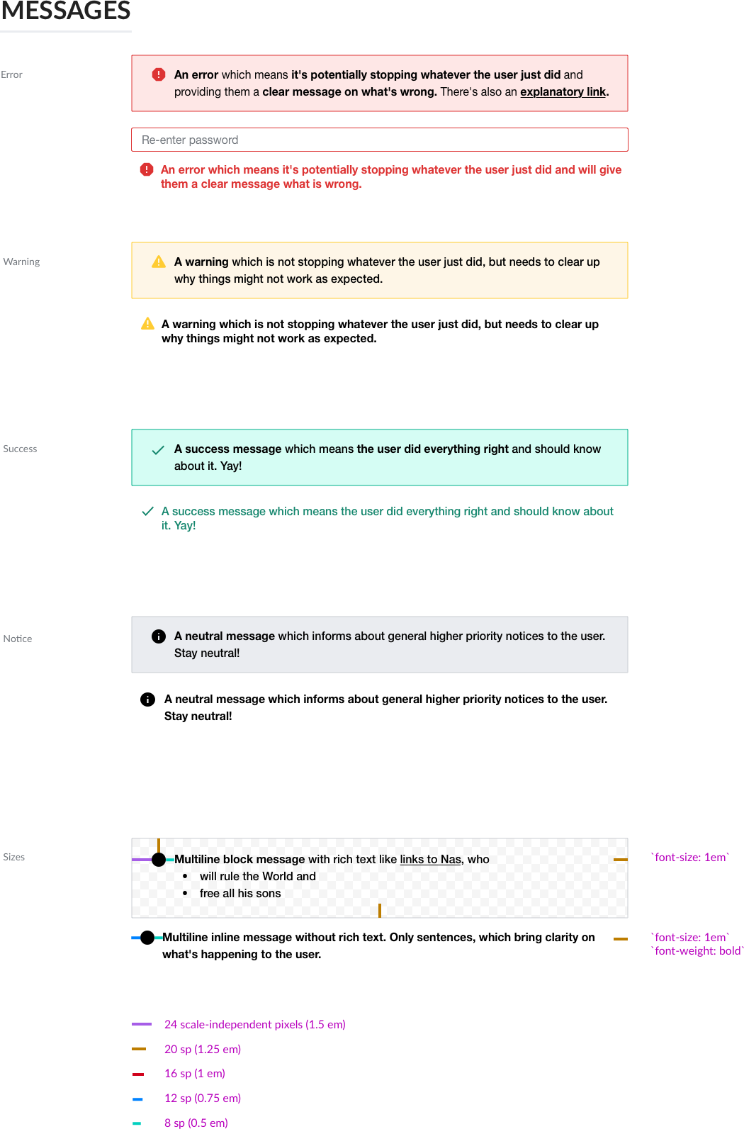
Messages and Message boxes are used in various places and should be part of M101
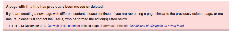
Current status quo
| MediaWiki core | mediawiki.UI |
|---|---|
 |  |
.warningbox in application 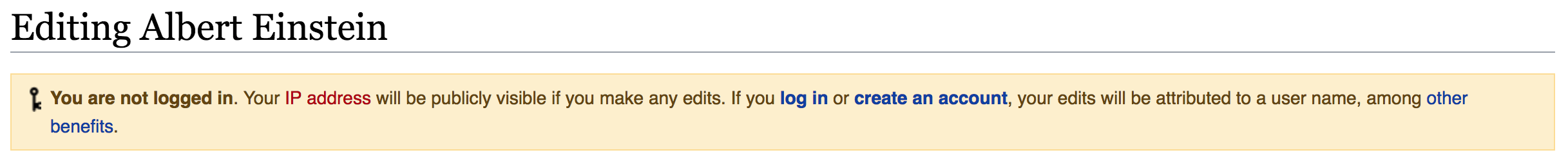 | |
| OOUI | MobileFrontend |
 |  |
| MW core: .fmbox-editnotice | MW core: PostEdit messages |
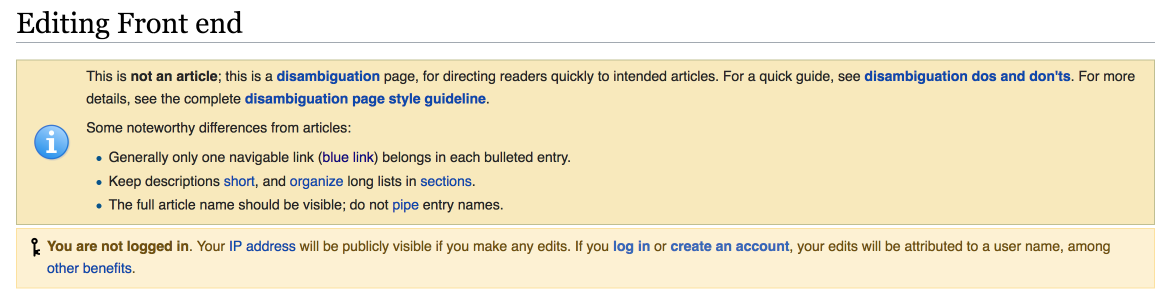 | |
| Editing a disambiguation page on English Wikipedia, with an fmbox-editnotice on top and anonymous user edit warning with class .warningbox (core messages) below | |
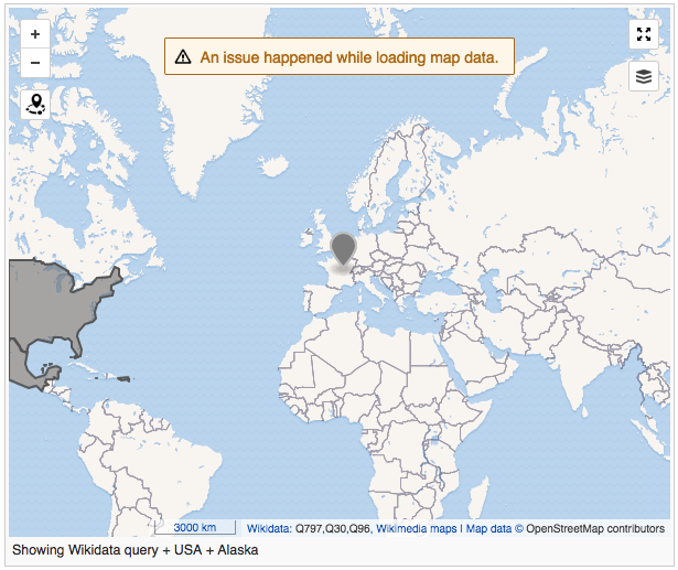
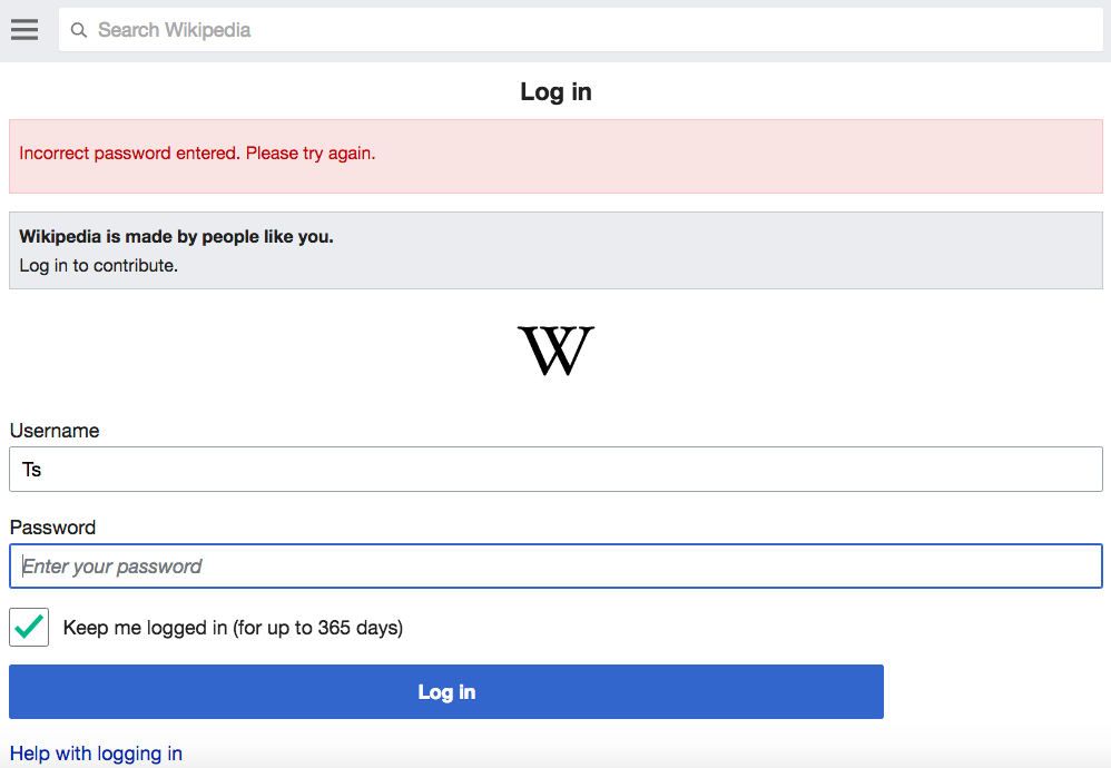
| MW core: .mw-warning | MW core: .mw-warning-with-logexcerpt |
 |  |
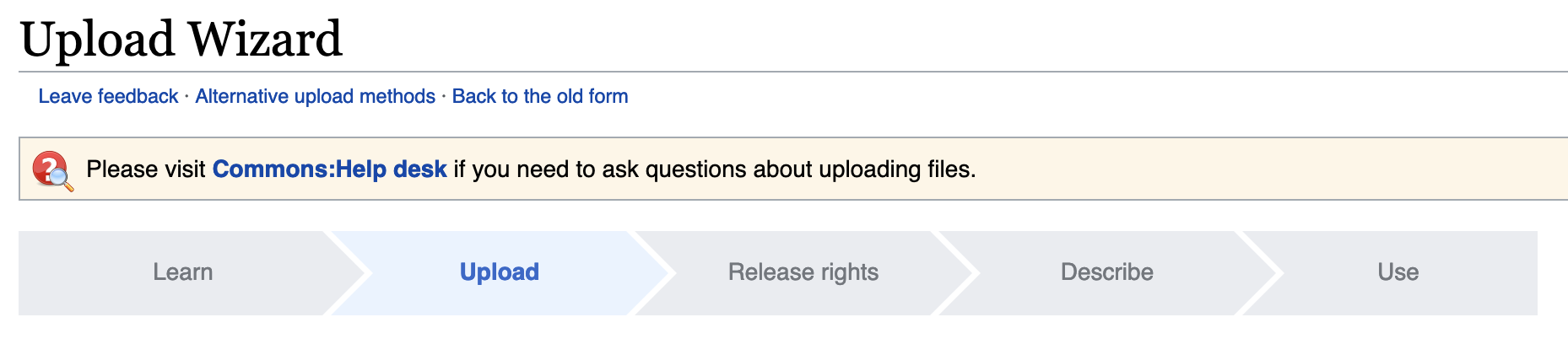
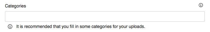
| Special:UploadWizard | Extension:Collections |
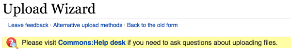 |  |
Scope of this task are the visual aspects of message boxes.
Finding guidelines on Voice & Tone is important, but are not part of this specific task.
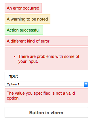
Definition of messages
- Messages, neutral notices
- Success messages
- Warnings, define clear separation from:
- Errors
Success criteria
- Responsive
- Color coding not the only way to identify type, additionally icons (definition of treatment) and voice&tone(?)
- WCAG 2.0 level AA color contrast sufficient
- Support of limited rich text and not only text, although be strict about limitation.
- Rich text examples: Links, bullet and numbered lists, bold text
- Works as block and toast messages (overlays)
Proposed solution