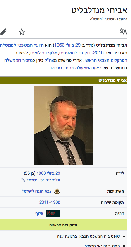
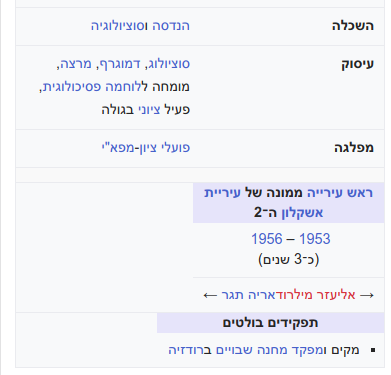
In small screens, minerva breaks tables and captions and set them as block. (see below code from minerva)
The code comment isn't clear, but the outcome is undesired as you can see in this example (important: change the screen to small, remove the explicit display:table and display:table-caption from the page [can be identified visually with lavender background])
The template currently explicitly override the settings of Minerva.
It looks like this was introduced in T184221 (10 months ago) and originally in T170344 (in different way). Possibly the issue is for table within table for which it is probably not required to override the display.
https://en.m.wikipedia.org/w/load.php?debug=1&lang=he&modules=skins.minerva.content.styles&only=styles&skin=minerva
(I find the code comment good to explain HOW but not WHY and to get the relevant tasks I had to dig with blames)
// These are only intended for smaller screens.
// This avoids having to undo them from another media query,
// by putting the original in a media query instead.
// This also avoids having a reset with too-high specificity, which
// would break unrelated styles from core and extensions.
@media all and ( max-width: @width-breakpoint-tablet ) {
	.content {
		table {
			display: block;
			width: 100% !important;
		}

		caption {
			display: block;
		}
	}
}