Summary
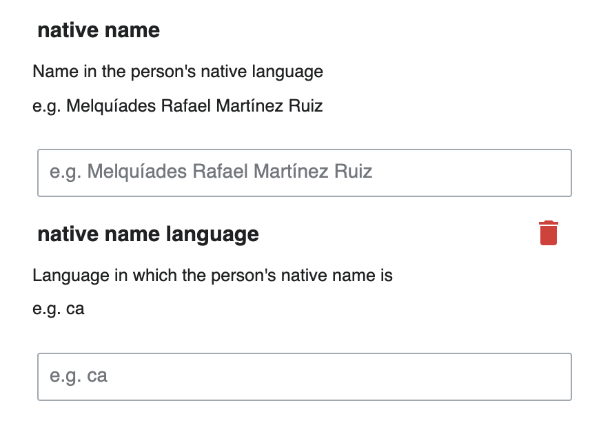
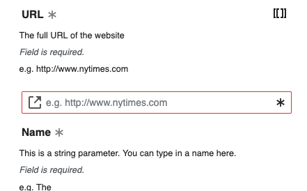
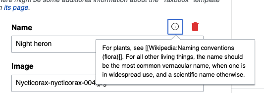
Currently parameter descriptions are hidden in the info icon, but the descriptions usually contain critical information and direction on what type of content a parameter expects and how to format it. In order to make this more visible and likely to be read, it should be relocated beneath the label for all parameters. Some descriptions are quite long and will need to be truncated, see requirements below.
This should be implemented on the test instance in order to use it for usability testing and understand any potential issues the proposed change may cause.
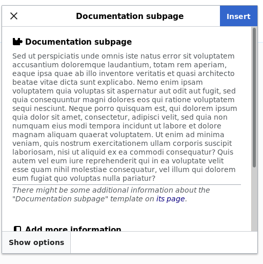
Current state:
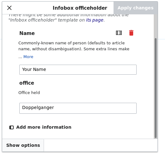
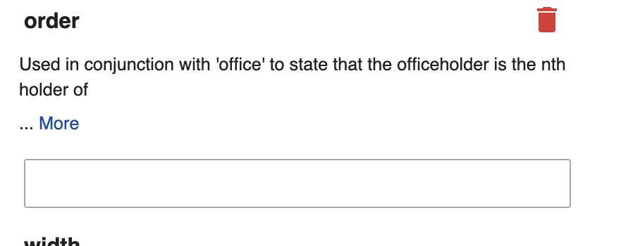
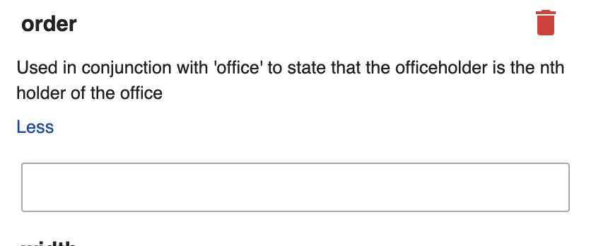
Mock up:
Requirements
- Remove info icon completely
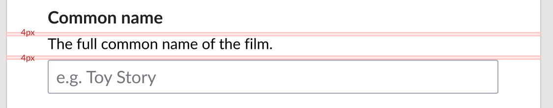
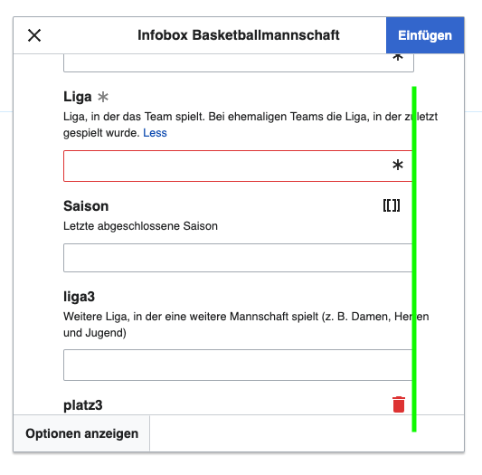
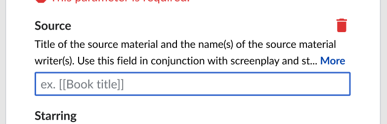
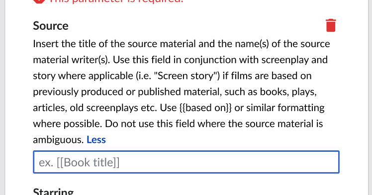
- Put all text from the TemplateData property 'Description' under the label, not within the info icon. Text should match 'Description' style - 14px/21px. Note: most parameter properties have the potential to be in multiple languages, displayed to match interface lang settings if available. This feature should remain.
- Text is truncated when longer than 2 lines
- If truncated, an in-line button 'More' expands full description. When clicked, 'More' is replaced with an in-line 'Less' button, which when clicked would re-truncate the text to 2 lines
- Keep the trash icon aligned with the title/label (appears when the field is in focus)
- When description is missing, then nothing shows beneath the label.