Page MenuHomePhabricator

Create a prototype to test our different grid options
Closed, ResolvedPublic

Description

Background

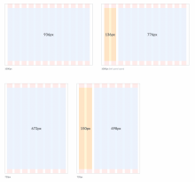
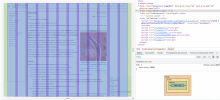
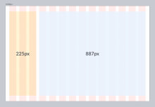
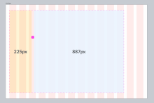
We have been working on different grid proposals and now we need to test all options (grid columns, margins and gutters) with a prototype like this one so that we can choose the best grid proposal to move forward.

Grids proposal in Figma

Acceptance criteria (or Done)

First prototype to test the margins and gutter in the grid (check this prototype)

Create a prototype with the following options:

  • Number of columns:
    • 14 columns
    • 12 columns
  • Margin and Gutter:
    • 40px margins and 40px gutter (they change on the different breakpoints)
    • 32px margin and 24px gutter (they change on the different breakpoints)
  • Table of content (on left):
    • Fixed width (244px)
    • Not fixed (aligned with the grid columns)
  • Use the new breakpoints defined in T303522
    • desktop-wide from 1680px screens and more
    • desktop from 1120px to 1679px screens
    • tablet from 640px to 1119px screens
    • mobile from 320px to 639px screens
Second prototype to test the ToC width (check this prototype):

Create a prototype with the following options:

  • 12 col. grid (32px margins, 24px gutter)
  • 24 col. grid (32px margins, 24px gutter)
  • 12 col. grid (32px margins, 24px gutter) with a new breakpoint (tablet-wide)where the ToC will expand to 3col

Prototypes

Some articles to test the ToC with long text

https://dsg-grid.web.app/cher (display the "Life and career" option)
https://dsg-grid.web.app/infection (display the "Diagnosis" option)
Event Timeline

bmartinezcalvo updated the task description. (Show Details)

@alexhollender_WMF thank you for creating this amazing prototype, it's really helpful to test our grids with real content.

After checking it and sharing the shame commented today during our meeting, my feedback is the following:

  1. My preference is for the grid with 12 columns, 24 gutter and not fixed ToC for the following reasons
  2. I wouldn't use the fixed ToC option with bigger width for 1st and 2nd columns:
    • We should create a grid with the same width for columns and gutters (this is a requirement to build a grid in Figma and code, so if we want to avoid technical problems we should go with the same width for all columns).
    • This grid with different width for 1st and 2nd columns is only working for the ToC use case. I know ToC is important and we should test the minimum width for it, but I think in this grid task we should create a grid that cover the maximum possible use cases, so we should create a scalable grid that works for many use cases instead of covering this specific ToC case.
    • With this grid we are not covering the no panel and right panel layout. In the case of no panel, the article content would be not centered in the page. And, in the case of right panel it would be smaller than left panel since this grid has the 1st and 2nd column bigger.
Some possible solutions to create a ToC bigger with a grid with same column grid:
  • Option 1: Using 3 columns for ToC from 1200px breakpoint and adding the article content to the rest of columns (using also the right side)

Captura de pantalla 2022-06-07 a las 18.15.19.png (1×1 px, 768 KB)

  • Option 2: Adding the ToC + Article as a block aligned to the grid column and separating ToC and article with a custom padding (as we have currently with the article content and info box). This solution is not recommended since if we create a grid is to use it and ito try to unify all our screen elements by aligning them to the columns of the grid

Captura de pantalla 2022-06-07 a las 18.18.55.png (1×2 px, 1 MB)

Things to improve in the prototype:
  • I would like to test how the left panel works on landscape and portrait tablets. Could it be possible to show/hide the ToC too in these breakpoints instead of adding the ToC as pop hover? I know this is a DI solution but we need to cover a left panel use case for tablet too (as we have in the Figma grid proposal)

Captura de pantalla 2022-06-07 a las 18.26.21.png (1×1 px, 954 KB)

Impact

  • needed for all components that need responsive
  • Who needs this?
    • Readers web needs dialog
      • also related to the Page layout (we could really use the Web's teams help on this)
  • What does it impact directly?
    • Dialog - grids need to size properly

Next steps:

@alexhollender_WMF Thanks again for building this fantastic prototype Alex. Following on from our chat the other day I just wanted to note my thoughts here for reference:

  • My preference is for 12 columns, as it offers more layout flexibility (can be divided equally by 2, 3, 4 and 6)
  • I have a slight preference for 24 px column gutters as it gives is more content space, but I could be swayed towards the 40px option if there was a good argument for it
  • I would argue against the fixed column width for the first two columns. My reason for this is that the purpose of the grid is to create a fixed underlying layout structure that creates consistency across our various pages. If we start to apply exceptions then I think this breaks the purpose of the grid.

Regarding my last point, I do appreciate that the grid should serve the content (not the other way around) and we need a solution so that the ToC remains legible at all viewport sizes. My suggestion would be that we establish a minimum width for the ToC and introduce breakpoint when the ToC reaches this, then we would change the layout so that the ToC spans three columns and the article content expands into the two right hand columns to fill the full available space. As shown here:

Screenshot 2022-06-09 at 09.31.22.png (1×2 px, 1023 KB)

Not sure if this is an option we would be able to add to the prototype?

@alexhollender_WMF Thanks again for building this fantastic prototype Alex. Following on from our chat the other day I just wanted to note my thoughts here for reference:

  • My preference is for 12 columns, as it offers more layout flexibility (can be divided equally by 2, 3, 4 and 6)
  • I have a slight preference for 24 px column gutters as it gives is more content space, but I could be swayed towards the 40px option if there was a good argument for it
  • I would argue against the fixed column width for the first two columns. My reason for this is that the purpose of the grid is to create a fixed underlying layout structure that creates consistency across our various pages. If we start to apply exceptions then I think this breaks the purpose of the grid.

@KieranMcCann I agree with you, 12 columns offers more flexibility and offers more symmetrical solutions. And I also agree with a not fixed ToC since we shouldn't adjust our grid to a single use case, but the different design use cases should be aligned to the grid.

Regarding using 24px or 40px gutter I think we should go with 24px since if we use 40px we would be missing space for ToC and also we would have too much separation between content columns if we decide in some moment to align all our components in the screen with the grid (e.g. article and info box would be too separate).

Captura de Pantalla 2022-06-09 a las 13.54.46.png (858×2 px, 1 MB)

Regarding my last point, I do appreciate that the grid should serve the content (not the other way around) and we need a solution so that the ToC remains legible at all viewport sizes. My suggestion would be that we establish a minimum width for the ToC and introduce breakpoint when the ToC reaches this, then we would change the layout so that the ToC spans three columns and the article content expands into the two right hand columns to fill the full available space. As shown here:

Screenshot 2022-06-09 at 09.31.22.png (1×2 px, 1023 KB)

Not sure if this is an option we would be able to add to the prototype?

About using 3 columns for the ToC on small screens (e.g. from 1200px breakpoint) my concerns are the following:

  1. If we use 3 columns for the ToC then it would be wider on 1200px screens than in bigger screens (1366px or 1920px) being the ToC much more bigger in smaller than bigger screens (view this Figma to compare). I think 3 columns for the ToC is too much.
  2. Could we hide the ToC from 1200px screens instead? In portrait tablet we have this behavior and 1200px would be for landscape tablets too.

Captura de Pantalla 2022-06-09 a las 14.06.34.png (1×1 px, 1 MB)

[Pending to take a decision on breakpoints T303522 to follow up with this task.]

@alexhollender_WMF as I comment in T298198 we've created new breakpoints defined in T303522 and these new breakpoints will affect the way the grids behave since breakpoints and grids are closely related. So, to be able to test this prototype you created, we should apply the new breakpoints defined in T303522 that are the following:

desktop-wide from 1680px screens and more
desktop from 1120px to 1679px screens
tablet from 640px to 1119px screens
mobile from 320px to 639px screens

Once we apply the new breakpoints in the prototype we'll be able to test how the ToC behaves in each breakpoint. You can check the ToC behaviors defined in the grids proposal to apply them in the prototype. The idea is that the ToC occupies 2 grid columns from the biggest screens to 1120px screens. From 1119px screens the ToC will be hidden. This would be one option to follow with the ToC behavior.

One other option with the ToC (that we commented with @KieranMcCann during one meeting to present you the grids) was to apply a fixed width for the ToC, but this is not the best option if we want to implement the grids in our system and designs.

So you could add 2 options in the prototype:

  • Not fixed ToC (same ToC behavior defined here)
  • Fixed ToC with 244px or so (the size defined in this task description)

Apart from applying the breakpoints in the prototype and add these 2 configurable options for the ToC you should update the prototype with 2 options for the grids margins:

  • 40px margin (when the gutter is 40px)
  • 32px margin (when the gutter is 24px)

I'm going to update the acceptance criteria in the task to reflect this to dos list.

bmartinezcalvo changed the task status from Open to Stalled.Aug 11 2022, 11:27 AM

This prototype needs to be updated to test our grids and solve T298198

@bmartinezcalvo:

  • i've updated the prototype to include the new breakpoints (639px, 1119px, 1679px)
  • in our last meeting we agreed that the ToC columns can not be fixed (otherwise it's not a grid) so i removed that option from the prototype. let me know if you understood the conversation differently
  • can you clarify what you mean by this comment?

Apart from applying the breakpoints in the prototype and add these 2 configurable options for the ToC you should update the prototype with 2 options for the grids margins:

  • 40px margin (when the gutter is 40px)
  • 32px margin (when the gutter is 24px)

prototype: https://dsg-grid.web.app/Moss

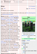
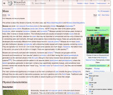
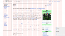
639px1119px1680px
639px.png (942×640 px, 348 KB)
1119px.png (942×1 px, 543 KB)
1680px.png (942×1 px, 608 KB)
bmartinezcalvo changed the task status from Stalled to In Progress.Aug 12 2022, 8:56 AM
bmartinezcalvo updated the task description. (Show Details)
  • in our last meeting we agreed that the ToC columns can not be fixed (otherwise it's not a grid) so i removed that option from the prototype. let me know if you understood the conversation differently

@alexhollender_WMF yes, if we implement the grids is to start using them in our different projects so we should start fitting layouts to grids instead of applying fixed widths so that our designs always adapt to the same grid and we can start creating responsive behaviors smoothly. So, in this case, we shouldn't use a fixed width for the ToC and in some moment we should start discussing about the info box width since it could be applied in the grid columns too.

  • can you clarify what you mean by this comment?

Apart from applying the breakpoints in the prototype and add these 2 configurable options for the ToC you should update the prototype with 2 options for the grids margins:

  • 40px margin (when the gutter is 40px)
  • 32px margin (when the gutter is 24px)

What I meant is that each grid gutter option have different margins applied:

  • The grid with 40px column gap has 40px margins on left and on right
  • The grid with 24px column gap has 32px margins on left and on right

Captura de Pantalla 2022-08-12 a las 11.10.42.png (974×2 px, 1009 KB)

Currently both 40px and 24px column gap prototype options have 40px margins on left and right, so you need to update the 24px column gap option with 32px margins on left and right (the 40px column gap prototype is ok).

Captura de Pantalla 2022-08-12 a las 11.15.01.png (1×2 px, 2 MB)

Status of this task. After a meeting with @alexhollender_WMF we decided to test the grid prototype with the following options:

@alexhollender_WMF will update the prototype and we will test it with the rest of the design team during our Design Review.

bmartinezcalvo updated the task description. (Show Details)

Solving this task since the prototype was already created and tested.