Background
Starting from the EPIC T90687: Define a baseline grid and support a responsive grid system this subtask wants to scale, consolidate and share the existing work that @alexhollender_WMF and @KieranMcCann have been leading around a responsive column Grid.
User story
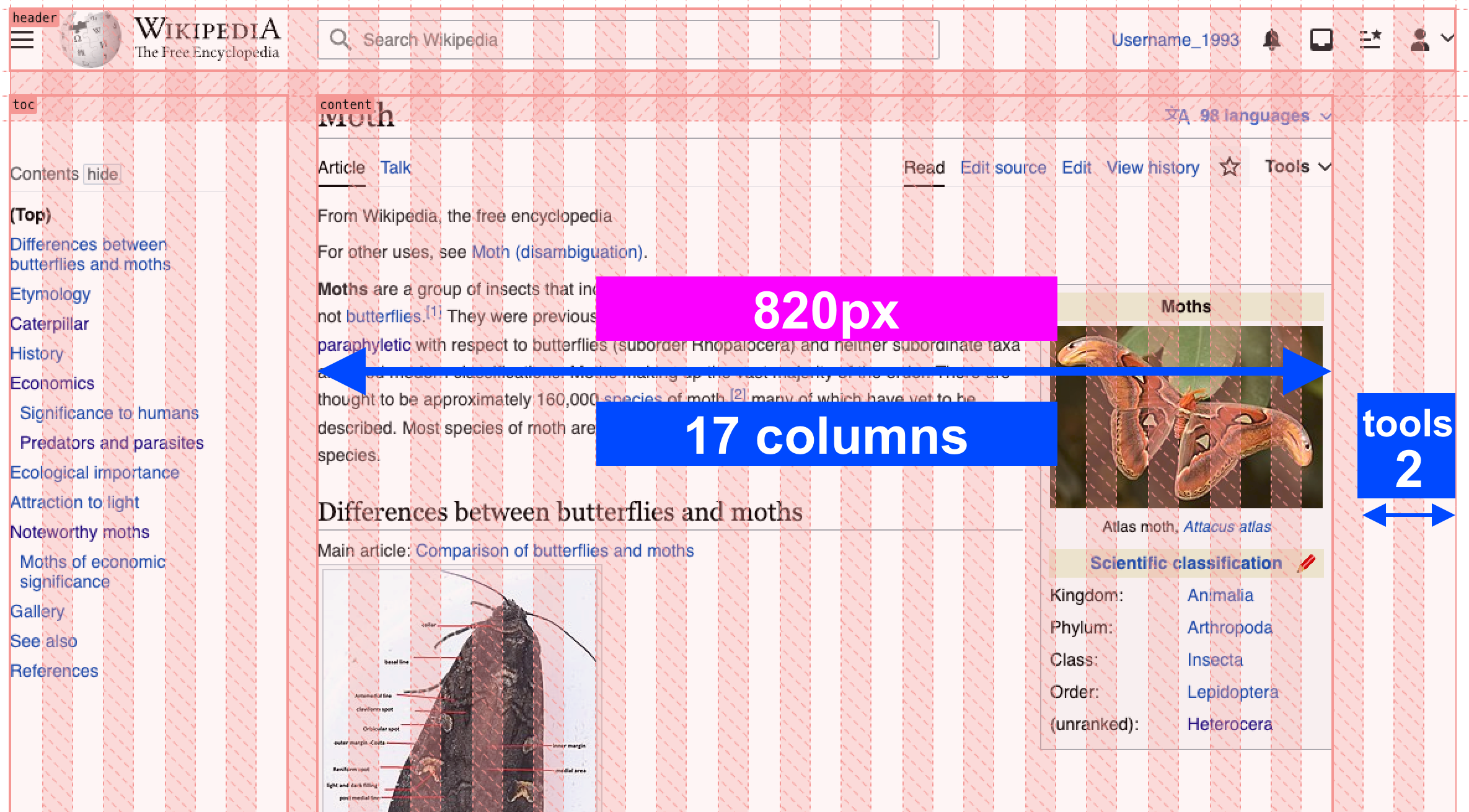
As a designer, I want to align components to a responsive column grid, so that I can define how elements move across different viewports. In order to achieve this I need to know how the grid changes across breakpoints T303522, which are those breakpoints, what are the outer margins of this grid, and which gutters are set between columns.
Impact
Grids are needed for any component with responsive behavior (Dialog, TypeheadSearch...)
Who needs this?
- Readers web needs Dialog
- Also related to the Page layout
What does it impact directly?
- Dialog: grids need to size properly
Design specs
Grid proposal
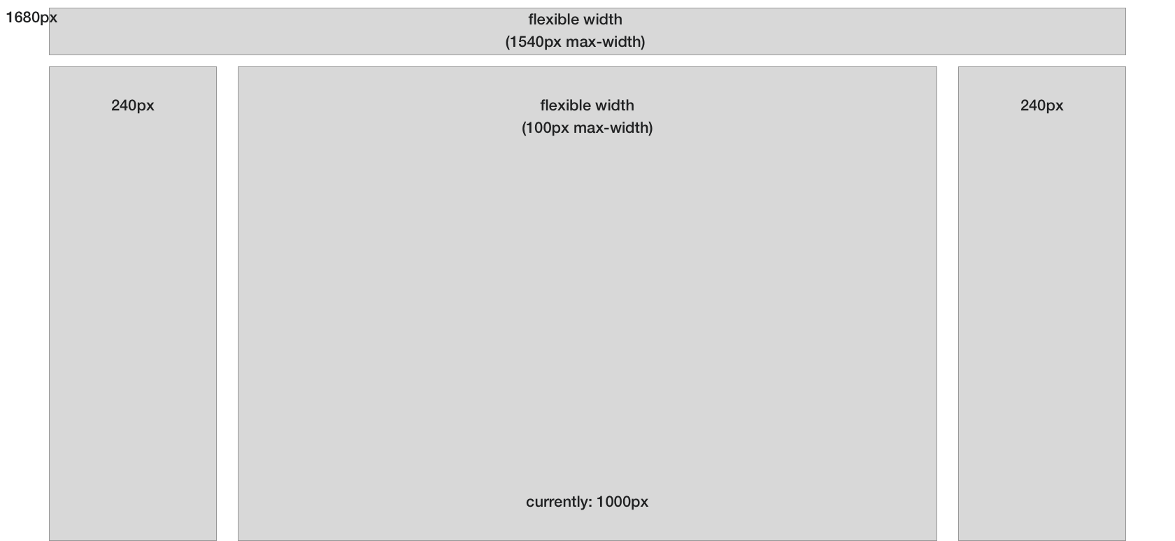
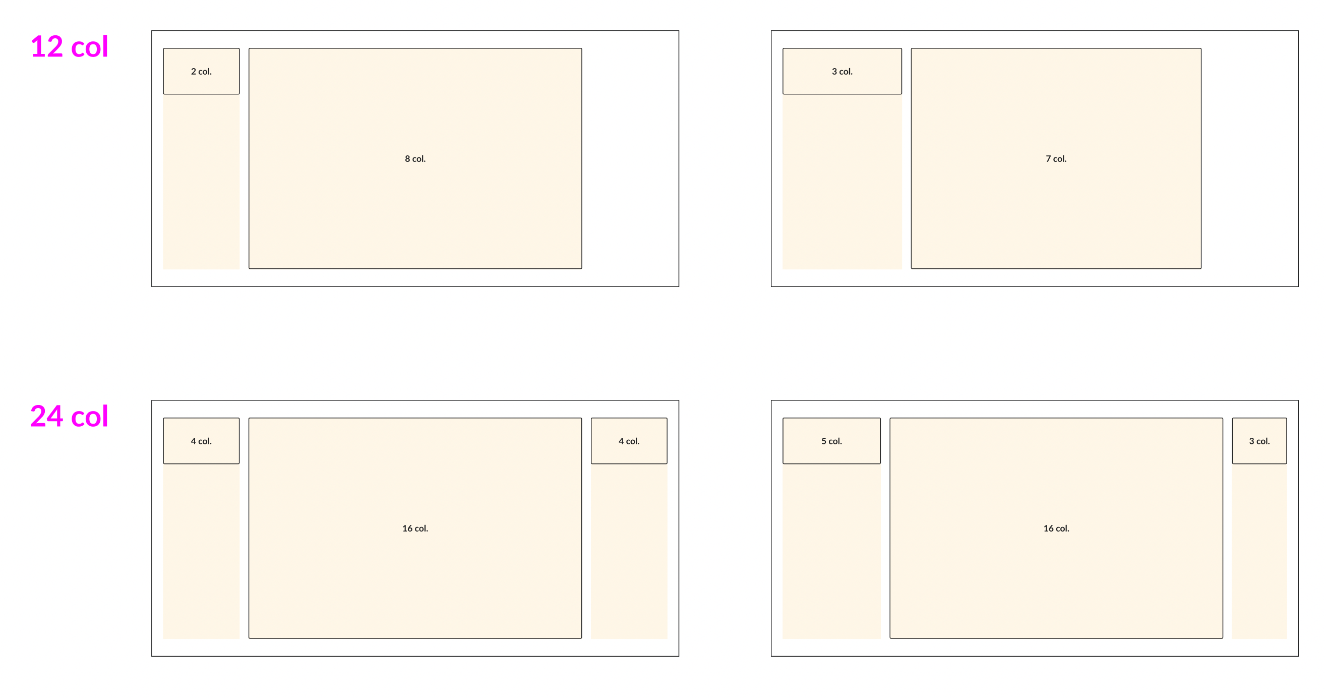
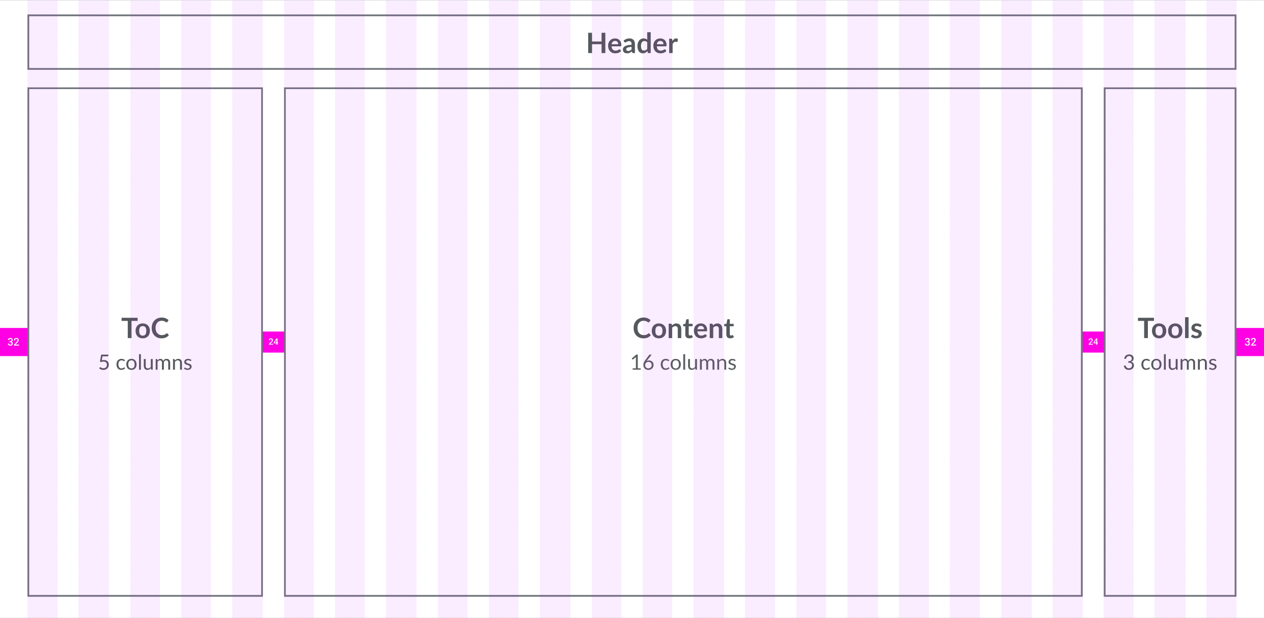
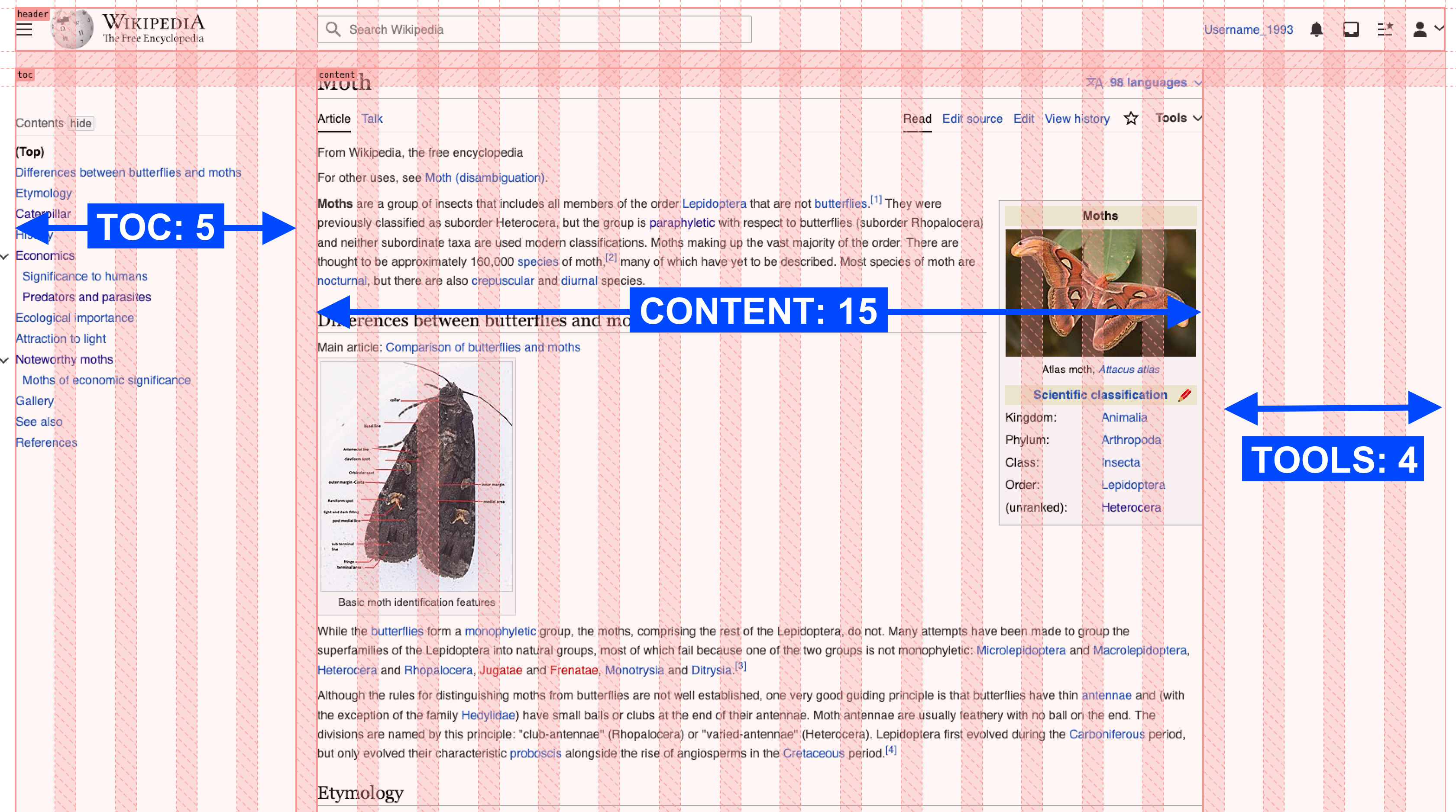
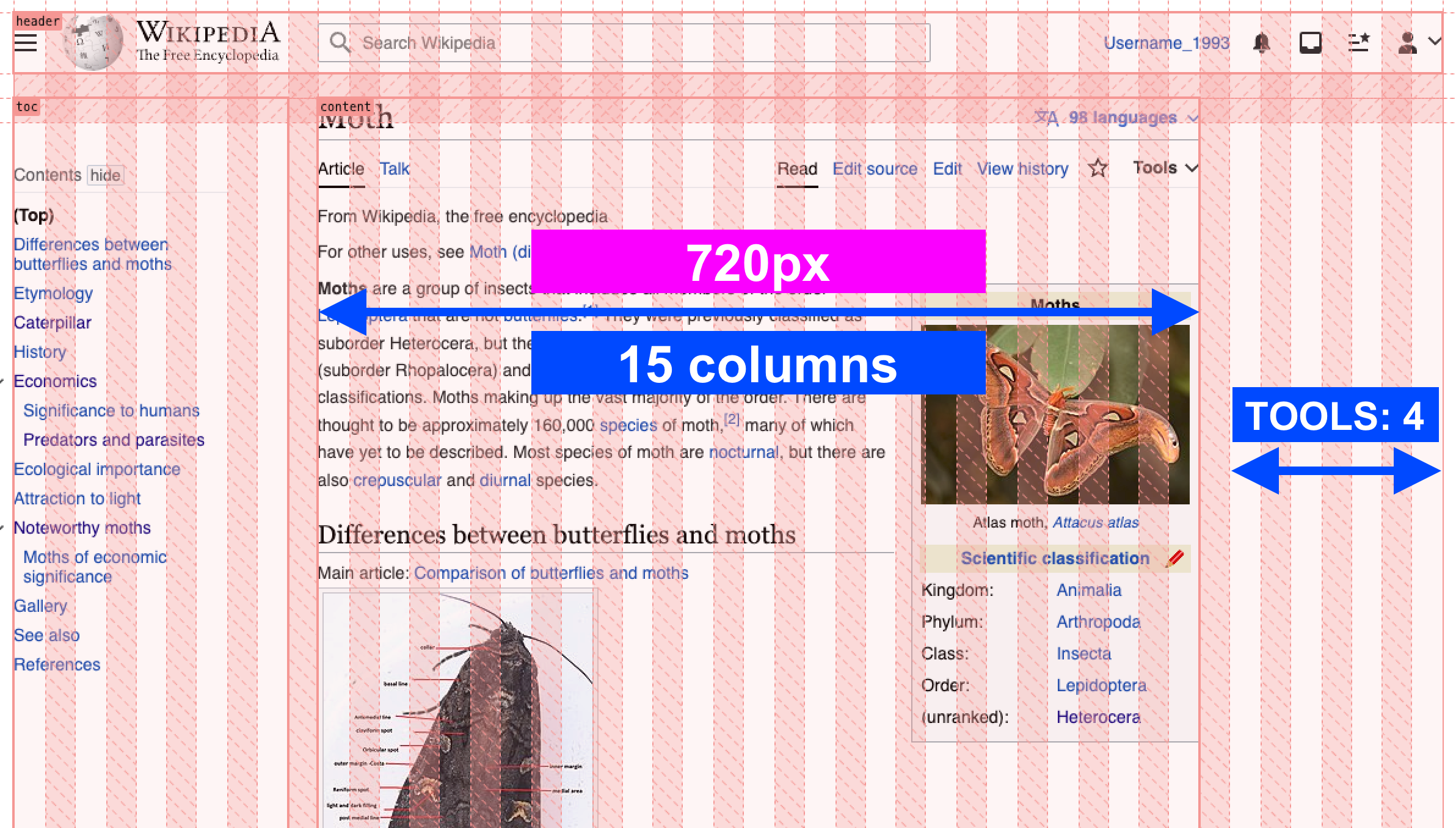
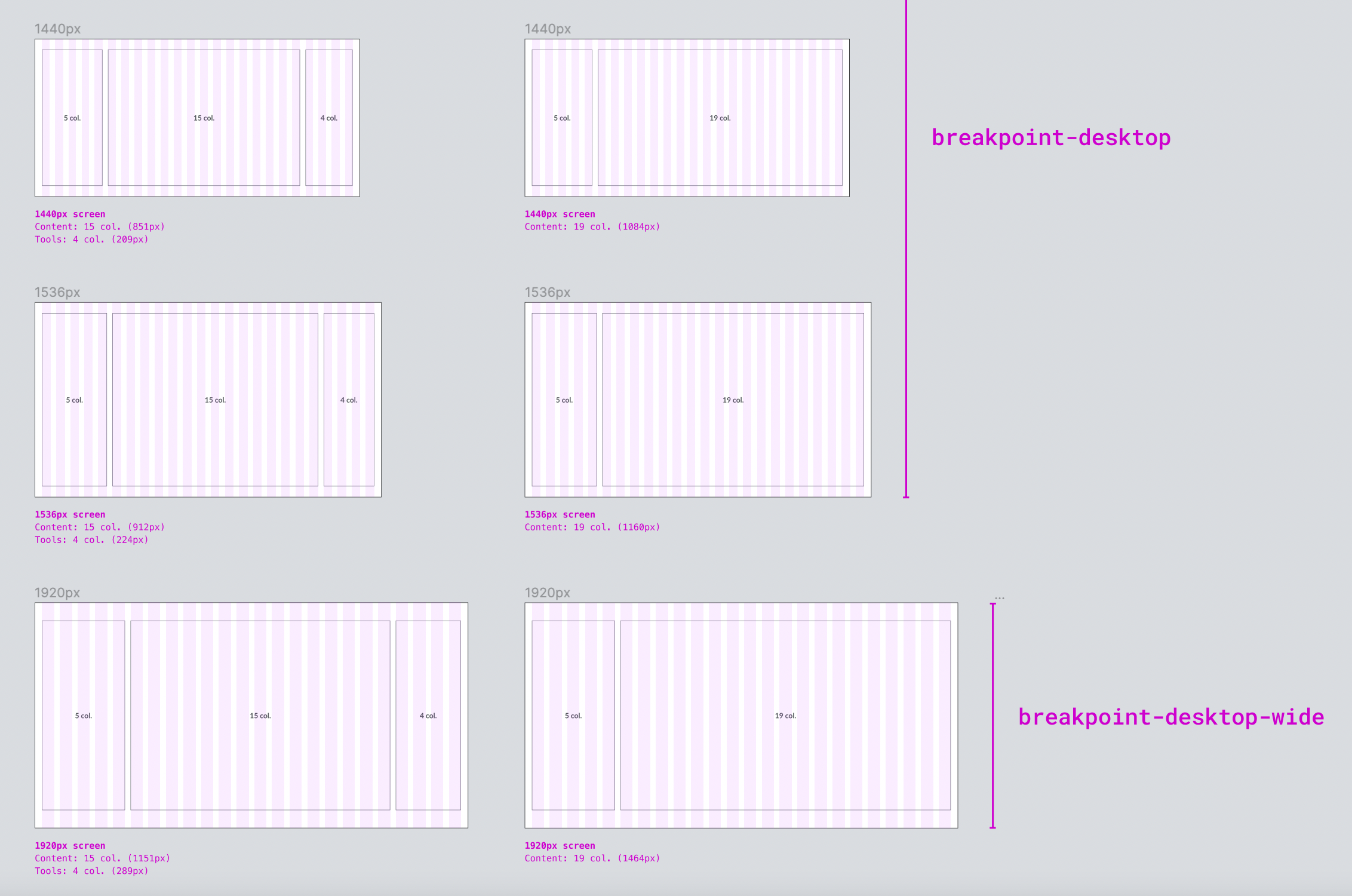
Desktop Wide
- 24 grid columns
- 24px gutter
- Margins scale according to the width of the screen
- Max content width 1514px
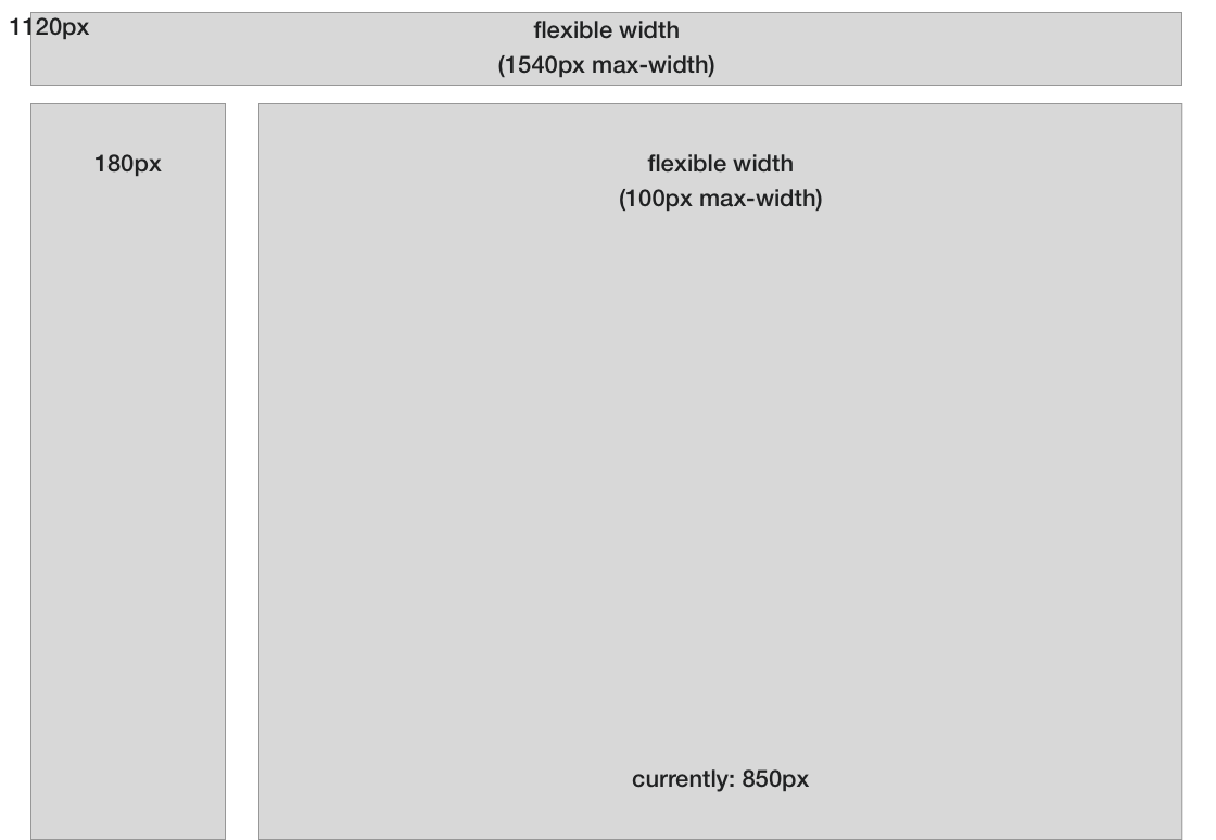
Desktop
- 24 grid columns
- 24px gutter
- 32px margins (to max content width and then they scale)
- Max content width 1514px
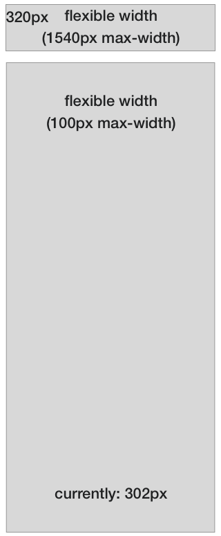
Tablet
- 8 grid columns
- 24px gutter
- 24px margins
Mobile
- 4 grid columns
- 16px gutter
- 16px margins
Acceptance criteria (or Done)
Design
- Create responsive Grid for all our breakpoints with the following specifications:
- Number of columns
- Max content width
- Margins
- Gutters
- Test new Grid in the 3 most common page layouts: panel, no panel, full
- Test grid in skins (New Vector, Vector Legacy and Minerva)
- The responsive column grid is available as a layout grid in our Figma library
- The Wikimedia Design Style Guide features a new page detailing the responsive column grid specs and recommendations.
Code
- Implement Grid in Codex T337282
Former implementations
CX Grid https://gerrit.wikimedia.org/r/plugins/gitiles/mediawiki/extensions/ContentTranslation/+/master/modules/ui/styles/grid/
DS Implementation inspirations elsewhere