Page MenuHomePhabricator

"Theme" (Accessibility for Reading) button in Vector 2022 should have consistent padding in button form
Closed, ResolvedPublic2 Estimated Story PointsFeature

Description

image.png (73×338 px, 2 KB)

Feature summary (what you would like to be able to do and where):
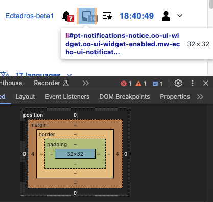
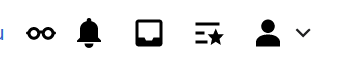
In the above picture, as you can see, the eyeglasses button has less padding surrounding it than the other buttons.

Use case(s) (list the steps that you performed to discover that problem, and describe the actual underlying problem which you want to solve. Do not describe only a solution):
For everyone who enables the Accessibility for Reading beta

Benefits (why should this be implemented?):
Consistent interface

QA Results - Beta

ACStatusDetails
1T353987#9759167

QA Results - PROD

ACStatusDetails
1T353987#9761682

Event Timeline

Aklapper renamed this task from New "Theme" (Accessibilty for Reading) button in V22 should have consistent padding in button form to New "Theme" (Accessibilty for Reading) button in Vector22 should have consistent padding in button form.Dec 23 2023, 7:56 PM
Aklapper renamed this task from New "Theme" (Accessibilty for Reading) button in Vector22 should have consistent padding in button form to New "Theme" (Accessibilty for Reading) button in Vector2022 should have consistent padding in button form.
aliu renamed this task from New "Theme" (Accessibilty for Reading) button in Vector2022 should have consistent padding in button form to New "Theme" (Accessibilty for Reading) button in Vector 2022 should have consistent padding in button form.Dec 23 2023, 7:57 PM
ovasileva triaged this task as Medium priority.Jan 4 2024, 3:33 PM
Jdlrobson renamed this task from New "Theme" (Accessibilty for Reading) button in Vector 2022 should have consistent padding in button form to [Design] New "Theme" (Accessibilty for Reading) button in Vector 2022 should have consistent padding in button form.Jan 29 2024, 4:15 PM
Jdlrobson assigned this task to JScherer-WMF.

This could be because the icon has a different shape than the square-ish icons beside it, in which case the padding would be fine.

@Jdrewniak or @Jdlrobson can you confirm that the padding is off? If not, I'll work with @DTorsani-WMF on solutions. He is already thinking through a more square version of the icon.

The bell icon is quite far from a square. I'm not sure what you mean.

image.png (393×665 px, 45 KB)

See the screenshot above. The Appearance button is structured very different from the others and doesn't have the vector-menu etc. css classes

The bell icon is quite far from a square. I'm not sure what you mean.

I double checked this, thanks! There is a 6 pixel discrepancy in the computed distance between icons.

Frame 1.png (40×169 px, 2 KB)

They should all be 16. I'll move this to ready for dev and unassign myself.

Copying my screenshot from T355420:

Buttons in vector-user-links are usually spaced by 8px, but the new appearance dropdown isn't:

image.png (46×238 px, 1 KB)

Jdlrobson renamed this task from [Design] New "Theme" (Accessibilty for Reading) button in Vector 2022 should have consistent padding in button form to "Theme" (Accessibility for Reading) button in Vector 2022 should have consistent padding in button form.Feb 8 2024, 6:01 PM
ovasileva raised the priority of this task from Medium to High.Mar 21 2024, 5:25 PM
ovasileva lowered the priority of this task from High to Medium.Mar 26 2024, 8:18 AM

Change #1021503 had a related patch set uploaded (by Jdrewniak; author: Jdrewniak):

[mediawiki/skins/Vector@master] Make spacing in UserLinks menus more consistent

https://gerrit.wikimedia.org/r/1021503

@JScherer-WMF although the patch above seeks to make the spacing around the icons more consistent, this doesn't mean there is 16px from glyph to glyph because sometimes the alert and notification icons can have a count beside them that sticks out beyond the original image. Instead, the patch targets spacing around the icon containers as shown below.

Screenshot 2024-04-18 at 11.11.38 AM.png (642×1 px, 76 KB)
Screenshot 2024-04-18 at 11.10.13 AM.png (676×1 px, 73 KB)
current spacing (top) vs new spacing (bottom)without icon container outlines

new spacing at different resolutions (logged-out):

Screenshot 2024-04-18 at 10.42.46 AM.png (2×1 px, 669 KB)
Screenshot 2024-04-18 at 10.42.38 AM.png (2×2 px, 708 KB)
Screenshot 2024-04-18 at 10.42.27 AM.png (2×3 px, 767 KB)

new spacing at different resolutions (logged-in):

Screenshot 2024-04-18 at 10.41.00 AM.png (2×1 px, 728 KB)
Screenshot 2024-04-18 at 10.40.47 AM.png (2×3 px, 1 MB)
Screenshot 2024-04-18 at 10.40.53 AM.png (2×2 px, 947 KB)

Implementation notes:
The implementation here was challenging because the menus don't conform to a standardized HTML structure. Some elements have classes that are also used in drop-downs. To handle this, 4px margins (both right and left, so 8px total) were added on all .vector-dropdown-label and .mw-list-item in this section, then reset to zero for items inside drop-downs.

Screenshot 2024-04-18 at 10.35.39 AM.png (1×888 px, 121 KB)

  1. In my opinion, making the container spacing consistent is enough and really good!
  2. Should we be standardizing the structures a bit?

Change #1021503 merged by jenkins-bot:

[mediawiki/skins/Vector@master] [VISUAL CHANGE] Make spacing in UserLinks menus more consistent

https://gerrit.wikimedia.org/r/1021503

Edtadros subscribed.

Test Result - Beta

Status: ✅ PASS
Environment: beta
OS: macOS Sonoma
Browser: Chrome
Device: MBA
Emulated Device:NA

Test Artifact(s):

Test Steps

✅ AC1: The left and right padding around the icons in the top right menu should be 4px on each side (see T353987#9727003)

screenshot 274.png (394×417 px, 36 KB)

screenshot 278.png (382×444 px, 32 KB)

screenshot 275.png (379×467 px, 36 KB)

screenshot 276.png (385×412 px, 35 KB)

screenshot 277.png (376×467 px, 33 KB)

screenshot 273.png (367×493 px, 34 KB)

screenshot 279.png (380×485 px, 35 KB)

Test Result - PROD

Status: ✅ PASS
Environment: PROD
OS: macOS Sonoma 14.4.1
Browser: Chrome 124
Device: MBA
Emulated Device:NA

Test Artifact(s):

Test Steps

✅ AC1: The left and right padding around the icons in the top right menu should be 4px on each side (see T353987#9727003)
Logged In

2024-05-01_10-43-28.png (675×1 px, 239 KB)

2024-05-01_10-47-40.png (697×451 px, 50 KB)

2024-05-01_10-44-24.png (625×436 px, 51 KB)

2024-05-01_10-41-30.png (623×451 px, 49 KB)

2024-05-01_10-41-55.png (626×461 px, 57 KB)

Logged Out

2024-05-01_10-45-17.png (627×447 px, 46 KB)

2024-05-01_10-45-42.png (624×439 px, 44 KB)

2024-05-01_10-45-58.png (627×444 px, 51 KB)