Page MenuHomePhabricator

Create a generalised multi-select widget (aka CapsuleMultiselectWidget)
Closed, ResolvedPublic

Assigned To
Authored By
Anomie
Feb 28 2015, 12:54 AM
Referenced Files
F2556358: Screen Shot 2015-09-08 at 2.12.37 PM.png
Sep 8 2015, 8:44 AM
F2556361: Screen Shot 2015-09-08 at 2.06.27 PM.png
Sep 8 2015, 8:44 AM
F2556363: Screen Shot 2015-09-08 at 2.06.42 PM.png
Sep 8 2015, 8:44 AM
F1391699: Image 2015-08-12 at 11.54.19 AM.png
Aug 12 2015, 7:30 PM
F1341553: Screenshot 2015-08-11 21.44.00.png
Aug 12 2015, 7:30 PM
F1326576: Screenshot 2015-08-11 17.08.42.png
Aug 12 2015, 2:40 AM
F1326798: Screenshot 2015-08-11 17.07.34.png
Aug 12 2015, 2:40 AM
F1223731: pasted_file
Aug 11 2015, 12:09 AM

Description

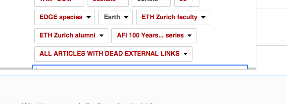
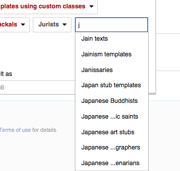
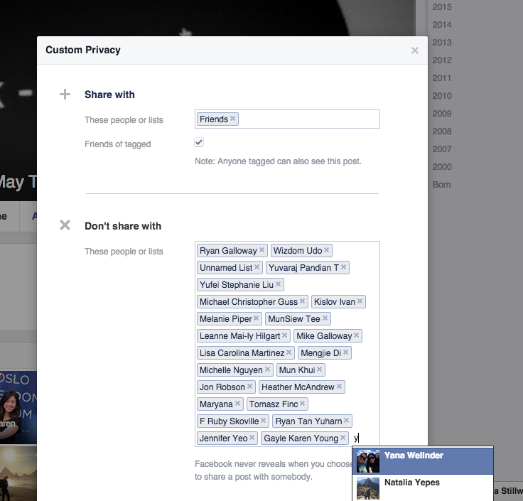
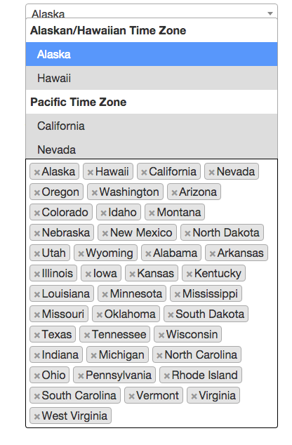
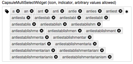
We have ButtonSelectWidget, RadioSelectWidget, and DropdownWidget for selecting one item from a list of options. But the only option for multi-select is a big list of individual CheckboxInputWidgets, ToggleButtonWidgets, or ToggleSwitchWidgets.

I could really use something along the lines of DropdownWidget that allows for multiple options to be selected.

While this is somewhat similar to T88250, the widget requested there lacks the critical feature of browsing the list of available options.

Event Timeline

Anomie raised the priority of this task from to Needs Triage.
Anomie updated the task description. (Show Details)
Anomie added a project: OOUI.
Anomie subscribed.

T88250: Create tag list / tokenizer / capsule controls widget is also somewhat related, but it's unclear whether it would present the whole list of items to choose from, or work more like search suggestions.

Anomie set Security to None.

... That's the one I meant to link. Oops.

Jdforrester-WMF renamed this task from Multi-select widget to Create a generalised multi-select widget.Mar 3 2015, 5:54 PM
Jdforrester-WMF triaged this task as Medium priority.

Change 224966 had a related patch set uploaded (by Anomie):
Add a capsule select widget

https://gerrit.wikimedia.org/r/224966

@Anomie, is there an interface that I can take a look at where this is needed?

I'm visualizing in my head a dropdown widget that includes either a list of the same kind of (CheckboxInputWidgets, ToggleButtonWidgets, or ToggleSwitchWidgets) or a mix of (CheckboxInputWidgets, ToggleButtonWidgets, or ToggleSwitchWidgets).

Even a rough paper pencil sketch would help and a use case or two.

@Anomie, is there an interface that I can take a look at where this is needed?

See

pasted_file (102×279 px, 9 KB)
from T88250: Create tag list / tokenizer / capsule controls widget

Change 224966 merged by jenkins-bot:
CapsuleMultiSelectWidget: Introduce

https://gerrit.wikimedia.org/r/224966

See

pasted_file (102×279 px, 9 KB)
from T88250: Create tag list / tokenizer / capsule controls widget

Thanks teeki. I have seen the list you attached and image, but @Anomie said it's only similar and "lacks the critical feature of browsing the list of available options" (mentioned in the desc of this task).

I'm looking to find out the use cases to this request (hoping to see the interface where this is wanted or an idea of what @Anomie needs this for).

The primary use case we (Editing team) had in mind was a category selector, like the ones in VisualEditor, HotCat or UploadWizard (each currently has a different implementation, UploadWizard's one is particularly ugly-looking).

To see the VE one, visit a random page (like http://en.wikipedia.beta.wmflabs.org/wiki/0.24595949980612886), click "Edit", then hamburger → "Categories", and start typing in the text field.

pasted_file (418×462 px, 28 KB)

To see the current "placeholder" design, visit https://doc.wikimedia.org/oojs-ui/master/demos/ and scroll down to CapsuleMultiSelectWidget.

Anomie needed something to use in ApiSandbox, if I recall. As for "lacks the critical feature of browsing the list of available options", I think the difference is that our capsule implementation is able to display the whole large dropdown list of available items (with scrollbars if needed), while Phabricator's (the one in the screenshot) has a hard limit of 5 items in the dropdown.

What you showed me on VE is actually pretty well implemented. After playing around with it, I found some areas where we can improve on. I'm keeping in mind how this would interact on mobile as well.

  1. The moving input box can be frustrating. We should have a consistent spot where users can add more tags.

Screenshot 2015-08-11 17.08.42.png (211×580 px, 25 KB)

  1. Truncated text within dropdown is not ideal, users should be able to see in full (as much as possible) what tag selections they will be adding.

Screenshot 2015-08-11 17.07.34.png (349×368 px, 34 KB)

I created a mock up to solve a couple of these issues. Let me know what you think.

  1. The moving input box can be frustrating. We should have a consistent spot where users can add more tags.

I don't think the moving input is a problem in this case — we return focus at the place of editing, and the dropdown shows up at the same place every time. Also, people are used to this kind of an input, its similar to what they see in Gmail and Facebook.

The dropdown went off-screen, this is sub-optimal.

Screenshot 2015-08-11 21.44.00.png (705×736 px, 146 KB)

Moving input is only a part of the concern, there is also text truncation issue and the input going off-screen. Even if the input is still in focus, users can't see what they're typing or see the results in the dropdown unless if they scroll down. This feels like an unnecessary extra step or interruption in favor of displaying all chosen tags vs. ability to see what you type as you enter more tags.

I think the decision to pursue displaying all chosen tags or ability to see what you type as you enter more tags is something we should ask users about. Or we can start by showing some of the entered tags with the option to expand the box to show all and preserving a visible spot for dropdown menu and input field. Note that I am keeping in mind of the experience on mobile too.

I think this is also a pretty good solution (aside from some design issues with dropdown menu, which we won't discuss now). It has full-width dropdown menu, giving the largest area possible avoiding text truncation as much as possible. The dropdown menu moves up when there is no more space at the bottom. You can also see what has been selected (this can look clearer though) within the dropdown. I believe this developer saw the same problems and tried to solve it with this execution (pictured below)

Image 2015-08-12 at 11.54.19 AM.png (634×416 px, 89 KB)

@violetto, thanks for researching this. Though the OO.ui.CapsuleMultiSelectWidget still needs design work, it comes close to what you described should be done.

EmptyFilledFilled with autocomplete
Screen Shot 2015-09-08 at 2.12.37 PM.png (62×443 px, 9 KB)
Screen Shot 2015-09-08 at 2.06.27 PM.png (215×445 px, 28 KB)
Screen Shot 2015-09-08 at 2.06.42 PM.png (409×451 px, 38 KB)

You can interact with this widget on the OOjs UI Demo page, search for CapsuleMultiSelectWidget (icon, indicator, arbitrary values allowed).

Prtksxna renamed this task from Create a generalised multi-select widget to Create a generalised multi-select widget (aka CapsuleMultiselectWidget).Jul 8 2016, 1:04 PM
Prtksxna closed this task as Resolved.
Prtksxna assigned this task to Anomie.