Problem
There are many areas of text in dark mode that do not meet the minimum color contrast requirements. The following updated Dark theme colors address the contrast issues from previous tickets filed.
Contrast issues
1. Article text
Text should probably be changed to whiter Base90 color on the dark background to help readability (or at least make the grey lighter). We've received a number of requests for this on the email queue.
Requested in:
https://ticket.wikimedia.org/otrs/index.pl?Action=AgentTicketZoom;TicketID=8969931#
+ New ticket where background color on Amazon device is also
showing as blue-gray: https://ticket.wikimedia.org/otrs/index.pl?Action=AgentTicketZoom;TicketID=10059782
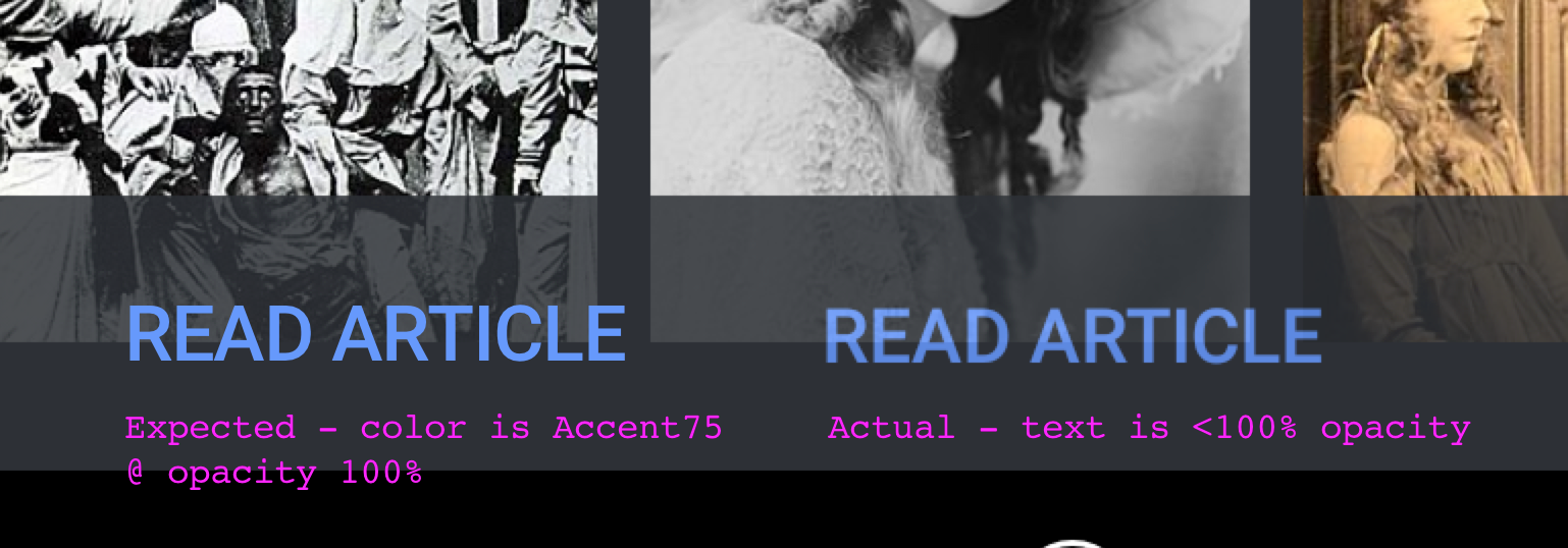
2. Link text - per T163461
Color of link text should be changed from the existing #36c to be higher contrast when in dark mode screens to the Accent75 dark mode link color.
3. Button/Action text – per T166453
Color of actions text and icons should be in a higher contrast than the existing #36c blue. Change to Accent75 dark mode link color.
4. Heading text - T150787
Color of actions text and icons should be in a higher contrast than the existing #36c blue. Change to Accent75 dark mode link color.
5. Bottom navigation toolbar - T146385
Color of bottom toolbar nav items should utilize #FFF instead of #36c.
6. Login and Join Wikipedia banner background - T169117
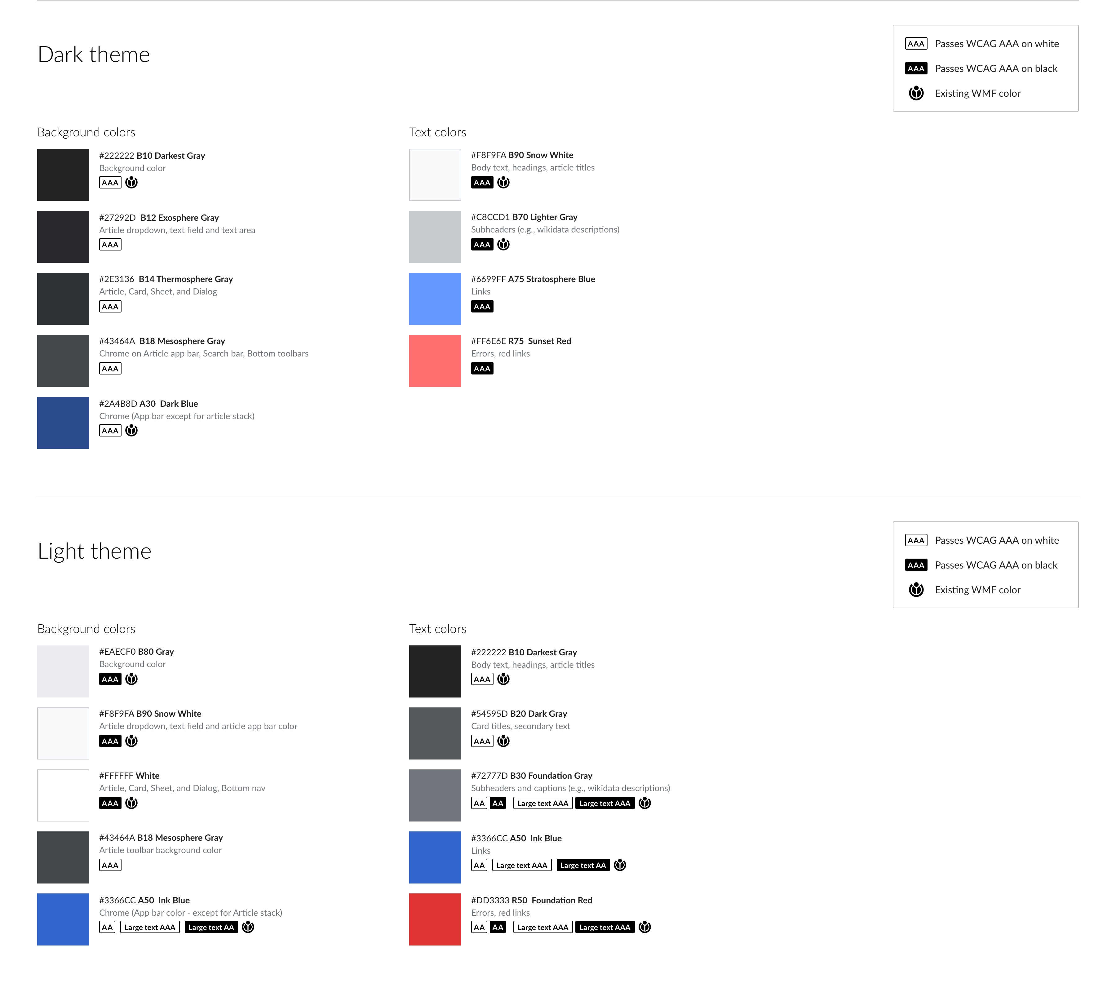
Dark theme color palette
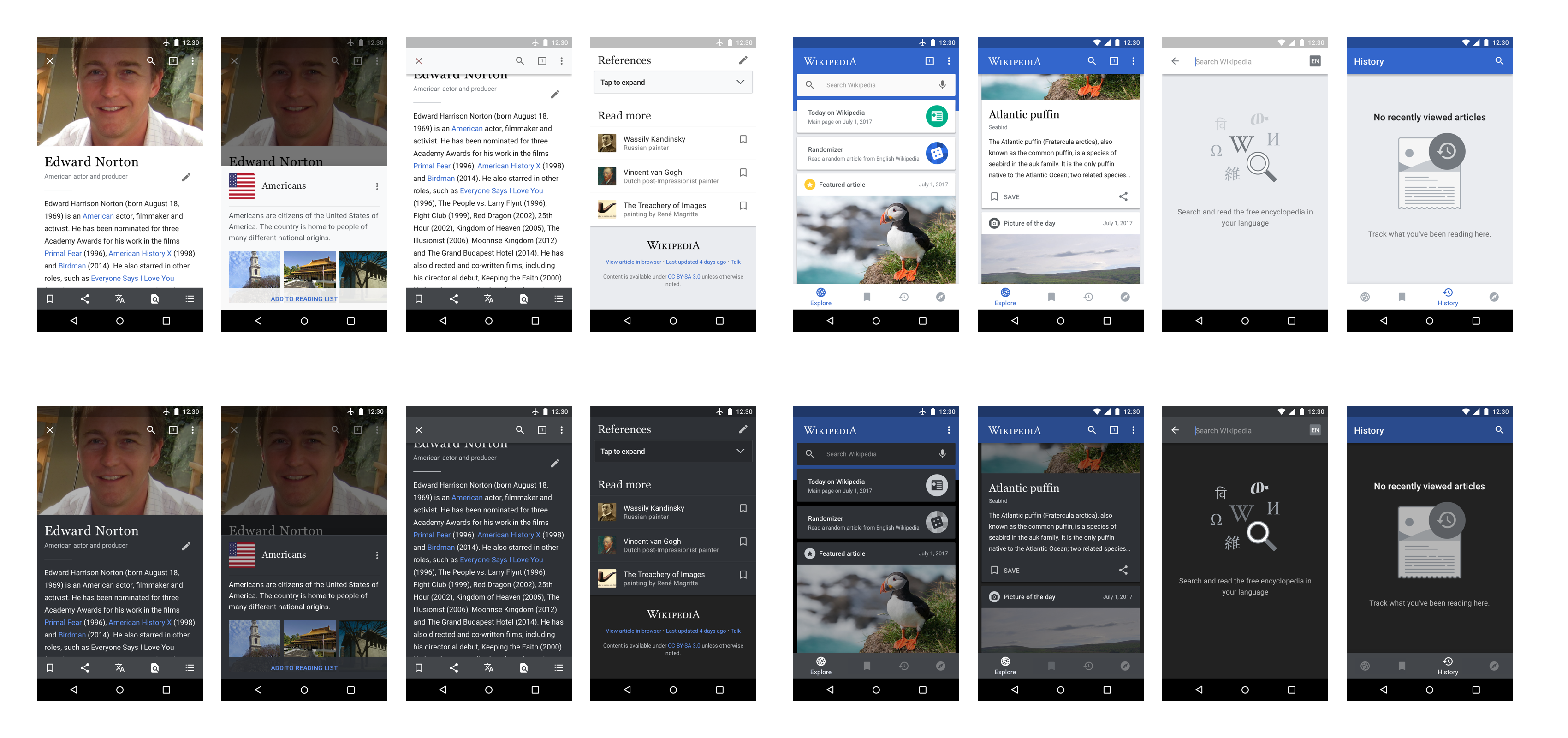
Theme assets
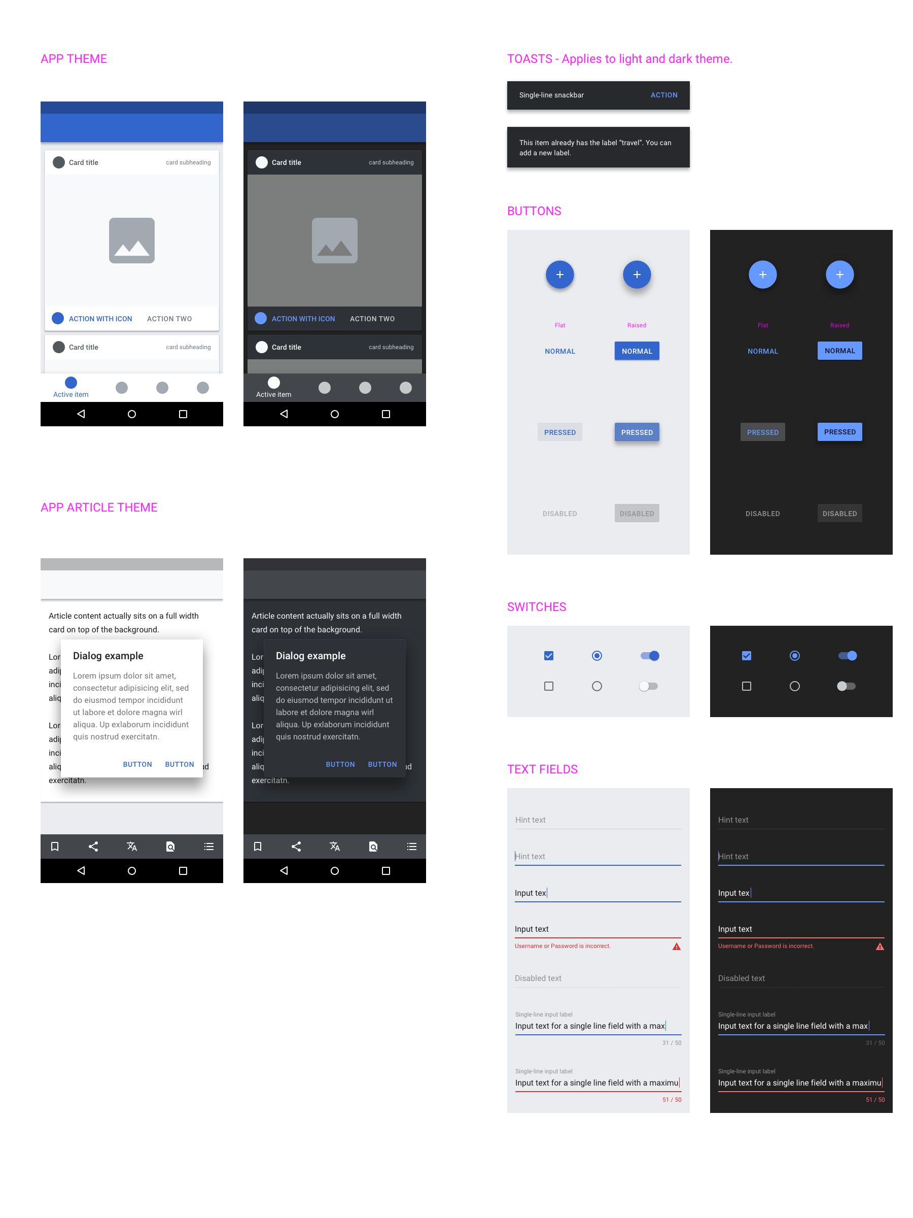
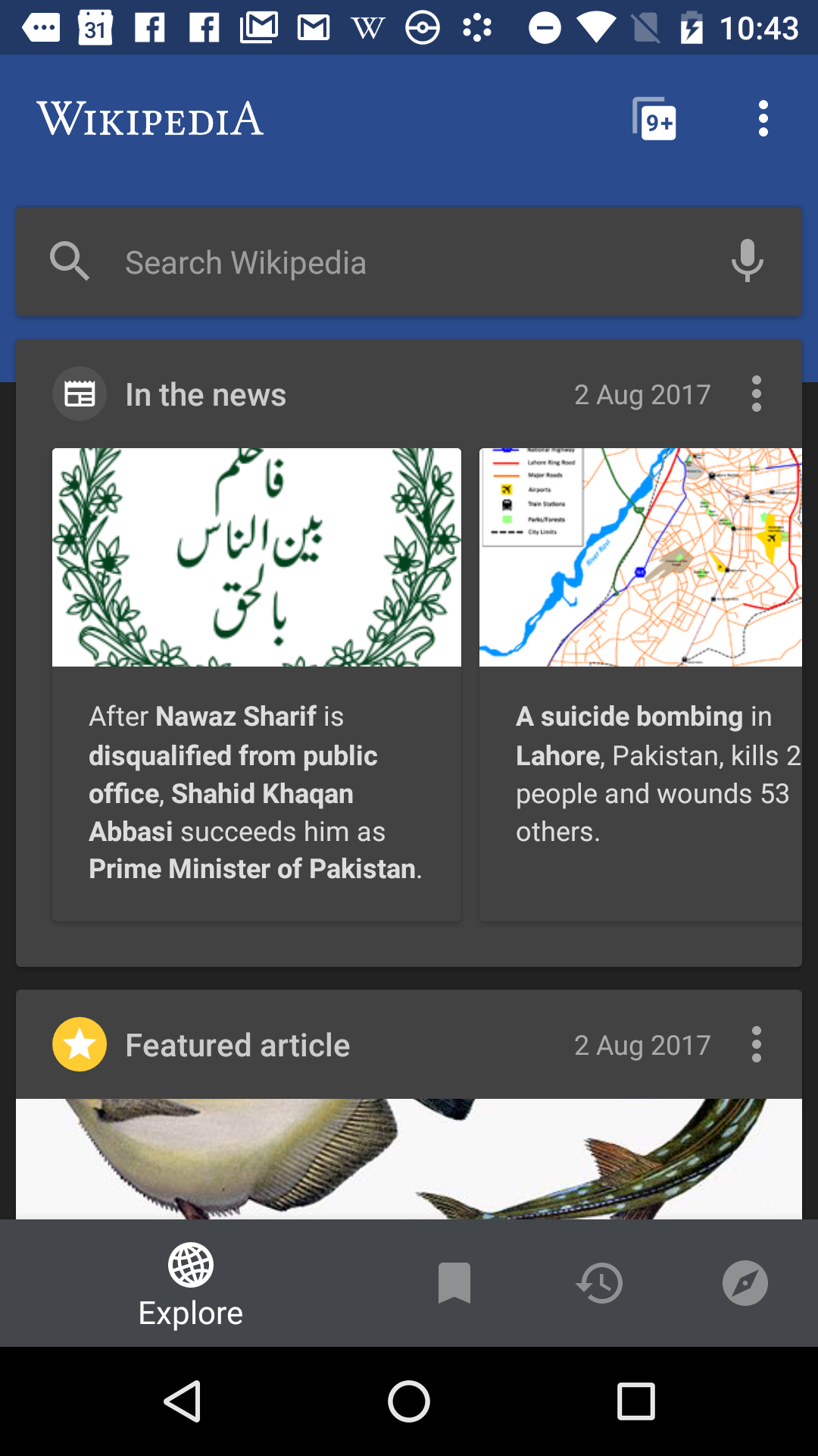
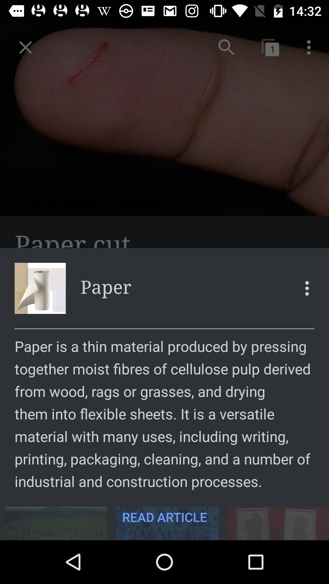
Example: screens