Spec
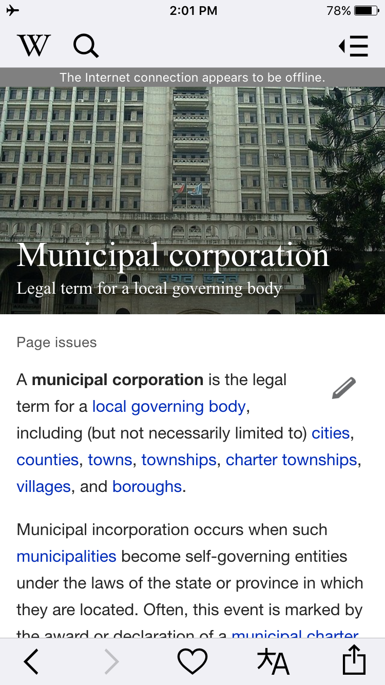
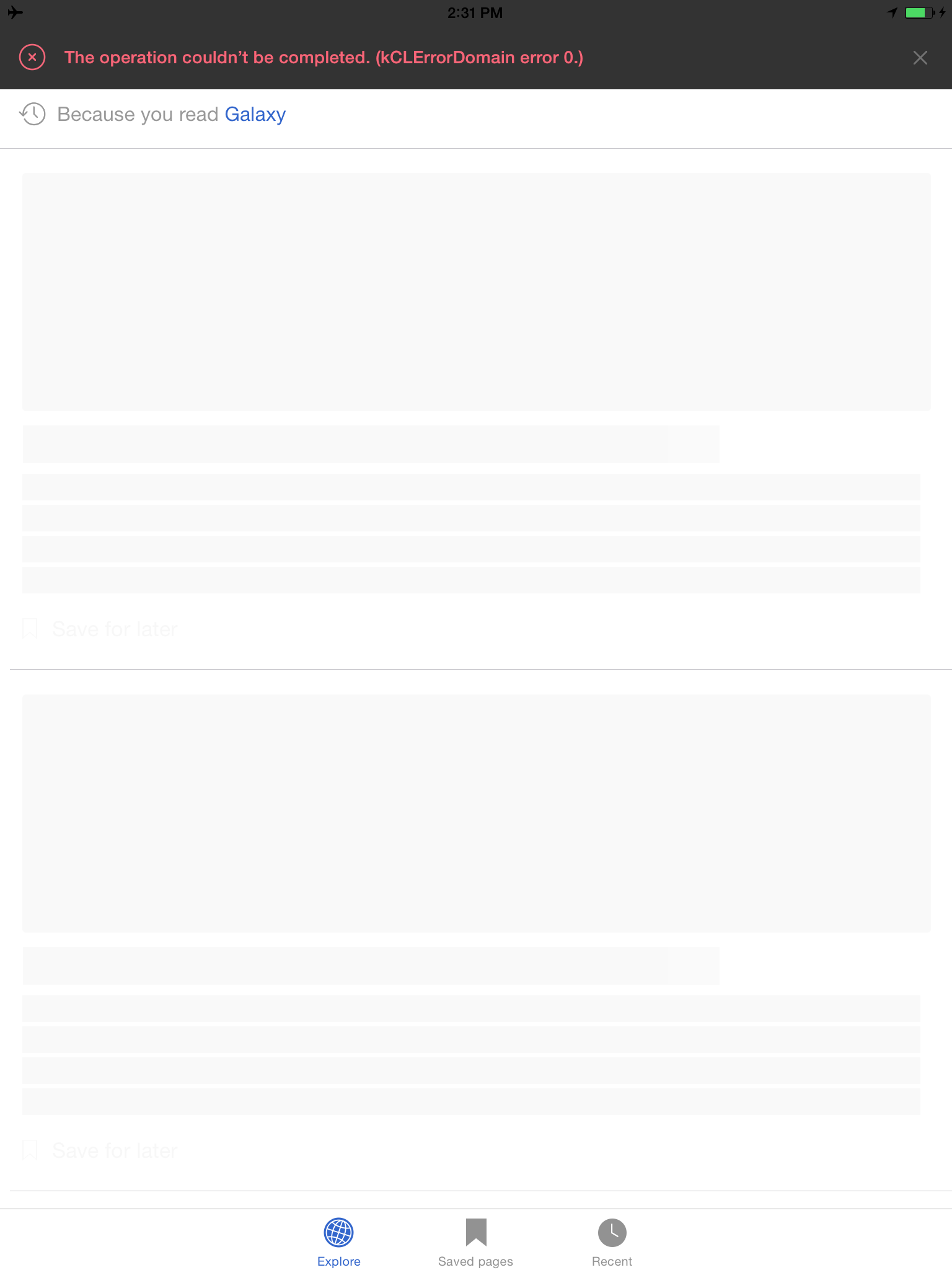
Global Error Banner View
Given I just did something that triggered a global error banner
When it is displayed
Then it should slide down from the top of the screen
And it should contain localized text describing details of the error (e.g. Internet connection appears to be offline).
And it should be presented on top of everything in the app
And it should have styling appropriate for its severity
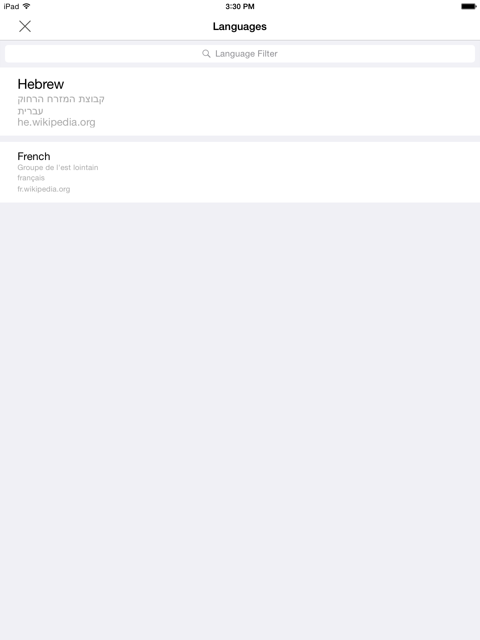
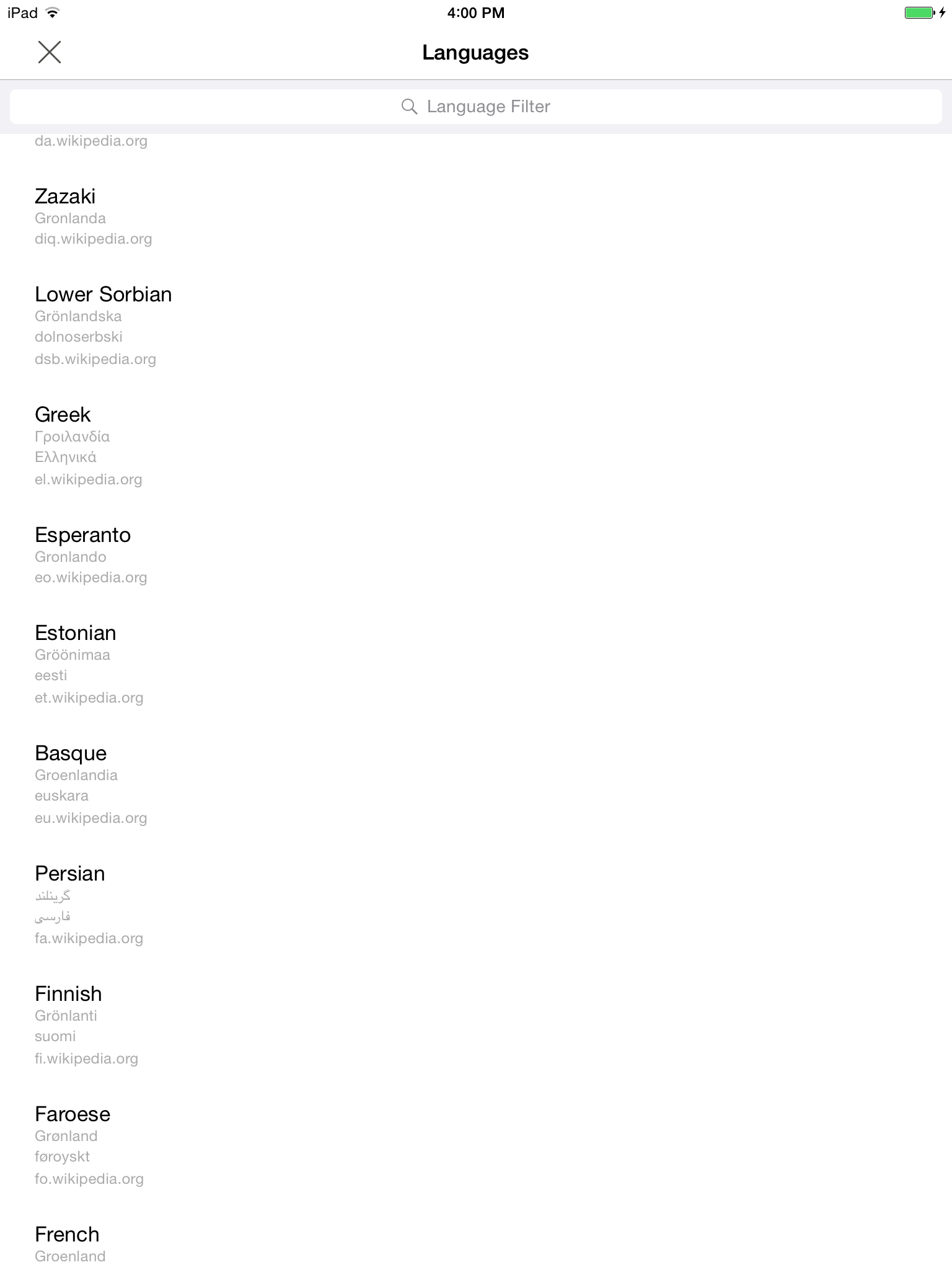
Language Picker View
Given an article has languages
When I go to view the languages for that article
Then I should see a "loading" banner
And I see a loading banner
When the languages are downloaded successfully
Then I should see them in the picker
And I see a loading banner
When the languages fail to download
Then I should see an error banner
Editing View
TODO: spec out banner behaviors on editing view. e.g. preview fetching "progress", etc.
Account Creation View
All account creation states are communicated using banners for the time being.
Scenario: Account Creation Data Entry
Background: Given I am on the account creation view
When I attempt to create an account
Then I should see a notification that tells me the account is being created
And I should not be able to dismiss the banner manually
And the "create account" button should be disabled
Scenario: Account Creation Response Handling
Background:
Given I am on the account creation view
And I am currently waiting for an account creation response
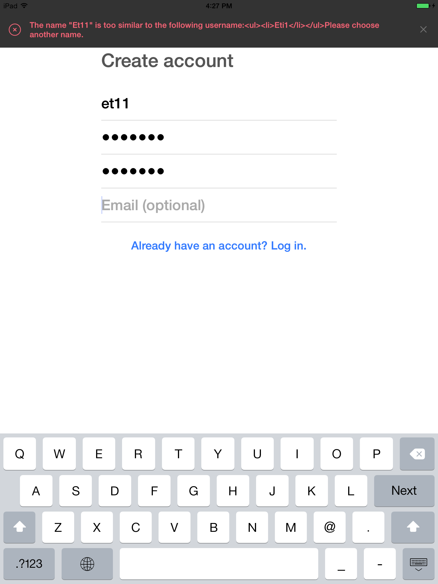
When account creation fails
Then I should see an error banner
And the "create account" button should be enabled
When the server sends a "captcha required" response
Then I should see a notification describing that I need to fill out the captcha
And I should see the captcha form view
And I should not be able to interact with the account creation text fields or buttons
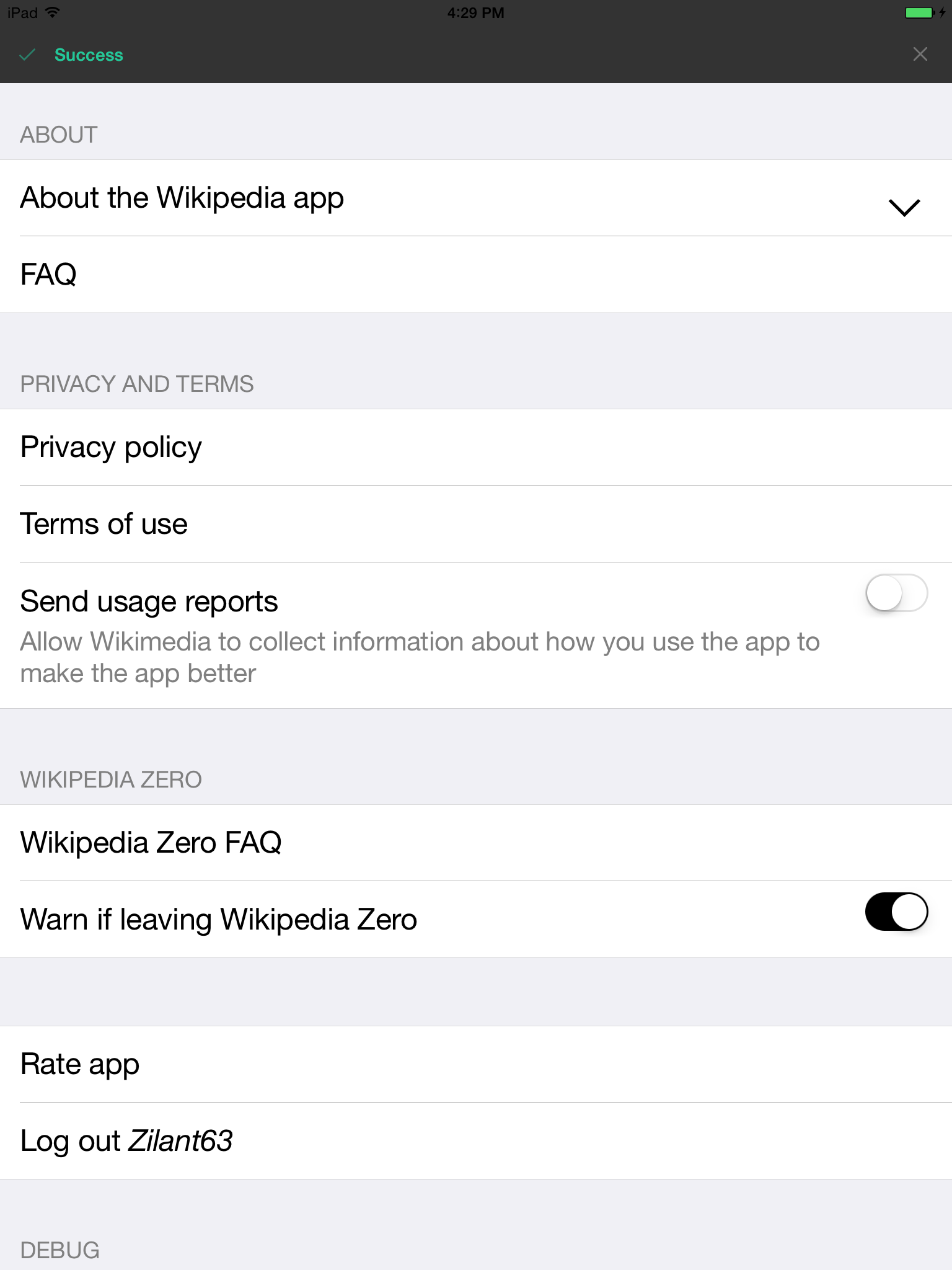
When account creation succeeds
Then I should see a notification that tells me I am logging in
And I should not be able to dismiss the banner manually
Scenario: Post-Account-Creation Login Response Handling
Background:
Given I am on the account creation view
And I am currently waiting to login
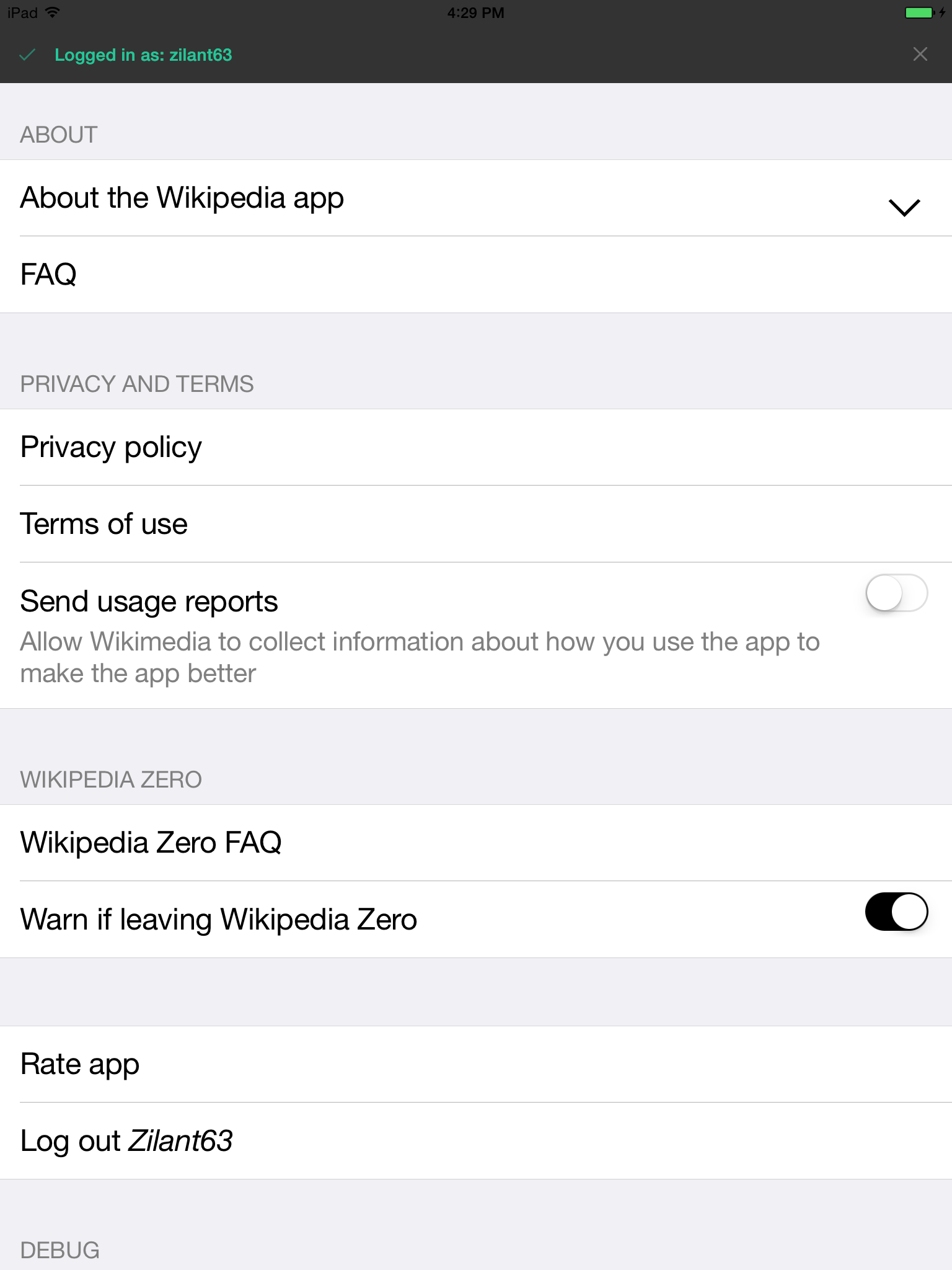
When I login successfully
Then I should see a notification that says I have logged in
And the account creation view should be dismissed
When I fail to login
Then I should see an error banner
And the "create account" button should be enabled
Scenario: Account Creation Captcha
Background:
Given I am on the account creation view
And I see the captcha view
When I tap the "refresh captcha" button
Then I should see a notification telling me the captcha is being refreshed
And I am waiting for a new captcha
When it arrives successfully
Then I should see the new captcha
And the captcha text field should be reset
And I am waiting for a new captcha
When it fails to be refreshed
Then I should see an error banner
Currently we use top and bottom gray bars for notifications. Lets design something better and make it consistent throughout the app.
Make UI for alerting users modern and consistent across the app.
- Do not block the UI
- Use legible type
- Use colors to denote purpose/importance (red bad / yellow meh / green good)
Suggested Pods:
https://github.com/Loadex/MessageBanner
https://github.com/KrauseFx/TSMessages
https://github.com/atljeremy/JFMinimalNotifications
What we have now -