Page MenuHomePhabricator

Echo has color contrast issues in standard theme and night theme
Closed, ResolvedPublicBUG REPORT

Assigned To
Authored By
Jdlrobson
Tue, May 14, 1:21 AM
Referenced Files
F54742274: Screenshot 2024-05-30 at 13.58 1.png
Thu, May 30, 7:17 PM
F54742982: Screenshot 2024-05-30 at 16.13 1.png
Thu, May 30, 7:17 PM
F54742227: Read proposal (1).png
Thu, May 30, 7:17 PM
F54741905: Screenshot 2024-05-30 at 13.55 1.png
Thu, May 30, 7:17 PM
F54742104: Screenshot 2024-05-30 at 15.59 2.png
Thu, May 30, 7:17 PM
F54740269: Unread proposal.png
Thu, May 30, 7:17 PM
F53049476: screenshot 337.png
Wed, May 15, 2:08 AM
F53049473: screenshot 335.png
Wed, May 15, 2:08 AM

Description

From T363779#9792848

Steps to replicate the issue (include links if applicable):

  • Log in and open Echo
  • Check the Echo overlay for color contrast issues

What happens?:
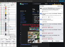
Lots of color contrast issues
{F53052951}
(the screenshots below are added from T363779#9792848

screenshot 336.png (1×1 px, 497 KB)

screenshot 335.png (1×1 px, 497 KB)

screenshot 337.png (1×1 px, 505 KB)

What should have happened instead?:
No color contrast issues.

Software version (on Special:Version page; skip for WMF-hosted wikis like Wikipedia):

Other information (browser name/version, screenshots, etc.):
Event Timeline

Restricted Application added a subscriber: Aklapper. · View Herald Transcript
KStoller-WMF moved this task from Needs Discussion to Up Next on the Growth-Team board.
KStoller-WMF added a subscriber: JFernandez-WMF.

I'm marking this as lower priority since it doesn't relate to our current work, however Echo notifications are a widely used feature so it makes sense work on this. I think first we'll need @JFernandez-WMF to take a look and suggest colors that remove the contrast / accessibility issue before engineers can work on this.

Thanks for filing this task @Jdlrobson! This is my suggestion:

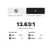
ProposalContrastContrast
Unread proposalbackground-color/interactive + text-color/basebackground-color/interactive + text-color/subtle
Unread proposal.png (120×550 px, 7 KB)
'test' text uses #202122 (text-color/base); 'username' text uses #54595d (text-color/subtle)
Screenshot 2024-05-30 at 15.59 2.png (145×157 px, 8 KB)
Screenshot 2024-05-30 at 13.55 1.png (144×159 px, 8 KB)
Read proposal background-color/base + text-color/basebackground-color/base + text-color/subtle
Read proposal (1).png (120×550 px, 6 KB)
'test' text uses #202122 (text-color/base); 'username' text uses #54595d (text-color/subtle)
Screenshot 2024-05-30 at 16.13 1.png (144×167 px, 8 KB)
Screenshot 2024-05-30 at 13.58 1.png (144×163 px, 8 KB)

Hopefully, the table is understandable, if not I am happy to re-phrase or jump on a quick call. I propose using our text color tokens, specifically base and subtle.

Thanks, @JFernandez-WMF.

I've created the following task for the associated engineering work: T366322: Fix Echo color contrast issues in standard theme & night mode, so I think we can consider this task (the design task) resolved.

@Jdlrobson I'm assuming Growth owns the fix for the standard theme, but Web is handling making sure night theme contrast passes accessibility tests. Is that correct?

Yes ideally Growth team would fix this (and web team is available for anything you get stuck on or any advice you need). My hope is that you could also verify and resolve any color contrast issues yourselves within the Echo notification dialog - https://night-mode-checker.wmcloud.org/ provides various tooling that can help with that - we're happy to QA this if you need it. For general accessibility issues e.g. ones that appear outside the Echo dialog, those are web team responsibility. Hope this makes sense?