Using the format from T324372, create a timeline visualizing new vs. returning active editors data (to replace the graphs we have been using from Superset).
Code and data in https://github.com/wikimedia-research/Editing-movement-metrics/
| kzimmerman | |
| Jan 5 2023, 12:39 AM |
| F36455918: Dec_3_sidelabelsblack.png | |
| Jan 23 2023, 9:38 PM |
| F36220195: Dec_3_sidelabels.png | |
| Jan 14 2023, 5:31 PM |
| F36189873: NewReturning_2.png | |
| Jan 13 2023, 2:08 PM |
| F36060529: NewReturning_1.png | |
| Jan 8 2023, 9:58 PM |
| F36055481: NewReturning_1.png | |
| Jan 8 2023, 5:22 PM |
Using the format from T324372, create a timeline visualizing new vs. returning active editors data (to replace the graphs we have been using from Superset).
Code and data in https://github.com/wikimedia-research/Editing-movement-metrics/
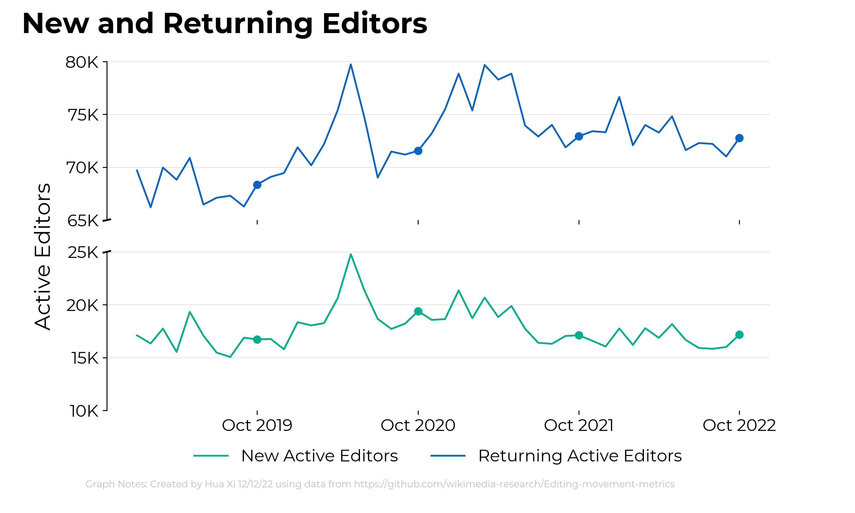
Here is a version with a split y-axis. I'm not sure if we'll want to explore this. I haven't added in the annotations which will need to done differently than with the unsplit chart.
Thank you for these, @HXi-WMF !
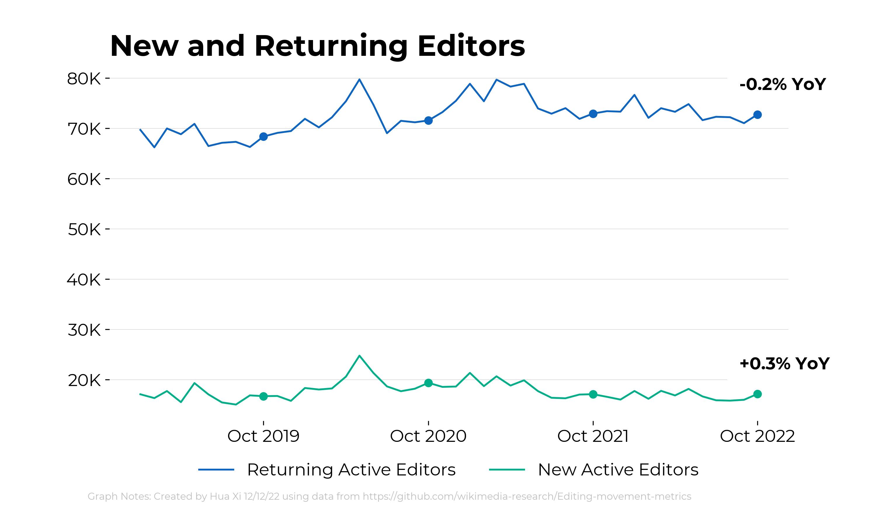
For these charts, I think the legend would be better if it appeared to the immediate right at the end of each line - so that the line is directly labeled. There's a good example here: https://depictdatastudio.com/directly-labeling-line-graphs/
The split chart is something we've debated in the past. I think for our current use cases, having the full chart (not split) is good because it helps give a relative sense of scale.
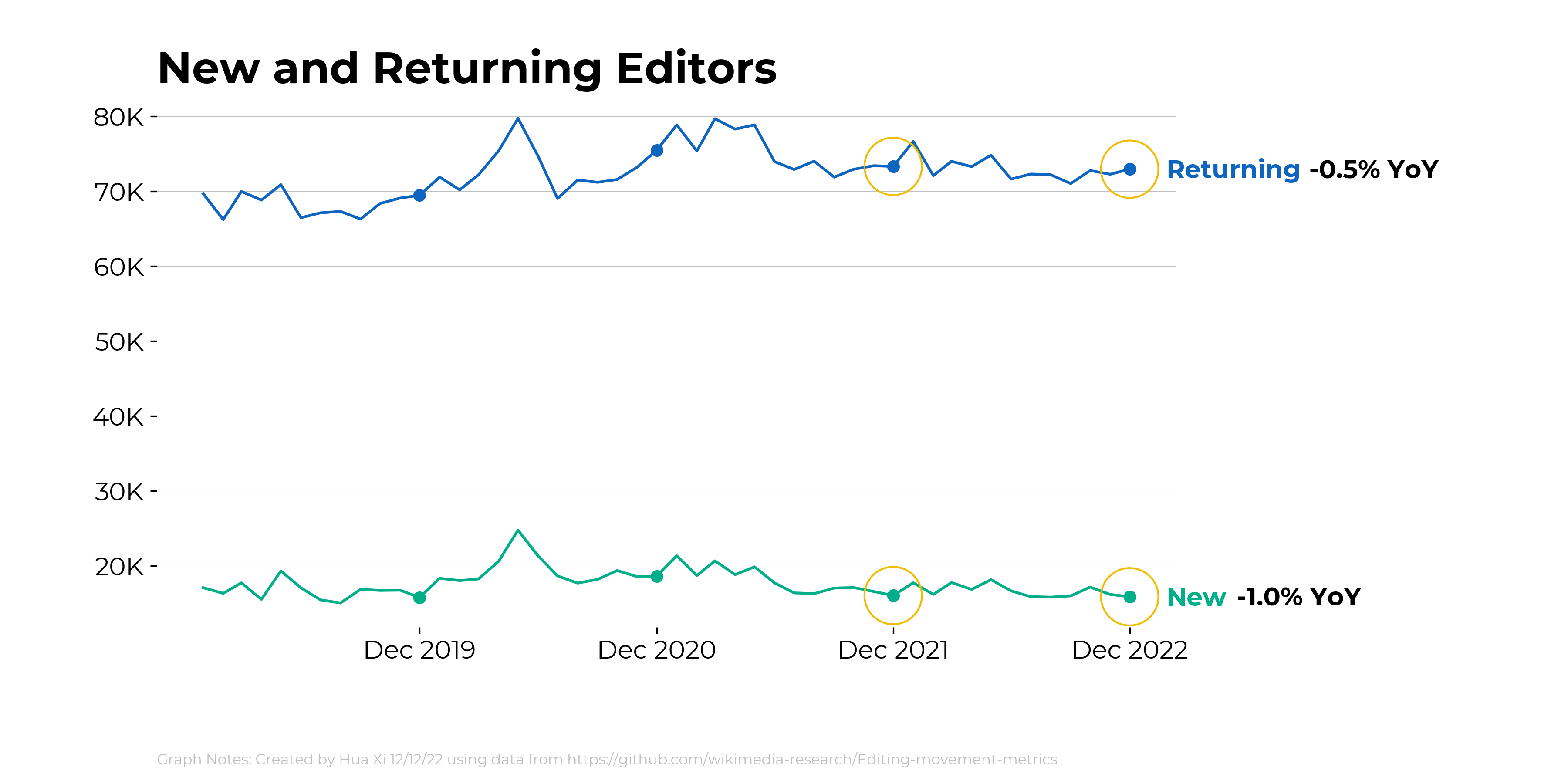
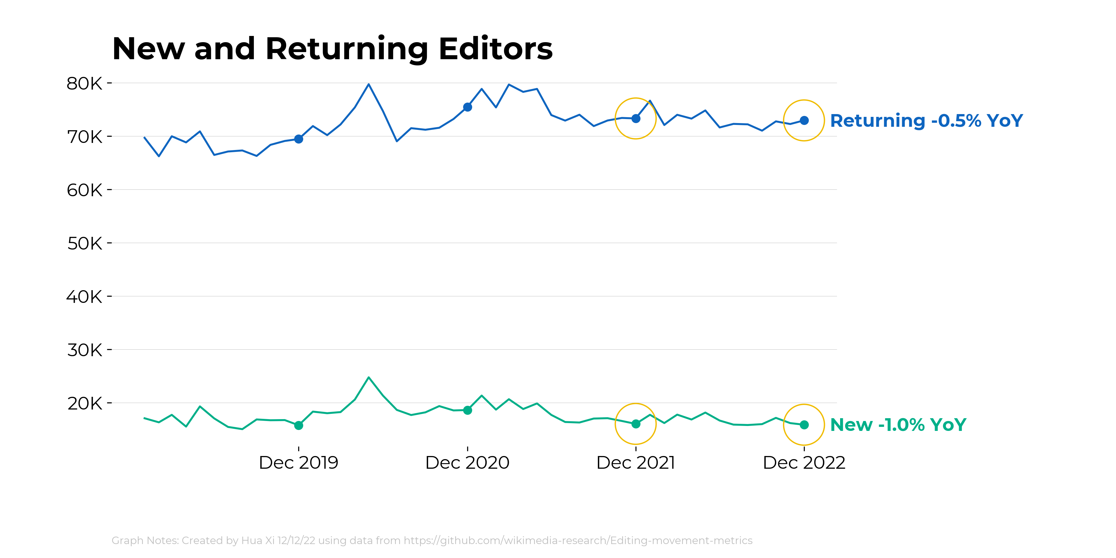
I would also suggest circling the YoY comparison data points.
Here is a version with the data labels on the chart. Do you think it looks cluttered with the data label and YoY annotation so close together?
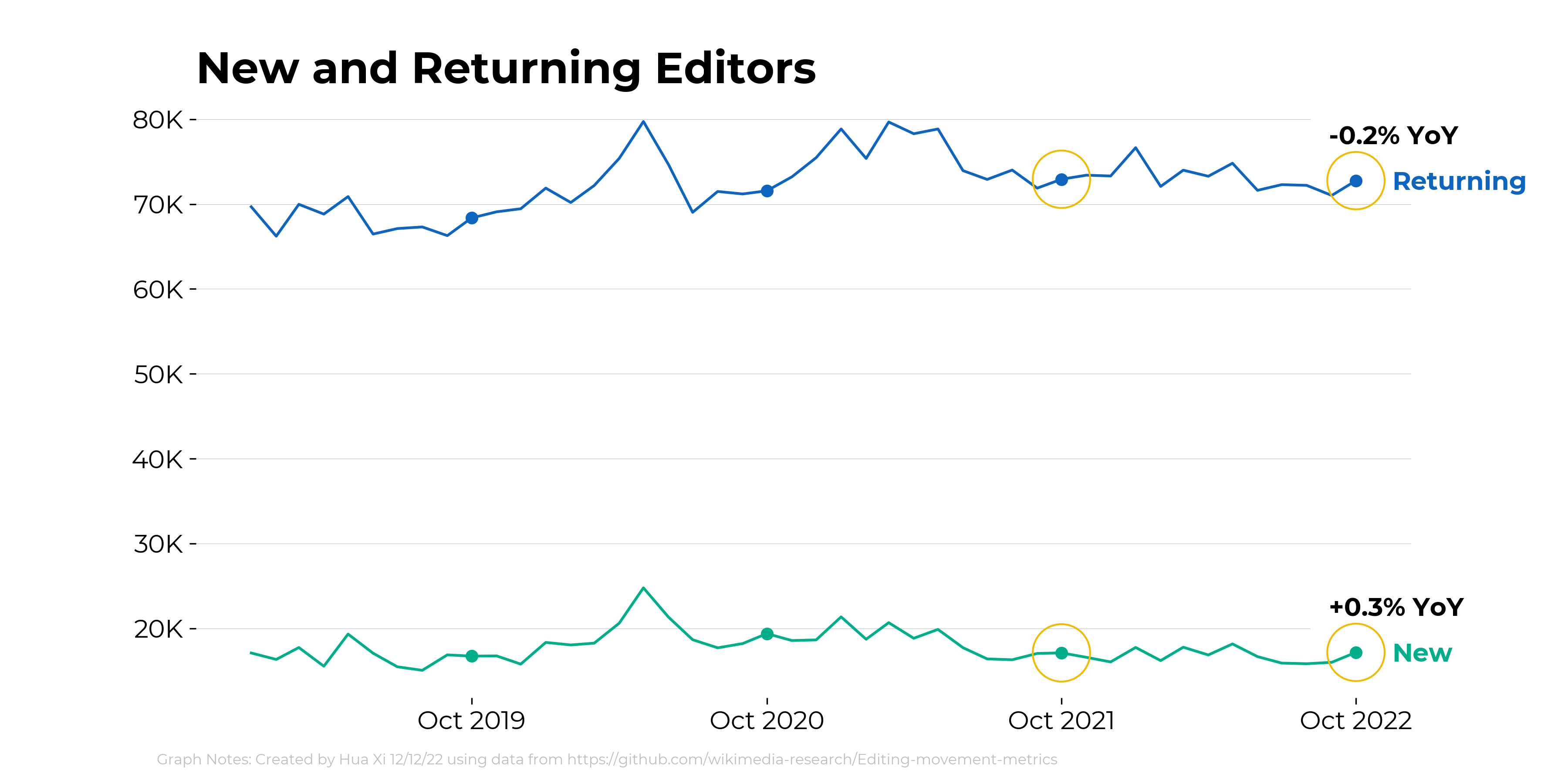
@HXi-WMF I don't think it looks too cluttered. Though perhaps it would be cleaner if the YoY number was inline with the legend (on the next line). Something like the chart shown here: https://blog.datawrapper.de/text-in-data-visualizations/#font-sizes (the "better" example under "Limit the number of font sizes in your visualization")
Here is a version with inline annotations and the YoY in black to match the other charts we've been making: