Page MenuHomePhabricator

Spaces between "Save page", "Show preview" and "Show changes" buttons are too small
Closed, ResolvedPublic

Description

Author: the.r3m0t

Description:
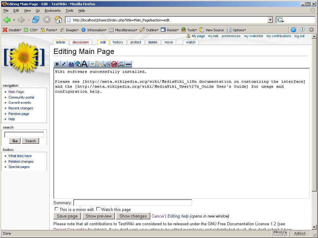
With the addition of the "Show changes" button, the line of buttons now looks a
bit confusing. (Will upload screenshot)

Possible solutions include bolding the "Save page" button and adding (for
example) an em space (   or   or   ) after the "Save page"
button to separate it from the less important buttons.


Version: 1.5.x
Severity: trivial
Platform: PC

Details

Reference
bz1714

Event Timeline

bzimport raised the priority of this task from to Medium.Nov 21 2014, 8:15 PM
bzimport set Reference to bz1714.
bzimport added a subscriber: Unknown Object (MLST).

the.r3m0t wrote:

Screenshot of problem as seen from an admin account (1024x768)

Mozilla Firefox 1.0.1 on Windows XP. Developer toolbar accidentally left in.

Attached:

screenshot.PNG (768×1 px, 99 KB)

  commited to head. Thanks :o)

the.r3m0t wrote:

Problem still appears on FiverAlpha.

avarab wrote:

(In reply to comment #2)

  commited to head. Thanks :o)

Ashar, I removed that space a few days ago ( in version 1.165 ), first of all it
looks like crap in some browsers, namely Konqueror and css is the right place to
do this, if you really want to add a margin on that button please do so in CSS
where it belongs.

the.r3m0t wrote:

Well, will anybody make this change?

Here's the addition to main.css (for Monobook):

#wpSave {

margin-right: 1em;

}

the.r3m0t wrote:

Forgot to mention that the exact same thing can be used for any other skin.
Users can also put it in their own /Monobook.css file as I will.

avarab wrote:

(In reply to comment #5)

Here's the addition to main.css (for Monobook):

#wpSave {

margin-right: 1em;

}

Why put a space between the save and preview buttons? It wasn't like that in 1.4.

Furthermore, why have a space between them at all? WONTFIX?

the.r3m0t wrote:

Well, I felt that with the addition of "Show pages" the whole thing looked too
crammed. It's the logical place to distance the three buttons.

avarab wrote:

(In reply to comment #8)

Well, I felt that with the addition of "Show pages" the whole thing looked too
crammed. It's the logical place to distance the three buttons.

You're right, I put a 1em right margin to #wpSave in HEAD as you suggested,
marking this as FIXED.

zigger wrote:

I prefer the following CSS for monobook/main.css, and it happens to match the IE
default. Firefox uses smaller internal and external margins, which is where I
see the problem. N.B. The CSS needs to be margin-left in monobook/rtl.css.

input#wpSave, input#wpPreview, input#wpDiff {

margin-right: 0.33em;

}

avarab wrote:

(In reply to comment #10)

I prefer the following CSS for monobook/main.css, and it happens to match the IE
default. Firefox uses smaller internal and external margins, which is where I
see the problem. N.B. The CSS needs to be margin-left in monobook/rtl.css.

input#wpSave, input#wpPreview, input#wpDiff {

margin-right: 0.33em;

}

Applied

input#wpSave, input#wpDiff {

margin-right: 0.33em;

}

To HEAD, that way the "Show preview" and "Show changes" buttins are grouped
togather.

zigger wrote:

(In reply to comment #11)

(In reply to comment #10)

I was wrong about IE, due to an IE6 CSS bug during a previous test.

Thanks for the prompt commit Ævar, but can you do monobook/rtl.css as well?

avarab wrote:

(In reply to comment #12)

(In reply to comment #11)

(In reply to comment #10)

I was wrong about IE, due to an IE6 CSS bug during a previous test.

Thanks for the prompt commit Ævar, but can you do monobook/rtl.css as well?

Can you provide a patch? I find thinking in ltr terms mind boggling.

zigger wrote:

(In reply to comment #13)
This can be added to the bottom of monobook/rtl.css :

input#wpSave, input#wpDiff {

margin-left: 0.33em;

}

zigger wrote:

(In reply to comment #14)

(In reply to comment #13)
This can be added to the bottom of monobook/rtl.css :

Corrected to override main.css:

input#wpSave, input#wpDiff {

margin-right: 0;
margin-left: 0.33em;

}