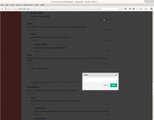
screenshot from clicking the topmost actionmenu
When I click the "Hide" or "Delete" moderation links, the dialogs pop-up more than halfway down the page.
They should appear close to the action-menu that requested them.
However, they must avoid placing the "[cancel / save]" buttons directly underneath (the link that triggered them), to avoid accidental double-click problems.
Note: this will all vary by screensize/windowsize.
Jay8g says: "The hide and unhide boxes always appear awkwardly in the lower right hand corner of the screen, not the center."
(semi-related see also: Bug 60196 "moderation dialog popup does not contain cursor automatically")
Version: unspecified
Severity: normal
Attached:
