Page MenuHomePhabricator

Design: Clarify functional zones / organization of the RC page
Closed, ResolvedPublic

Description

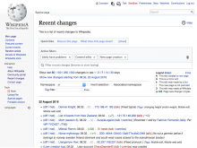
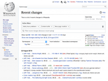
Now that some changes were made to integrate the old and new filters a little bit more on the page, it strikes me that we could use an overall label to distinguish all the links above our filter tools from the actual filter tools. On the old page, there was a label above the tool box that said "Recent changes options," which could be a little more clear, I think.

What I'm looking for is something right above the Active Filter Display Area that says:

Filter Recent Changes


The label should, at a minimum, be larger than the "Active Filters" label.
Event Timeline

Would it be possible to detail a bit more in the ticket description the problem to solve and what we know about it, instead of a particular solution?

It seems that the concern is that users would not be able to identify the filters as such, but in the research we did based on this prototype we didn't observed confusion with the block on links on top.

I think it this is a concern worth observing with more detail before acting, especially considering the effects of pushing the main content (the list of contributions) down the page.

@Pginer-WMF asks:
>Would it be possible to detail a bit more in the ticket description the problem to solve

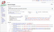
Absolutely. As we know, this page has grown over time in layers. The design, to put it kindly, is not one that anyone would have come up with if given the assignment. It starts with a bunch of links which...what are they even doing there, in the most prominent spot on the page? Then from the links we go with no transition at all into the new tools, and then from there to tools that are in a completely different style.

We don't want to redesign the old tools and elements at this time. But what I think might be possible would be to rearrange the page with the goal of 1) clarifying the main functional zones of the page and 2) emphasizing the page's main function by clearing the links out of the top area, where they are liable to distract new users. I see the main functional zones as these:

  1. - Tool Area
  2. - Results Area
  3. - Other stuff (this is either one zone or two, depending on how you count Legend and Related Links)

I'll note that logically, the Legend should go near the Results Area. Benoit notes that the Legend is already collapsable. Perhaps the Related Links could be as well? That would make the page a lot cleaner and move the results up even further.

I talked to Benoit, who thinks that if we're going to do this, we should do it now and release all at once. I'm copying Moriel because I don't want to get into anything that would cause a big delay in release. And Daisy in case she thinks that moving stuff around without testing is a mistake (though I'll point out that the version we tested is actually different from what we're releasing with respect to Namespace, etc.)

Here is a CRUDE proof of concept sketch. At a minimum, it shows we can rearrange things without moving the results down.

rearranged RC tools.png (842×1 px, 347 KB)

jmatazzoni renamed this task from Design: label the RC Filter area to Design: Clarify functional zones / organization of the RC page.Mar 1 2017, 7:37 PM
jmatazzoni added a subscriber: Trizek-WMF.

Thanks for the clarifications, @jmatazzoni

I agree that having a bunch of links at the beginning of the page dilutes the purpose of the current tool. I think it is important to both (a) make it clear that the filters are the main tool to manipulate the data and (b) keep the connection between filters and data clear. My concern with moving the links between the filters and the result is that it breaks the strong connection between these two pieces.

On regular use (the one we want to optimise to increase efficiency of reviewers) we expect users to move frequently between the results and the filter area (tweaking the filtering criteria depending on the activity), and having a bunch of links getting in the way between these two pieces won't help to keep the process fluent. Especially when some of those links may look like filters too ("New pages", "New editors' contribs", "IPs' contribs", "Mobile contribs") but they won't add filters to the current page but load a new page with a new set of filters.

I think that collapsing the area (while hinting part of its contents) may help to reduce weight to this secondary area while not getting in the way of the filtering refinement process. I explored some mockups with different degrees of prominence for the links:

A) Expandable area with few linksB) Compact box at the top of the pageC) Compact box in the filter area
RC-quick-links-prominent.png (768×1 px, 259 KB)
RC-quick-links-compact.png (768×1 px, 269 KB)
RC-quick-links-filter-area.png (768×1 px, 258 KB)
Surfaces some of the "introductory" links about the page and provides a way to access the rest. Muscle memory my help users of those links to find them since the area is in the same location.Prominence is reduced and only a one line non-clickable version of the content is kept to give context to those interested in accessing the links. Moves out of the way and does not consume extra space.Defines a secondary area with the legend. Some links can work as further filtering options (although the behaviour may be unexpected). When it is expanded, breaks the connection between filters and the results, but at least does not do so by default.

I have also some additional comments about logistics:

I talked to Benoit, who thinks that if we're going to do this, we should do it now and release all at once. I'm copying Moriel because I don't want to get into anything that would cause a big delay in release.

Our next milestone is to release a beta feature. The beta feature environment is for features to evolve and improve based on the users feedback. I don't think we should create additional blockers. I see no problem in including these changes with the next ones we plan to test with users, get some initial impressions, and improve the beta feature.

And Daisy in case she thinks that moving stuff around without testing is a mistake (though I'll point out that the version we tested is actually different from what we're releasing with respect to Namespace, etc.)

I wanted to note that the differences in the version we tested capture our intended direction. If we identify problems because the namespace or tag selector are not better integrated, we can move towards the direction we tested in the prototype with some users.

Thanks for putting up those designs Pau. Here's my biggest question:

  • All of these designs collapse the related links list by default. My understanding is that these links were put there by "the community," which makes me skittish about hiding them. On the other hand, examining the links more closely, I see that the list is random at best. Some links, like the link to Related Changes, arguably deserve prominent display. Others are ridiculously general or completely redundant (see below for both). How much leeway do we have to add or subtract from this list and re-order and relocate it? @Jdforrester-WMF? @Quiddity? @Trizek-WMF? What do you think?

Here are some specific notes about how we might re-organize and reduce these links:

  • Ridiculously general: The whole "About Us" line does not belong at the top of this page. Nothing in this line relates at all to edit review. There is literally a link to a page whose topic is "What is Wikipedia?" Can we just drop all these? (If any are important, they belong in the left nav.)
  • Completely redundant: "What does this page mean?" is just a Help link. It goes to the same place as the standard Help link.
  • The "Utilities line" and the various Related Changes page preset links currently in the "This page" line are relevant. If we list them someplace it should be under a heading that gives a better idea of the utility they offer: e.g, "Edit-review tools and resources"
  • The Links box in options B and C includes a Show/Hide link. None of the things in the above "Edit-review tools and resources" needs to be passively displayed (i.e., permanently "shown"). I'd think a dropdown menu would be sufficient.

I talked to Benoit, who thinks that if we're going to do this, we should do it now and release all at once. I'm copying Moriel because I don't want to get into anything that would cause a big delay in release.

Our next milestone is to release a beta feature. The beta feature environment is for features to evolve and improve based on the users feedback. I don't think we should create additional blockers. I see no problem in including these changes with the next ones we plan to test with users, get some initial impressions, and improve the beta feature.

I agree. My idea was to do it with the current release if it was not blocking or taking too much time, which is not the case.

All of these designs collapse the related links list by default. My understanding is that these links were put there by "the community," which makes me skittish about hiding them.

If, when you click on the [show] / [hide] link, you have this preference memorized, it is fine.
Community links are not the same on all wikis. This list may also be used to have a quick access to the most useful combinations of filters.

Sigh. James says that we can't change the links without some kind of community process. I'm moving this to Q4.

Sigh. James says that we can't change the links without some kind of community process. I'm moving this to Q4.

That's his opinion. We can also be bold and suggest such a change.
You should add this idea to the "future" change section on the project page, @jmatazzoni.

@Pginer-WMF, I talked to James about our idea of putting the links into a user-editable dropdown menu. He says it will inspire just as much "shouting" as changing the list would get. Which means we're not liable to go that way until we are ready, some time next quarter, to take on the whole interface and deal with the issue thoroughly. Sigh.

Which means I'm back to thinking our best interim solution is some variation of the concept below. I really feel like those links are such a huge miscue at the top of the page, and that moving them is preferable to adding in a new section header for the tools, as you and I discussed.

James thinks this plan would be fine with the community, though he suggests switching the positions of the Links and the Legend, so that the links are more like where they were before (on the left). I'd also suggest using a single link to collapse/expand both the Legend and Links, since there is no space savings advantage if a user hides just one of them.

rearranged RC tools.png (842×1 px, 347 KB)

This plan does also have the advantage of putting the Legend next to the things it describes, though I know you don't like separating the tools and the results. If you don't object too strongly, can you please work up a design along these lines? Doing it this way should be relatively simple, since it only reshuffles the elements without really changing any of them—enabling us, with luck, to bring out this clearer organization as part of the first release.

Which means I'm back to thinking our best interim solution is some variation of the concept below.

If it is ok to make those links collapsible, why not make them collapsed by default?
We can make them float to the right, out of the main scanning line but still close enough to where they were for users to discover them.

RC-quick-links-related.png (768×1 px, 267 KB)

In that way we avoid (a) breaking the connection between filters and filtered content (which I really think is something important to keep), and (b) adding more unnecessary elements such as the legend to the main scan line.

@Pginer-WMF asks:

If it is ok to make those links collapsible, why not make them collapsed by default?

I personally like this design, but don't have time for the "shouting," as described above. @Jdforrester-WMF, care to comment?

If we pack this with the Beta feature and if users's choice is memorized somewhere (cookie, preferences), it will go fine.

(Sorry for commenting late.) These lists of navigational links have a unique setup at every wiki, including many designs that assume a placement at page-top and full-width. Additionally, I believe many editors typically use it as a quick-access point -- I.e. they sometimes visit the RC page primarily in order to access this navbox, because RC is linked in the site-wide sidebar. (This is how I find various pages at certain wikis.).
I advise against changing anything related to the MediaWiki:Recentchangestext navbox. I strongly discourage changing its visibility (default-collapsed-state).
Example links (random larger wikis):

etc.

For this ERI task, I suggest going with something like the original task description, and just add a clear header.
I specifically recommend:

  • Just use the pre-existing MediaWiki:Recentchanges-legend message (to avoid having to re-translate an almost identical string into 283 languages). (see translatewiki)
  • Put that above the ERI filters. It will implicitly cover the ERI filters and the old options.

As Benoît pointed out, I think it is important to consider the proposed changes would be presented as part of a beta feature. Beta features provide some more room to experiment. They allow people negatively impacted by any change to disable the feature and avoid such impact in their workflows, giving them the opportunity to report details about the specific issues. I don't think that there are precedents in this context that justified the concern of "people shouting" in this context. If the change is problematic, we'll learn and adjust. If we change nothing, we have little to learn.

As Nick indicated, the main purpose of these links seem to go somewhere else. I think it makes sense to keep those links discoverable, and make sure that users can find them. But I also think we have a good rationale for the change: leaving the page to go somewhere else is not the main function of the page and presenting such options in the current way distracts from the main functionality of the page. In addition, the added filtering capabilities the page adds, already facilitates some of the tasks that some links provide.

I don't think we are talking about such a radical change not to even try. Going with solutions that add more clutter just based on the possibility of people complaining, does not make much sense to me. I think our community is perfectly able to understand the reasons above, and the beta feature setting would allow us to explain and learn from the needs we overlooked if any.

I don't think we are talking about such a radical change not to even try. Going with solutions that add more clutter just based on the possibility of people complaining, does not make much sense to me. I think our community is perfectly able to understand the reasons above, and the beta feature setting would allow us to explain and learn from the needs we overlooked if any.

+1, thanks Pau.

they sometimes visit the RC page primarily in order to access this navbox, because RC is linked in the site-wide sidebar. (This is how I find various pages at certain wikis.).

Thanks for saving us from screwing up Nick. Genuinely. But that is about the saddest note someone who cares about UI could get: "Don't move those links, which are just confusing clutter on the particular page they're on, because people are using this page as an extension of the left nav." Sigh.

I don't identify collapsing those links as a blocker.

I did an initial exploration for a more long-term solution.
The user goals for these links seem to be: (a) discover relevant tools, and (b) quickly access them regularly.

We can provide a drop-down menu with all the tools initially that allow users to mark their favourites for easy access later. When there are favourites, those are the ones shown initially (with an option to expand and reach the rest). When there are no favorites, all tools are shown.

Some quick mockups to illustrate the idea:

Initial access for quick linksFull list of linksFavorite links shown initially
quick-links-dropdown.png (768×1 px, 268 KB)
quick-links-dropdown-open.png (768×1 px, 283 KB)
quick-links-dropdown-custom.png (768×1 px, 277 KB)

Thoughts?

I like it. I've been confused first by the labels, believing this list was a sort of duplicate of some current filters. For instance, Mobile edits is a filter used in the filter list, and should not be in the shortcuts.

Closing this. At this point, I think we're moving on with more comprehensive solutions