Page MenuHomePhabricator

User perception of radio buttons sufficiently understandable?
Closed, ResolvedPublic

Description

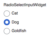
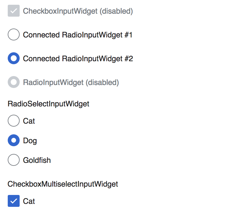
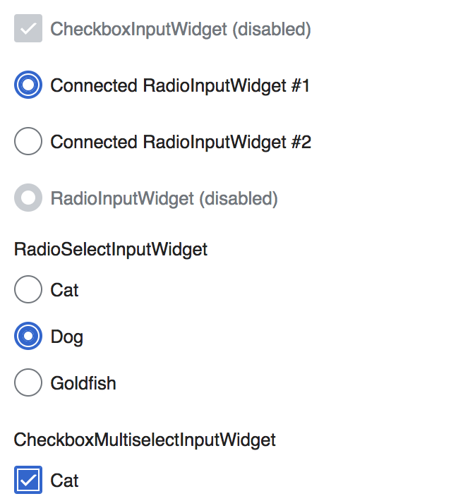
In T86003#3270922, @Amire80 brought up his concern about users probably having issues with identifying radio buttons' state (as of currently v0.21.4):

When I started trying the TwoColConflict beta feature, I was very perplexed by the radio buttons in it. I didn't perceive them as radio buttons at all. I couldn't understand what is selected and what isn't. After trying them several times, I still don't perceive them as radio buttons, as several options from which I am supposed to select one. They look like blue circles that don't communicate anything.

blue circles.png (454×732 px, 32 KB)

I thought that perhaps it's an experimental part of TwoColConflict, but now I realize that it's part of OOJS UI and it's about to be used in other places.

Did this go through user testing? Am I the only one who finds them confusing?

I love OOJS UI in general, but I just cannot wrap my head around these radio buttons.

Event Timeline

Restricted Application added a subscriber: Aklapper. · View Herald Transcript

Not saying that there is no problem with the radios, but that particular usage is more confusing than the rest. The distance between the two options, and the added circle for help don't convey any hierarchy.

Screen Shot 2017-05-18 at 12.03.18 PM.png (46×565 px, 10 KB)

@Amire80 do you feel a typical usage — like the one in the demos— is equally hard to understand?

Screen Shot 2017-05-18 at 12.05.53 PM.png (120×168 px, 13 KB)

@Amire80 This has been changed a while ago to follow the design templates in M101 and there is a small, but maybe decisive sizing issue (too big) of the white inline dot. Are you feeling as strongly when looking at the demos?

Related to this, as part of the research on the new filters for edit review (T162675) we are observing users making use of pagination settings (T162786) in a prototype, which includes radio buttons. We have not observed issues so far, but we'll take a closer look to identify potential sources of confusion around this.

Here's a test case with the dot 2px smaller in each direction (example “Dog” on the RadioSelectInputWidget in contrast to current status quo above.

T165645 Radio Button active dot size - OOjs UI Widget Demo 2017-06-12.png (710×770 px, 76 KB)

With this we would come closer to Mac OS X representation of an active element, apart from that it is in better harmony with the checkmark. As we haven't seen issues with perceiving active state of radios from user testing, I don't have a strong preference. Still, I might lean towards smaller dot because contrast between active and inactive state is a tad higher.
Would be great to have more feedback here, @Amire80 as task writer and also further design opinion, @Pginer-WMF

I think I know what really bothers me: That the blue circles are considerably larger than the font of the label text.

Here's a test case with the dot 2px smaller in each direction (example “Dog” on the RadioSelectInputWidget in contrast to current status quo above.

This looks good. Especially in the case of the focused state helps to clarify the difference between the main element and the focus-related border.

I think I know what really bothers me: That the blue circles are considerably larger than the font of the label text.

In that case I think we can close this ticket and continue the discussion about T86003: MediaWiki theme: Checkboxes and radios size (original design looks oversized on desktop)

Change 358610 had a related patch set uploaded (by VolkerE; owner: VolkerE):
[oojs/ui@master] WikimediaUI: Strengthen Radio*Widget's :checked state

https://gerrit.wikimedia.org/r/358610

Jdforrester-WMF triaged this task as Medium priority.
Jdforrester-WMF moved this task from Reviewing to OOjs-UI-0.22.2 on the OOUI board.
Jdforrester-WMF edited projects, added OOUI (OOjs-UI-0.22.2); removed OOUI.
Jdforrester-WMF removed a project: Patch-For-Review.

Change 358610 merged by jenkins-bot:
[oojs/ui@master] WikimediaUI: Strengthen Radio*Widget's :checked state

https://gerrit.wikimedia.org/r/358610

Volker_E raised the priority of this task from Medium to Needs Triage.Aug 10 2017, 7:29 PM
Volker_E moved this task from Backlog to Done on the UI-Standardization-Kanban board.