Page MenuHomePhabricator

MediaWiki theme: Checkboxes and radios size (original design looks oversized on desktop)
Closed, ResolvedPublic

Assigned To
Authored By
Esanders
Jan 7 2015, 2:29 PM
Referenced Files
F9100437: image.png
Aug 17 2017, 7:20 PM
F9100439: image.png
Aug 17 2017, 7:20 PM
F9100199: image.png
Aug 17 2017, 6:46 PM
F8109883: blue circles.png
May 17 2017, 12:55 PM
F4600936: T86003 Checkboxes 14&16px.png
Oct 13 2016, 7:08 PM
F4600932: T86003 Checkboxes 14&16px.png
Oct 13 2016, 7:07 PM
F4600876: T86003 Checkboxes 14&16px.png
Oct 13 2016, 6:49 PM
Tokens
"Orange Medal" token, awarded by Krinkle."Mountain of Wealth" token, awarded by Prtksxna."Mountain of Wealth" token, awarded by Volker_E.

Description

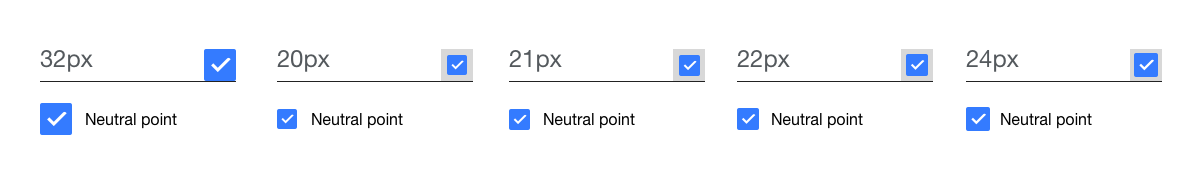
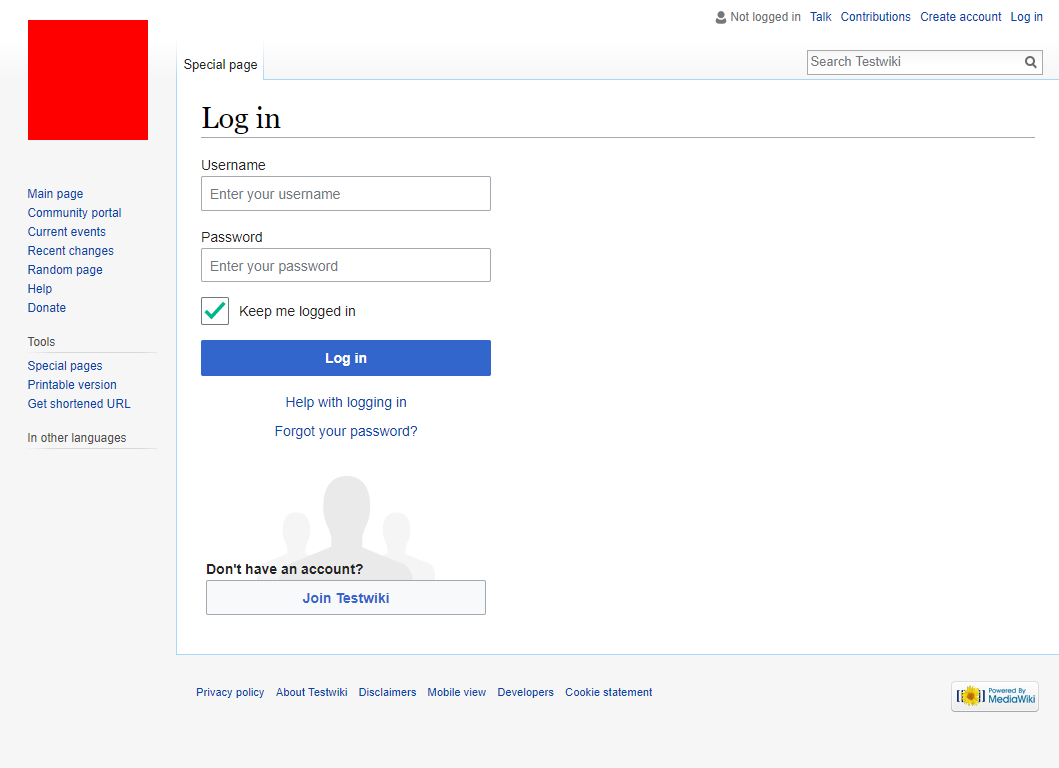
Original design and implementation:

This might be useful on mobile where a large target area is required, but on desktop the just look far too large compared to the native controls and either mess up your line height, or get very tight when stacked vertically (see RadioSelectWidget).

pasted_file (375×296 px, 19 KB)

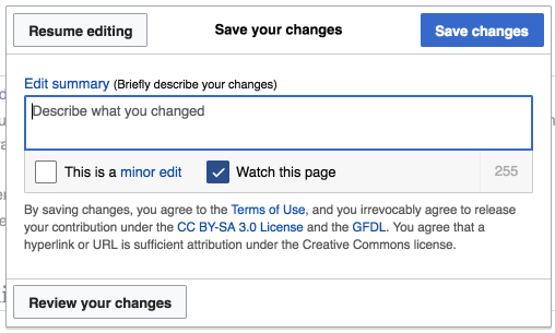
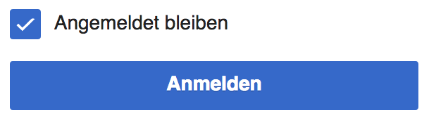
Current design and implementation:

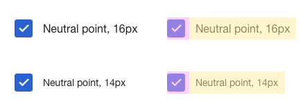
Scaled down by 25% (2em -> 1.5em) everything looks a lot more sensible:

pasted_file (360×333 px, 19 KB)

Related Objects

Event Timeline

There are a very large number of changes, so older changes are hidden. Show Older Changes

I want to point out that monitor screens aren't restricted to interactions with mouse and keyboards anymore. It's true that traditionally radio buttons and checkboxes are smaller controls compared to others, but times have changed and controls on desktop computers can now be interacted with fingers and air motion. This calls for changes on user interface controls as well.

1em is relative to the browser default (16px) - we just choose our default to be smaller than the browser default, but that is applied to the wrapper so everything scale relative to that so it isn't a problem.

While some touch UIs have checkradios of a comparable size to their buttons, they avoid the vertical discrepancy with the label by having the label a comparable height to the button. We have not addressed this issue with our current design. Either the checkradios need to get smaller, or the labels need to get bigger, but that would leave us with different font sizes on the page. As checkradios almost never appear alongside other controls this shouldn't be a problem.


example: Android L, controls only ~40% bigger than font size

pasted_file (109×317 px, 12 KB)

I see. What do you think is the blocker or issue if we used 16px (1em) for the labels instead of 12.8 (.8em)?

Then the labels would have a different font size to all the other text on the page.

Gotcha. I hear @Jdlrobson might know the rationale or reason why we've been using 0.8em instead of 1em on body text size.

I would think using 1em is a better idea, gives us a better range of text size options for less important info to display without losing legibility.

The reason we use 0.8em is because on the small screens of yesteryear it was sensible to use smaller text size to get more encyclopedic content in a single screen.

We, the VisualEditor team, have long desired to bump it to 1em, but it should be done generally, not one control at a time.

I would support bumping it up to 1em. This would also make it consistent with mobile which uses 1em.
We can always use media queries for smaller/large screens if 0.875em makes more sense there.

I'll happily merge any patches to do this.

Regardless of what we decide to do with the base font size it wouldn't fix this particular issue. All of our controls are defined relative to our base font size, so when we say that our buttons are currently 2em high, that means 2 * ( 16px * 0.8 ). If we were to change the base font size to 1em, *everything* would scale up uniformly, so not only would the text get bigger, but buttons would get bigger, padding would get bigger, and we'd still have the same relative height discrepancy between checkradios and labels.

I just attached the specs for both checkboxes and radio buttons. As long as the ratio stays the same I think it'll be fine. Currently if text is 1em, space above and below will be 0.5em. We can make it so if text is 0.8em, space above and below will be 0.4em.

My patch does not affect the internal ratios of the checkbox/radio and I'm not proposing we do, that remains 50% padding to 100% tick/dot as you say (be it 1em and 0.5em or 0.8em and 0.4em).

Can make it so the controls inherit the text size of the parent instead of specifying 0.8? This is so we make sure that there is no text bigger or smaller of the text size surrounding these controls. Or is this already the case in your patch?

It's ideal that the controls are displayed at the least of 16px so that they're tappable. But that's a separate issue raised here: T87077

Prtksxna added subscribers: matmarex, Prtksxna.

Since rGOJUfc6ef37c9f88 was submitted and merged there has been a lot of discussion on this task. The discussion raises points to keep the radios and checkboxes to their original size of 2em. I think we should reconsider this bug as the patch was merged before any discussion could happen.

T93944: Regression on Checkboxes and radio buttons was opened recently as a result of this. In T93944#1163398 @matmarex rightly points out that the change was intentional and thus its not a regression. I think we should—

  • re-open this issue
  • merge T93944 into it (as they're both talking about the same thing)
  • discuss and resolve the issue before submitting a patch

The pholios attached to T93944 aren't very helpful for this issue - they're rendered at a huge size and don't show any text context. They make a great blueprint for the implementing them in CSS, but designers should also be providing real world examples with lots of context to know if these designs feel right.

It's a normal practice for designers to create within context so it works like you mentioned, no worries there. We upload clean specs because it's clearer for production usages like you also mentioned. It's easier to convey the multiple states idea in a blank canvas.

Perhaps the checkboxes and radio buttons can at least do with a label next to it in the mock up. I can change that in the future!

Some context around checkboxes can be found here.

Any closure on this? We seem to be going in circles here.

Nominating for blocking until we get this resolved. Want to make sure we're listening to Design here.

I'd like to come to a resolution as well.

What about this: whenever a screen is only interactable by mouse, we'll use a smaller checkbox. But for other screens like phones, tablets, or even computers with touch screen capability, let's keep them the same height as buttons and text fields so they're finger-friendly.

@violetto The media query i was talking about (pointer:coarse; to check touch devices) is a working draft and not implemented in all browsers. but I think there should be ways to detect touch devices in Javascript. modernizr has an api if i remember correctly.

matmarex renamed this task from MediaWiki theme: Checkboxes and radios look oversized on desktop to MediaWiki theme: Checkboxes and radios size (original design looks oversized on desktop).Jun 4 2015, 9:47 PM
matmarex updated the task description. (Show Details)
matmarex moved this task from Reviewing to Next-up on the OOUI board.

Not sure it was taken into account before but line-height may also help. It seems we want the controls to be larger than the text (which seems sensible UX-wise). If the problem is with alignment, then giving the label a larger line-height (without changing the font-size) would mitigate that problem. That seems to be what iOS and Bootstrap do, as well.

Hijacking this task now and changing the scope slightly:
We want a specific sizing guideline that is working for mobile and desktop clients – in order to keep maintenance small and also address convergence of all kinds of new devices like touch-enabled notebooks.

M101 is in current stage misleading as template, as it features buttons, text input fields, checkboxes and radios with the same height (2em = 32px at base font-size: 16px).
Current OOjs UI (as of v0.17.9) features 20.47px x 20.47px for a checkbox at base font-size: 12.8px

I'd like to propose to get everything, templates, OOjs UI and mediawiki.UI together and make the invisible touch target 32px high and the checkbox itself 2/3 of the buttons height, which translates here to 21.33px
32px also goes well with current line-height as it's exactly the same.

Thoughts @Pginer-WMF @RHo @Nirzar ?

Just to refresh the Ui complexity we're dealing here with. We've got:

  • 12.8px base font-size in VE/OOjs UI
  • 14px base font-size in Vector and
  • 16px base font-size in MobileFrontend

I think it makes sense to have a single solution that works across platforms. The approach of having a bigger active area than the visual representation of the widget seems a good approach to me.

The proposed size seems good to me in general, but I'm a bit concerned with the default sizes being of fractions of a pixel which may result in blurriness and alignment problems (starting with placing the checkbox centered within it's active area). In other words, I'd prefer a general rule that leads to a default checkbox of 22px rather than 21.33px.

I created a comparison of checkboxes at different sizes in case it helps:

checkboxes-compared.png (180×1 px, 13 KB)

I think the proposed sizes visually work better. the added tap area + label target together make up for a accessible toggle interaction.

the pixel splitting will happen if we use ems on 12.8. so either we have to use fixed pixels which i dont think anyone will agree with.

@Nirzar, there are several patches by myself (https://gerrit.wikimedia.org/r/#/c/303338/ https://gerrit.wikimedia.org/r/#/c/315456/ ) with different technical approaches, to result in rounded full pixel values in at least our common use cases and with the browser default of 16px.

My sentence shouldn't have stopped at 21.33px. I agree and it was my original intention that if 2/3 are translated to 21.33px we then go for 22px, as it needs to be an even number in order to center align the checkmark and the radio indicator.

But, in my following comment I've been looking into the base font-sizes and, @Pginer-WMF also pointed this out in his image (with assumed 16px font-size), the visual harmony between font-size and widget width/height is depending on the corresponding font-size.

As VE/OOjs UI are using 12.8px, I won't touch 20.47px before we're solving T97631, as it's too deeply woven into VE. See for example

20.47px24px
T86003 Save Dialog with Checkboxes - Editing Front end - Wikipedia 2016-10-13.png (305×508 px, 47 KB)
T86003 Save Dialog with Checkboxes, adapted to 24px - Editing Front end - Wikipedia 2016-10-13.png (305×509 px, 46 KB)

3/4 of the button height 32px translating to 24px works for both – 14px&16px base font-size. If no opposing arguments are raised I will amend M101 and submit a patch for mediawiki.UI/MobileFrontend

T86003 Checkboxes 14&16px.png (160×440 px, 10 KB)

Checkboxes with touch area

Yeah the pixel approach sounds good. this will work better than pixel splitting. also sizes shown in the mock look reasonable for the label font size.

Putting this on stalled as long as T97631 is not resolved or new directives are agreed on. Filed T148265 as follow-up on mediawiki.UI alignment.

Volker_E changed the task status from Open to Stalled.Oct 15 2016, 3:03 AM

Change 339097 had a related patch set uploaded (by Jforrester):
MediaWiki theme: Make checkboxen smaller whilst retaining clickarea

https://gerrit.wikimedia.org/r/339097

(I hope it's the right place to mention this.)

When I started trying the TwoColConflict beta feature, I was very perplexed by the radio buttons in it. I didn't perceive them as radio buttons at all. I couldn't understand what is selected and what isn't. After trying them several times, I still don't perceive them as radio buttons, as several options from which I am supposed to select one. They look like blue circles that don't communicate anything.

blue circles.png (454×732 px, 32 KB)

I thought that perhaps it's an experimental part of TwoColConflict, but now I realize that it's part of OOJS UI and it's about to be used in other places.

Did this go through user testing? Am I the only one who finds them confusing?

I love OOJS UI in general, but I just cannot wrap my head around these radio buttons.

@Amire80 I'm clearly interested in your concerns, but this is a different task – filed T165645 for it.

Drive-by feedback: The checkboxes/radio buttons being larger than the text is very annoying and I'd much rather they were the same size or a teeny bit larger, not the way they are currently.

@Niharika Why is this annoying?
Again, one reason is to make the indication easier to decipher for people with visual impairments and second, to have a compromise for mobile users. Also, are you talking about the former state being or the soon to be production T148265, where the visual size already got reduced to 20x20px at base font-size of 12.8px or ~22x22px at 14px (MW core standard).

image.png (174×636 px, 12 KB)

With the fix for T148265, I think this is in fact resolved?

Before
image.png (768×1 px, 61 KB)
After
image.png (768×1 px, 60 KB)

As of recent versions, with different em sizing in and the first PS Change 185415 merged, checkboxes take up 20x20px visual space at base font-size: 0.8em and 25x25px at font-size: 1em (clickable area possibly bigger due to label). It is a middle ground when mobile usage is taken into account. Still we've found a harmonious middle ground between font-size and widget size.
20x20px is due to our 0.8em base in VE OOUI and a tad more (21.8833x21.8833px) in MW core usage. We might still adapt that size for one-fits-all when T97631 is resolved.
Would have been waited for @Niharika's response if I'm right with reading her comment as critique on the old mediawiki.ui appearance. But for sanity let's remain this closed.

Hi @Volker_E. It's annoying because it's unlike what I see on other websites and it makes everything space out more instead of the compact version of things I'd like. I looked at the new design and still think it's a tad bit too big. The normal sized text looks weird against those huge checkboxes.

What's the rationale behind having such large checkboxes/buttons etc?

@Niharika

It is a middle ground when mobile usage is taken into account.

Sensitive touch area support requires bigger widgets (recommendation is >40px, we can get away with a tad smaller here as we've got horizontally more area, but need to ensure some vertical space as well – as long as the labels are connected to the checkbox).

Change 339097 abandoned by VolkerE:
MediaWiki theme: Make checkboxen smaller whilst retaining clickarea

Reason:
The original task has been resolved and there's no plan nor UX need on reducing the size on desktop further.

https://gerrit.wikimedia.org/r/339097