Page MenuHomePhabricator

Better handling of 'instruction text' on Preferences tabs for Recent Changes and Watchlist
Closed, ResolvedPublic

Description

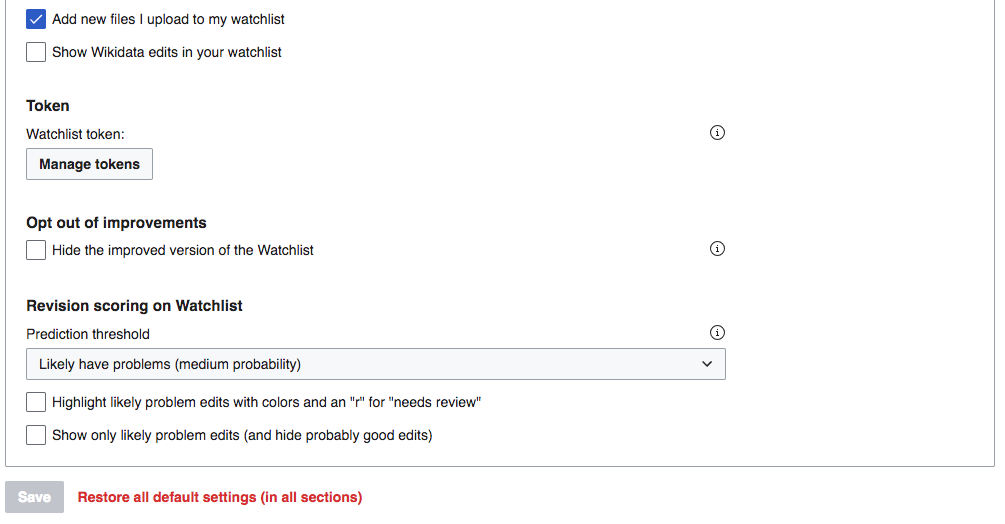
In translating the preferences pages for Watchlist and Recent Changes to the new UI standards, one element was handled in a manner that doesn't work as well as it could, IMO. Specifically, all the instances of what I would call on-page instructional texts or contextual help were turned into help icons that reveal information only when clicked (examples in screenshot).

Screen Shot 2017-12-01 at 12.07.59 PM.png (672×906 px, 116 KB)

I have two issues with this:

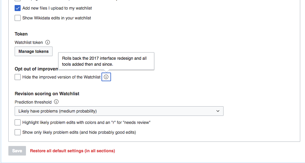
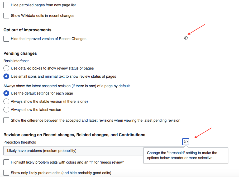
  1. Icon placement and size: In cases where we are going to use the help icon, it should be placed right next to the thing to which it refers, rather than aligning right. In the example above, the icon for the opt-out feature is 375 pixels from the feature description. In my observation, users only see what they are looking at. So if they're looking a the left side of the page, they will not see even highly related items floating on the right—especially such tiny ones as these. (Metaphorically, users are hikers following a trail, not hunters scanning for prey.)
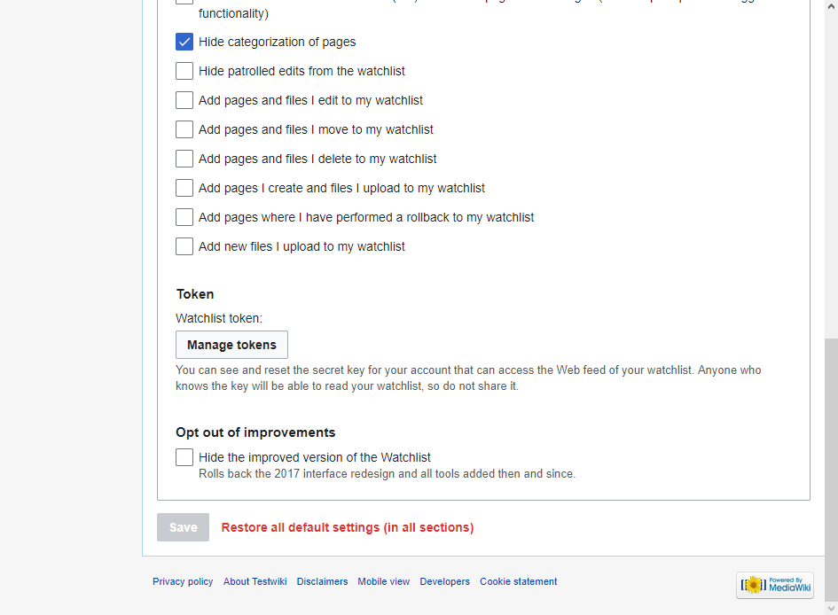
  2. Don't hide stuff we want people to see: I regret deeply that elements of our Preference functionality and UX do not achieve the level of crystal clarity to which we always aspire—which is to say, these pages are confusing messes. But such being the case, displaying some explanatory texts passively, at the top level where users just see them, can be helpful. E.g., the very important option to "Hide the improved version of Recent Changes" is mysterious, and it's something we want users to understand before they click on it (the message is at least partly a warning about the features they will lose).
    • If we don't currently have a UI "style" or element or whatever for "instructional text" or "contextual information" or some such, we should create one.
    • If we do have such an element, let's please use it for the elements specified below.

What elements need what treatment

The following elements on these preference pages currently have help icons. Here are how I'd handle each:

  • Numeric elements at page top. These are discussed in T181844, and may be changing entirely so that the upper limits are handled gracefully by the widget. However if we don't change these, then I'd display the limits passively. Otherwise users enter a number and Save, and only then get told what the limit is.
  • Opt out of improvements: change to passive instruction text
  • Prediction threshold: if you move the help icon placement next to the feature name, I could go either way. If we don't move the placement, then please display passive text.
  • "Token" element on Watchlist (only). if you move the help icon placement next to the feature name, I could go either way. If we don't move the placement, then please display passive text.

Related Objects

Event Timeline

From the description:
  • If we don't currently have a UI "style" or element or whatever for "instructional text" or "contextual information" or some such, we should create one.
  • If we do have such an element, let's please use it for the elements specified below.

T185752: Support inline help labels as an alternative to popup help buttons (info icons)

Change 439925 had a related patch set uploaded (by Bartosz Dziewoński; owner: Esanders):
[mediawiki/core@master] Pass through 'helpInline' to OOUI FieldLayout and make true by default

https://gerrit.wikimedia.org/r/439925

I'm still seeing this problem on the OOUI version of preferences (examined by adding ?ooui=1 to the URL). Namely, that the i-icons for important info are positioned far from the option that is being explained, where users are unlikely to see them. See screenshot below.

Screen Shot 2018-07-18 at 3.02.09 PM.png (524×1 px, 69 KB)

My opinion is that these Info icons will be much more discoverable and clear if they are positioned right next to the element they modify, as in this mockup.

Screen Shot 2018-07-18 at 3.05.13 PM.png (546×1 px, 67 KB)

If the above is not possible, then the best option would be to put such important clarifying information right on the top level, using the new "inline help label" style created in T185752. But I think with proper positioning, the i icon could work well here.

@Volker_E I see there is a patch for this. What is the status of the task? I think there are two issues here. One is the particular solution desired for these preferences page.

The more important issue is what the standard will be for these i-icon elements going forward. Throughout the Preferences pages they seem to be aligned right in most cases—usually far from the text they are explaining. If that is meant to be the standard placement for these, then I'd like to make a strong argument that the desire for balance, or whatever is behind a right-aligned placement, should give way to the argument for clarity and discoverability. Is right alignment the standard for this element, or just an artifact of some quirk of Preferences page structure?

If the above is not possible, then the best option would be to put such important clarifying information right on the top level, using the new "inline help label" style created in T185752.

Once the patch is merged all help would be shown inline.

Is right alignment the standard for this element, or just an artifact of some quirk of Preferences page structure?

While it might not be ideal, it is standard for this element, you can see more example of this in the OOUI demo.

Side-by-side comparison for the proposed patch:

BeforeAfter
image.png (694×945 px, 67 KB)
image.png (694×945 px, 64 KB)

Change 439925 merged by jenkins-bot:
[mediawiki/core@master] Pass through 'helpInline' to OOUI FieldLayout and make true by default

https://gerrit.wikimedia.org/r/439925

matmarex assigned this task to Esanders.

I think this can be considered resolved with Ed's patch (see screenshots above).

@jmatazzoni Please reopen if you think this isn't good enough :)

(the change is already live on https://en.wikipedia.beta.wmflabs.org/wiki/Special:Preferences?ooui=1#mw-prefsection-watchlist, and will be deployed to production wikis next week, per the usual schedule)