Design a configuration interface for reading theme preferences.
Description
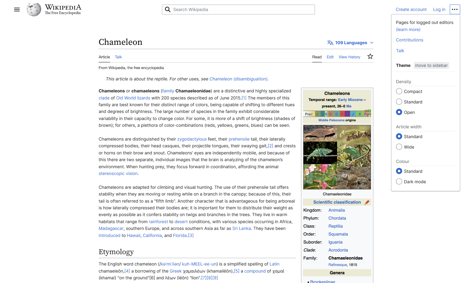
Description
| Status | Subtype | Assigned | Task | ||
|---|---|---|---|---|---|
| Open | Jdrewniak | T341631 [EPIC] Q1 Main hypothesis: Typographical and palette customizations | |||
| Open | Jdrewniak | T313828 [EPIC] Typography: improve typography and allow for variable typography settings | |||
| Duplicate | Florian | T50946 Add font size adjustment feature | |||
| Duplicate | Jdlrobson | T91201 [GOAL] Accessibility settings/preferences on desktop and mobile | |||
| Duplicate | Jdlrobson | T345359 [Goal] Allow logged-out and logged-in users to set preferred typography | |||
| Resolved | Design | JScherer-WMF | T347309 Refine typography settings interface |
Event Timeline
Comment Actions


Video outlining proposed designs and validation approach:
https://youtu.be/Z44M_0W_IFc
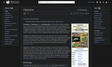
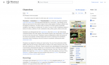
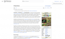
Proposal
An A/B test with consolidated reading theme settings in the main menu as one treatment, and another treatment with the night/day mode button broken out as part of the editor tools. The intention behind the A/B test is to determine whether readers will fast-flip between day and night modes depending on context. Placing the toggle in a more prominent place is a better affordance for quickly changing polarization theme depending on your reading context
Proposed success criteria for t2 would be much higher adoption of the setting compared to t1 and Control. Failure criteria is if dark mode is used as a “set and forget” setting.
Treatment 1 showing consolidated reading theme settings

Treatment 1 showing consolidated reading theme with density settings open

Treatment 2 showing Night/Day mode button broken out into editor tools

Treatment 2 showing Night mode

I'll be getting design team feedback on these this week. @ovasileva @Jdlrobson @sgrabarczuk @Jdrewniak I would love your feedback and guidance on next steps.
Comment Actions
Thanks for putting this together @JScherer-WMF! The video walkthrough is v helpful for understanding these designs. I had some initial questions/feedback
- In the video walkthrough you mentioned the main menu made sense from an IA perspective because the main menu has some settings and reader related stuff, including languages. I've always had the impression that the main menu was more focused on editor links (i.e. the contribute section), and infrequently accessed site wide links. I believe that's one of the reasons why its hidden by default for anon users, because that content isnt as relevant for readers. Languages also arent inside the main menu, I think we moved them out because we didn't want settings inside the main menu. Right now there's a notification reminding people of the new location of languages, but as I understand that will eventually be removed. I'm not sure how much of a concern this is, but I'm wondering if the usage of the main menu goes against some of those IA changes we've made in the past
- Is there a proposed solution for the decreased discoverability for anon users who will not see the main menu by default? Or is treatment 2 the main intervention to at least have dark mode easily accessible?
- For treatment 2, will this design need to be adapted if we want more themes (i.e. sepia)? And even with just dark mode, many sites have an auto setting based off their OS. I'm wondering if we should consider these cases and future extensibility with the single button toggle.
- I was also thinking about the IA for treatment 2. Since legacy vector, that section of the page toolbar is for "page actions" ('edit' & 'view history' link to sub pages of an article, and 'watch/unwatch' is an article page specific action). In my mind, switching themes is a site wide interface setting, and isn't specific to a page. This is probably a minor thing for most users, but I think its important to point out this IA also impacts accessibility. That area of the page is a navigation landmark region that's currently labelled "page actions". These regions allows screenreader users to quickly access sections of the page. In my mind the most accessible experience for screenreader users is for all the reader settings to be located in a single place under a navigation landmark region with a descriptive label like 'interface settings' or something similar. I could imagine it being hard for screenreader users to have the theme setting separated from the rest of the reader settings and under the 'page actions' region. To note, most people using dark mode wont be using a screenreader, but there plenty of people who have limited vision that rely on a combination of sight and screenreaders, so this use case isn't unheard of.
- I'm thinking about the collapsible radio buttons, to me it seems like a custom UI component, almost like a combination between a disclosure widget and a radio button. I know we have patterns that look similar like in the TOC and the collapsible headings on mobile, but each of these cases are actually quite different when it comes to their implementation and accessibility. Similarly, I think there's nuance with this design that will likely need more research and testing. Some questions that come to mind, does clicking the legends (i.e. density, color) also show/hide the radio buttons, or is it only the arrows that does that? Is there accessibility/HTML concerns with having the radio buttons hidden, but the fieldset and legend elements still visible? Should we implement this with a button and custom JS like we did with the ToC, or could we use <details>. None of these questions are sure blockers or things that we cant work around by any means, but I wanted to acknowledging that custom UI elements could take a bit more time to figure out compared to something in Codex for example.
Comment Actions
Thank you for the video @JScherer-WMF - it was super helpful to get an idea of the proposal. A couple of notes (very similar to what @bwang said above):
Treatment 1:
- I really like the simplicity and it fits the overall style of the page
- Introducing settings in a navigational menu. We don’t currently have that distinction, but is it a distinction we might want to have? All the other items in the menu are navigational. Wondering if it might be confusing to have both in a single menu/what other effects might this mix have in the long term.
- I have similar concerns to what @bwang said above. The main menu collapsed is by default which might hurt discoverability. We could potentially think of some tutorial or popup on first launch that helps with this. However, the main menu overall is used very infrequently as the links in there are not relevant to most casual readers, which is one of the reasons we collapsed it in the first place.
Treatment 2:
- I like this, might draw some more attention on the edit button (so we should probably look at edit rates if we go with this
- I'm not sure how we want to treat the overall navigational hierarchy. Right now that bar is focused on per-page actions (which is a separation we introduced within Vector 2022). Adding global actions here might be a bit confusing to readers/break out of that pattern.
- Small concern on adding more options in that bar (it’s already quite long), especially with the new label on the watch icon
Comment Actions


Thanks for the feedback @ovasileva and @bwang !
I did another iteration on this today based on your feedback and the feedback of the design team. I walked through the new approach and rationale in this video.
Logged in, no tools

Logged in, with tools

Logged-in, hidden

Logged-in, unhide

Logged out
Logged-out, hidden
Logged-out, unhide
@ovasileva does this treatment align with our conversation yesterday and satisfy the feedback above?
@Jdlrobson does this raise any red flags for navigation that you're aware of?
Comment Actions
Outstanding items that need to be taken care of still:
- Icon for hidden theme menu
- I want to put these in the main menu in Minerva, but I'm still unclear on how that would impact scope given that we'd need to move the existing text settings.
Comment Actions
This looks great, thanks @JScherer-WMF! A couple of notes:
- Discoverability of the hide button - with the new default-open proposal, our expectation would be that most logged-out users set their preferred theme and then hide the menu. We should check that the hide action is easily discoverable and understandable.
- +1 on collapsing into the three dot menu be a bit awkward/breaking out of the existing pattern. I like the broken-out component idea within the other menu.
Comment Actions
Justin says we can mark this as done. The only thing we've missing is a settings icon for desktop web.