| | Status | Subtype | Assigned | Task |
|---|
| | Open | | Jdrewniak | T341631 [EPIC] Q1 Main hypothesis: Typographical and palette customizations |
| | Open | | Jdrewniak | T313828 [EPIC] Typography: improve typography and allow for variable typography settings |
| | Open | | Jdrewniak | T261334 [Goal] Font-size: Use `rem` in modern Vector |
| | Duplicate | Spike | None | T254055 Typography: Increased font-size design for Vector 2022 |
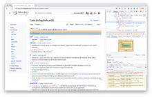
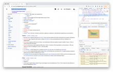
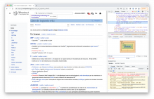
| | Resolved | BUG REPORT | ppelberg | T322738 Font size of page description, warning box, toolbar, edit buttons and other elements too large |
| | Resolved | BUG REPORT | TheresNoTime | T321728 Preview font size has increased in Vector 2022 |
| | Resolved | | ovasileva | T322000 [Unplanned] Font size in jQuery UI dialog too large when using vector 2022 |
| | Resolved | BUG REPORT | ovasileva | T314798 Regression: "Translations" and "Upload media" links in user menu have different font-size |
| | Open | | Jdrewniak | T338979 Remove wikimedia-ui Codex theme overrides in Vector |
| | Resolved | | Jdlrobson | T340262 Use Codex CSS Button components inside MobileFrontend |
| | Resolved | | ppelberg | T315596 [SPIKE] Audit places in VE that depend on skin font size |
| | Resolved | | ovasileva | T344443 Create typography prototype to share with communities |
| | Resolved | | JScherer-WMF | T346058 Designs for community prototypes |
| | Resolved | | JScherer-WMF | T346059 Evaluative testing of the community prototype workflow |
| | Resolved | | Jdrewniak | T347208 Launch Community Prototype |
| | Open | | Jdrewniak | T345357 [Goal] Improve default typography on mobile and desktop sites |
| | Resolved | | Jdrewniak | T344515 Typography: Audit font sizes across Vector 2022 and Minerva |
| | Resolved | | ovasileva | T311469 [QA] Evaluate Chinese, Japanese, and Korean characters' font size |
| | Resolved | | ovasileva | T346064 Generate design options for new default |
| | Resolved | | JScherer-WMF | T351661 Solicit feedback from design team on new proposed sizes |
| | Resolved | | ovasileva | T351693 Implement new default typography options |
| | Resolved | | None | T351754 Vector 2022 paragraph spacing is too small |
| | Resolved | BUG REPORT | ovasileva | T352875 Lists and other line breaking items appearing within paragraphs have the wrong vertical margins. |
| | Duplicate | | ovasileva | T351756 Minerva font sizes should closely follow vector options for font sizes |
| | Resolved | | JScherer-WMF | T346065 Triangulate community prototypes, design prototypes, and research insights to propose a new default typography |
| | Open | | JScherer-WMF | T346066 Share and discuss new typography defaults with pilot wikis and other communities |
| | Resolved | | KSarabia-WMF | T348984 Implement initial CSS Custom properties in Vector |
| | Duplicate | | Jdlrobson | T345359 [Goal] Allow logged-out and logged-in users to set preferred typography |
| | Resolved | | JScherer-WMF | T345360 Design exploration for typography settings |
| | Open | | JScherer-WMF | T346069 Evaluative testing of proposed typography settings design |
| | Open | | JScherer-WMF | T346070 Share and discuss proposed typography settings designs |
| | Resolved | | ovasileva | T345363 Create font size settings interface functionality for vector |
| | Resolved | | NBaca-WMF | T346375 [Spike] Consider the impact of dark mode and font size on user preferences table |
| | Resolved | | Edtadros | T346987 Convert font size feature flag to hidden user preference |
| | Resolved | Design | JScherer-WMF | T347309 Refine typography settings interface |
| | Resolved | | JScherer-WMF | T349210 Refine typography settings interface on mobile |
| | Resolved | | None | T350170 Update mobile settings to use client side preferences |
| | Resolved | | ovasileva | T349938 Review feasibility of proposed settings interface on mobile and desktop |
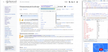
| | Resolved | | ovasileva | T350195 Desktop settings dropdown interface for logged in users: Version 1 |
| | Resolved | | None | T350417 Build out client preferences in side bar |
| | Resolved | Spike | Jdrewniak | T350418 Should binary controls in user settings become toggles in mobile resolutions? |
| | Resolved | | bwang | T350612 Design a skeleton loading state for reading settings interface |
| | Resolved | | ovasileva | T351141 Make the client preferences controls pinnable |
| | Resolved | BUG REPORT | Jdlrobson | T352257 [subtask] Vector 2022 "Tools" menu collapsing does not make main content take that space anymore |
| | Resolved | | ovasileva | T351142 Update theme icon for client preferences in user links |
| | Resolved | | DTorsani-WMF | T350436 Reading theme icon: Add reading theme icon to Codex and OOUI |
| | Resolved | | ovasileva | T352642 Use Codex icon for theme |
| | Resolved | | ovasileva | T351307 Finalize language and copy for typography settings |
| | Resolved | | ovasileva | T351867 Update copy for typography settings |
| | Resolved | | Jdlrobson | T351339 Deploy client preferences to production beta features |
| | Resolved | | ovasileva | T352826 Replace links in the Vector 2022 beta feature description |
| | Declined | | ovasileva | T353986 Width of "Standard" should change based on font size |
| | Resolved | | ovasileva | T354818 Standard and large font-sizes break the homepage layout |
| | Resolved | | ovasileva | T356653 Show a toast notification on page load for night mode when the setting doesn't take effect in Minerva |
| | Duplicate | | None | T344133 Add tooltip text for content width limit toggle |
| | Duplicate | BUG REPORT | Jdlrobson | T359406 (Vector 2022) Full screen toggle non-functional, wastes space on wide monitor |
| | Resolved | | ovasileva | T345756 [SPIKE] Exploratory testing of new font size |
| | Resolved | | Jdrewniak | T346072 Develop a strategy for using CSS Custom Properties in Vector |
| | Resolved | | ovasileva | T351998 Update copy for beta feature |
| | Resolved | | KSarabia-WMF | T352075 Duplicate Events Generated when Interacting with Radio Buttons |
| | Resolved | | jwang | T350709 QA User Preferences Selection Panel Instrumentation |
| | Resolved | | None | T356076 Apply different default font size to different pages on desktop |
| | Duplicate | BUG REPORT | JScherer-WMF | T357084 H3s on Minerva have too much vertical space above them |
| | Resolved | BUG REPORT | ovasileva | T349303 Implement initial CSS Custom properties for font-size in Minerva Neue |
| | Resolved | | Jdlrobson | T357724 [Regression] Users are getting the incorrect default mobile font size |
| | Resolved | | ovasileva | T357770 Evaluate rationale for line height changes in Minerva |
| | Resolved | | ovasileva | T358498 Change line height on Minerva to 1.65 for "Standard" font size |
| | Resolved | | ovasileva | T358591 Ask Readability consortium about ASD, information density, and typography |
| | Resolved | | ovasileva | T358501 Review line-heights for typography changes in light of the feedback we got about Minerva for other Minerva sizes and V22 |
| | Resolved | | ovasileva | T359029 Change line height for Medium font size on Minerva |
| | Resolved | | ovasileva | T359030 Increase line height for Vector in standard and large mode |
| | Duplicate | BUG REPORT | JScherer-WMF | T358893 For consideration: Spacing between code blocks and paragraph seems a little big |
| | Duplicate | BUG REPORT | JScherer-WMF | T358808 [Bug] Bottom margin on lists in Minerva are too short |
| | Resolved | | ovasileva | T360092 [spike] Identify small default content area pages |
| | Open | | ovasileva | T360097 [goal] Deploy reading accessibility settings menu and new typography defaults on desktop |
| | Resolved | | ovasileva | T360098 Allow reading accessibility settings menu to have different defaults for logged-in and logged-out users on desktop |
| | Resolved | | bwang | T360099 Accessibility settings menu should default to open for all logged-in and logged-out users |
| | Resolved | | jwang | T359418 Analyze usage of desktop text size beta feature |
| | Resolved | | GMikesell-WMF | T361158 Exception handling for appearance settings - Vector |
| | Resolved | | ovasileva | T357706 [config] Disable limited width on the main page and associated history page |
| | Resolved | | ovasileva | T354817 Design spike: should we scale page width with font-size globally? |
| | Resolved | | ovasileva | T309489 Main Page history is not full width |
| | Resolved | | ovasileva | T361586 Make appearance menu persist |
| | Open | | None | T362145 [Spike] What do existing users get |
| | Resolved | | ovasileva | T362147 Deploy reading accessibility settings menu and new typography defaults to first set of wikis |
| | Open | | None | T362148 Deploy reading accessibility settings menu and new typogrpahy defaults to remaining Wikipedias |
| | Open | BUG REPORT | bwang | T330527 Wider tables overlap sticky page tools (Upstream Minerva's responsive table styles to core SkinModule) |
| | Open | | Jdrewniak | T364015 Exception handling for appearance settings (width) - Vector |
| | Open | | JScherer-WMF | T362939 [Design] Fix unintended vertical spacing behavior in Minerva and Vector |
| | Resolved | | None | T362808 Rename "client preferences menu" to "appearances menu" |
| | Resolved | | ovasileva | T360917 [Spike 3hrs] Unintended vertical spacing behaviour |
| | Stalled | BUG REPORT | bwang | T361038 Unexpected paragraph spacing added by the poem tag |
| | Open | | None | T361767 Don't use padding-bottom for paragraphs |
