Page MenuHomePhabricator

Identify the best diff style (mobile or desktop) and use it on both mobile and desktop
Closed, ResolvedPublic

Assigned To
Authored By
Nemo_bis
Feb 26 2015, 9:28 PM
Referenced Files
F41820739: obraz.png
Feb 9 2024, 12:30 AM
F41820704: obraz.png
Feb 9 2024, 12:30 AM
F17157466: image.png
Apr 20 2018, 2:50 AM
F17154641: image.png
Apr 20 2018, 2:50 AM
F17154828: image.png
Apr 20 2018, 2:50 AM
F87576: diffs.png
Mar 13 2015, 7:02 AM
F86934: Screenshot_from_2015-03-12_19:25:37.png
Mar 13 2015, 2:32 AM
F86706: Screenshot_from_2015-03-12_18:30:47.png
Mar 13 2015, 2:00 AM
Tokens
"Pterodactyl" token, awarded by violetto."Like" token, awarded by He7d3r.

Description

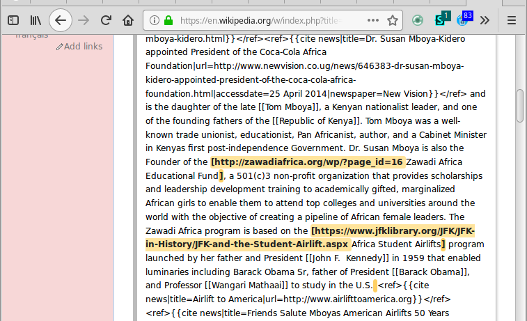
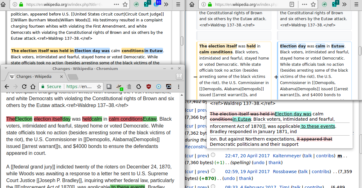
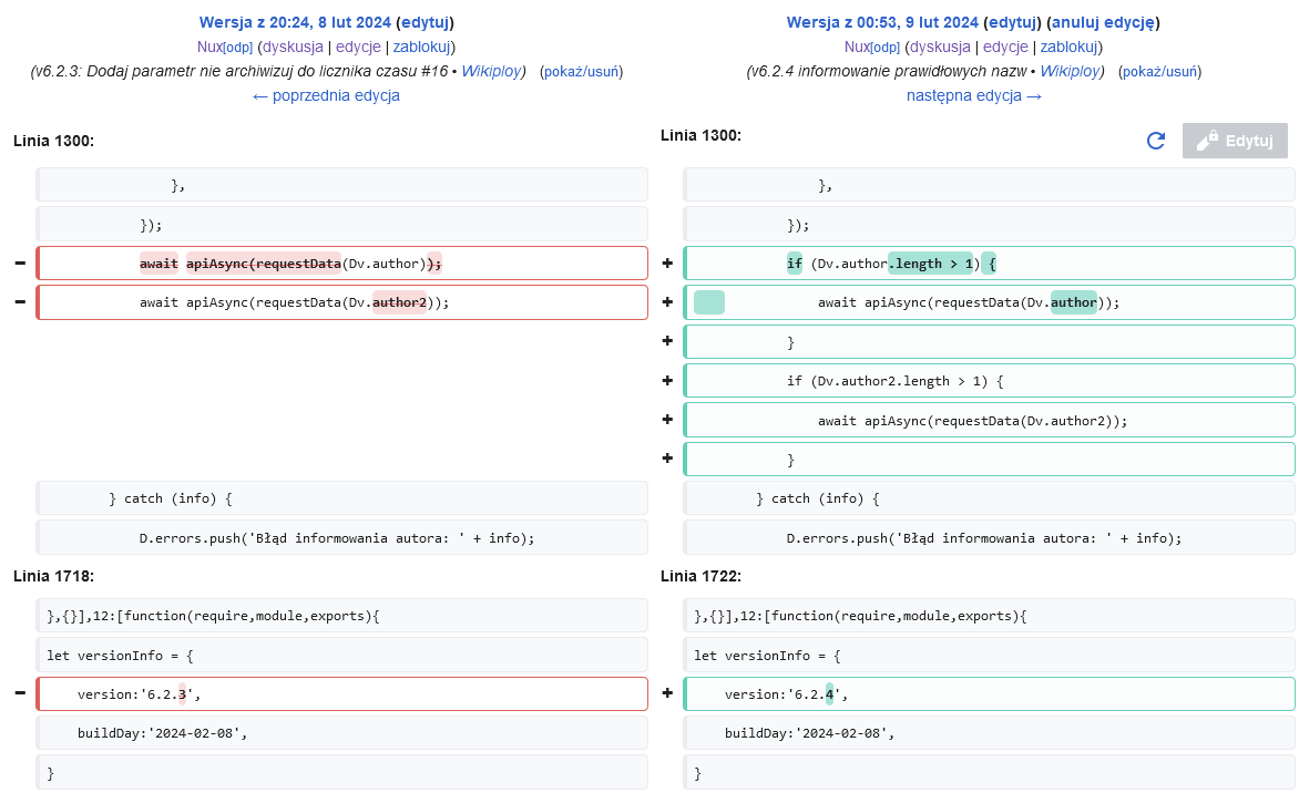
MobileFrontend uses a different diff style than core, reverting it to the pre-2012 colours. The MediaWiki core 2012 scheme was decided upon in T13374.

Can we please clarify once and for all which is the preferred style and standardise on it everywhere, including RSS feeds.

Proposal

Use desktop styles on mobile site.

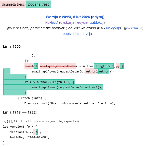
del {
background: #ffe49c;
}
del::before { 
content: "-";
background-color: #fff;
font-weight: bold;
padding: 0 0.25em;
border-left: solid 1px #ffe49c;
}
ins {
background: #a3d3ff;
}
ins::before {
    content: "+";
    background-color: #fff;
    font-weight: bold;
    padding: 0 0.25em;
    border-left: solid 1px #a3d3ff;
}

Accessibility notes

  1. Let's not rely only on color
  2. Avoid red/green due to most prevalent color blindness

Event Timeline

There are a very large number of changes, so older changes are hidden. Show Older Changes
This comment was removed by TheDJ.

Besides the colors, I just wish that we had never added those absolutely hideous-looking, space-wasting, rounded boxes around each single line of text in the diffs. Can we take this opportunity to do away with them?

If we are talking about ‘cultural’ considerations, one point that needs to be made is that it seems good that both additions and removals are marked with neutral and distinct colours that do not read as ‘X is bad, Y is good’. This is why so many different open source communities go away from the standard green-red colour scheme, to show that the additions and removals should not be treated as a win-lose situation. In that area, Wikimedia community probably did better by removing the old diff styling.

If we are talking about colour blindness issues, then it should be, as TheDJ pointed out, decided on whether inline diffs are legible and distinct to colour blind users. If they are not, then it should’ve been brought to standard, already decided colour scheme that is used on desktop. I, personally, don’t have colour blindness of any kind as far as I am aware, but I’ve tried to use diff colours from the mobile version on desktop some time ago (thought they looked ‘better’ at first glance) and after some time I’ve removed it because the diffs become really unreadable with very bright styling that mobile colours have.

[...] (It is the only working filter I could find, most online filters seem to have broken lately). [...]

Sidenote that I've updated the list of tools at w:WP:Color. Specific highlights are https://www.toptal.com/designers/colorfilter for webpage analysis or http://www.color-blindness.com/coblis-color-blindness-simulator/ for file analysis. Also these 2 browser-extensions: Colorblinding (chrome) NoCoffee (chrome) NoCoffee (firefox).

If we are talking about colour blindness issues, then it should be, as TheDJ pointed out, decided on whether inline diffs are legible and distinct to colour blind users.

Yes, all the existing official variations are accessible to people with almost all forms of color blindness. (with the very edge-case exception of people with achromatopsia, but that's one of the rarer forms and is generally accompanied by other severe vision impairments). The only slightly concerning color selection at the moment are the navpopups gadget diff colors.

If we are talking about ‘cultural’ considerations [...]

As mentioned above, yellow/blue can be unintuitive for inline diffs. E.g. this diff, when seen with WikEdDiff inline viewer, it is unclear whether the link is being added or removed.

image.png (461×757 px, 82 KB)

However, inline diffs are better at displaying other things. E.g. paragraph breaks.

image.png (907×1 px, 224 KB)


AFAICT, this task's actual goal is to decide on:
(1) which colors to use for the 2-column and the 1-column (inline) diffs, and
(2) whether they need to be the same colors as each other, and
(3) whether they should be any of the existing color variations.

To which my personal opinion/answers are:
(1) unclear,
(2) not necessarily, and
(3) possibly. :D
[As with much of life, if the answer seems simple/obvious, then we're probably not looking closely enough or have an ulterior motive!]

However, I lean towards:
(1) WikEdDiff's particular shades of yellow/blue for 2-column diffs, and a lighter variant of the red/green for 1-column diffs,
(2) no, and
(3) maybe, but we need a thorough overview of the existing variants first.
All of which is complicated by the fact that every diff-color variant is attached to a different diff-parser or visualization method, which completely influences the feedback anyone will give.
E.g. (clockwise) WikEdDiff, vector, navpopups, mobile (and there are more!):

image.png (606×1 px, 220 KB)

I imagine we will continue trying new things (such as the use of strikethrough which navpopups has done for years) and user-testing those variations and doing further external research, for at least a few more years.
I do hope we tweak the mobile diff colors to be slightly more subtle in the meantime, but I don't think they need to be consistent immediately. Ditto (in reverse) for navpopups. But none of it is urgently worth arguing over. HTH!

Yes, all the existing official variations are accessible to people with almost all forms of color blindness. (with the very edge-case exception of people with achromatopsia, but that's one of the rarer forms and is generally accompanied by other severe vision impairments). The only slightly concerning color selection at the moment are the navpopups gadget diff colors.

Accessible as in ‘pass WCAG 2.0’ or ‘look distinct and intelligble’? I’ve tested a diff page with Colour Filter and at least with deuteranopia the colours are awfully similar to be distinct enough. They are distinct in desktop diffs, however.

As mentioned above, yellow/blue can be unintuitive for inline diffs. E.g. this diff, when seen with WikEdDiff inline viewer, it is unclear whether the link is being added or removed.

That’s more of a downside of reliance on colour, not of colours themselves. This is a major accessibility problem − but it should be solved by having other visual signifiers in inline diffs, such as icons (+/−), a legend somewhere on the page or text decoration (strikethrough for deleted fragments, for example). The problem with them won’t be solved with just changing it back to green-red (or blue-orange, in the other direction).

Good points overall.

Jdlrobson renamed this task from Identify the best diff style and use it everywhere to Identify the best diff style (mobile or desktop) and use it on both mobile and desktop.Jul 29 2021, 12:09 AM
Jdlrobson added a subscriber: alexhollender_WMF.

I checked in with @alexhollender around this and he suggested the editing team would n eed to be involved in this change.

Seems there are too many considerations for us to do this right now as part of tech-debt.

Change 892990 had a related patch set uploaded (by Jforrester; author: Jforrester):

[mediawiki/extensions/MobileFrontend@master] Mobile diff: Change colours to the same accessible ones as desktop

https://gerrit.wikimedia.org/r/892990

Note from diff coordination meeting: With additional visual markers like +/- diffs don’t necessarily need to have strict contrast compliance on diffing colors!

…if those are applied consistently in inline settings as well, yes

Hi. I was forwarded here from another task :). I did a colour change for myself as I had problems remembering on mobile which colour is which. Changing to red-green helped with that.

Note that aside from colours I'm also using a strike-through line.

two columnsinline
obraz.png (716×1 px, 58 KB)
obraz.png (576×581 px, 32 KB)

This is the CSS that achieves above:

/**
	Two columns.
*/
.diff-addedline
{
	border-color: rgba(0,175,137,0.6) !important;
	background-color: rgba(0,175,137,0.01) !important;
	.diffchange
	{
		background: color-mix(in srgb, rgba(0,175,137) 35%, white);
	}
}
.diff-deletedline
{
	border-color: rgba(209,29,19,0.7) !important;
	background-color: rgba(209,29,19,0.005) !important;
	.diffchange
	{
		background: color-mix(in srgb, rgba(209,29,19) 15%, white);
		text-decoration: rgba(200,0,0,0.4) line-through;
	}
}
/**
	Inline (aka single column).
*/
:is(.mw-diff-inline-deleted, .mw-diff-inline-changed, .mw-diff-inline-moved) del
{
	background: color-mix(in srgb, rgba(209,29,19) 15%, white);
	text-decoration: rgba(200,0,0,0.4) line-through;
}
:is(.mw-diff-inline-added, .mw-diff-inline-changed, .mw-diff-inline-moved) ins
{
	background: color-mix(in srgb, rgba(0,175,137) 50%, white);
	outline: 1px solid rgba(0,175,137,0.6);
	outline-offset: -2px;
}
.mw-diff-table-prefix .mw-diff-inline-legend .mw-diff-inline-legend-ins
{
	background: color-mix(in srgb, rgba(0,175,137) 50%, white);
}
.mw-diff-table-prefix .mw-diff-inline-legend .mw-diff-inline-legend-del
{
	background: color-mix(in srgb, rgba(209,29,19) 15%, white);
	text-decoration: rgba(200,0,0,0.4) line-through;
}

Note that color-mix can be done in Sass/Less to get better browser support.

Jdlrobson claimed this task.

All users should be getting a consistent color for diffs now (unless they follow a URL to Special:MobileDiff). The MobileDiff will redirect to the new diff page once T358293 is complete.

@Nux I would recommend creating a new ticket for reconsidering the colors across the platform or make this color configurable (generally I don't think it's a good idea to repurpose tickets from their original goal which here was consistency).