Page MenuHomePhabricator

Show richer info on Flow topics at the Table of Contents
Open, MediumPublic

Description

The table of contents provides an overview of the topics in a Flow board. Users may be interested in acting on some of them based on a criteria (e.g., topics I have not read yet). If we can surface relevant information, relevant topics can be identified at first sight. This also complements the filtering system (T90471) since it helps to identify which filter will be useful to view only similar topics to a given one.

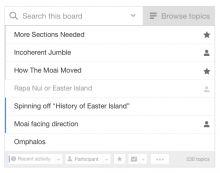
Browsing.png (455×577 px, 36 KB)

Information is presented in three areas:

  • Activity is presented as a border on the left side.
    • Topics with recent activity will show a blue line on the left side.
    • Topics the user has explicitly visited (clicked or opened the URL before as in visited links) will show a grey line on the left side.
  • Closed/resolved topics are shown with a light text color.
  • The connection with the user is represented on the right side using icons:
    • Topics that the user starred will show a star.
    • Topics the user has participate will show a user icon. If the user participated and starred a topic, the user icon will be shown. Participation takes precedence visually to starring since that will allow the pattern of starring topics to participate in them later (users can later visit all topics with a star to reply to them, and the star will become a user icon).
Event Timeline

When you create subtasks, be sure to remove user-notice, notice, Roadmap.

Some good points at https://www.mediawiki.org/wiki/Topic:Sfjyqa42qruwvlbb ("No indication of topic length in the ToC")

Diego Moya wrote:

The new Table of Contents, combined with the lack of page structure brought by infinite scrolling, cause a loss of intuition about the relative length of discussions. Old talk pages give an spatial indication of the size of topics (using the number of sub-sections and the amount of scrolling in the scrollbar) which is now lost, making it hard to find the most lively topics - everything looks the same in the new ToC.
You could add some secondary notation to convey similar information. The most obvious is adding the number of replies to the right of the topic title at the ToC. There could also be some visual cues, giving more weight to longer threads - for example, adding color to topics with >5 comments, and bold typeface to topics with >20 comments or several indentation levels.

He7d3r wrote:

Or... the menu which currently shows "Recently active topics" could have more options, one of them to sort the topics by the number of replies, and other by the sum of the length (bytes) of the replies.

Diego Moya wrote:

In fact, I find it quite difficult to find the topic "New indentation and threading model" in the ToC every time i want to revisit it, despite I know it's one of the longest threads.
Topics with the most activity should be more salient; the current list of topics in the ToC makes all topics look exactly the same.