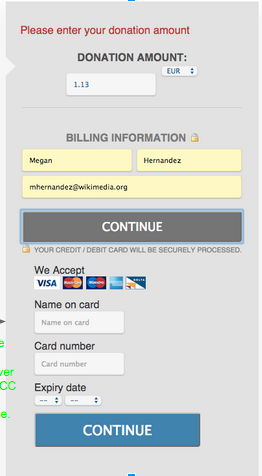
When a donor enters our flow without having a currency & amount passed in the URL, the dropdown is all weird and tiny (same as the State one on the US GC form). Make it look nicer (align & same height).
| • atgo | |
| Sep 21 2015, 10:06 PM |
| F2624625: Screen Shot 2015-09-21 at 2.44.52 PM.png | |
| Sep 21 2015, 10:06 PM |
When a donor enters our flow without having a currency & amount passed in the URL, the dropdown is all weird and tiny (same as the State one on the US GC form). Make it look nicer (align & same height).
| Subject | Repo | Branch | Lines +/- | |
|---|---|---|---|---|
| Align amount and currency inputs | mediawiki/extensions/DonationInterface | master | +8 -1 |
Change 284596 had a related patch set uploaded (by Ejegg):
Align amount and currency inputs
Alignment is good when both are dropdowns, but still off when currency is a regular label