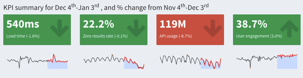
We currently have the KPI summary module:

The idea is to add sparklines so in addition to the numbers, we have a quick glimpse at long-term trend(s) with the option of seeing the full detailed time series on those KPIs respective modules. There is an R package that adds sparklines htmlwidget that we can try adding into the table (here's an example of how I've added HTML+JS to make links in the monthly metrics table) and underneath the value boxes.
For the KPI Summary Page, we are going to put sparklines under the four infobox. When user selecting "All available data", we will show the sparklines for all available data; for all other options, we will show the sparklines for the last 90 days.
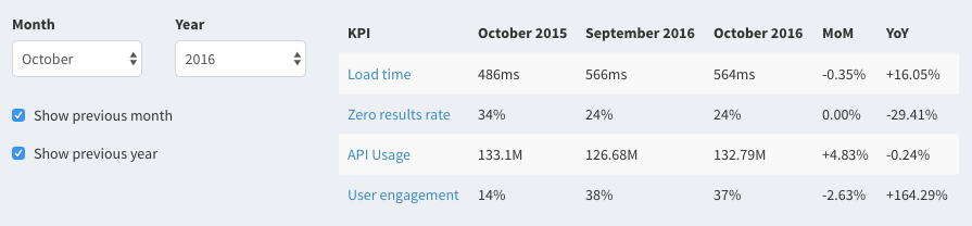
For the Monthly Metrics Page, we will show sparklines of monthly medians.
P.S. Here's an example of adding sparklines to a DT table in a Shiny app.