There are currently a few issues with using the Timeless skin on small screens and touchscreens. I assume it's a desktop skin, but there's no harm in making it usable on phones as well.
- Swiping right to exit the menus/sidebars is fascinating but unintuitive since this is not very obvious. A touch/click action outside the menu should allow the menus to disappear.
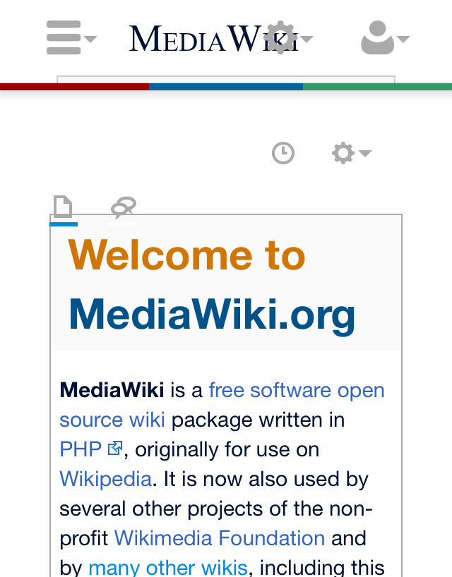
- One button overlaps with the MediaWiki wordmark at the top, and the namespace/namespace talk buttons (top left) are moved downwards on the Main Page even though there's enough space [1]. Curiously this does not happen on Extension:Scribunto/Lua reference manual [2], or maybe all six buttons were moved downwards.
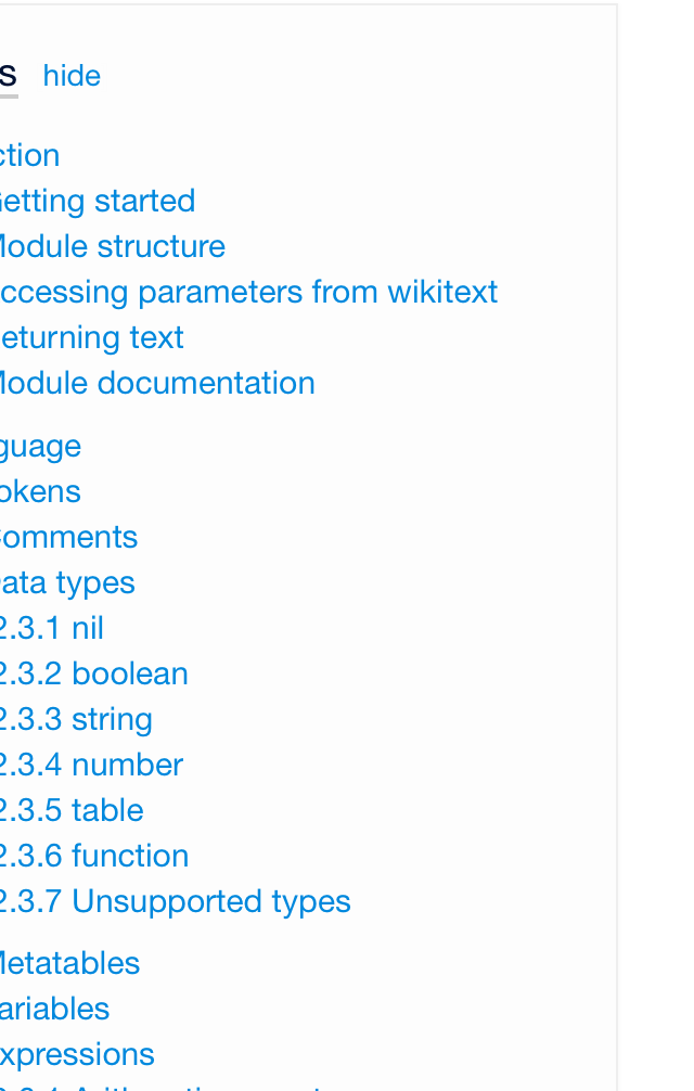
- The TOC does not wrap properly and some text is hidden on on the left (it is impossible to scroll) [3].
- Conversely, tables are hidden to the right, forcing the page to be wider [4]. I think they should have overflow hidden and scroll without affecting other elements, but maybe this is just my personal aesthetic preference.
That's actually about it, except for issues relevant on desktop as well (e.g. font choices etc.). Nice work, @Isarra.