Page MenuHomePhabricator

Grafana has confusing or wrong scale for "scores errored" graph
Closed, ResolvedPublic

Description

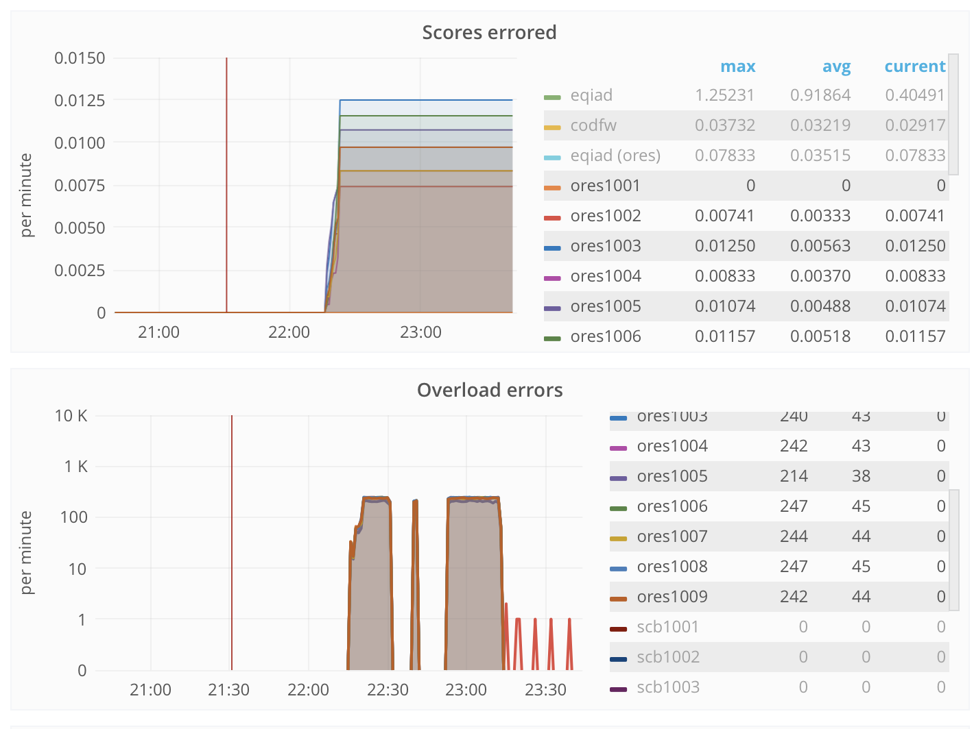
"Overload errors" are a steady 240 errors/minute on each server, but the "scores errored" graph shows something other than count. Servers are oddly showing different "scores errored" for this interval, when their load was well balanced. The Y values doesn't follow overload errors during windows between tests. What is this graph showing on the Y axis?

Observed during stress testing.

Screen Shot 2017-09-11 at 4.43.20 PM.png (1×1 px, 226 KB)

Event Timeline

I believe that overload errors don't count as "errored scores" because the score job hasn't started yet. Does this make the data make sense. Maybe we should rename the variable or just add the two together for "scores errored".

@Halfak I see what you mean. The moving window was my biggest gripe, but we can reopen if the the graphs are hard to interpret the next time we need them.