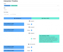
- Vertical timeline, user 1 edits on left, user 2 edits on right
- Display information and links in appropriate places
- There is no mockup — use best judgement calls
- Make adjustments based on first round of team feedback
Description
Description
| Status | Subtype | Assigned | Task | ||
|---|---|---|---|---|---|
| Resolved | • TBolliger | T166807 Epic ⚡️ : Interaction Timeline | |||
| Resolved | dbarratt | T178640 Interaction Timeline MVP | |||
| Resolved | dbarratt | T178716 Interaction Timeline MVP: Style the vertical Timeline layout |
Event Timeline
Comment Actions
These are just wireframes to indicate placement of elements relative to each other — they are not visual mockups, so none of the colors/sizes/spacing is finalized.
Here's some general guidance that you can use:
- Minimize whitespace but not at the cost of usability.
- Responsive is best, but optimize for a standard laptop display. It should also function on a large desktop monitor. Ignore mobile for now.
- When in doubt, use/defer to OOjs UI.
I trust your best judgement, but if you'd like specific feedback/direction we're all available to help.
Comment Actions
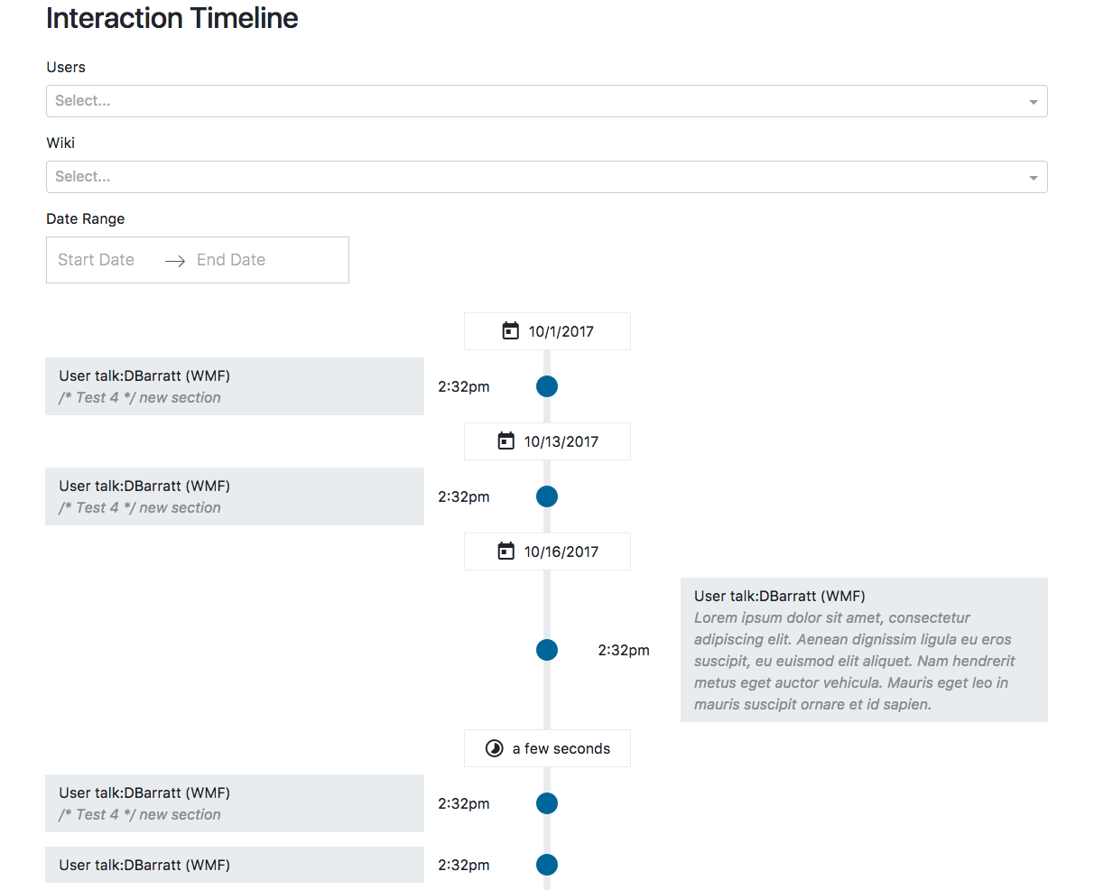
@CSindersWMF I've made the line thiner (see screenshot). Anything else (other than the missing usernames at the top as @TBolliger mentioned)?

Comment Actions
Looks good. The only thing missing is the link to the diff. Since we won't have in-line diffs for MVP the link should just say 'diff' and not 'expand diff'.
I'm also not understanding the "a few seconds ago" box — in which case would that appear?
Comment Actions
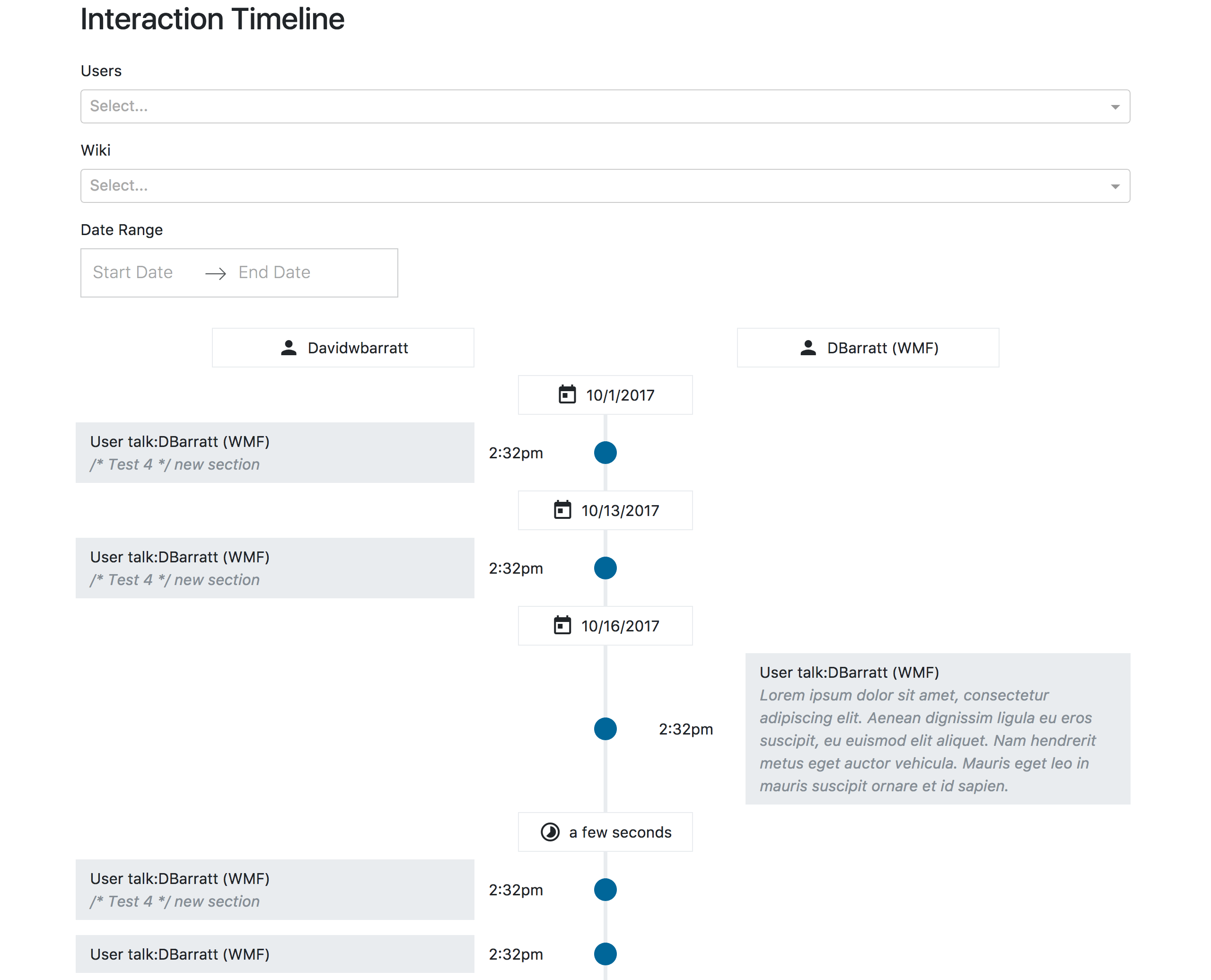
I think the whole card will link since that's the only link on the card. Here's an earlier version with hover states:
https://tools.wmflabs.org/interaction-timeline/
(I'll add the real links when T178715 is complete).
I'm also not understanding the "a few seconds ago" box — in which case would that appear?
umm, in the wireframe it says "1 hour between interactions" I simplified that to just be the time between the interactions (i.e. "one hour") since I think it will be obvious that it's the time between the revisions. So it appears whenever it switches from one user to the next within the same day.
Comment Actions
The date indicators and the "time between" arithmetic are two different types of information, so we will probably want to display them differently. My hypothesis is that calendar date is only important for locating a specific event on the timeline, while the "time between" is used to understand the sequence of edits relative to each other. It looks like you're already visually differentiating this with different icons (calendar vs. stopwatch) which is good for MVP.
It looks like some of the requirements got lost in the parent/child task splitting 😕 . T178640: Interaction Timeline MVP lists the requirements for each edit card:
- Each 'edit' should be in a box, containing:
- Page name (linked to the page)
- Full edit summary
- Link to the diff (opens in new tab)
- Timestamp (linked to the edit revision)
You've pulled the timestamp out of the box to match the wireframe — 👍 — but I think the rest still stands. I think the link to the diff is more important than a link to the live version of the article, but I do not think it is intuitive for the whole card to link to the diff. But — we can figure this out in testing. Let's ship the MVP with this current functionality and see what people think!
So — it looks like the only thing missing is to link the timestamp to the edit revision.
Overall, it's looks great, David! Really good work. I'm excited to see it all come together with live data.
Comment Actions
I was thinking the timestamp would link to that position on the timeline i.e. "Anchored links to specific diffs" [T179607].
So the card will link to the diff on the wiki ex:
https://en.wikipedia.org/w/index.php?diff=prev&oldid=804936899
(in the future, this would just expand the diff rather than linking to it)
and the timestamp would be something like:
https://tools.wmflabs.org/interaction-timeline/?id=804936899
and have the diff expanded for you.
Or does that not make sense?
Comment Actions
I was thinking the blue dot on the vertical line would create the anchored link — both are equally valid ideas.
I suggested the timestamp to link to the revision, which is how it works on page history and user contributions.
Comment Actions
Oh, I think I'm confussing the revision and the diff. Uhh.. ok, that's fine. I wasn't thinking a link to the revision was necessary, but I guess that makes sense. I wasn't thinking the dot was a link, but it can be.
Comment Actions
Yeah, there are a few types of similar links, each with their own uses:
- Diffs (example) show the before-and-after difference between two revisions. (Note that the revisions do not need to be immediately successive, it is possible to see a diff that spans multiple revisions.) Diffs are used to evaluate the exact contents of the edit that were made by a user: what was added, what was removed, what was modified.
- Revisions (example) are a snapshot of the page. There is a revision for every edit. These are used to evaluate the document as a whole as it existed at a certain point in time, not what was added/removed/modified. Users will sometimes share permalinks of revisions in case something is archived or updated.
- History (example) or 'Revision history' is a log page of every revision. Users can generate a diff by selecting two radio buttons and clicking the 'compare selected revisions' button, or using the 'cur' or 'prev' links. Users can see the individual revision by clicking the timestamp for the log entries. This is used to evaluate how an article (or talk page) has changed over time. A primary use case is determining when a bad edit was made so it can be corrected.
In terms of importance for the Timeline, I would say diffs are far-and-away the most important, followed by a link to the revision, followed by a link to the live article, followed by a link to the page history. When we build in-line diffs, we can probably tuck the revision/history/page links into the diff container. They'd be hidden under a click, but it would keep the UI streamlined.
Comment Actions
@TBolliger AH! well given all that... I think the card itself should initially be a link to the diff, then later it will change to expand/collapse the diff and include any other links within that expansion... and I think the timestamp should be a permalink within the same application (i.e. within the Interaction Timeline). But if this is confusing to users then let's do something else! :)
Comment Actions
Let's go with this, and we can change based on feedback.
But — anchored links aren't a requirement for MVP, so don't worry about plumbing that in yet. The prioritized list of next features can be seen at T179607.
Comment Actions
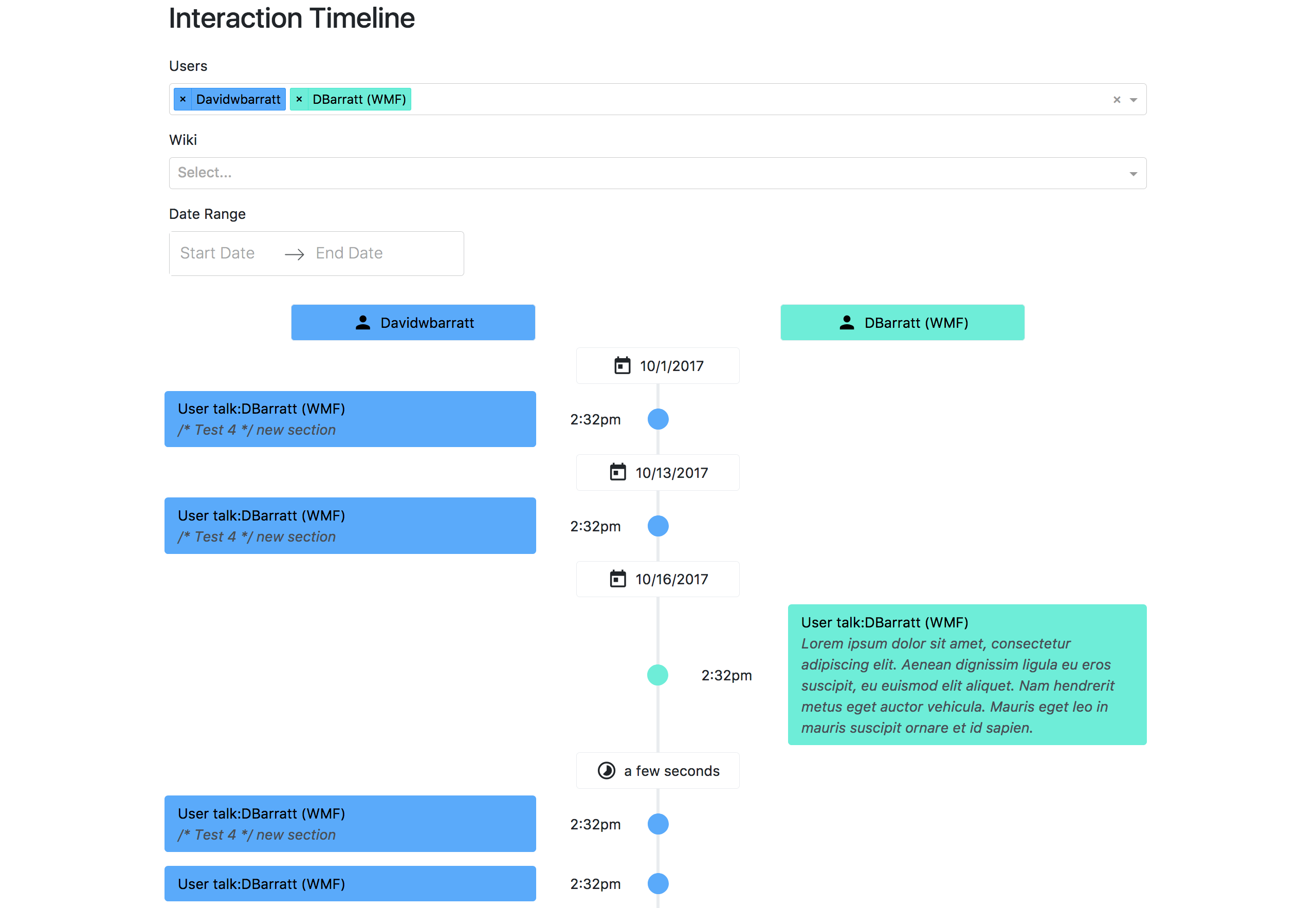
In my opinion, these colors feel too strong, mostly because the color coding is somewhat redundant to the left/right column layout. Anyone else have thoughts?
Comment Actions
I've been saying it's redundant all along. :)
Here's an updated version with things better lined up:

Comment Actions
Yes, it's redundant but it's also a fairly common design pattern: most modern messaging apps/services use both alignment and color to situate the user. (To be fair, in most chat programs the messages overlap and both take up ~80% of the width, while ours do not overlap and each side takes up 50%.) In my opinion the color should be a subtle reminder, not the sole indicator of this information.
Comment Actions
NO we are absolutely not doing those colors @TBolliger! things have to be accessible AND usable.