Page MenuHomePhabricator

Fix large font size of items in hierarchy filters on Special:Drilldown page on mobile screen
Closed, ResolvedPublic

Description

How to recreate the issue :

  • Install the Cargo and Page Forms extension.
  • Use Special:CreateClass page to create a new template and a new form, ensure that you create at least one field with hierarchy checked. (Fillout all the fields on Special:CreateClass - including Category)
  • Now create a page on Special:Forms using the Form name you just providied on Special:CreateClass.
  • Now go to your template page by visiting Special:Templates and then the template you just created. On the template page click on "More" and then select Create data.
  • Now visit Special:Drilldown and select the required template. Here you will find something like this :

WhatsApp_Image_2017-12-30_at_1.57.01_AM.jpeg (1×720 px, 146 KB)

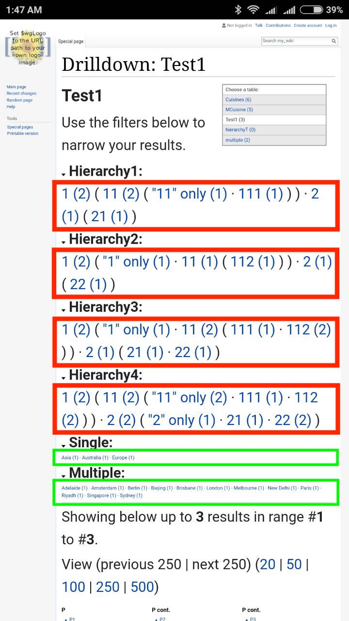
The filter line (link text) in the green box is what it is normally. But the filter line in case of hierarchy (green box), is currently larger in text size.

Event Timeline

This comment was removed by Aklapper.

Argh. I am very sorry for my previous comment! Imported as https://codein.withgoogle.com/tasks/5917123056500736/ , I am going to add more info ("see Phab task' is not sufficient as we don't want students to have to click for every single task to make them find out if it's within their skill set)

@Aklapper Thanks for adding information to the task. I will take care of this while adding future tasks.

I thought this is a common problem (or design?) for all Mediawiki page on mobile phones? Viewing desktop version of Wikipedia on a mobile phone also shows bigger article content font size (see image). I'm not sure if this page should be treated separately?

Screen Shot 2018-01-12 at 9.48.09 PM.png (1×620 px, 213 KB)

@eflyjason You are somewhat right, or either I also believe the same. But the case with the specified page is a little different.
Check out the updated screenshot in the task description. Compare text size in the red and green box

@Yaron_Koren What are your views about this?

Hi - this is a tough one. I think the default mobile display of the Vector skin is strange in the way it makes certain text very small, almost unreadable. So my inclination is to make all the Special:Drilldown text the larger of the two fonts. On the other hand, the MediaWiki developers (presumably) intended it to look that way, so maybe there's some thinking behind the font sizes.

I guess, if there's an option, I'd go with the bigger font size for all the drilldown text. So perhaps the hierarchy values are the only ones being displayed correctly. :) If you can make the other values look like those, without affecting the display in the regular desktop view, that would be great.

I can't recreate the problem:

Screen Shot 2018-01-13 at 12.43.56 PM.png (1×784 px, 141 KB)

I'm creating form like this:

Screen Shot 2018-01-13 at 12.45.50 PM.png (1×1 px, 192 KB)

Is there anything specific we have to do to recreate the problem?

As you have shown the types of the fields, it looks fine. I don't know why you cannot recreate the problem. Maybe, you can try adding more pages.
There is nothing specific to be done (that I know of).

Untitledgagadfdfs.gif (757×1 px, 666 KB)
(click to view gif)

Another observation. It seems that it's some sort of random bug?

Yaron_Koren claimed this task.

I just tried this, and the font sizes look fine now; I'm guessing this was fixed at some point.