Page MenuHomePhabricator

Create map showing progress of datasets added
Closed, ResolvedPublic

Description

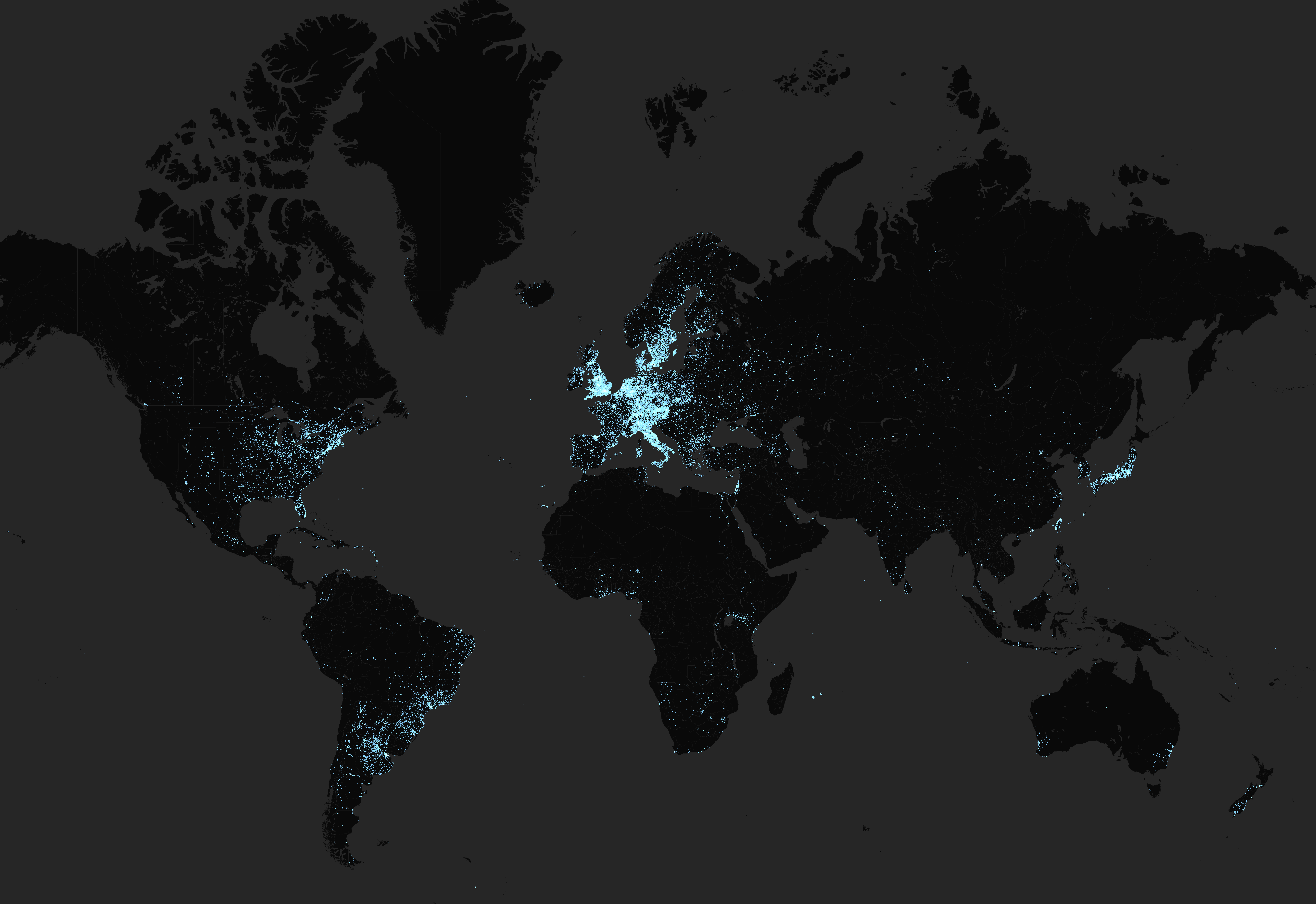
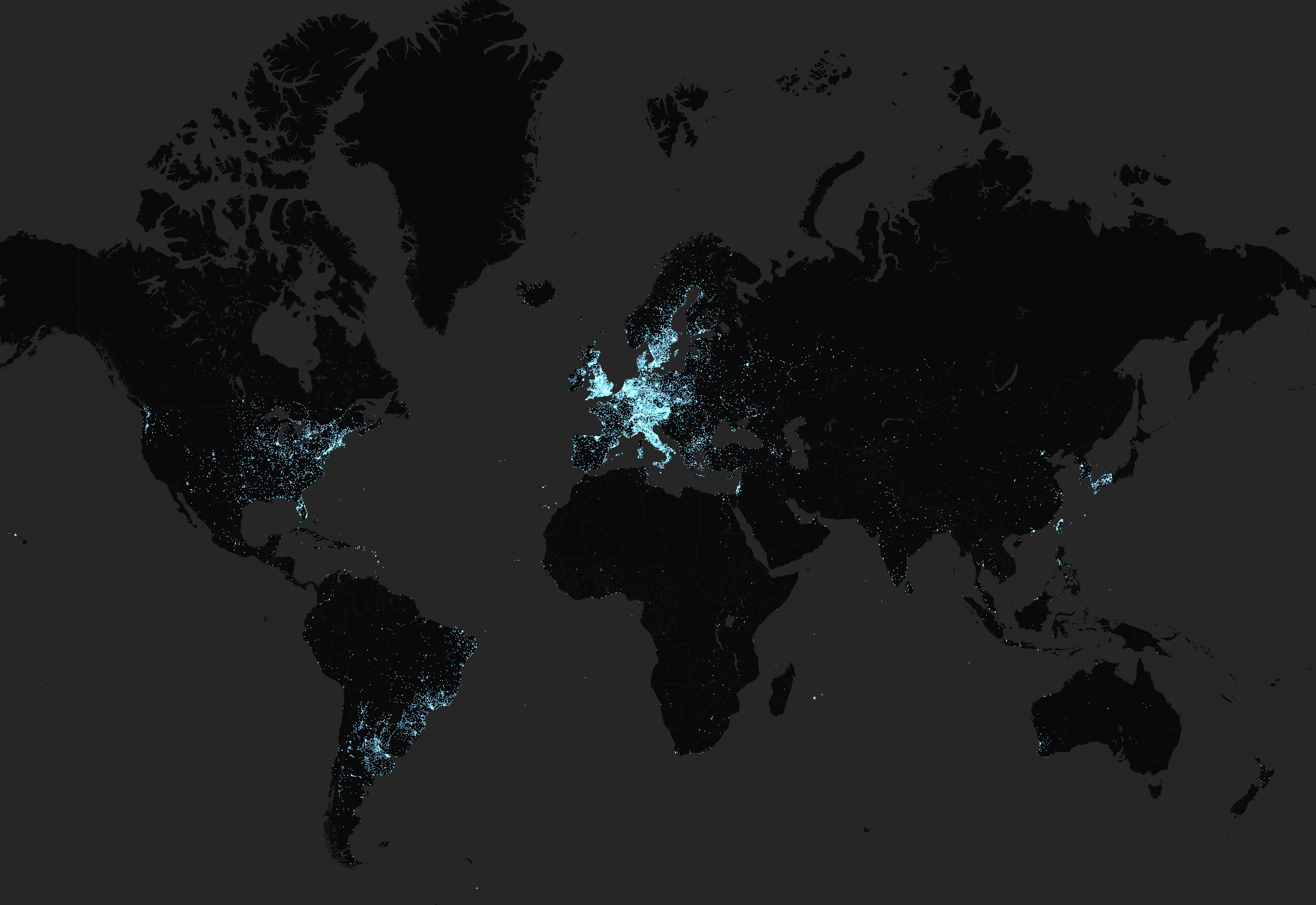
Find a way to show the progress of of data uploads of FindingGLAMs

I found a way to create two maps, but not a way to to make the new dots a different colour

@Alicia_Fagerving_WMSE If I gave you two spreadsheets (results of the same Wikidata query on different dates) is there an excel formula which could tag the new items so I could create different colours on a map?

screenshot-mrjohncummings.carto.com-2019.10.10-18_51_33.png (5×8 px, 3 MB)

screenshot-mrjohncummings.carto.com-2019.10.10-19_23_18.png (5×8 px, 3 MB)

Here is the category on Commons
https://commons.wikimedia.org/wiki/Category:FindingGLAMs_visualizations

Event Timeline

@Mrjohncummings Mail me the files and I'll look into it – is there a specific way the result should be formatted? Would a new file with *only* the items present in the newer dataset work?

@Mrjohncummings And speaking of, I just uploaded a couple thousand US libraries so a new dump should be made today :)

The map includes my US libraries, so I'm happy. Note that the way we did it – with a huge clunky spreadsheet – is probably not sustainable in the long run.

Uploaded it to Commons: https://commons.wikimedia.org/wiki/File:Map_of_GLAM_institutions_on_Wikidata_%E2%80%93_growth_from_April_to_October_2019.png

@Mrjohncummings – could you add a link to the Carto map to the file description above?

Can you also create separate ones for Africa, Europe and North America?

Made a separate category to keep track of those since there's more and more of them :)

@Mrjohncummings would it be easy to re-make with another color scheme? https://commons.wikimedia.org/wiki/File:Map_of_GLAMs_on_Wikidata_with_and_without_a_Wikipedia_article_in_any_language.png

I believe red and green are by far the most problematic colors to use together, accessibility wise.