(splitting this into two separate tasks)
Material for Mkdocs does a really nice rendering of its default/standard horizontal nav menu into a left nav tray when the browser window size can no longer accommodate the full width of all the menu items horizontally:
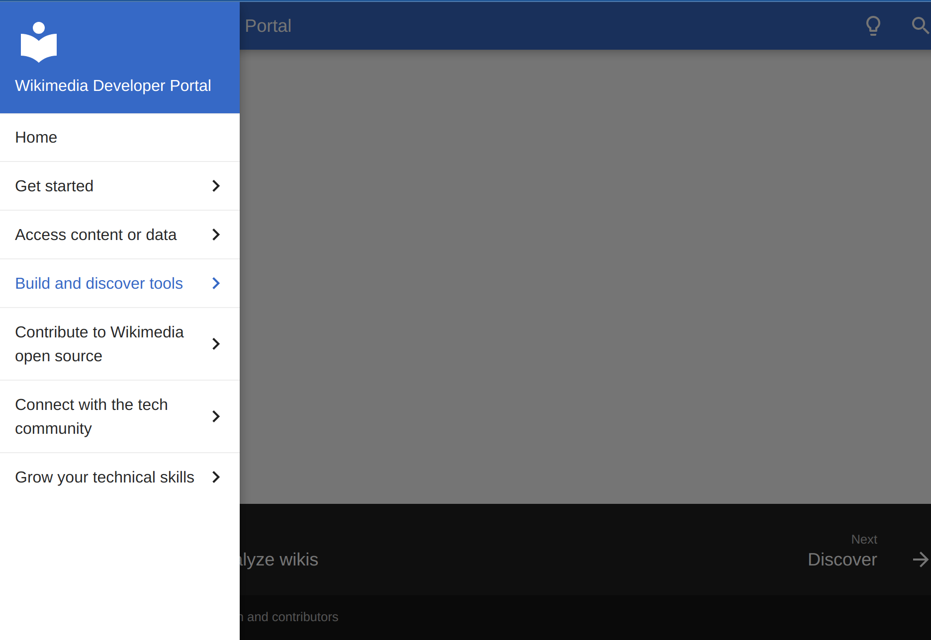
We should investigate the possibility of having this type of left navigation menu displayed on *all* browsers (likely collapsed into a tray on mobile),
This would be a nicer UI for the dev portal because it would:
- Ensure more consistent UX/UI across languages: the Material theme seems to be rather smart about switching from the horizontal menu to the vertical one when the nav labels overflowing the horizontal space. This (nice) behavior will, however, result in the portal rendering differently depending on the language in which you're viewing it. In the screenshot below, for example, the horizontal nav can accommodate the current section labels in English, but if they were being rendered in German, the increased word length would likely result in the horizontal nav automatically being rendered as a left vertical nav instead. It would be nice if you didn't have a different navigation experience based on the language you're using.
- Eliminate the need to be overly terse in how we name site sections due to the constraints of displaying section labels horizontally. Labels that look quite nice in a vertical nav look terrible and hard to read when rendered horizontally:
