Feature summary :
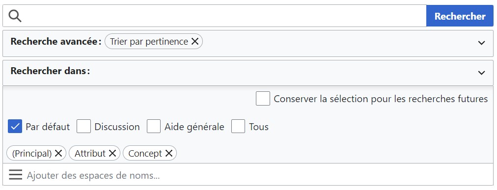
In the "Search in" part of the Special:Search page, there is an option that is not well positionned.
This is a lack of affordance, and depending on the language you are using, this is even worse (see the linked image in French).
There is a quick thing you could change in the CSS to make it better to understand, especially for the user's first use.
Benefits (why should this be implemented?):
Better understanding, easier to use.
Base :
.mw-advancedSearch-namespace-selection-header > .oo-ui-labelElement {
   float: right;
   margin: 0 0.5em 0.4em 0;
}
Proposition :
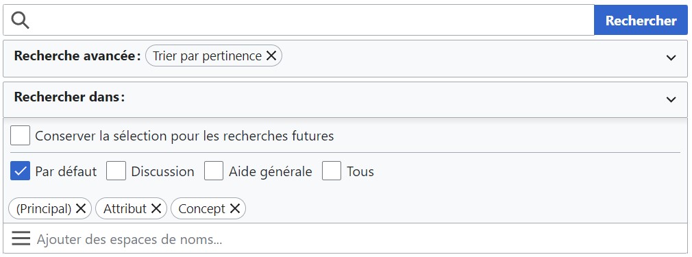
.mw-advancedSearch-namespace-selection-header > .oo-ui-labelElement {
-    float: right;
-    margin: 0 0.5em 0.4em 0;
+    margin: 0 0.5em 0.1em 0.5rem;
+    border-bottom: 1px solid #a2a9b1;
}