Steps to replicate the issue (include links if applicable):
- Enable Vector 2022.
- Customize your User menu to add, for example, the "Add a clock to the personal toolbar" gadget in Preferences (on en.WP, at least)
- Go to a page like https://en.wikipedia.org/wiki/Caribbean_Community
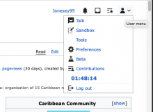
- Pop open the User menu (note that the tooltip calls this "User menu"). Observe that the UTC clock gadget is visible.
- Scroll down the page until the "pinned" User menu is rendered.
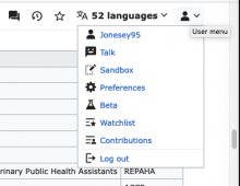
- Pop open the User menu (note that the tooltip calls this "User menu"). Observe that the UTC clock gadget is no longer visible.
What happens?:
The "User menu" is rendered differently when the reader is scrolled to the top of the page versus when it is part of the "pinned" banner at the top of a scrolled page, even though the icon and tooltip are identical, a UI indication that they should contain identical content.
Watchlist and a link to my User page also appear in the User menu within the pinned banner, but not in the initial rendered version at the top of the page.
What should have happened instead?:
The "User menu" should render identically whether the reader is at the top of the screen or scrolled down and viewing the User menu from the pinned banner.
Software version (skip for WMF-hosted wikis like Wikipedia):
Other information (browser name/version, screenshots, etc.):
Firefox 107 for Mac OS.
Top of page, initial version:
Scrolled down, pinned version:
One other note: I have inserted a link to a "Tools" page in my User space using code in https://en.wikipedia.org/wiki/User:Jonesey95/vector.js. I am glad that the link still appears in Vector 2022, but that link also does not appear in the "pinned" User menu. The menus should be identical.
I looked through the list of open Desktop Improvement bugs and did not see this one. My apologies if it is a duplicate.

