Page MenuHomePhabricator

Change the order of buttons in the new user menu
Closed, DuplicatePublicFeature

Description

Steps to reproduce Go to fr.wikipedia.org, login and enable New vector.
Description Hi, the new user menu is good but I would like change the ordrer of buttons.

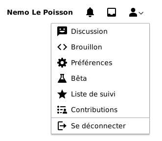
Actualy, the ordre is inspired by Old vector with horizontals links :
Talk - Draft - Preference - Beta - Watchlist - Contributions - Log out

But the new user menu is vertical so you have to make a big movement of the mouse to click in Watchlist or Contributions :

image.png (288×331 px, 15 KB)

Proposal Create a new order, Preference and Beta are less used :

Talk
Draft
Watchlist
Contibutions
Preference
Beta
Logout

Use case(s) Make the Watchliste button and the Contributions button easier to access (alternative to T288638)

Thanks,

Event Timeline

ovasileva subscribed.

@NemoLePoisson - We are currently experimenting with potentially moving the watchlist link out of the user menu in T289209: [Design Spike] Explore adding watchlist link in top header. Based on the results of that analysis, we might re-consider rearranging the items within the menu.

It appears that the Watchlist has been moved out of the initial version of the rendered menu, but it still appears in the user menu in the pinned banner that appears when you scroll. Related: T289619 and T325124.

I agree that Preferences and Beta should be moved below the Watchlist and Contributions links in all versions of this user menu.

Changing the order, please consider also "Translation" and "Uploaded Media" as part of the list (screenshot)