Page MenuHomePhabricator

Login warning message is cut off
Closed, ResolvedPublicBUG REPORT

Assigned To
Authored By
Jdlrobson
Dec 7 2023, 5:14 PM
Referenced Files
F63353562: Screenshot 2025-07-07 at 9.21.46 AM.png
Jul 7 2025, 1:52 PM
F60324996: image.png
May 20 2025, 9:34 PM
Restricted File
Aug 27 2024, 5:00 PM
F57276978: Screenshot 2024-08-16 at 5.01.00 PM.png
Aug 27 2024, 5:00 PM
F57305788: Screenshot 2024-08-27 at 11.56.49 AM.png
Aug 27 2024, 4:25 PM
F57305765: image.png
Aug 27 2024, 4:25 PM
F57275909: IMG_9104.PNG
Aug 15 2024, 11:20 PM
F57275940: Screenshot 2024-08-16 at 00.13.09.png
Aug 15 2024, 11:20 PM

Description

Steps to replicate the issue (include links if applicable):

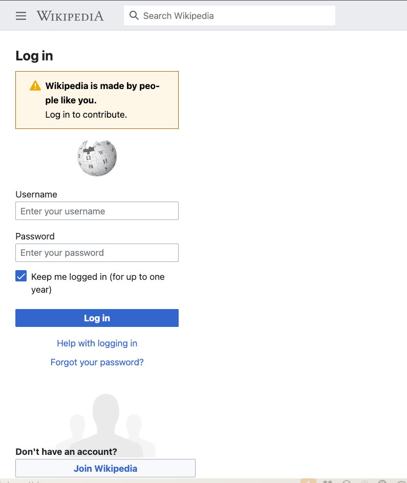
What happens?:

Screenshot 2023-12-07 at 9.13.17 AM.png (795×944 px, 90 KB)

What should have happened instead?:

  • The message should not be cut. The form appears to have a width: 290px; and this should be changed to @size-4000
  • The styling of the section "Don't have an account" and the "Log in" button have been adjusted to reflect the new change (TBC)

Software version (skip for WMF-hosted wikis like Wikipedia):

Other information (browser name/version, screenshots, etc.):

Event Timeline

I have increased the form - width to 400px,

attached the screenshot for Final output.

{F56226073}

Please point out, if I have made any mistake.
~ Thanks.

Change #1052166 had a related patch set uploaded (by Agamyasamuel; author: Agamyasamuel):

[mediawiki/core@master] Fixed: Login warning message is cut off

https://gerrit.wikimedia.org/r/1052166

Jdlrobson added a subscriber: RHo.

Hey @RHo does design have any input on how this should behave? I think the Growth team usually maintains login page so also tagging them. Let me know if that's wrong!

thanks @Jdlrobson - the style of the notice being incorrectly a warning was already flagged and being addressed in T366127: Change 'Wikipedia is made by people like you' warning to a Notice message by the Growth team. Adding @JFernandez-WMF @KStoller-WMF in case they want to merge to ensure fix can be done on the same ticket.

KStoller-WMF added subscribers: Cyndymediawiksim, Sgs.

Thanks! I think we can keep this task separate, but perhaps @Sgs or @Cyndymediawiksim can provide some help with code review / support for https://gerrit.wikimedia.org/r/1052166 since they are working on similar code at the moment as part of T366127.

Change #1054274 had a related patch set uploaded (by Jdlrobson; author: GauriGuptaa):

[mediawiki/core@master] Login warning message is cut off

https://gerrit.wikimedia.org/r/1054274

@KStoller-WMF there is a question on the patch if someone from the growth team could help guide!

@Jdlrobson I'd be happy to help on the patch review but I'm not fully understanding the issue here. Is that The message should not be cut. ? Or is Could we increase this to 400px or 500px? a design change request? The volunteer's patch is achieving both so the task is resolved in a way. Could we add context on why the message should not be cut? The problematic styles seem to live under .cdx-message__content so rather we need (1) to do some changes in Codex to add utility classes to handle word wrapping or we need (2) to overwrite them from userlogin.less.

@Jdlrobson I'd be happy to help on the patch review but I'm not fully understanding the issue here. Is that The message should not be cut. ? Or is Could we increase this to 400px or 500px? a design change request? The volunteer's patch is achieving both so the task is resolved in a way. Could we add context on why the message should not be cut?

Breaking the word doesn't seem very user friendly here given the available space and the intention. Mobile already has a limited width, and given the existing 290px width restriction was not documented it seemed like it should be re-evaluated. On mobile minimum width is typically 400px these days - so the login form is wider on mobile than it is on desktop. Is this intentional? I suspect this has also been designed for desktop where the font size was 14px but hasn't considered that mobile has a 16px font size.

It seems like it would be useful for the Growth team designer to weigh in whether this restriction is helpful and makes sense and at the very least document the intention behind it so this is at least better understood. As you point out to me it is not clear the context for why this limited width exists in the first place and why it is so small - what does 290px equate to?

The problematic styles seem to live under .cdx-message__content so rather we need (1) to do some changes in Codex to add utility classes to handle word wrapping or we need (2) to overwrite them from userlogin.less.

Overwriting them in userlogin.less would be fine. That seems to be the current behaviour for enforcing the limited width!

fwiw - these word breaks also affect other notices during the authentication process, for example the two-factor authentication step (on both mobile and desktop):

Screenshot 2024-08-15 at 04.45.58.png (1,298×1,536 px, 192 KB)
Screenshot 2024-08-15 at 04.47.20.png (1,401×981 px, 100 KB)
Screenshot 2024-08-15 at 04.48.06.png (876×1,598 px, 157 KB)
Screenshot 2024-08-15 at 04.47.44.png (1,284×911 px, 101 KB)

It seems like it would be useful for the Growth team designer to weigh in whether this restriction is helpful and makes sense and at the very least document the intention behind it so this is at least better understood. As you point out to me it is not clear the context for why this limited width exists in the first place and why it is so small - what does 290px equate to?

Tagging @JFernandez-WMF to weigh in on this.

But just so I'm clear on the impact: this seems to only be an issue when viewing the mobile version from a desktop device, correct?
When testing multiple mobile screensizes on a device simulator, I'm never seeing line-breaking hyphenation occur.

Screenshot 2024-08-15 at 9.45.40 AM.png (1,582×1,486 px, 511 KB)

But just so I'm clear on the impact: this seems to only be an issue when viewing the mobile version from a desktop device, correct?

No this also impacts the desktop skin for OAuth workflows (see @Krinkle's comment above).

When testing multiple mobile screensizes on a device simulator, I'm never seeing line-breaking hyphenation occur.

Correct. There is no minimum width on mobile resolutions, so actually on most devices this box is bigger than the desktop site! :-)

When testing multiple mobile screensizes on a device simulator, I'm never seeing line-breaking hyphenation occur.

Screenshot 2024-08-15 at 9.45.40 AM.png (1,582×1,486 px, 511 KB)

Correct. There is no minimum width on mobile resolutions, […]

While there may be no minimum width specified in CSS, mobile devices are physically not of infinite width. Their width is no different from specifying a min-width. The word-wrap: break-word; rule is there on mobile just the same.

The above screenshot wraps neatly at most screen sizes because it is an English sentence with (mostly) unbreakable words like "is", "like" and "you". As long as there is a sentence that is longer than the width (i.e. it spans two or more lines), we will see cuts.

The above example wraps over two lines, even in the above screenshot. Therefore, it will cut. Note that we don't display just one sentence in one language on one wiki. We display any of thousands of messages there, the vast majority of which (like the above) span more than one line.

  • Log in
  • Welcome
  • Create account
  • Permission error
  • 2FA
  • Error messages during account creation or log in
  • Default translation of the these in 400 languages.
  • Customization to the wording of these on 900 wikis.

The below is that same login screen in the default translation for Spanish or German (no customisation):

Screenshot 2024-08-16 at 00.10.06.png (994×858 px, 109 KB)
Screenshot 2024-08-16 at 00.09.42.png (1,057×872 px, 112 KB)

Or in English, with a customisation that adds one word in the sentence, thus moving the breakpont from, after, to inside, the word "people":

Screenshot 2024-08-16 at 00.13.09.png (953×613 px, 57 KB)

The below is an an example that we show to people by default in English, without customization, which I encounter on a weekly basis. It's a permission warning, which has enough longer words to create a word cuts. Including on the iPhone SE that I carry:

IMG_9104.PNG (750×1,334 px, 85 KB)

In the Message component, we set word-wrap: break-word and hyphens: auto via an internal hyphens() mixin to prevent long words from overflowing the container and ensure that sensible hyphens are added by the browser when it breaks words. For instance, here's an OOUI message (which doesn't use either CSS property) with a very long German word:

image.png (1,356×146 px, 28 KB)

And here's the Codex message (using lang="de" to get language-specific hyphens working):

Screenshot 2024-08-27 at 11.56.49 AM.png (1,072×242 px, 35 KB)

This is a contrived example, but we have had real-world cases where long words or URLs have exceeded the length of the container and can't be broken without these properties.

The specific issue here is the hyphens property, which seems to cause lines to break more opportunistically when a hyphen can be inserted, at least in the flex layout of the Message component. If you remove the hyphens rule for the examples from this task, the long-ish words will be placed on a new line rather than broken. However, we're testing specific messages in a single language, so we should think carefully about whether to remove hyphens for all Messages. I see two paths forward:

  1. Keep setting hyphens: auto in the Message component, and set hyphens: manual (the default value, which will only add manually-placed hyphens), hyphens: initial, or hyphens: unset in feature code when hyphens are problematic.
  2. Remove hyphens: auto from the Message component, but offer the Codex hyphens mixin publicly (there's a similar one in MediaWiki core mixins) or just suggest adding hyphens: auto when long strings can be expected.

Neither of these is a perfect solution, since we can't predict what would be ideal for every language for a given message. I'm curious what you all and @Volker_E
think.

@Krinkle, what I meant to get across was that a width of 290px is applied at the breakpoint of 640px which is the threshold for tablet devices:

Screenshot 2024-08-16 at 5.01.00 PM.png (3,328×1,304 px, 763 KB)

{F57305435,size=full}

So for anything below 640px, the message box is larger. e.g. the message box appears smaller on an iPad Air (820px) than an iPhone (390px) which seems unexpected.

Change #1054274 merged by jenkins-bot:

[mediawiki/core@master] Login warning message is cut off

https://gerrit.wikimedia.org/r/1054274

Is this is how the form is intended to look after the change?

image.png (739×693 px, 27 KB)

@matmarex I've been chatting with @Volker_E about this today and we're working this out. There will likely be a follow up.

Change #1052166 abandoned by Jdlrobson:

[mediawiki/core@master] Fixed: Login warning message is cut off

https://gerrit.wikimedia.org/r/1052166

Change #1148928 had a related patch set uploaded (by Jdlrobson; author: Jdlrobson):

[mediawiki/core@master] Revert "Login warning message is cut off"

https://gerrit.wikimedia.org/r/1148928

Jdlrobson-WMF removed a project: good first task.

Hi Gauri - we are cautiously reverting this as I need to review this further with the designers. I'll get back to you once we have clearer requirements here. This revert doesn't reflect the quality of your code!

Thanks for working on this and helping us understand this ticket better! I've improved the requirements based on the useful discussion we've had so far!

Change #1148928 merged by jenkins-bot:

[mediawiki/core@master] Revert "Login warning message is cut off"

https://gerrit.wikimedia.org/r/1148928

The hyphenation part of this issue is resolved now that Codex v2.2.0 is merged into core. I've opened a separate task for the message icon that's cut off.

Screenshot 2025-07-07 at 9.21.46 AM.png (628×228 px, 24 KB)

Change #1052166 restored by Agamyasamuel:

[mediawiki/core@master] Fixed: Login warning message is cut off

https://gerrit.wikimedia.org/r/1052166

Change #1052166 abandoned by Agamyasamuel:

[mediawiki/core@master] Fixed: Login warning message is cut off

https://gerrit.wikimedia.org/r/1052166