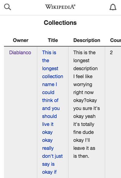
Broken mobile experiences make me sad. We are the mobile team we should be leading the way here.
In mobile the column heading should hide and everything should be stacked with padding between collections to signal the next.
It shouldn't look like this: