Page MenuHomePhabricator

Build user interface for the Highlight Tools and implement highlighting in the Edit Results List
Closed, ResolvedPublic

Description

By letting reviewers apply color to emphasize desired edit properties in the results area, Highlighting makes Recent Changes data more meaningful. Among other user benefits, this new interpretive layer adds another tool for prioritizing work. (View in prototype).

Highlighting can be used by itself or in combination with filtering. The Dropdown Filter Panel (T149452) contains the highlighting tools. Highlighting status for filters is displayed in the Active Filter Display Area (T149391).

Highlighting Tools

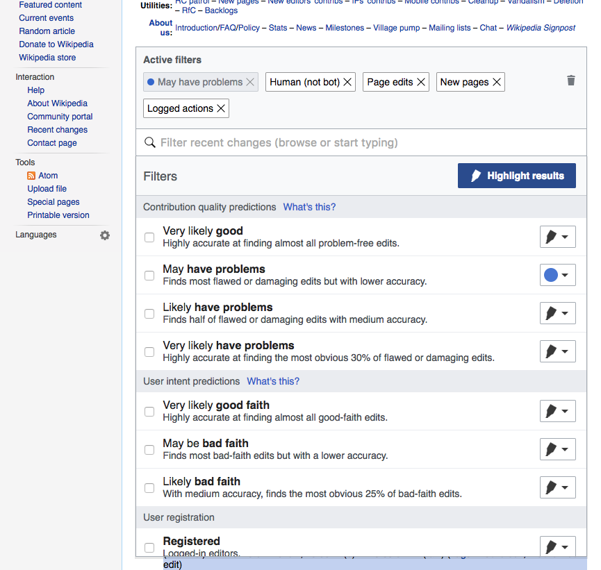
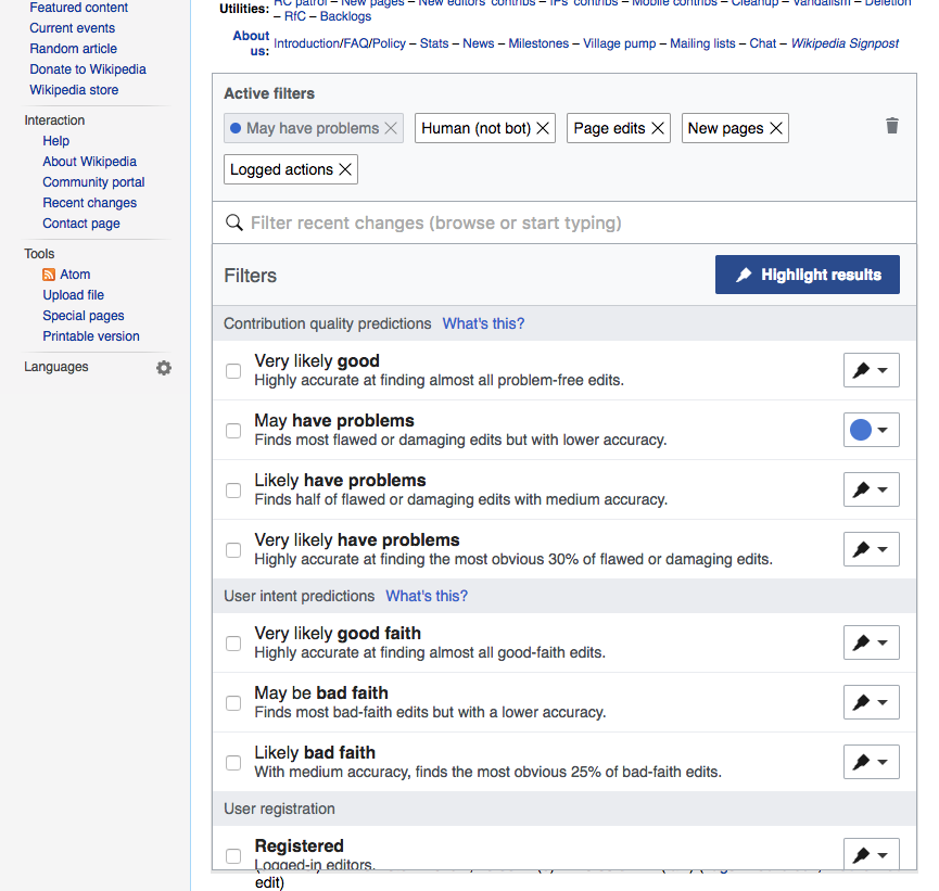
‘Highlight Results’ Button

rc-highlighting-filter-panel.png (645×1 px, 112 KB)

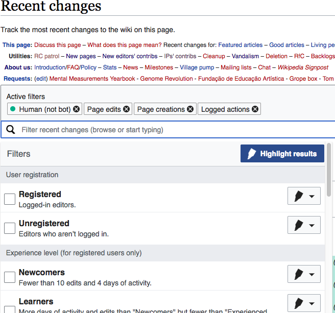
  • In its default state, the Dropdown Filter Panel does not display the Highlighting tools. The “Highlight results” button in the filter panel header displays in its inactive (white) state.
  • Clicking the button in its inactive state causes the following to happen
    • The button toggles to its blue, active state
    • Highlight menus are displayed for every filter option
    • Any previously applied highlight settings that were not explicitly canceled are reapplied immediately to:
      • Edits in the Edit Results List
      • Highlight menus for individual filters
      • Filter tags in the Active Filter Display Area.
  • Clicking the button when it’s in its active (blue) state causes the following to happen:
    • The button toggles to its white, inactive state
    • All highlight menus are hidden.
    • Highlighting is turned off and disappears from results.
    • Highlight status indications disappear from tags in the Active Filter Display Area, where: 1) any tags that were highlight-only disappear entirely; 2) tags for active filters that also had highlighting remain, but the colored dots disappear.
  • The user must act explicitly to remove highlighting from filters (so that it won’t return when highlighting is reactivated). This can be done two ways:
    • To cancel highlighting for an individual filter, the user selects the white, no-highlight option from the highlight menu for a particular filters (see below).
    • To cancel all highlighting (and all other settings), the user clicks the trashcan icon.
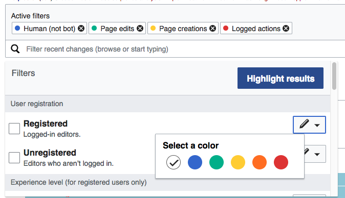
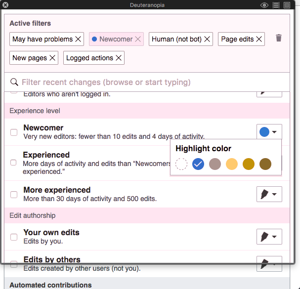
The Highlight Menus

highlight-menu.png (159×497 px, 9 KB)

rc-highlight-menu-layout.png (126×296 px, 8 KB)

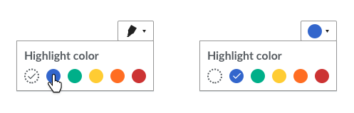
  • When highlighting is enabled, each option in the filter panel displays a highlight menu.
    • In the default state, the menu displays a black marker icon (F5779711). When a color is selected, a filled circle of that color is displayed instead.
    • When the filter is greyed-out (because other active filters in the group exclude the results), the highlight menu button will shown the marker or the color selected with 60% opacity. The menu will still be functional, but it will convey the idea that the selection won't be shown in the results.
  • On rollover, the highlight menu displays a tooltip (see T149385 for approved tooltip text). Tooltips are filed as a separate task T159587: RC filters - add tooltips to 'Highlight results' button and to the highlight menu .
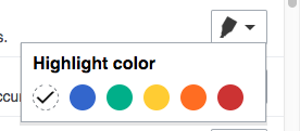
  • When the user opens the highlight menu, a label reads“Select a color” and a set of colored circles are shown. A dashed circle with no color fill represents the lack of highlight (default selection). The options are provided in the following order: dashed circle (lack of highlight), blue, green, yellow, orange, and red. Colors will be based on M82.
  • The current selection is indicated by a check mark inside the relevant color circle.
  • When the user selects a highlight color, the highlight menu closes and the following things happen immediately (i.e., while the Dropdown Filter Panel is still open):
    • The highlight menu displays a color dot of the selected hue.
    • The selected color is applied to appropriate results.
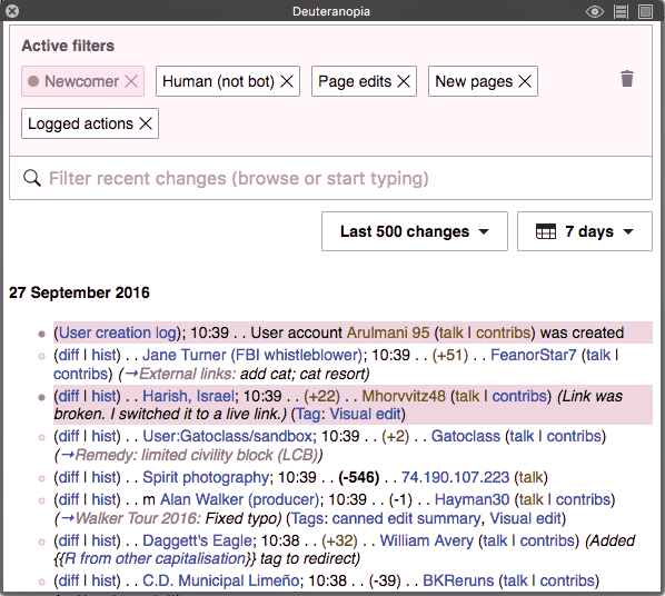
    • Tags in the Active Filter Display Area are updated to reflect the new selection (see T149391) When an active filter is highlighted, the white filter tag will include a color dot to indicate the highlighted color. Highlight-only tags, where the filter is inactive, are grayed.

Display of Highlighting in the Results List

Non-Highlighted Edits

  • In the results area, non-highlighted edits display on a white background.
  • In the left margin, they display a bullet point that has a light gray fill with a darker gray border.

Highlighted Edits

rc-highlight-results.png (512×914 px, 191 KB)

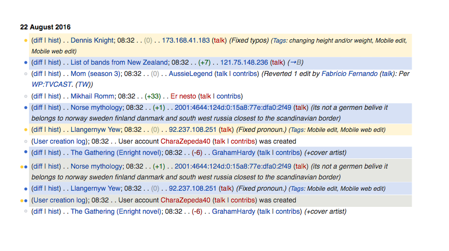
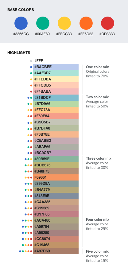
  • Highlighted items show a colored bullet point corresponding to the color of each highlighted property/filter that applies to the edit. Bullets are right aligned. Colors appear in the same order for each item (same order as in the color selector: blue, green, yellow, orange, and red).
  • Highlighted edits display a background color corresponding to the color of each highlighted criteria that applies to the edit.
  • When multiple highlight criteria apply, the display color is calculated by combining the multiple highlight colors. This codepen and the mockup below illustrate the color functions to be applied when combining colors.

color-blending-spec.png (886×417 px, 88 KB)

Related Objects

Event Timeline

There are a very large number of changes, so older changes are hidden. Show Older Changes

Three questions for @Pginer-WMF:

  1. In the mockup currently, when you turn highlighting off using the Highlight Results button, highlight-only tags disappear from the active tag display area. Tags for options that are both filtered and highlighted remain, which is correct. But they keep their highlight color dots (even though no results are highlighted). This seems like a miscue, since the purpose of the Active Filter Display Area is to show you your currently active settings. In the spec above, I’ve said that the dots should go away. Do you disagree?
  2. Under Highlight Results in the spec above it says that “Colors [of dots] appear in the same order for each item.” How is the order of colored dots determined? Please update the spec.
  3. Do you need to add definitions of the highlight colors used in the highlight menu (and results dots, I presume) and backgrounds for edit results? Or are these colors standard?
jmatazzoni renamed this task from Build user interface for the Highlight Tools and implement highlighting in the edit Results List to Build user interface for the Highlight Tools and implement highlighting in the Edit Results List.Oct 29 2016, 1:27 AM
jmatazzoni updated the task description. (Show Details)

Three questions for @Pginer-WMF:

  1. In the mockup currently, when you turn highlighting off using the Highlight Results button, highlight-only tags disappear from the active tag display area. Tags for options that are both filtered and highlighted remain, which is correct. But they keep their highlight color dots (even though no results are highlighted). This seems like a miscue, since the purpose of the Active Filter Display Area is to show you your currently active settings. In the spec above, I’ve said that the dots should go away. Do you disagree?

You are right. Circles on tags should go away when highlighting is not enabled. That is a bug on the prototype.

  1. Under Highlight Results in the spec above it says that “Colors [of dots] appear in the same order for each item.” How is the order of colored dots determined? Please update the spec.

The idea is to use the same order in which the colors appear in the selector: blue, green, yellow, orange, red. I made that explicit in the description

  1. Do you need to add definitions of the highlight colors used in the highlight menu (and results dots, I presume) and backgrounds for edit results? Or are these colors standard?

The "pure" version of the colors are from the standard palette (M82), the exact values are almost final (there is an ongoing revision to adjust the tone of red). The colors to use on the result list as background are a lighter version that can be the result of mixing different colors, Initial values were used for the prototype, but I still want to do some adjustments. Once this is clear, I can add a list with the specific values.

@Pginer-WMF notes:

The "pure" version of the colors are from the standard palette (M82),

I was curious so had a look. I don't see any yellow or orange here. Is it understood what they are to be?

@Pginer-WMF notes:

The "pure" version of the colors are from the standard palette (M82),

I was curious so had a look. I don't see any yellow or orange here. Is it understood what they are to be?

The idea is not to reinvent the colors for those that already exist in the palette. Currently there is red, blue, green and yellow; and we plan to use the same exact colors for those.

In addition to those, we are also providing orange as an option to highlight (I don't think there are plans for an orange to be added in the palette). The reason is to provide options for a natural warning levels when focusing on "negative" filters (yellow->orange -> red). In the same way that the palette does not prevent from using pictures that contain other colors, for cases such as charts or color pickers, we may be able to extend such colors. If we think that we are providing too many choices, we can consider reducing the set of colors provided initially.

Pinging @jmatazzoni and @Pginer-WMF

FYI, T144922 also highlights rows on RecentChanges based on some ORES threshold. Would it coexist with ERI highlighting or be replaced?

Pinging @jmatazzoni and @Pginer-WMF

FYI, T144922 also highlights rows on RecentChanges based on some ORES threshold. Would it coexist with ERI highlighting or be replaced?

I think it should be replaced. As mentioned in T144922#2748112, I think the system we provide allows people to decide what to focus on, and how to color code their results.
If we observe that there is a very clear set of default highlights useful for all kinds of activities, we can consider including them by default. But I won't consider this initially, especially if we help with the discovery of the highlight feature (T151006) and improve the support for repetitive use (setting different default filters, saving custom filter sets, etc.).

Change 337048 had a related patch set uploaded (by Sbisson):
[WIP] Special:RC highlight changes according to filter config

https://gerrit.wikimedia.org/r/337048

@Pginer-WMF You might have already considered this, but maybe we could come up with a palette optimized for color-blind users, like http://mkweb.bcgsc.ca/colorblind/ .

@Pginer-WMF You might have already considered this, but maybe we could come up with a palette optimized for color-blind users, like http://mkweb.bcgsc.ca/colorblind/ .

Colors are based on the default palette where color blindness was considered as a factor for selecting colors. In most cases users do not need to select more than one highlighting color. The choices provided are for you to pick the most meaningful color for you, not to select al of them (selecting many would be counterproductive being color blind or not), and color blind users should be able to identify that the row have a background color that matches the one they picked in the color selector (even if other people see that color differently).

This raises a related code-question I had in mind for a while. Should we name the colors by their proper names in the back-end and the model ("yellow" / "blue" / "green" etc) at all? If we do, we're "stuck" to these colors, and if we ever want to change the pallete or allow for changes, we will need to do some very creative corrections in the back end or "remember" the colors in the front end for highlights.

Are we expecting in the future to adjust those colors at all, or allow for different colors in different themes (like monobook, etc) ?

If so, should we not name our colors in the back end something more generic - like "color1", "color2", etc?

In general terms, I am usually more comfortable naming things this way so we are more flexible in the future in case we want to change the visual aspect; I'm a little concerned when we're connecting the UI concepts so strictly to the backend code.

I'm not sure about this, though. Thoughts, @Mattflaschen-WMF , @SBisson , @Catrope @Pginer-WMF ?

In terms of how may colors evolve, I can see the following scenarios:

  • We decide to reduce the colors we provide to users as an option. For example, we can consider that orange is not needed since green-yellow-red provide already enough levels for the good-bad spectrum when highlighting. As a result we may remove the option from the UI but still support it as a URL parameter for backward compatibility.
  • We decide to adjust the specfic shade of a given color. For example, green can change to be more bright in our standard palette and we want to reflect that to align with the colors.

Given the above I don't see a risk in naming colors by their color name. If we use generic names such as color1, color2 and color3, is not clear to me what should we do if we want to remove color2, will color2 disappear or it will become the former color3?

Pginer-WMF updated the task description. (Show Details)

@Mooeypoo I added the icon to the description:

For the documentation - How do you deal with accessibility? Is there an alternative information added to the <li> or something?

Change 337048 merged by jenkins-bot:
RCFilters UI: Highlight behavior

https://gerrit.wikimedia.org/r/337048

For the documentation - How do you deal with accessibility? Is there an alternative information added to the <li> or something?

There are css classes added to list items that are highlighted but I doubt that will help accessibility. Right now, accessibility concerns are addressed by using colors that are identified for the color-blind, but I'm not sure how to handle other types of accessibility, except for using a filter rather than a highlight, to get a list of desired results...

We should discuss this and see if we can come up with some more needed support, and how to implement it.

@jmatazzoni Are we ok with the cases which may look identical a user: 1) when highlight functionality is used without actual filtering (only highlighting is used) and 2) the conflicting filters that return no results?

Use case:

  1. Discard default filters. There is no selected filters displayed - the result of default filters is still displayed.
  2. From the drop-down filters list, select to highlight (not the filters themselves!) 'Unregistered' and 'Newcomers'.
  3. the selected filters will be displayed greyed out with selected colors for highlighting
  4. and the highlighting will be applied to the default set of results

Screen Shot 2017-02-24 at 2.36.14 PM.png (600×1 px, 217 KB)

  1. Now, after step #2, select 'Unregistered' and 'Newcomers' filters. Since it's a conflicting state filters - the display in the filter area won't change. But the result set will be empty displaying "No changes during the given period matching these criteria."

Screen Shot 2017-02-24 at 2.35.49 PM.png (368×812 px, 65 KB)

@Mooeypoo, @Pginer-WMF There is a small deviation in the placement of the highlight popup comparing to specs (and the prototype).
In the prototype

Screen Shot 2017-02-24 at 3.05.28 PM.png (121×276 px, 13 KB)

In betalabs
Screen Shot 2017-02-24 at 1.55.55 PM.png (388×674 px, 61 KB)

@jmatazzoni Are we ok with the cases which may look identical a user: 1) when highlight functionality is used without actual filtering (only highlighting is used) and 2) the conflicting filters that return no results?

I forget who told me this, but there was a suggestion that we could use a red border along with the muted (greyed out) effect to represent conflicts.

Change 339796 had a related patch set uploaded (by Catrope):
Make highlight popup right-aligned

https://gerrit.wikimedia.org/r/339796

Change 339796 had a related patch set uploaded (by Catrope):
Make highlight popup right-aligned

https://gerrit.wikimedia.org/r/339796

This will fix the popup placement, but it depends on a pair of OOUI changes that is still in review.

In the prototype

Screen Shot 2017-02-24 at 3.05.28 PM.png (121×276 px, 13 KB)

In betalabs
Screen Shot 2017-02-24 at 1.55.55 PM.png (388×674 px, 61 KB)

Another small difference: the white circle indicating the lack of highlight should be using a dashed border to convey more clearly the idea of no highlight.
Based on a quick inspection of the HTML, I think adjusting the CSS in the following way would work:

.mw-rcfilters-ui-highlightColorPickerWidget-buttonSelect-color-none{
    border: 1px dashed #565656;
}

Change 340248 had a related patch set uploaded (by Mooeypoo; owner: Mooeypoo):
RCFilters UI: Dash the border 'none' highlight

https://gerrit.wikimedia.org/r/340248

@Pginer-WMF - Fixed in the above commit. I just realized I'm still missing the proper icon. Did you say you've uploaded it? I couldn't find where?

@Pginer-WMF - Fixed in the above commit. I just realized I'm still missing the proper icon. Did you say you've uploaded it? I couldn't find where?

I added it in the description where the marker icon is mentioned:

In the default state, the menu displays a black marker icon (F5779711). When a color is selected, a filled circle of that color is displayed instead.

Also embedded (Phab. embeds the SVGs with a generic document icon, you can search for "marker.svg" to see what I mean), and also in the comment I pinged you (T149467#3048484).

Here it is also:

(Phab. generic icon for SVGs, long ticket description, and comment collapsing probably didn't help)

For the documentation - How do you deal with accessibility? Is there an alternative information added to the <li> or something?

There are css classes added to list items that are highlighted but I doubt that will help accessibility. Right now, accessibility concerns are addressed by using colors that are identified for the color-blind, but I'm not sure how to handle other types of accessibility, except for using a filter rather than a highlight, to get a list of desired results...

Blind-blind people will not care about colors, I'm afraid.

Blind-blind people will not care about colors, I'm afraid.

I assume you mean color-blind people, but I'm not sure which is the issue in this particular case:

  • Recognising color is not a mandatory step for finding the edits of your interest. You can use regular filters without the need of highlight.
  • Highlight is useful when picking few colors (1-2), and you would pick from the colors that you better recognise. You don't need to see the rows green, you only need to see them highlighted in the color you chose.
  • The color selector is based on the standard palette where color-blind conditions were taken into account in order to pick distinct enough colors.

A practical example:

This is how a green highlight for "newcomers" is seen by a user with deuteranopia:

color-blind-green.png (536×598 px, 158 KB)

This is the color choices the user had:

color-blind-selection.png (536×598 px, 90 KB)

Given that deuteranopia affects especially green, the user probably would chose a color that provides better contrast for her such as blue. This would be the result:

color-blind-blue.png (585×607 px, 102 KB)

For me it is not clear which is the problem. Can you describe a specific situation that can be problematic for color-blind users?

For me it is not clear which is the problem. Can you describe a specific situation that can be problematic for color-blind users?

I'm mentioning totally blind people. Will they benefit of that feature?

For me it is not clear which is the problem. Can you describe a specific situation that can be problematic for color-blind users?

I'm mentioning totally blind people. Will they benefit of that feature?

If we provide the accessibility attributes correctly I can imagine users highlighting some aspects and being aware of such additional information as they process the information on each row. It should nor be much different than an "N" appearing now to indicate that a row corresponds to a new page. It could be a mysterious "N" or an indicator of "New page" depending on how that is implemented.

Change 340248 merged by jenkins-bot:
RCFilters UI: Dash the border 'none' highlight

https://gerrit.wikimedia.org/r/340248

@jmatazzoni Are we ok with the cases which may look identical a user: 1) when highlight functionality is used without actual filtering (only highlighting is used) and 2) the conflicting filters that return no results?

Use case:

  1. Discard default filters. There is no selected filters displayed - the result of default filters is still displayed.
  2. From the drop-down filters list, select to highlight (not the filters themselves!) 'Unregistered' and 'Newcomers'.
  3. the selected filters will be displayed greyed out with selected colors for highlighting
  4. and the highlighting will be applied to the default set of results

Screen Shot 2017-02-24 at 2.36.14 PM.png (600×1 px, 217 KB)

  1. Now, after step #2, select 'Unregistered' and 'Newcomers' filters. Since it's a conflicting state filters - the display in the filter area won't change. But the result set will be empty displaying "No changes during the given period matching these criteria."

Screen Shot 2017-02-24 at 2.35.49 PM.png (368×812 px, 65 KB)

An interesting question @Etonkovidova . Yes, this is fine. The difference is that filters are AND, so everything has to be both. But highlighting is OR. I never thought about that before. Anyway, I think the behavior is as expected. Thanks for asking .

Change 339796 merged by jenkins-bot:
RC Filters: Make highlight popup right-aligned

https://gerrit.wikimedia.org/r/339796

Change 340894 had a related patch set uploaded (by Mooeypoo):
[mediawiki/core] RCFilters UI: Add highlight icon

https://gerrit.wikimedia.org/r/340894

The screen shot below displays the corrected visuals for Highlight colors box - the placement is correct, the circle is dashed.

Screen Shot 2017-03-02 at 5.35.46 PM.png (410×715 px, 66 KB)

@jmattazoni -- Two questions:
(1) The following has not been yet implemented. Since they are relatively minor, could they be split up into separate phab tasks?

On rollover, the highlight menu displays a tooltip (see T149385 for approved tooltip text).

In the left margin, they display a bullet point that has a light gray fill with a darker gray border.

(2) Regarding the re-applied highlighting correctly implemented):

Any previously applied highlight settings that were not explicitly canceled are reapplied immediately

The user must act explicitly to remove highlighting from filters (so that it won’t return when highlighting is reactivated).

Please review the following use case to confirm that this is expected behavior :

  1. A user discards default filters
  2. Then, the user selects only highlighting for filter 'Unregistered'
  3. The user discards 'Unregistered' highlighting via clicking on 'Highlight results' - the filter selection is gone along with the highlighting.
  4. The user clicks to 'Restore default filters' - the filters are restored.
  5. Clicks on 'Highlight results' to apply highlighting to the filters present in the capsule.

Clicking on 'Highlight results' will display previously displayed highlights, and also will 'restore' those filters. So the user will see not only default filters that he specifically requested, but also added highlighted filters that he forgot to explicitly dismiss.

Good catch. My sense here is that 'Restore default filters' should wipe out any previous settings, including highlighting. Just as the Trashcan does. (It's not "add default filters to what I've already selected." ) @Pginer-WMF, do you disagree?

@jmattazoni -- Two questions:
(1) The following has not been yet implemented. Since they are relatively minor, could they be split up into separate phab tasks?

On rollover, the highlight menu displays a tooltip (see T149385 for approved tooltip text).
In the left margin, they display a bullet point that has a light gray fill with a darker gray border.

I am seeing the light gray bullet points (they pre-existed this project, actually—though we may have knocked them out for a while I suppose). So you can mark that one as done.

Re. the tooltip, I suppose you could make it a separate ticket, but it seems like a very small one.

I filed the issue for tooltip T159587: RC filters - add tooltips to 'Highlight results' button and to the highlight menu . There is a small issue: T159586: RC filters - colored bullet points displayed overlapped related to highlighting behavior. I added these both as related task.

I am still waiting on decision on T159503: [minor] RC filters -should 'Restore default filters' return 'Highlight results' button to inactive state? and on the issue that I mentioned in my comment:

Clicking on 'Highlight results' will display previously displayed highlights, and also will 'restore' those filters.

Good catch. My sense here is that 'Restore default filters' should wipe out any previous settings, including highlighting. Just as the Trashcan does. (It's not "add default filters to what I've already selected." ) @Pginer-WMF, do you disagree?

I agree, the "restore default filters" and the trash can are used to get to a clean slate for the user to start again so it makes sense to clear previous highlighting states.

Change 340894 had a related patch set uploaded (by Mooeypoo):
[mediawiki/core] RCFilters UI: Add highlight icon

https://gerrit.wikimedia.org/r/340894

As part of the review process in the patchset the icon ha been modified. The resulting shape also captures the idea of a marker, but may not work that well at the size at which the icon will be rendered.

Below I compared two renderings of the prototype with the original and the modified icon. The modification in angle results in less room for the shape, forcing it to be smaller and less recognisable. With the increased ange of the curves, the distinction between the body of the marker and the tip seems also harder to get.

Panel with the originalPanel with the icon from the patchset
list-with-highlight.png (821×865 px, 182 KB)
list-with-adjusted-highlight.png (821×865 px, 181 KB)

Regarding the template specification, we are considering to adjust icon margins depending on the shape to achieve optically similar weights. You can see an example we created in F6240497, or the Material design guidelines on iconography which follow a similar pattern.

If we want to stick with the 2px margin on icons for now (until all are updated to match any new template), we can keep it aligned wth the rest of the icons. I made a version of the icon with the 2px margin to align with other icons:

It is a couple pixels smaller, looking in the example as shown below:

classic-marker-adjusted.png (775×863 px, 164 KB)

I've updated the patch to use the adjusted icon.

Change 340894 merged by jenkins-bot:
[mediawiki/core] RCFilters UI: Add highlight icon

https://gerrit.wikimedia.org/r/340894

Change 341457 had a related patch set uploaded (by wikigit):
[mediawiki/core] RCFilters UI: Add 'highlight' icon to highlight button

https://gerrit.wikimedia.org/r/341457

Change 341457 merged by jenkins-bot:
[mediawiki/core] RCFilters UI: Add 'highlight' icon to highlight button

https://gerrit.wikimedia.org/r/341457

Everything seems to be in place

  • updated pencil icons
  • the reverse icon for 'Highlight results'
  • subtasks and all outstanding issues have been clarified

Screen Shot 2017-03-08 at 9.54.17 AM.png (613×656 px, 123 KB)

QA recommendation: Resolve.