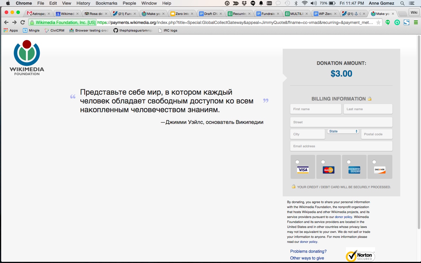
Maybe during mustache forms or refactor in March? but the grey GC box is fitting to width of the card security text, which is awkward in some languages. Text should wrap.

| • atgo | |
| Jun 5 2015, 9:47 PM |
| F175309: Screen Shot 2015-06-05 at 11.45.47 PM.png | |
| Jun 5 2015, 9:47 PM |
| F175311: Screen Shot 2015-06-05 at 11.47.15 PM.png | |
| Jun 5 2015, 9:47 PM |
Maybe during mustache forms or refactor in March? but the grey GC box is fitting to width of the card security text, which is awkward in some languages. Text should wrap.
Change 219051 had a related patch set uploaded (by Ejegg):
Allow text in the payment table to wrap
Change 219117 had a related patch set uploaded (by Ejegg):
Allow text in the payment table to wrap
Just deployed a CSS change to let the text wrap. That helps a lot, but the grey box is still a bit wider in language=ru than in language=en.
Thanks @Ejegg. I think this looks good, but we still have some issues with the astropay form looking a bit strange. I'll follow up in the other task