Page MenuHomePhabricator

Make the "constructive" & "destructive" selection more visible when used in ButtonSelectWidget
Closed, DeclinedPublic

Description

This is a more specific concern adapted from T163222: On labels.wmflabs.org, make the blue buttons more visible when they have been selected

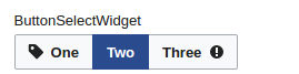
See the example below where a selected "constructive" button on the left is hardly distinguishable from the non-selected "constructive" button on the right.

Capture d’écran_2017-04-18_19-06-09.png (69×665 px, 9 KB)

When these flags are not used, the buttons color scheme fully inverts and selection is 100% clear.

Screenshot from 2017-04-22 11-11-59.png (67×269 px, 4 KB)

Event Timeline

Halfak renamed this task from make the "constructive" and "destructive" more visible when used in ButtonSelectWidget to Make the "constructive" & "destructive" selection more visible when used in ButtonSelectWidget.Apr 22 2017, 4:15 PM
Volker_E added subscribers: Ladsgroup, Volker_E.

I disagree with the experience side of this. We don't need to have such UI pattern at all, as it's in some ways a weak implementation.
The progressive and destructive normal buttons were invented just for one use case originally:
Following the rule of at maximum one primary button per view, there were a few cases in VE, where you've had two same-weight buttons and the primary “Save” button.

T163623 Button priority - Editing Front end - Wikipedia 2017-05-28.png (744×1 px, 63 KB)

The pattern shown in T163222 doesn't need to provide these buttons to be clear to the user. We already provide binary decision UI widgets – a RadioSelectWidget (probably preferable), a ToggleSwitchWidget or maybe a ButtonSelectWidget are sufficient. I'll provide more arguments about the current pattern weakness in the original task.

We shouldn't provide another binary pattern out of box without strong arguments as it might result into misuse and further confusion to users elsewhere being exposed to four similar outcome widgets, that all look and behave slightly different.

Follow-up will be to take care about making binary patterns clear and adding explanation of only limited use of destructive and progressive ButtonGroupWidget combo in #wikimediaui_style_guide .

I don't see why making it clear when these buttons are selected has anything to do with having side-by-side buttons in a ButtonSelectWidget. The bug here is about it not being clear when a "construct" or "destructive" button is selected. This isn't about how the buttons are used at all.

While I get, that this doesn't seem as sufficiently supported in first place, I will try to reframe my standpoint. Because defining interaction elements is foremost about how they are intended to be used:
OOjs UI allows for a wide range of different combination of widgets. Just because it does so, doesn't mean it's useful nor feasible to support each and every combination, as it leads to

  1. confusion for users having to learn n different ways of a very similar interaction pattern and
  2. code bloat and continuous maintenance costs

Does OOjs UI support that specific combination out-of-box:
Yes.
Is the combination of flagged buttons in a ButtonSelectWidget widely used or was that combination intended:
No.
Are there other widgets meant to be used for such need already available:
Yes, for example a RadioSelectWidget or a “normal” ButtonSelectWidget
Is there something missing when switching over to one of the other binary widgets from current implementation:
No, not from my understanding.

What is missing from my perspective is a guideline on how to use existing components rather than supporting another binary combination, like I've stated in my last comment.