I think the buttons are following the OOui principles, but it is obvious to differentiate a selected blue button from a non selected blue button:

Reported on fr.wp, and I +1 this feedback.
| Trizek-WMF | |
| Apr 18 2017, 5:14 PM |
| F8222670: image.png | |
| May 31 2017, 8:45 PM |
| F7614071: Capture d’écran_2017-04-18_19-06-09.png | |
| Apr 18 2017, 5:14 PM |
I think the buttons are following the OOui principles, but it is obvious to differentiate a selected blue button from a non selected blue button:
Reported on fr.wp, and I +1 this feedback.
I don't know the exact implementation, but before we're going to invent another unique button group, we should be clear what to accomplish with the interactive elements.
An idea that comes to my mind would be to use a ToggleSwitchWidget instead. Where is this in use? Is it WikiLabels?
Merged these and filed T163623: Make the "constructive" & "destructive" selection more visible when used in ButtonSelectWidget because I think that's a bug.
To get back to this topic, first off, @Trizek-WMF where can I see the view form this screenshot? Is this still around somewhere, with the evolvement of new RCFilters?
Repeating myself from T163623:
The pattern shown doesn't need to provide these buttons to be clear to the user.
We already provide binary decision UI widgets – a RadioSelectWidget [seems to be] sufficient.
Other weak parts (only by looking at the screenshot) are
Just from button label weakness, consider a RadioSelect(Input)Widget instead…
Pick a campagn on http://labels.wmflabs.org. It has been apparently changes since I've reported the problem.
Is this still around somewhere, with the evolvement of new RCFilters?
No, it is not related.
Repeating myself from T163623:
The pattern shown doesn't need to provide these buttons to be clear to the user.
We already provide binary decision UI widgets – a RadioSelectWidget [seems to be] sufficient.Other weak parts (only by looking at the screenshot) are
- why are those two decisions side-by-side? Research has shown that users are faster in finishing their task when label is above the form widgets and left (RTL right) aligned,
- “Oui“ et “Non“ are weak button labels, as they should clearly indicate what they stand for,
- misalignment of “incertain ?” label
Just from button label weakness, consider a RadioSelect(Input)Widget instead…
Those questions are for whom has created the Labelling system. :)
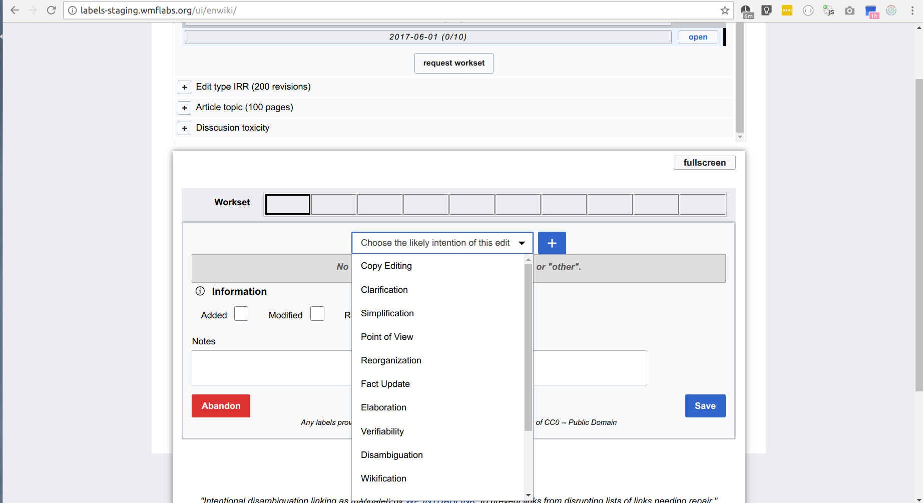
One note: These are for the person who built the label form of edit quality. For example. Edit type form is a completely different:
@Halfak made those but I reviewed them and while reviewing I wasn't aware of researches about UX of form widgets (and that's to some degrees is my fault). Our team doesn't have a UX designer and your comments here is a very valuable for me. I talk to Aaron about implementing your suggestions.