We'll use this ticket to monitor the progress of the analysis of the 3rd running of this test. The test is expected to be turned on the week of Sep 5 and run for at least 7 days.
Description
Description
| Status | Subtype | Assigned | Task | ||
|---|---|---|---|---|---|
| Invalid | None | T174064 [FY 2017-18 Objective] Implement advanced search methodologies | |||
| Resolved | Gehel | T171740 [Epic] Search Relevance: graded by humans | |||
| Invalid | None | T174106 Search Relevance Survey test #3: action items | |||
| Resolved | mpopov | T175048 Search Relevance Survey test #3: analysis of test | |||
| Resolved | mpopov | T178096 Make a Puppet profile/role for doing R-based heavy stats/ML on Wikimedia Cloud |
Event Timeline
Comment Actions
Rather than continuing to pester you at 8pm on a friday about the WIP report, a few comments on the text:
The “MLR (20)” experimental group had results ranked by machine learning with a rescore window of 20. This means the model was trained against labeled data for the first 20 results that were displayed to users.
The rescore doesn't effect the training, it effects the query-time evaluation. It means that each shard (of which enwiki has 7) applies the model to the top 20 results. Those 140 results are then collected and sorted to produce the top 20 shown to the user. Same for 1024, but with the bigger window (7168 docs total).
uses a Deep Belief Network
As mentioned on IRC its actually a https://en.wikipedia.org/wiki/Dynamic_Bayesian_network. It is based on http://olivier.chapelle.cc/pub/DBN_www2009.pdf and we are using the implementation from https://github.com/varepsilon/clickmodels. Might be worth somehow calling out that this is how we take click data from users and translate it into labels to train models with.
Comment Actions
Tangentially related, i wonder if this can be used to better tune the DBN data as well. Basically the DBN can give us attractiveness and satisfaction %'s, which we currently just multiply together and then linear scale up to [0, 10]. We could potentially take the values from this click model, as well as a couple other click models (implemented in the same repository) that make different assumptions, and then learn a simple model to combine the information from the various click models to try and look like the data we get out of the relevance surveys (requires having survey data on queries that we also have enough sessions to train click models on). Or maybe that ends up being too many layers of ML, not sure.
Comment Actions
HOLY MOLEY I'M FINALLY DONE: https://wikimedia-research.github.io/Discovery-Search-Adhoc-RelevanceSurveys/
Update: production instructions
Comment Actions
Cool stuff, @mpopov!
I was worried about only having a binary classifier, but I see in the conclusion that it can get mapped to a 0-10 scale. Have you looked at the distribution (or the distribution when mapped to a 0-3 scale) to see if it matches the distribution of Discernatron scores in a reasonable way? I don't recall whether the Discernatron scores were, for example, strongly unimodal, or strongly bimodal, or just generally lumpy.
Overall this is a wonderful, complex analysis, and it looks like we now know what question to use and how best to turn survey data into training data. I hope it all leads to even better models!
Comment Actions
Many thanks! Both @EBernhardson and I (and maybe others) were interested in the comparison. It'll be neat to see.
Comment Actions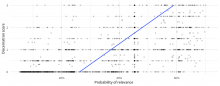
Alrighty, here ya go! It's not as pretty as you were probably expecting!

R code for reference:
library(magrittr)

base_dir <- ifelse(dir.exists("data"), "data", "../data")
scores <- readr::read_tsv(file.path(base_dir, "discernatron_scores.tsv"), col_types = "iidli") %>%
  dplyr::mutate(Class = factor(score > 1, c(FALSE, TRUE), c("irrelevant", "relevant")))
responses <- readr::read_tsv(file.path(base_dir, "survey_responses.tsv.gz"), col_types = "DicTiiic")
responses %<>%
  dplyr::filter(survey_id == 1, question_id == 3) %>%
  dplyr::group_by(query_id, page_id) %>%
  dplyr::summarize(
    times_asked = n(),
    user_score = (sum(choice == "yes") - sum(choice == "no")) / (sum(choice %in% c("yes", "no")) + 1),
    prop_unsure = sum(choice == "unsure") / (sum(choice %in% c("yes", "no", "unsure")) + 1),
    engagement = sum(choice %in% c("yes", "no", "unsure", "dismiss") / times_asked)
  ) %>%
  dplyr::ungroup() %>%
  dplyr::inner_join(scores, by = c("query_id", "page_id")) %>%
  dplyr::rename(discernatron_score = score) %>%
  dplyr::filter(reliable == TRUE)

library(keras)

model <- load_model_hdf5(file.path("production", "relevance-classifier.h5"))
predictors <- responses[, c("user_score", "prop_unsure", "engagement")] %>%
  as.matrix
predictions <- as.numeric(predict_proba(model, predictors))

results <- data.frame(
  discernatron = responses$discernatron_score,
  model = predictions
)

library(ggplot2)

ggplot(results, aes(x = discernatron, y = model)) +
  geom_point(alpha = 0.2) +
  scale_y_continuous(labels = scales::percent_format()) +
  geom_smooth(method = "lm", se = FALSE) +
  coord_flip() +
  labs(x = "Discernatron score", y = "Probability of relevance")
Comment Actions
Thanks! I'm not sure what I was expecting, but it is interesting to see. It seems to like giving scores of 0.5, but a lot of models end up with a sort of "default" score they like best. I am surprised that it doesn't show any scores above 0.75. Should we map scores from a 0-0.75 range, rather then 0-1? Or, based on the low end of the trend line, maybe even 0.25-075?
That trend line is very helpful, BTW, since the correlation isn't super clear by eye. It's definitely pointed in the right direction. I'm also not too alarmed by the spread. The survey and Discernatron are different rating environments. I know that my Discernatron ratings were skewed by the context of other results, which are absent in the survey. Hopefully, survey takers also have a better understanding of the particular article they are reading.
I definitely want to talk more about T182824 in January. I think the best way to test the effect of survey data on training is going to be A/B tests, and having frequency-based strata in the results will let us see more clearly where changes are happening.
Comment Actions
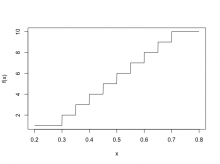
Good point! I was just thinking about this yesterday. Originally I was thinking of calculating the 1-10 ranking (which is what I think the ranking learner expects to see as the response in the training data) via round(10 * predicted_probability) but it does look like the mapping could be:
f <- function(x, old_min = 0.25, old_max = 0.75, new_min = 1e-6, new_max = 1) {
  y <- pmax(pmin(x, old_max), old_min) # ensures the maximum observed value is 0.75 and minimum observed values is 0.25
  z <- ((new_max - new_min) * (y - old_min) / (old_max - old_min)) + new_min
  return(ceiling(10 * z)) # returns steps 1-10
}
So predictions made on 0.25-0.75 scale (with anything above/below the bounds restricted to the bounds) to 1-10:
x <- seq(0.2, 0.8, length.out = 1000)
plot(x, f(x), type = "l", ylim = c(1, 10))

Using that we get the following:
…which actually doesn't look too bad! :D
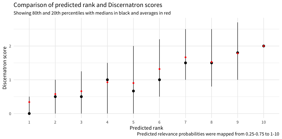
f <- function(x, old_min = 0.25, old_max = 0.75, new_min = 1e-6, new_max = 1) {
  y <- pmax(pmin(x, old_max), old_min)
  z <- ((new_max - new_min) * (y - old_min) / (old_max - old_min)) + new_min
  return(ceiling(10 * z))
}

results <- data.frame(
  discernatron = responses$discernatron_score,
  model = factor(f(predictions), 1:10)
) %>%
  dplyr::group_by(model) %>%
  dplyr::summarize(
    lower = quantile(discernatron, 0.8),
    upper = quantile(discernatron, 0.2),
    middle = median(discernatron),
    average = mean(discernatron)
  )

ggplot(results, aes(x = model)) +
  geom_pointrange(aes(y = middle, ymin = lower, ymax = upper)) +
  geom_point(aes(y = average), color = "red") +
  labs(
    y = "Discernatron score", x = "Predicted rank",
    title = "Comparison of predicted rank and Discernatron scores",
    subtitle = "Showing 80th and 20th percentiles with medians in black and averages in red",
    caption = "Predicted relevance probabilities were mapped from 0.25-0.75 to 1-10"
  )
Comment Actions
Nice! That is not a perfectly straight line, but it is remarkably good considering the mess that was the original input.
Comment Actions
Added Python version into the production instructions for @EBernhardson's convenience :) https://github.com/wikimedia-research/Discovery-Search-Adhoc-RelevanceSurveys/tree/master/production#predicting-rank