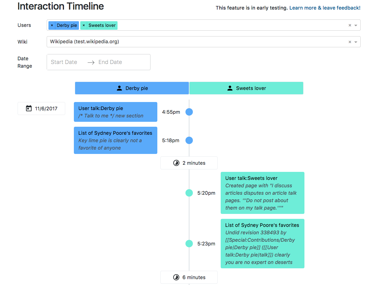
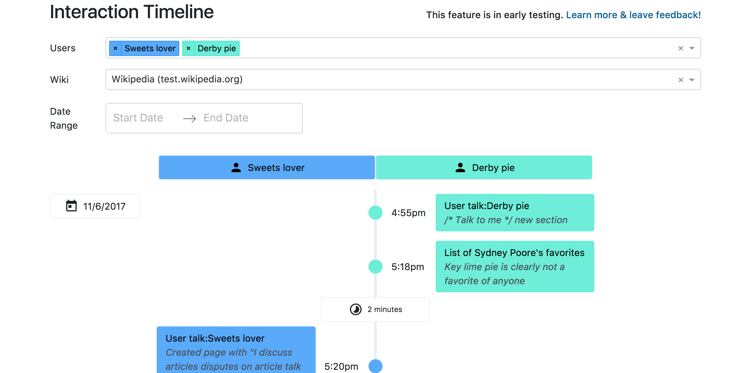
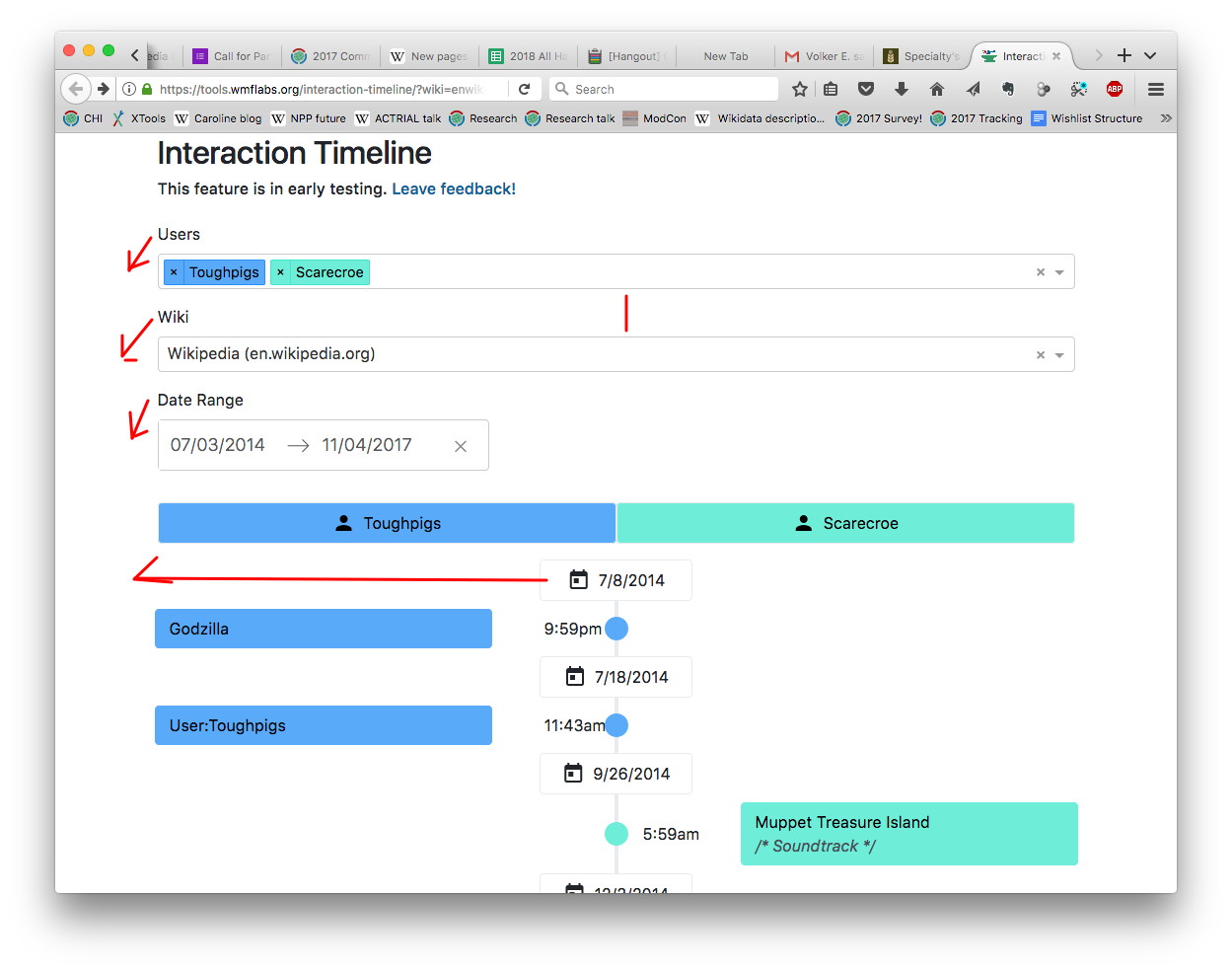
Page MenuHomePhabricator

Timeline MVP: increase information density
Closed, ResolvedPublic3 Estimated Story Points

Description

Initial Feedback:

2017-11-08.jpg (985×1 px, 158 KB)

  • Apply changes as shown in the image above
  • Move the description to the same line as the 'Interaction Timeline' title
  • Condense everything and make the font smaller.
  • Change "Leave feedback!" to "Learn more & leave feedback!"
  • Improve with any other feedback from @CSindersWMF

Event Timeline

dbarratt set the point value for this task to 3.

w00t! feel free to send or post screenshots here and tag me in them? I'm available to give feedback :)

I'll work on these changes, but it kind of feels like we are falling into the "above the fold" anti-pattern described here:
http://iampaddy.com/lifebelow600/

I agree with you, David. I think we'll get our biggest gains from reducing the font size and padding between elements in the Timeline itself. But it doesn't hurt to tighten up the top elements themselves — we'll probably re-approach all the input fields once we start adding more filters and ways to manipulate the information in the Timeline itself.

I snuck in a new (tiny) requirement: Change "Leave feedback!" to "Learn more & leave feedback!"

@TBolliger & @CSindersWMF What do you think?

Screen Shot 2017-11-09 at 22.50.11.png (922×1 px, 90 KB)

I think it looks a lot busier, so I'm not a fan.

I thought of a nice UX improvement (regardless) would be to "pin" the usernames (and the date in this design) to the top of your browser window when they read the top.

Mission accomplished, it is now more information dense.

I like your 'pin' idea, let's track it so we don't forget it: T180245: Interaction Timeline V1: Scroll to top button

One small suggestion- maybe make the time difference even smaller? The time difference between edits? But other than that, looks great!

dbarratt moved this task from Review to Done on the Anti-Harassment (AHT Sprint 9) board.

Looks good- I still think the boxes could be made slightly smaller? Sorry to be picky, I'm just worried editors will reject the size :/

Looks good- I still think the boxes could be made slightly smaller? Sorry to be picky, I'm just worried editors will reject the size :/

You mean the text size? The title, the summary, or both?

We're inviting people to give feedback today. We'll find out soon if really a problem or not. I think we're done for this sprint.