Page MenuHomePhabricator

Interaction Timeline V1: Scroll to top button
Closed, ResolvedPublic2 Estimated Story Points

Description

Problem to solve

Scrolling down on a long timeline (example) loses of the context of which user is represented in which column. (Is apples the left column or right column?)


Acceptance criteria

  • If the user is scrolling below the username bar an overlay should appear at the top of the page, displaying the usernames above the Timeline columns
  • Should play well with the diff overlay
  • Include a link to '↑ Top' in the far right side of the overlay. On click, it should scroll the user to the top of the page.
  • The usernames should be linked to their userpage on the selected wiki, and open in a new tab when clicked.
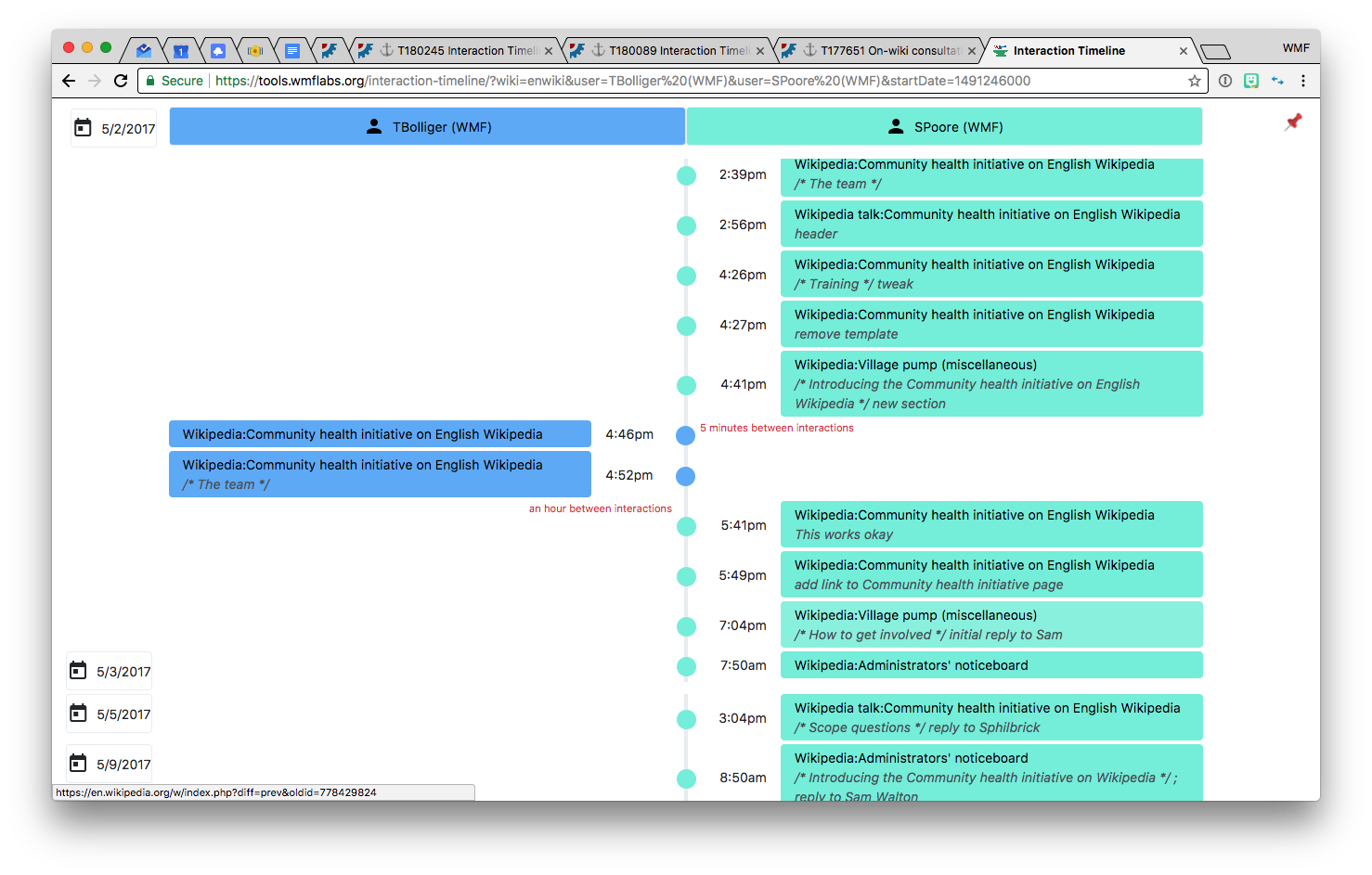
Mockup

floating usernames scrolling up.png (943×1 px, 109 KB)

Notes

JavaScript Event: https://developers.google.com/web/updates/2017/09/sticky-headers

Event Timeline

Blocked by design, and a decision to do this.

Caroline, when you start to think about this, please consider how this top sticky bar can be useful in ways other than just reinforcing which users are in which column. Should the date also stick? Should users be able to adjust the filters from this sticky bar?

Also, consider that information density is important. By nature this tool will decrease the amount of data in the viewport at any given time. I suggest we think of a pin/unpin show/hide option.

Screen Shot 2017-12-01 at 4.20.02 PM.png (943×1 px, 274 KB)

Here's my first thoughts — This bar scrolls and picks up the current date as you scroll. Clicking the pin icon hides the overlay, but the pin icon would continue to float on the far right. Clicking it again would show the overlay again.

We'll probably want better icons for the pin than the 📌 emoji. Hide/show or pin/unpin.

Hovering over the icons should show appropriate hint text (e.g. "show username overlay" or "hide username overlay")

I like it! I'm not sure it takes up enough screen real estate to warrant a preference though.

Screen Shot 2017-12-01 at 4.20.02 PM.png (943×1 px, 274 KB)

Here's my first thoughts — This bar scrolls and picks up the current date as you scroll. Clicking the pin icon hides the overlay, but the pin icon would continue to float on the far right. Clicking it again would show the overlay again.

We'll probably want better icons for the pin than the 📌 emoji. Hide/show or pin/unpin.

Hovering over the icons should show appropriate hint text (e.g. "show username overlay" or "hide username overlay")

I think that you are on the right track with a sticky top bar and an overlay that can be off or on. Not clear though about the specifics of the way you describe it here.

I like it. An alternative would be to show all the search params in the toolbar (Names, Dates and Wiki).

TBD: Include a link to 'back to top' in the overlay

+1 on this. This is a must have on infinite scroll pages.

TBD: Allow users to refine the search directly from the overlay

I don't think we should do this. Query update means different results so we have to scroll up anyway to show the interaction from the beginning. I don't think it will be a good user experience.

I like it. An alternative would be to show all the search params in the toolbar (Names, Dates and Wiki).

Let me dummy one up so we can see what it might look like.

TBD: Allow users to refine the search directly from the overlay

I don't think we should do this. Query update means different results so we have to scroll up anyway to show the interaction from the beginning. I don't think it will be a good user experience.

Agreed, and the "back to top" link essentially solves a similar need of refining the query.

Few more options. This one (below) puts the icons in a similar rectangle as the dates, so they're not just in the either by themselves. I like this as the "back-to-top" link could still be visible, even if the overlay is disabled.

floaty 2.png (943×1 px, 167 KB)

And this one (below) has a bottom border:

floaty 3.png (943×1 px, 167 KB)

We'll probably want to use a more subtle color than black for these icons.

@SPoore — Let me try to clarify what I mean in these designs. I think this wireframe conveys the concept the best:

floaty 3.png (943×1 px, 167 KB)

The current top of the tool would look the same: the header, the search filters, the row for the usernames, and the timeline. When a user scrolls down the page, as soon as they pass the usernames, the usernames would stick to the top of the browser (e.g. how the VisualEditor toolbar sticks.)

Similar behavior would happen as a user scrolls past the different calendar dates. As the user scrolls past a new date box, it would 'stick' inside the bar.

On the far right of the screen would be two icons — a 'back to top' icon and a 'hide' icon. Clicking 'back-to-top' would scroll the page all the way to the top. Clicking 'hide' would make the overlay disappear (except for the 'hide' icon, which would change to a 'show' icon) so the timeline would look how it does today.

There are some animations we'll need to make sure are smooth and not clunky, but I'm sure @dbarratt has a few tricks up his sleeves. :)

TBolliger moved this task from Analytics to Triage/To be Estimated on the Anti-Harassment board.

This is the "back to top" icon I used, from Material:

ic_vertical_align_top_black_24dp_1x.png (24×24 px, 102 B)

dbarratt set the point value for this task to 2.Feb 14 2018, 7:54 PM

Yeah, just tested. Great work!

Two quick, minor questions for David:

  • Is it possible to add a browser tooltip for "scroll to top"?
  • On crazy long scrolls on very heavy queries, how smooth will the animations be?
dbarratt moved this task from Done to In progress on the Anti-Harassment (AHT Sprint 15) board.
  • Is it possible to add a browser tooltip for "scroll to top"?

Yeah, not a problem.

  • On crazy long scrolls on very heavy queries, how smooth will the animations be?

The animation is done in CSS, so it shouldn't be an issue. Everything I tested with was fine.

TBolliger renamed this task from Interaction Timeline V1: Usernames above the columns should be pinned/stickied while you scroll to Interaction Timeline V1: Scroll to top button.Feb 28 2018, 7:42 PM
TBolliger moved this task from AHT Sprint 15 to AHT Sprint 16 on the Anti-Harassment board.
TBolliger moved this task from Ready to In progress on the Anti-Harassment (AHT Sprint 16) board.

1,000 points to your Hogwarts house of choice. Great work!

I'm a Gryffindor (at least according to Pottermore)