Page MenuHomePhabricator

[Bug] Horizontal scrollbar shown when browser window is between 1000px and 1107px
Closed, ResolvedPublic

Description

Steps to reproduce

  1. (if you are on a Mac, you need to go to System Preferences > General > and change "Show Scrollbars" to "always")
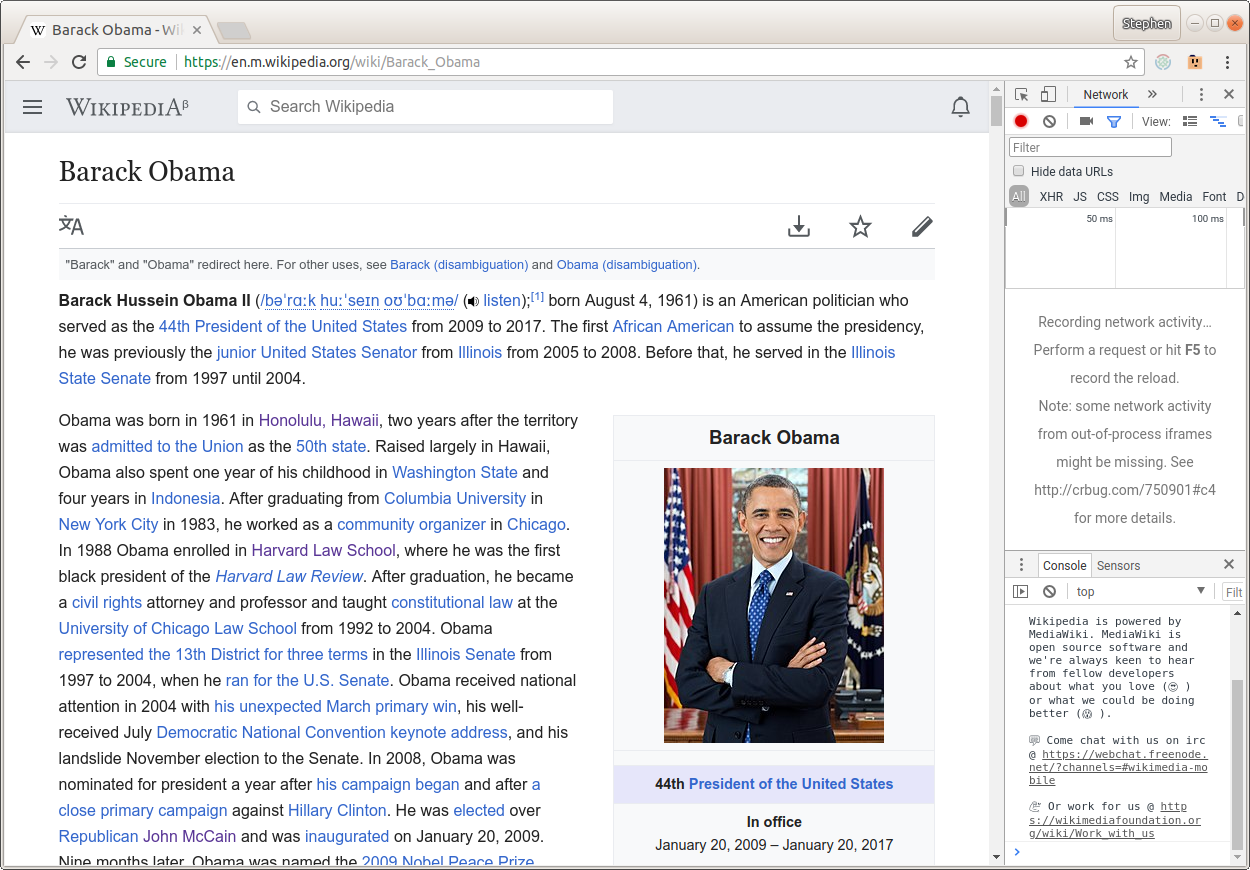
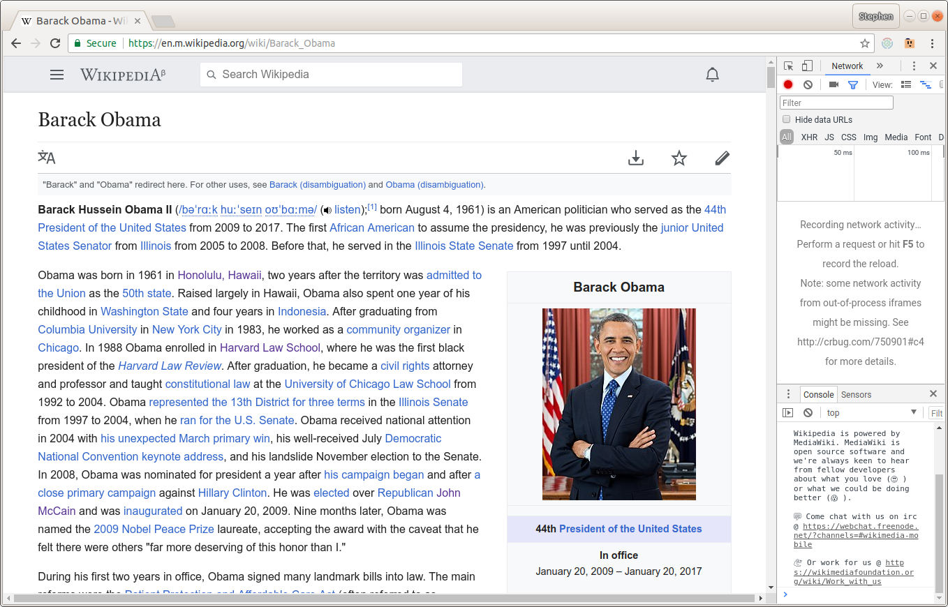
  2. Visit https://en.m.wikipedia.org/wiki/Barack_Obama
  3. Open developer tools to easily eye the screen dimensions
  4. Change the browser window size to 999px
    Screenshot from 2018-04-10 08-20-02.png (870×1 px, 428 KB)
  5. Increase the width to 1000px
    Screenshot from 2018-04-10 08-20-11.png (870×1 px, 445 KB)
  6. Increase the width to 1107px
    Screenshot from 2018-04-10 08-21-37.png (870×1 px, 444 KB)
  7. Increase the width to 1108px
    Screenshot from 2018-04-10 08-21-22.png (870×1 px, 452 KB)

Expected results

  • No horizontal scrollbar is necessary for a large window

Actual results

  • The horizontal scrollbar pops in and out as different CSS breakpoints are hit

Environments observed

  • enwiki

Browser Version:

  • Chromium v65.0.3325.181

OS Version:

  • Ubuntu v17.10 64b

Device Model:

  • Desktop

Device Language:

  • English

Notes

When I scroll a little ways past #Cultural_and_political_image, the horizontal scrollbar disappears. Maybe this is an issue with lazy loading placeholders?

Event Timeline

The only thresholds we officially support are 320px (mobile), 720px (tablet) and 1200px (desktop). Anything in between can and is likely to break. Looking into this i think the problem is our fixed max width and margins are not compatible at this resolution.

@alexhollender which thresholds should we be caring about more? Should we adjust our max width and margins (at tablet/desktop) to counter for this?

To clarify: this issue only appears when resizing from browser size ≤999px to ≥1000px, correct? I'm not sure I understand your question of which thresholds we should be caring about more?

@alexhollender right now we have 3 notable breakpoints where we adapt the layout. These are mobile (320px), tablet (720px) and desktop 1000px.

Thus as you approach these breakpoints the design starts to suffer.

https://vimeo.com/235428198 is a great talk that I saw yesterday that gives an idea of how you might solve this but hints at the added complexity cost of trying to solve this problem.

We should be cautious and mindful about supporting a completely fluid layout but it is possible...

We notice the screen pops back into place when content near "Post-presidency (2017–present)" loads so probably a local wiki issue.

This is caused by .content .figure, .content .thumb {width: 320px} , while the [[ Job_Growth_by_U.S._President_-_v1.png | included image ]] is 370px wide, causing it to overflow on the right side. You can easily spot this when you disable javascript.

Additionally, when you scroll down with JS enabled, the horizontal scrollbars disappear, because the image is lazy loaded and suddenly

.content a > img {
    max-width: 100% !important;
    height: auto !important;
}

becomes active. guess we need a .content a > noscript > img
and

.lazy-image-loader {
    max-width: 100%;
}

Change 428511 had a related patch set uploaded (by Jdlrobson; owner: Jdlrobson):
[mediawiki/skins/MinervaNeue@master] Size restrict images inside noscript tags

https://gerrit.wikimedia.org/r/428511

Change 428511 merged by jenkins-bot:
[mediawiki/skins/MinervaNeue@master] Size restrict images inside noscript tags

https://gerrit.wikimedia.org/r/428511

@alexhollender I think this can skip QA but I wanted to give you the opportunity to verify this is fixed: http://reading-web-staging.wmflabs.org/w/index.php?title=Barack_Obama&mobileaction=toggle_view_mobile and that we haven't broken anything relating to image styling. Be sure to test with JS disabled and enabled.

Sorry, there's some confusion. I left a comment on the patch when I merged it that it does indeed fix the no-JS case but does not fix the lazily loaded case originally reported.

I also note that this forced 320px, breaks anything that is larger than that, even if it would have the noresize class set... ( See also: T181756 and T185562 )

@Jdlrobson assuming I should wait on checking this out based on the comments that came in after yours

@alexhollender you can take a look at this now - it's on staging.

Change 429848 had a related patch set uploaded (by Jdlrobson; owner: Jdlrobson):
[mediawiki/skins/MinervaNeue@master] Regression: Avoid reflows on lazy image placeholders

https://gerrit.wikimedia.org/r/429848

We've caused reflows in this change which is very bad for performance so reopening.

Change 429848 merged by jenkins-bot:
[mediawiki/skins/MinervaNeue@master] Regression: Avoid reflows on lazy image placeholders

https://gerrit.wikimedia.org/r/429848

@Jdlrobson just checked this out with and without js. Not seeing anything weird. What specifically should I be looking for re:

We've caused reflows in this change which is very bad for performance so reopening.

@alexhollender, if you set your browser to emulate a slow connection or offline and load a page, all the grey placeholders had short heights. When the placeholders were lazily replaced with images, they are given proportional heights which caused the page to reflow for nearly each image loaded. With the new patch Jon made, there should _generally_ be no difference between grey placeholder height and loaded image height.

@Niedzielski - should we test on a slower connection then or are we good to go?

@ovasileva I tested this fix before merging and it looked good to me!

sounds good then. resolving!