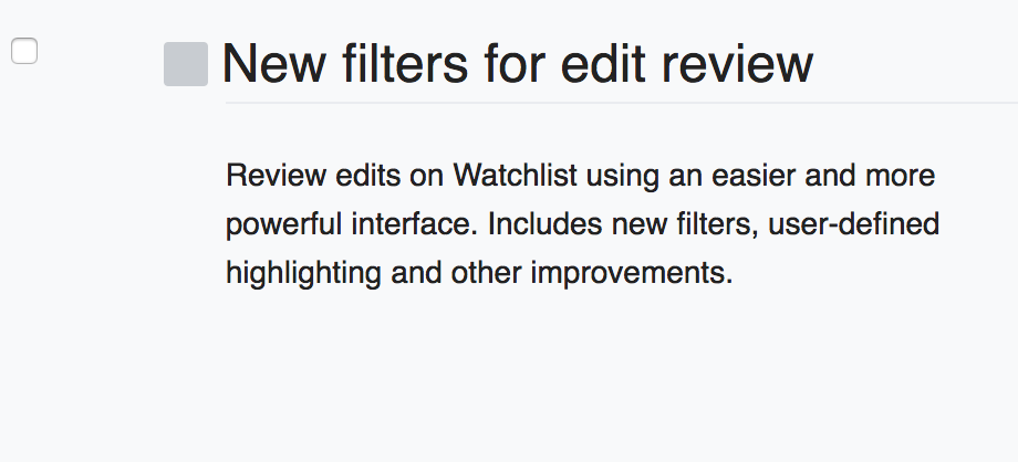
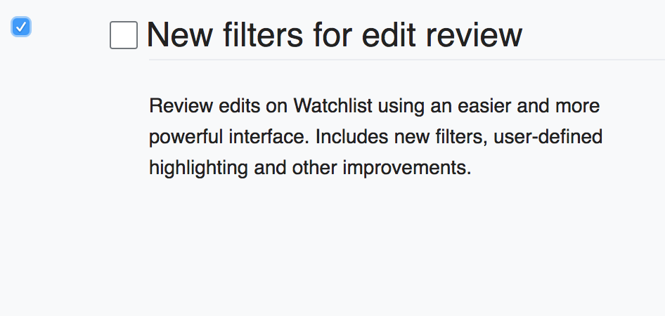
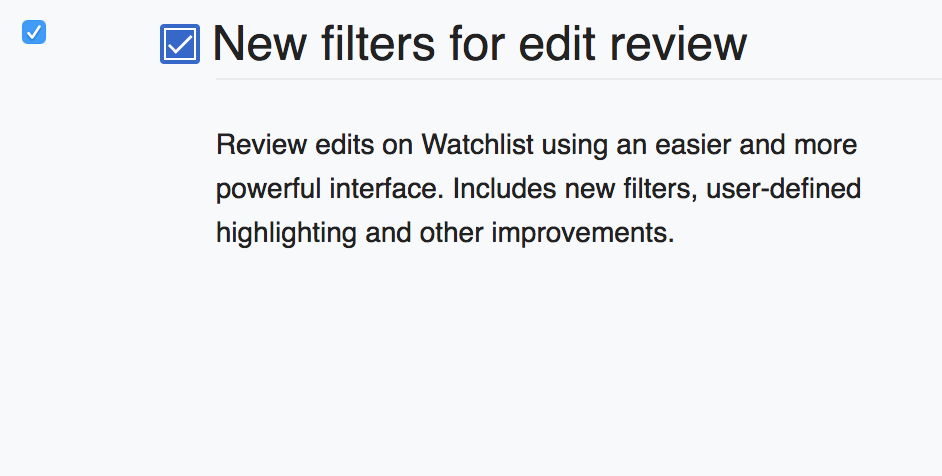
Why are there 3 states with two checkboxes?

| Reedy | |
| Jun 1 2018, 11:56 AM |
| F18649298: Screen Shot 2018-06-01 at 12.59.51.png | |
| Jun 1 2018, 12:00 PM |
| F18649278: Screen Shot 2018-06-01 at 12.54.17.png | |
| Jun 1 2018, 11:56 AM |
| F18649279: Screen Shot 2018-06-01 at 12.54.23.png | |
| Jun 1 2018, 11:56 AM |
| F18649280: Screen Shot 2018-06-01 at 12.54.29.png | |
| Jun 1 2018, 11:56 AM |
Why are there 3 states with two checkboxes?
One problem here is that the beta tab uses OOUI elements and Global Preferences does not. CommTech punted on making Global Preferences OOUI compliant until regular preferences are successfully converted to OOUI: T186842
And from a usability point of view, the two rows of preferences is less than ideal. But 'fixing' the design of preferences is outside of the scope of this project. We're favoring function over form on this project as the target audience is power users and this is a set-it-and-forget it feature.
And yes, this is probably a duplicate of T188424: Improve the UI of Global Preferences (aka "fix two vertical rows of checkboxes")
Developers make poor user interfaces, and are often happy to use them. Doesn't make it right, or sensible for other users (whether power or not).
It's not about fixing the design of preferences itself, though, that could be part of it. You're reusing the Preferences form from core... then adding extra complexity to it.
Why does it need an extra check box?
It is. But all of the forms have extra checkboxes too. As the beta part was mostly irrelevant, I had already updated the ticket to reflect this
Merging as a duplicate of T188424: Improve the UI of Global Preferences (aka "fix two vertical rows of checkboxes") because both tickets are posing the same problem: the current UI of two rows of checkboxes use a substandard UI.
Regardless, this work is outside the scope of the Community Tech team for 2018.