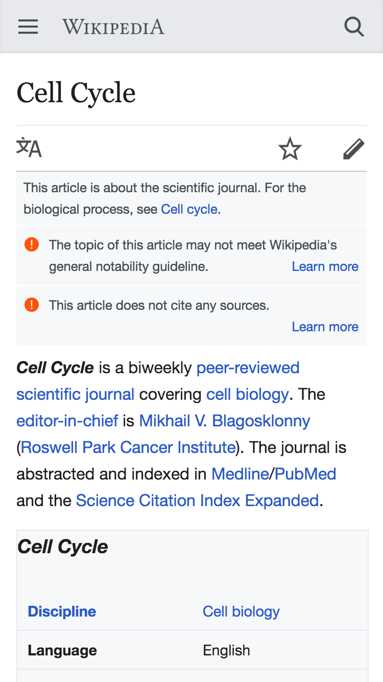
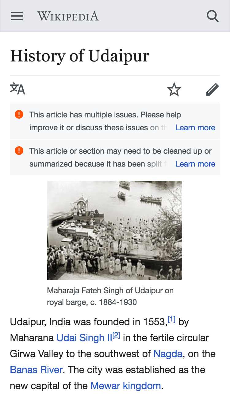
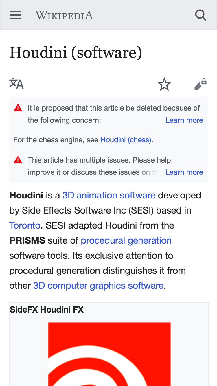
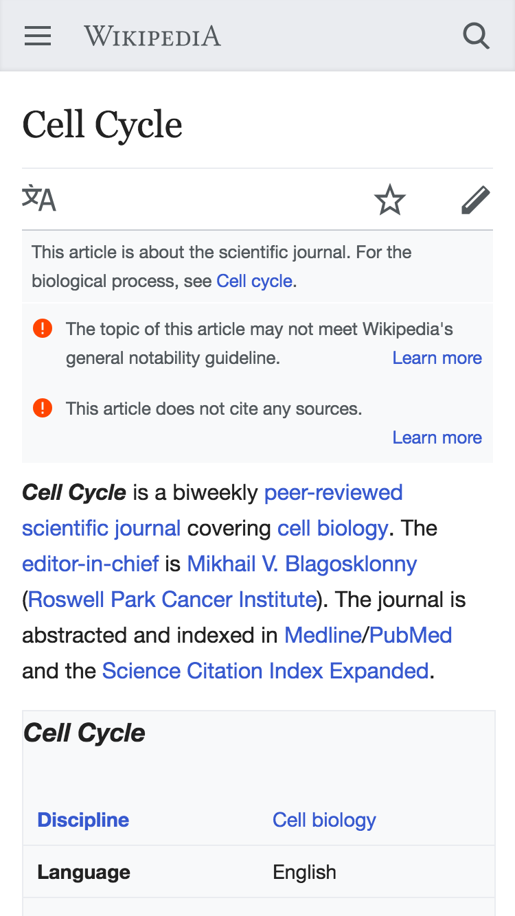
Problem
When page issue banners stack (either on top of other page issue banners, or on top of other hatnotes - disambiguation/redirect/etc.) it becomes difficult to distinguish them from other elements/banners.
| example of page issue banner blending into hatnote below it | example of stacked page issues blending into each other |
 |  |
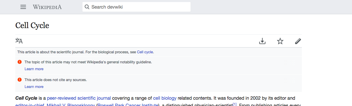
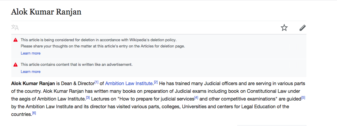
Solution
Can we add either a 1px margin, or a 1px white border, to .ambox?
| with border/margin | with border/margin |
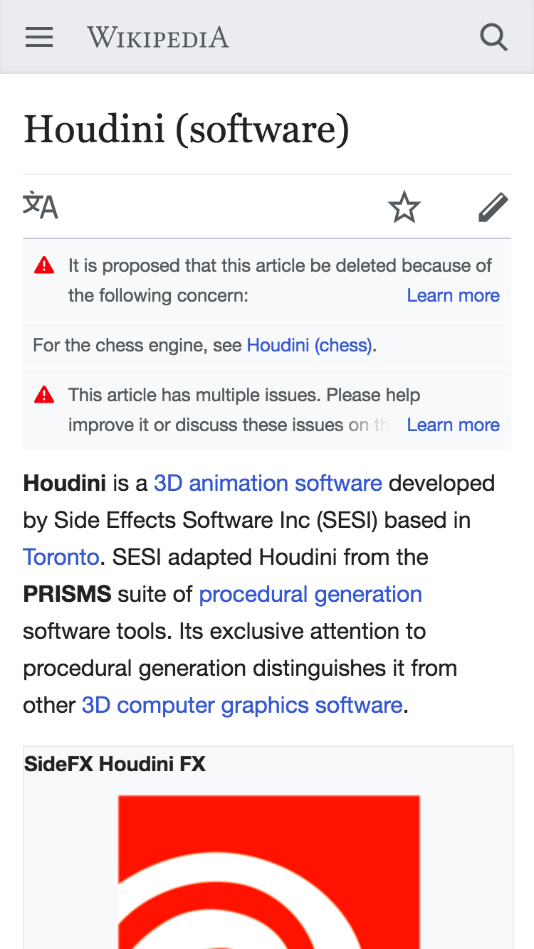 | 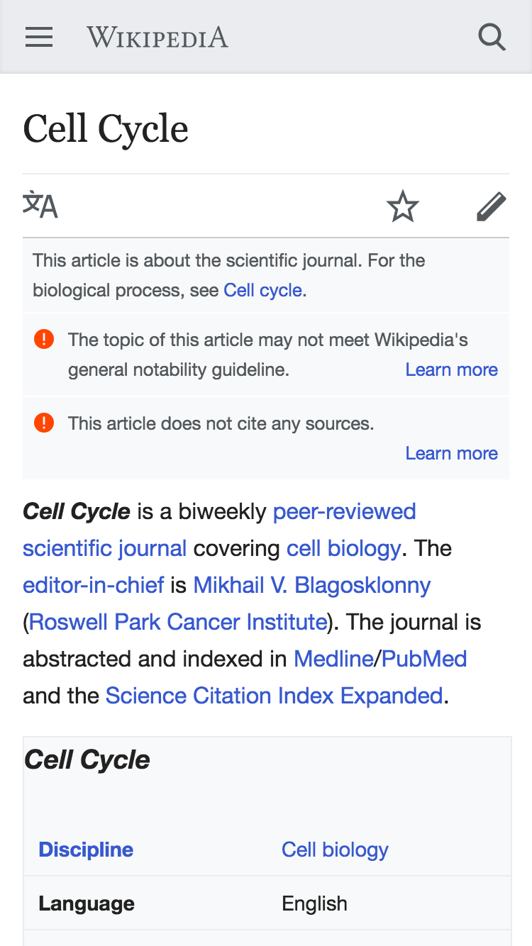 |
Developer notes
We'll want to target the top of any sibling elements, being careful to not apply the rules inside the page issues overlay or any issues collapsed inside a multiple issues template:
.mw-parser-output >.ambox + .ambox {
    border-top: solid 1px @var;
}
QA instructions
- visit the following pages (make sure you're bucketed into the AB test). For each page verify that there is a 1px white border between each of the gray banners above the article.
- https://reading-web-staging.wmflabs.org/wiki/Cell_Cycle
- https://reading-web-staging.wmflabs.org/wiki/Misandry
- https://reading-web-staging.wmflabs.org/wiki/Alok_Kumar_Ranjan