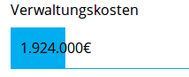
Currently, the amount of money is in the bars:
This is very easy to scale.
However, the amount of money all crosses the right border of the bar, since the bars are not that large. This decreases readability.
Two solutions:
- If we use a small scaling factor for the length of the bars (e.g. one that makes sure that a whole bar is 100% of our money) we could crank that up and adjust it so that it chooses 90% of the available space for the largest bar.
- Or we leave the scaling as it is but place the amount-of-money-text right to the bar, so it is always on white background. If for some reason the bar is very large it should fail gracefully and stop at the right most end and have the bar grow under the text (using floats? It seems to be tricky)
Question: What could be implemented and what possible negative side-effect would these solution(s) have?