Page MenuHomePhabricator

Consider displaying a tooltip by the password input field to explain password requirements
Open, Needs TriagePublic

Description

With our increased password length (T208246) the requirements for passwords are adding up: must be 8+ characters, must not match the username, and must not be common.

Currently, on both desktop and mobile web, if a password does not meet the requirements an error message displays. Perhaps we can add a tooltip (or other design element) that allows a user to see all the requirements at once.
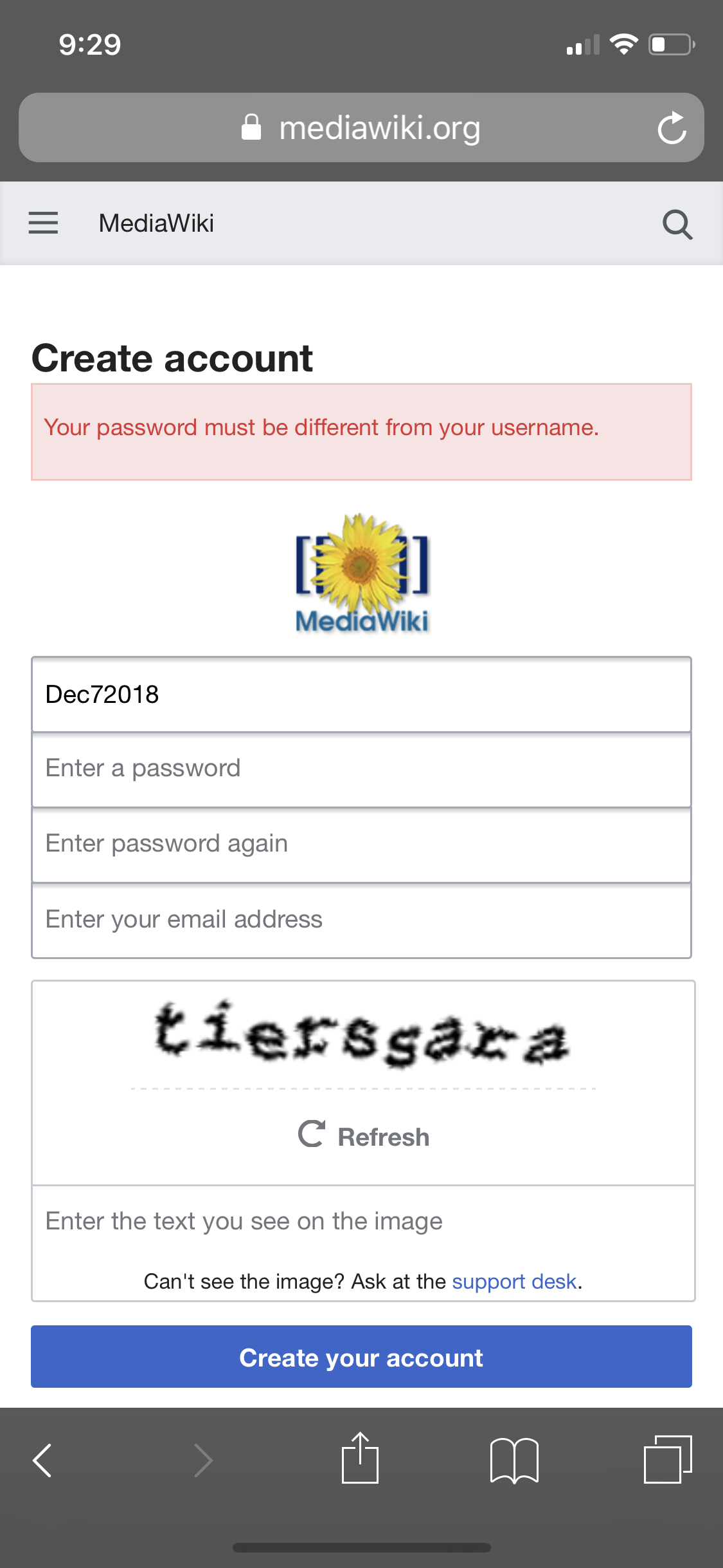
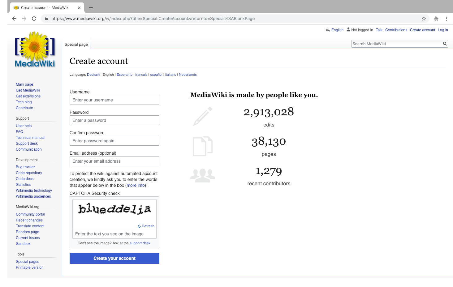
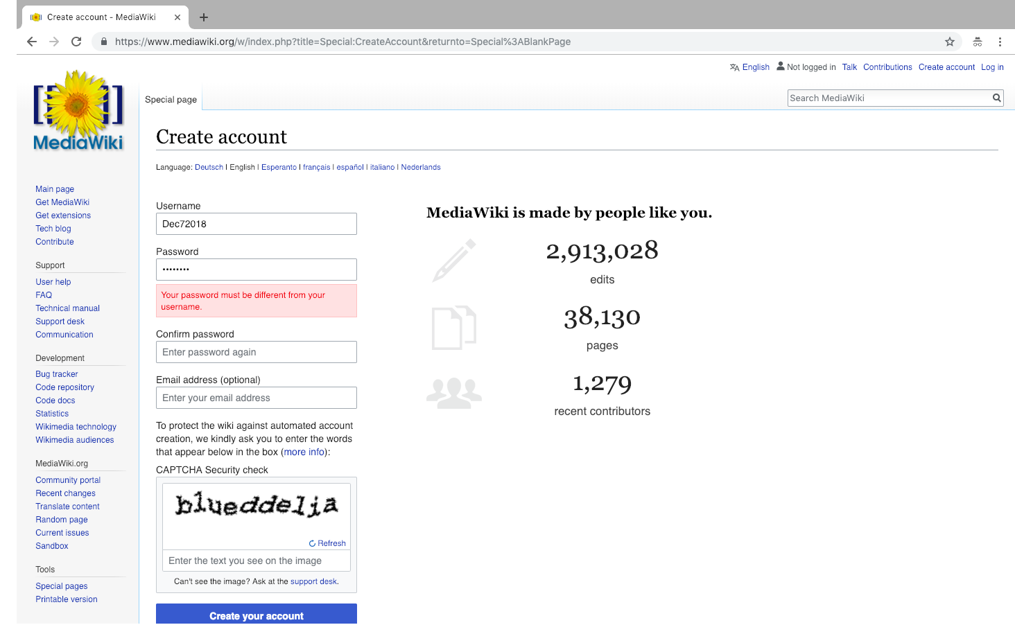
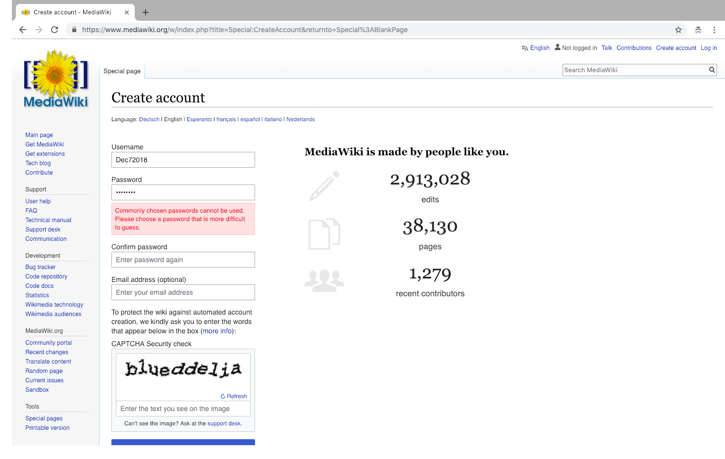
IMG_0797.PNG (2×1 px, 399 KB)
Screen Shot 2018-12-07 at 9.21.23 AM.png (928×1 px, 228 KB)
Screen Shot 2018-12-07 at 9.49.18 AM.png (928×1 px, 232 KB)
Screen Shot 2018-12-07 at 9.49.25 AM.png (928×1 px, 233 KB)
Mobile account creation & errorDesktop account creationDesktop error for matchingDesktop error for common
See also T211439

Event Timeline

TBolliger renamed this task from Consider displaying a tooltip by the password input field to explain password strength to Consider displaying a tooltip by the password input field to explain password requirements.Dec 7 2018, 5:52 PM
Tgr subscribed.

A tooltip (if you mean in the traditional sense, ie. something shown on hover) does not seem useful as people have no reason to hover over the password field. Placeholder text could be used (currently it's just "Enter a password"), although on mobile web on small screens there is no field label and the placeholder text is used to tell what the field is for; and the space is pretty limited. Or simply put something below the form (the same place where the error will show up, and same design, just a non-error color).

This could either be hand-set or (ideally) generated by from the reqiurements, in which case it would have to be built into $wgPasswordPolicies somehow. Which I think is a good idea anyway, password policies should be able to alter the form. Filed T211514: $wgPasswordPolicy should be able to alter the password form field about that.