Page MenuHomePhabricator

Use consistent icons for the issue summary bar
Open, MediumPublic

Description

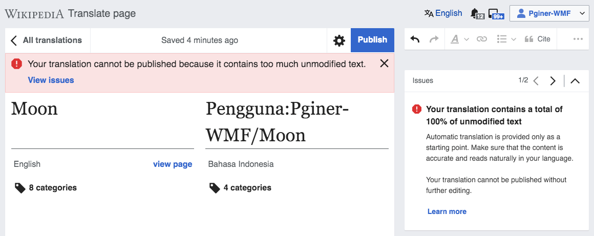
Currently when a problem such as not being able to publish is shown it includes both a summary on top and an issue card. Currently the icons used in each case are not consistent:

Screenshot 2019-06-07 at 10.42.20.png (420×1 px, 81 KB)

The icons used in the summary have to:

  • Represent the kind of problem. Using the error icon for errors, and the warning icon for warnings. In the example, the warning (triangle) is used instead.
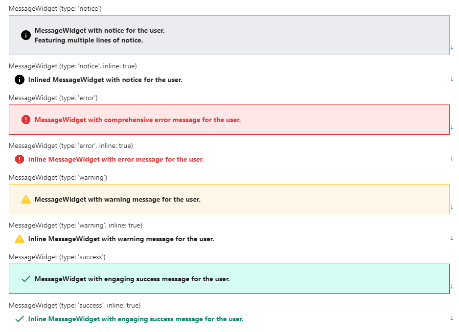
  • Use the color version of the icon. Making it easier to connect with the ones used in the cards (updated in T200773).

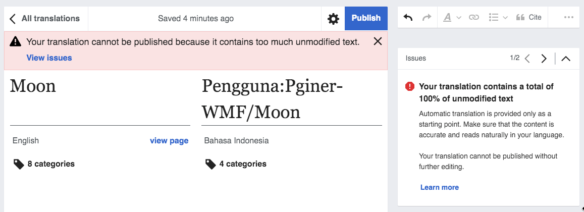
The expected result would look as shown below:

Screenshot 2019-06-07 at 10.44.04.png (461×1 px, 93 KB)

Event Timeline

Pginer-WMF triaged this task as Medium priority.Jun 7 2019, 2:36 PM

OOUI v0.33.0 introduced OO.ui.MessageWidget, which should replace our custom mw.cx.ui.MessageWidget, which means icons will be consistent with what is used inside of issue cards. See T225571

image.png (680×938 px, 57 KB)

There is also a demo, where you can see these widgets on display.

Change 550567 had a related patch set uploaded (by Esanders; owner: Esanders):
[mediawiki/extensions/ContentTranslation@master] Have mw.cx.ui.MessageWidget inherit from OO.ui.MessageWidget

https://gerrit.wikimedia.org/r/550567

Change 550567 merged by jenkins-bot:
[mediawiki/extensions/ContentTranslation@master] Have mw.cx.ui.MessageWidget inherit from OO.ui.MessageWidget

https://gerrit.wikimedia.org/r/550567