Page MenuHomePhabricator

Upload warning options are ambiguously worded: "OK" and "Cancel"
Closed, ResolvedPublic

Description

From T241655: Commons upload warning options are ambiguously worded: "OK" and "Cancel" (author: RoySmith):

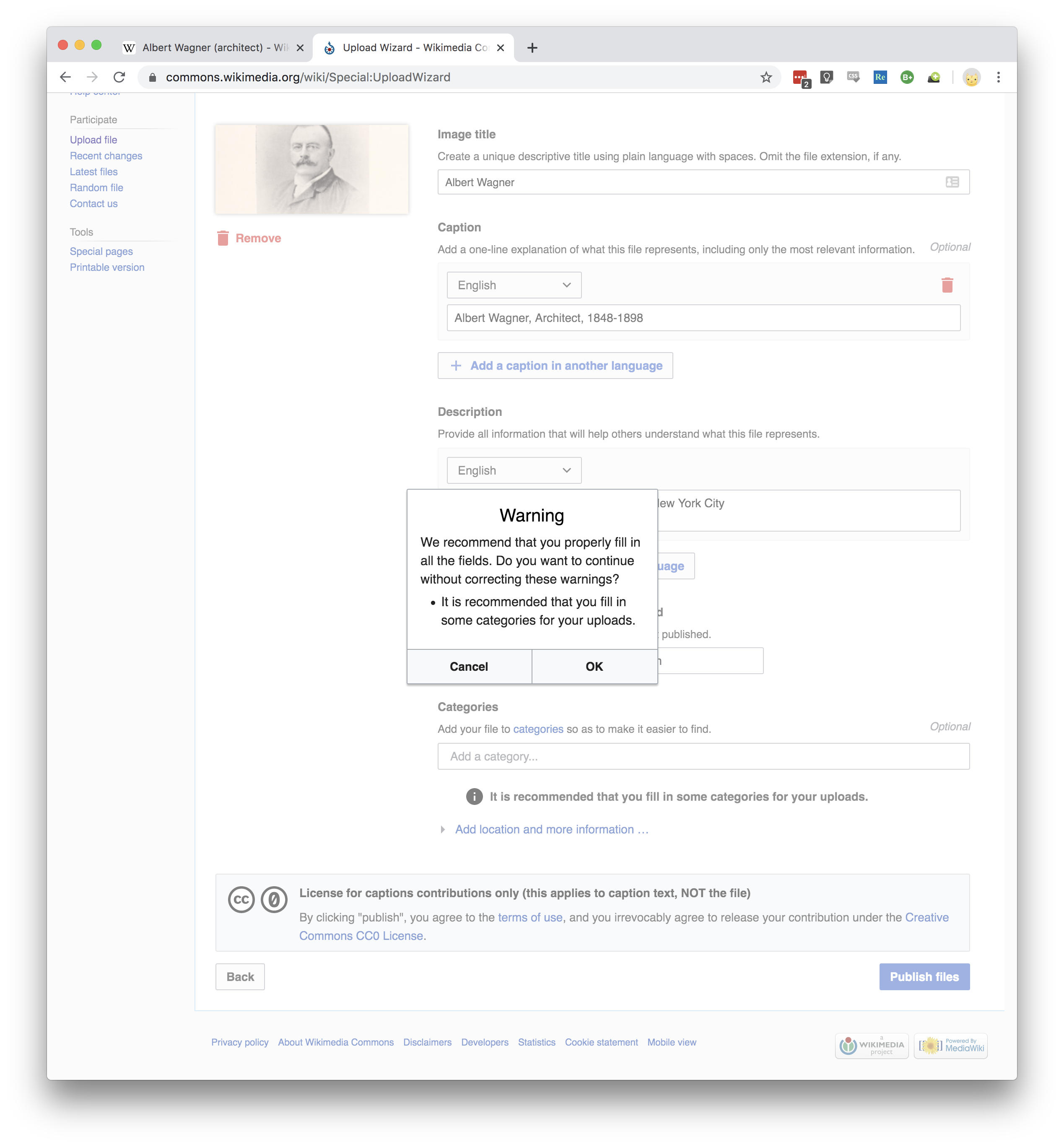
The following warning:

Warning
We recommend that you properly fill in all the fields. Do you want to continue without correcting these warnings?
It is recommended that you fill in some categories for your uploads.

offers two buttons, "Cancel" and "OK". I don't know which button does what. I think, "OK", means, "Yes, continue", but maybe it means, "OK, let me fill in some categories"? Buttons like this should offer obvious, unambiguous, answers to the question being asked.

Screen Shot 2019-12-31 at 2.41.45 PM.png (2×2 px, 830 KB)

Event Timeline

Ostrzyciel triaged this task as Medium priority.Mar 12 2021, 1:34 PM

Change 829311 had a related patch set uploaded (by Ostrzyciel; author: Ostrzyciel):

[mediawiki/extensions/MediaUploader@master] Fix wording in a warning dialog

https://gerrit.wikimedia.org/r/829311

Change 829311 merged by jenkins-bot:

[mediawiki/extensions/MediaUploader@master] Fix wording in a warning dialog

https://gerrit.wikimedia.org/r/829311

Is there a screenshot of what the new dialog box will look like?

Is there a screenshot of what the new dialog box will look like?

Here you go:

image.png (438×775 px, 46 KB)

But please do note that this is about MediaUploader, the non-Wikimedia fork of UploadWizard. You will not be seeing this change on Wikimedia Commons. For that, see this task: T241655

Thanks for the screenshot.

Dialogs like this read better if the question part comes immediately before the choices. And the wording of the question you pose requires a Yes or No answer.

Also, it talks of correcting warnings, but you haven't actually given any warnings. You've just given recommendations. And you can't "correct a warning". You can correct a problem which led to a warning being issued.

It's also odd that you recommend "properly" filling in all the fields. As if anybody might want to fill them in improperly?

I suggest wording it like this:

Warning

* You have not filled in the 'Date' field
* You have not filled in the 'Categories' field

Do you want to continue without correcting these problems?

Yes      No

I uhhh, feel reluctant to change this again unless I'm overpowered by either (a) authority (if, incidentally, you are a professional UX designer or can back that up with literature) or (b) majority voice (a third opinion).

If either of these is the case, please reopen the task. Otherwise, I don't think this detail is important enough for me to ponder on it more. There is a lot other tasks to solve.