Page MenuHomePhabricator

Unexpected space before the Reply button when it wraps to a new line
Closed, ResolvedPublic

Assigned To
Authored By
ppelberg
Dec 17 2022, 1:28 AM
Referenced Files
F36867243: image.png
Feb 23 2023, 11:20 PM
F36867240: image.png
Feb 23 2023, 11:20 PM
F36867238: image.png
Feb 23 2023, 11:20 PM
F36867236: image.png
Feb 23 2023, 11:20 PM
F36867234: image.png
Feb 23 2023, 11:20 PM
F36867228: image.png
Feb 23 2023, 11:20 PM
F35870686: image.png
Dec 17 2022, 1:28 AM

Description

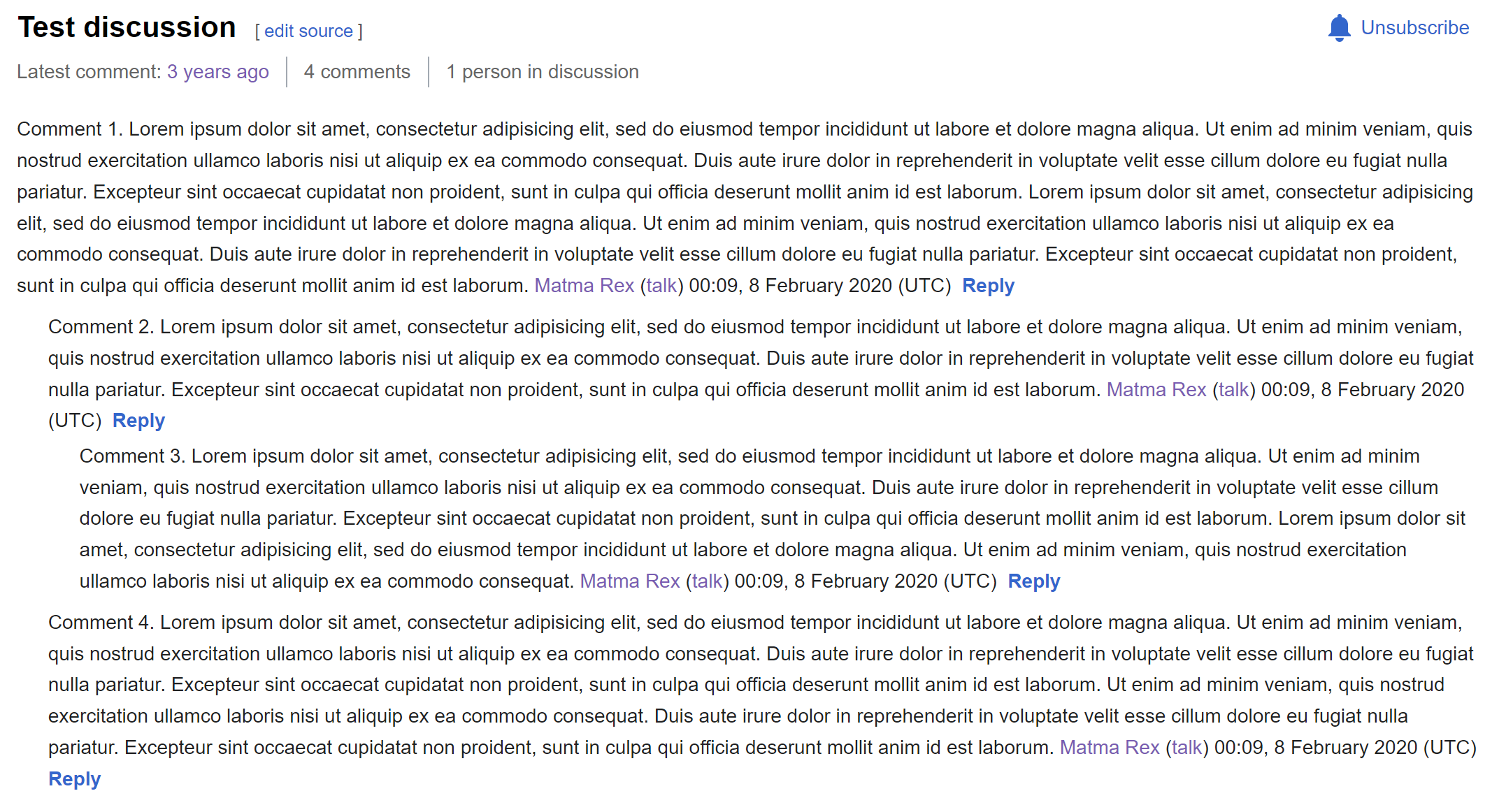
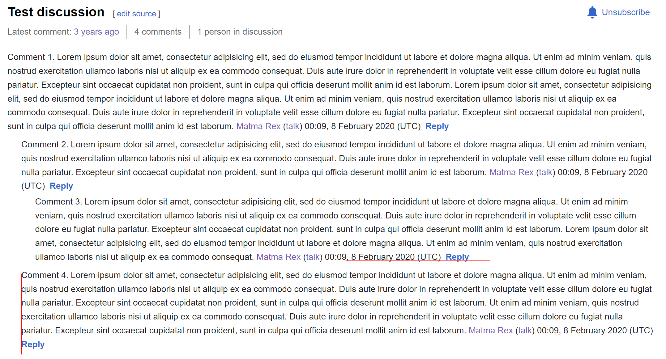
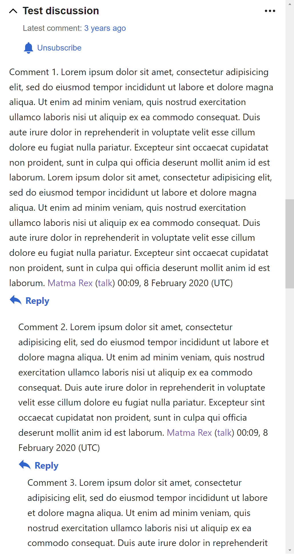
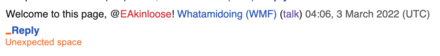
For people who have the Show discussion activity setting enabled within Special:Preferences, when the Reply button wraps onto a new line, [what looks like] an unexpected space appears before it.

Thank you to @Jonesey95 for noticing this issue.

Behavior

  1. On desktop, visit Special:Preferences
  2. Confirm the Show discussion activity setting is enabled
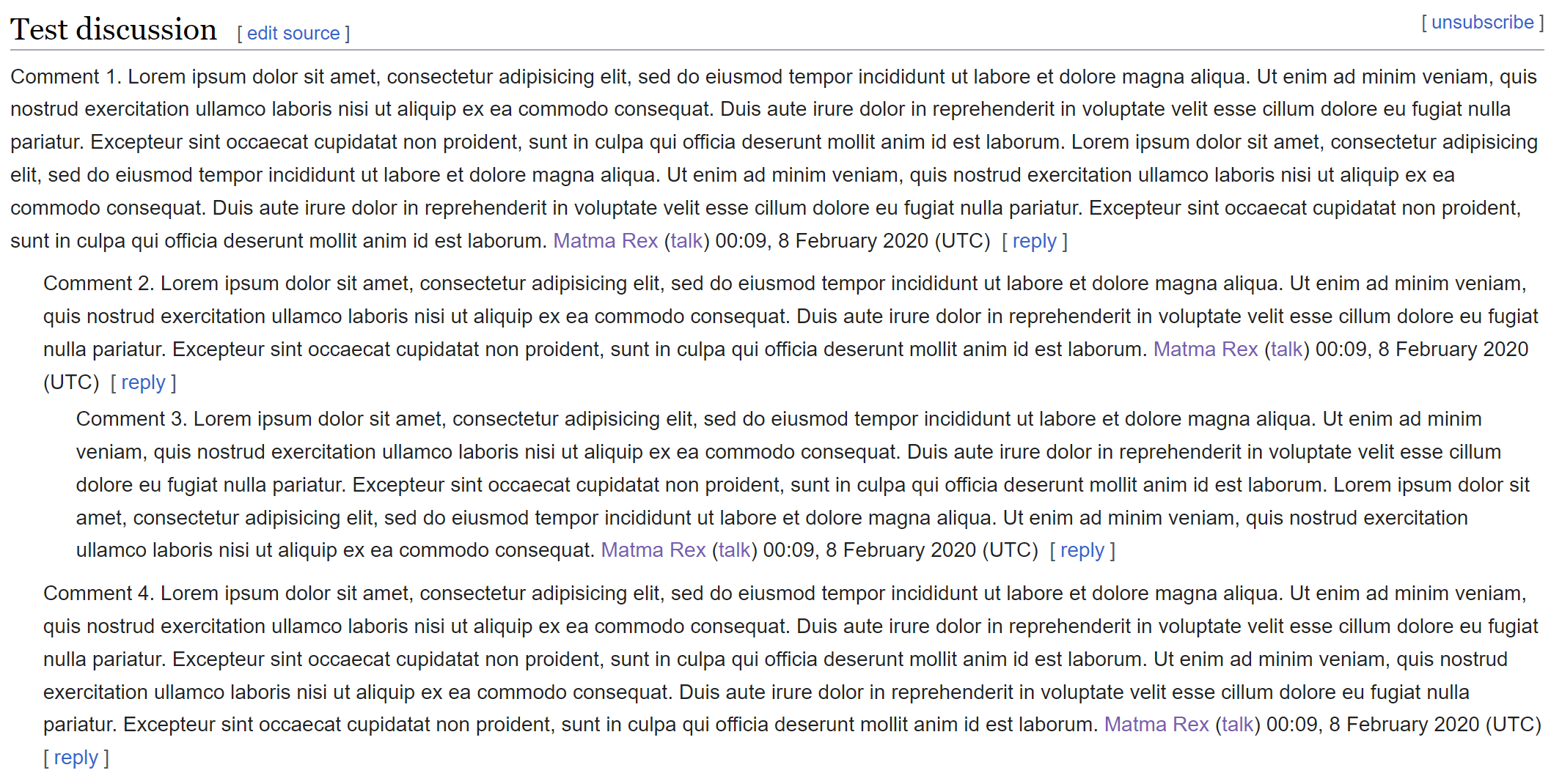
  3. Visit a talk page where the Reply Tool is available. E.g. https://www.mediawiki.org/wiki/Talk:Talk_pages_project/Usability .
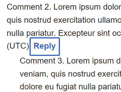
  4. Decrease the width of your browser window such that the Reply buttons wrap onto a new line beneath the timestamp that precedes it
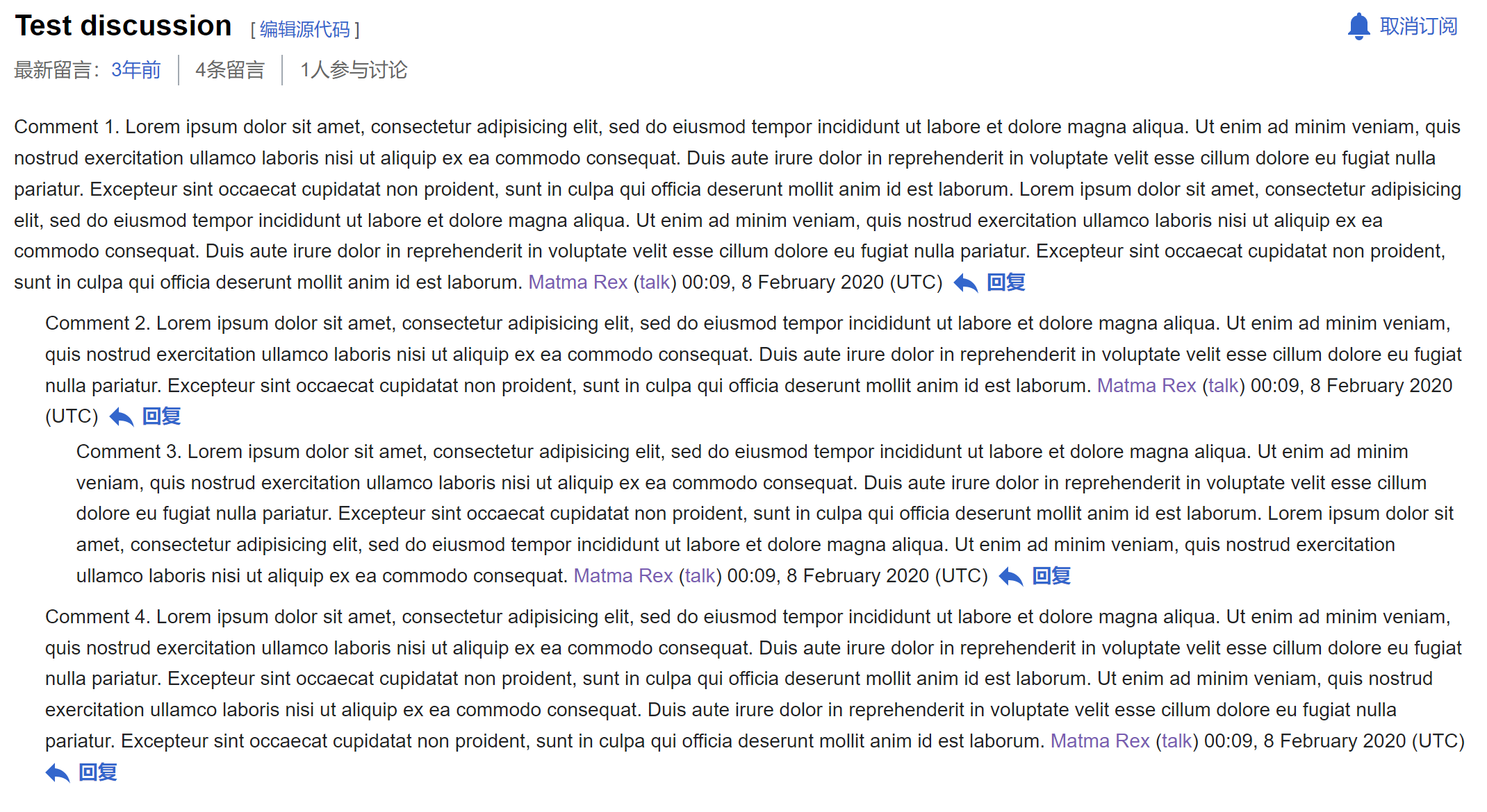
5. ❗️ Actual✅ 5. Expected
image.png (56×440 px, 11 KB)

Done

  • Expected behavior is implemented

Event Timeline

It behaves this way because the space before the reply button is not a real space, but a piece of CSS margin. We had to do it this way, because we had to apply CSS display: inline-flex to the button to work around a Chrome bug with text selection (T260072), and it changes the normal behavior of text layout / line-breaking. However, it looks like the Chrome bug has been just recently fixed in Chrome 108, so maybe we can drop the workaround in a few months.

Change 891720 had a related patch set uploaded (by Bartosz Dziewoński; author: Bartosz Dziewoński):

[mediawiki/extensions/DiscussionTools@master] Undo inline-flex hack, fix alignment of buttons with text when wrapped

https://gerrit.wikimedia.org/r/891720

After the changes:

image.png (1×2 px, 359 KB)

Note that:

Reply buttons are aligned with normal text, horizontally and vertically
image.png (1×2 px, 295 KB)
The clickable extent of the button is bigger than it looks like
image.png (316×414 px, 34 KB)
Looks okay in languages where we add icons to the buttons
image.png (1×2 px, 362 KB)
Looks okay on mobile too
image.png (1×1 px, 309 KB)
Looks okay with visual enhancements disabled
image.png (1×2 px, 344 KB)

Change 891720 merged by jenkins-bot:

[mediawiki/extensions/DiscussionTools@master] Undo inline-flex hack, fix alignment of buttons with text when wrapped

https://gerrit.wikimedia.org/r/891720

Change 897892 had a related patch set uploaded (by Bartosz Dziewoński; author: Bartosz Dziewoński):

[mediawiki/extensions/DiscussionTools@master] Fix [reply] spacing on mobile when usability improvements unavailable

https://gerrit.wikimedia.org/r/897892

Change 897892 merged by jenkins-bot:

[mediawiki/extensions/DiscussionTools@master] Fix [reply] spacing on mobile when usability improvements unavailable

https://gerrit.wikimedia.org/r/897892